Kurgan the Lurker Posted October 28, 2007 Share Posted October 28, 2007 Since Lost and the Damned (at least in their current rules) can be lead by power armor we do allow them to be shown. That may change though once the new Apoc template comes out for them though as they have lost the Power Armor option sadly. <_< Link to comment https://bolterandchainsword.com/topic/119449-the-disciples-of-the-four/page/2/#findComment-1404856 Share on other sites More sharing options...
wolf-time-hero Posted October 28, 2007 Share Posted October 28, 2007 ye its pretty much a codex in there and the ogryn bezerker rulles :lol: <_< also paint them as alpha legion cus they have inducted alpha legion in the rules for the gaurd......with the rule "were in disguise" lol also seems i can post them i will soon .....also can i post a chimera? Link to comment https://bolterandchainsword.com/topic/119449-the-disciples-of-the-four/page/2/#findComment-1404862 Share on other sites More sharing options...
wolf-time-hero Posted October 28, 2007 Share Posted October 28, 2007 delete this please Link to comment https://bolterandchainsword.com/topic/119449-the-disciples-of-the-four/page/2/#findComment-1404881 Share on other sites More sharing options...
Kurgan the Lurker Posted October 28, 2007 Share Posted October 28, 2007 Wolf time: You shouldn't be hijacking TinWeasels thread. Either make your own or go post your LatD stuff over at Boot Camp (a Guard related forum and therefore more appropriate for LatD). Link to comment https://bolterandchainsword.com/topic/119449-the-disciples-of-the-four/page/2/#findComment-1404882 Share on other sites More sharing options...
wolf-time-hero Posted October 28, 2007 Share Posted October 28, 2007 ok ^^ let me edit it away sorry tin weasle Link to comment https://bolterandchainsword.com/topic/119449-the-disciples-of-the-four/page/2/#findComment-1404883 Share on other sites More sharing options...
Tinweasel Posted November 8, 2007 Author Share Posted November 8, 2007 Looking for some feedback on recent GS work on my Aspiring Champion, before I go any further. Essentially I'm wanting the "broken open" knee to look like the interior has somewhat burst the armor and is composed of sinew/muscle or Chaosy fleshy bits, and I'm wanting the surface of the Power Fist to look like it's covered in fleshy areas and has spikes and a bolter housing growing out of it. I'm trying to finish the work fairly quickly because I think I've finally settled on final colors for the warband scheme and I want to get crackin' on him, but I'm trying not to rush things because I don't have a lot of experience at sculpting (this is I think my third or fourth heavily modified figure or so?) and I want it to look good... http://img.photobucket.com/albums/v229/bwride/gw_asp_champ_wip5.jpg Any suggestions or critique would be appreciated! I'm wondering whether I ought to do all the spikes and the base of the bolter housing on the fist like I've tried with the current ones; likewise, does the knee look good or does it need more work? Oh, and I think I have a name for my Warband finally: The Disciples of the Four Bear in mind that they're an ultra-zealous offshoot of the Word Bearers who not only spiritually want to demonstrate their faith and convert the unbelievers to the worship of the four Gods of Chaos, but also see themselves as physical representatives of the power and the glory of the Chaos Gods and so will have all kinds of physical "displays" of the strength and "beauty" of Chaos itself. So what do you think of the name, and does it sound appropriate given the "theme" of my Warband? I think I'm going to run with the icon earlier in the thread displaying the four 8-pointed overlapping spiked circles, as it's fairly straightforward to paint but ambiguous enough that it could cover a wide range of fluff for my Warband (the larger circle represents their strength and pride as the embodiment of Chaos, the complementary circles represent their alliances (these are part of a Lost and the Damned army allied with The Shriven, after all), the four spiked circles overall represent the Four Gods of Chaos, etc.) Here it is:http://img.photobucket.com/albums/v229/bwride/d_icon.jpg Link to comment https://bolterandchainsword.com/topic/119449-the-disciples-of-the-four/page/2/#findComment-1414528 Share on other sites More sharing options...
Kurgan the Lurker Posted November 8, 2007 Share Posted November 8, 2007 The gun spikes/sores look fine. Not so sure about the knee joint though. It looks flimsy to me. I understand what you are trying to accomplish with it, it just seems small is all. Name seems appropriate though I am wondering, will each Marine have dedications to all four gods on them? Your warband emblem can be done with the new brash etched stuff in the new GW basing kit if you don't want to free-hand it that is. Link to comment https://bolterandchainsword.com/topic/119449-the-disciples-of-the-four/page/2/#findComment-1414846 Share on other sites More sharing options...
wolf-time-hero Posted November 8, 2007 Share Posted November 8, 2007 man very nice only thing i would changge is make the leg more stronger it looks llike a plastic SPOON could cut it lol beef it up and it will look FINE man go for it! :huh: Link to comment https://bolterandchainsword.com/topic/119449-the-disciples-of-the-four/page/2/#findComment-1415083 Share on other sites More sharing options...
Tinweasel Posted November 9, 2007 Author Share Posted November 9, 2007 The general consensus apparently seems to be that the knee joint looks a little off, so I guess its not just me that sees it as being a little too thin and awkward looking (well, it originally was just a paperclip, but that's no excuse). I did some work tonight to see what I could do about "bulking it out" a little bit. I tried to tidy it up and make it look a little less sloppy and with straighter lines/sinews. (And yeah, his leg's a little "backbent" compared to a normal posture - that's intentional.) Here's a front view of the revised knee joint. The back's always looked a bit more "natural" but I added some of the same sinews/flesh to the outside of the joint and it did make a difference there as well: http://img.photobucket.com/albums/v229/bwride/gw_asp_champ_wip6.jpg Thanks for the straightforward feedback so far, that's especially what I'm after! I'd appreciate opinions on the reworked joint, if folks would be so kind? @ Kurgan - I hadn't really considered modeling "devotion" to all 4 gods on the figures, I just kinda figgered I'd run the gamut of modeling options for each of the powers across the lot of 'em, primarily the ones that are fully outfitted as full members of the Warband (as opposed to my playing around with color schemes of other Legions for "indoctrinated" newer recruits). My favorite has always been Nurgle for "atmosphere" but I'm going to try and play around with modeling and decoration for all the gods, depending on what bitz I can scrounge and what inspiration I can find. I think I'm going to keep the idea of "impurity symbols" as a carry-over from the Word Bearers - it's easy enough to do some tattered parchment hanging from studs and spikes, after all. I'm thinking that Khornate mutations would be more angular and/or spiky, like weapon growths and skulls and the like; Tzeentchian mutations would be more fluid and graceful, incorporating bone and exotic curves and animal parts; Slaaneshi stuff I plan on going all "Cenobite"-esque, with leather and straps and barbed hooks and such - I suppose I could try sculpting naked anatomy, but I just see that going terribly wrong as it's never been one of my strong suits. Any of this sound about right? I think I've come up with a fairly straightforwards way of doing straps and such, but I'm going to test it out on my Shriven LatD accompanying troops first. So far as the etched symbols, would that be the 40K basing kit? I haven't seen any of 'em in person and can't seem to find pictures of the contents on GW's site. I'm thinking I've got a way of getting it easily replicable from figure to figure, but that's going to involve some more sculpting of a sort - well, subtractive sculpture anyways, and stamping... 8^) [EDIT] I found the Chaos Space Marine Painter tonight - very nice! Here's what I have in mind for my Warband color scheme: http://img.photobucket.com/albums/v229/bwride/gw_d_color_scheme.png More of a fleshy-colored red than the Word Bearers dark crimson I painted on the inducted CSM earlier in the thread, with a blackish-purple contrast color. [/EDIT] Link to comment https://bolterandchainsword.com/topic/119449-the-disciples-of-the-four/page/2/#findComment-1415631 Share on other sites More sharing options...
Tinweasel Posted November 15, 2007 Author Share Posted November 15, 2007 Well, I've only been able to work on him in fits and starts and that being complicated by not wanting to smudge any of the spike "nodes" by working on nearby ones simultaneously. Barring any last-minute comments or suggestions, though, I think he's about ready for priming. http://img.photobucket.com/albums/v229/bwride/gw_asp_champ_wip7.jpg http://img.photobucket.com/albums/v229/bwride/gw_asp_champ_wip8.jpg As I said in my last post, I bulked out the knee joint a bit more - I've been trying to sculpt it to look more like sinew and muscle rather than outright skin. I'm hoping the effect holds up - I plan on painting the exposed fleshy areas in pale greyish-green tones for the most part, which I think will balance out the fairly robust reds, orangey-yellows, and purples I'm planning for the Warband scheme. Link to comment https://bolterandchainsword.com/topic/119449-the-disciples-of-the-four/page/2/#findComment-1420781 Share on other sites More sharing options...
LunchBox Posted November 16, 2007 Share Posted November 16, 2007 Hey Tin...good to see you around these parts! I like the champ...the knee joint gives the feeling of 'agony within', which is missing from most CSM creations. I can't wait to see you work your brush-magic! Link to comment https://bolterandchainsword.com/topic/119449-the-disciples-of-the-four/page/2/#findComment-1421497 Share on other sites More sharing options...
Tinweasel Posted November 16, 2007 Author Share Posted November 16, 2007 Hey Tin...good to see you around these parts! I like the champ...the knee joint gives the feeling of 'agony within', which is missing from most CSM creations. I can't wait to see you work your brush-magic! Hey, a familiar face! Your stuff's looking good in the magazine, BTW! I've been a member over here for a while but since I've primarily been putzing around with non-power armored stuff I haven't had much opportunity to post things and be topical, short of trolling the occasional thread. Since I started this corrupted Imperial Guard project (with accompanying evil Chaos Marines), though, the armored stuff fits right in. Definitely liking the feedback here, just wish I had more... Glad you like the Champion - yeah, with the knee I was aiming for a look of something unnatural sorta bursting out of the armor. (I bought a box of the Possessed and the mutation sculpting was very inspiring...) I've started painting now and have mostly finished up with the skin tones last night, so I'll likely be posting pics up here pretty soon. (I've been putting up the rest of my stuff primarily on the Relicnews Painting & Modeling Forum for the sake of it not being topical here...) Thanks for the feedback and good to see a familiar name! Link to comment https://bolterandchainsword.com/topic/119449-the-disciples-of-the-four/page/2/#findComment-1421820 Share on other sites More sharing options...
Tinweasel Posted November 17, 2007 Author Share Posted November 17, 2007 Now working on the painting, I started by painting the non-armor fleshy areas and was aiming for a pale greenish color. In combining a greyish-tan and an olive drab in successive washes over white, I ended up with something that looks overall beige (or very light beige, as the case might be)... Not quite what I was expecting. http://img.photobucket.com/albums/v229/bwride/gw_asp_champ_wip9.jpg The reds aren't in place yet for comparison's sake, so the overall tone might change, but are there any suggestions - or does it look okay thus far and I should keep on going with the current color? (Bear in mind that the teeth are only basecoated, the mouth grill/metal head crest is untouched, and everything else will primarily be in reds or purples... The very first thing I wanted to try painting was the skin tone and the end result is not what I expected.) Link to comment https://bolterandchainsword.com/topic/119449-the-disciples-of-the-four/page/2/#findComment-1422565 Share on other sites More sharing options...
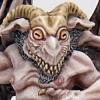
Tinweasel Posted November 21, 2007 Author Share Posted November 21, 2007 It's been my main focus to get the fleshy areas to a point where I was happy with the color and appearance. I think I've hit my mark so far as greenish flesh (with a hint of grey): http://img.photobucket.com/albums/v229/bwride/gw_asp_champ_wip11.jpg I've always pictures his head appearance-wise as his helmet having more or less turned to flesh except for a few choice bits - the grill amongst the teeth, the decorative arrow on the top of the head, and the ear/vox-pieces on the sides. It's a little bit hard to tell unless you view him from more of a top-looking-down angle, but I painted on something like age/liver spots on his "scalp." I'm thinking I should probably go with greenish "glowing" eyes, more or less along the same lines as the inducted Word Bearers CSM I've painted. Ideas or comments? I had the idea to make the topknot itself look like "real" hair - I'm thinking blonde, like it came from an Eldar or something. I was thinking something in a yellowy-golden color, since it'd be a complementary color to the purple seconday colors. Maybe if I did some tiny flecks of "blood?" Any ideas? Link to comment https://bolterandchainsword.com/topic/119449-the-disciples-of-the-four/page/2/#findComment-1425782 Share on other sites More sharing options...
Tinweasel Posted November 24, 2007 Author Share Posted November 24, 2007 http://img.photobucket.com/albums/v229/bwride/gw_asp_champ_wip12.jpg Did some more work, but I'm not sure of how well the topknot fits into the overall appearance. I'd still like some feedback, per my last post, if possible... Link to comment https://bolterandchainsword.com/topic/119449-the-disciples-of-the-four/page/2/#findComment-1427508 Share on other sites More sharing options...
Starks333 Posted November 24, 2007 Share Posted November 24, 2007 before i comment/suggest are you using this squad for tabletop? or golden daemon? i thought i read in your post in Lunchies thread that you were going to daemon it lemme know so i know how to respond :tu: Starks Link to comment https://bolterandchainsword.com/topic/119449-the-disciples-of-the-four/page/2/#findComment-1427569 Share on other sites More sharing options...
Tinweasel Posted November 24, 2007 Author Share Posted November 24, 2007 before i comment/suggest are you using this squad for tabletop? or golden daemon? i thought i read in your post in Lunchies thread that you were going to daemon it lemme know so i know how to respond :devil: Starks Oh, feel free to pick stuff apart regardless. I guess ideally I'm aiming for something that I'd be able to enter into the Golden Demons. I seem to be putting a healthy amount of work into these guys conversion- and posing-wise right from the outset, moreso than what I figger I'd do with a simple TT army, and I'm putting in some serious effort on the paint jobs as opposed to just cranking 'em out. Still unsure as to whether I'd want to enter these Chaos troops or my corrupted Guard elsewhere in next year's Demons (or maybe both), but I seem to be moving a bit quicker on these guys as the Guard unfortunately seem to need a majority of self-sculpting. First, an update with some additional work: http://img.photobucket.com/albums/v229/bwride/gw_asp_champ_wip13.jpg Second, where I'm at and my tentative plans on what I had in mind from here: I plan on doing an overall shading black/red glaze at this point in the depressions on the armor to tidy everything up a bit. I'm thinking one more step of highlights to get the armor color to a somewhat fleshier appearance than the first CSM I posted earlier in the thread - right now the highlights on the armor are currently 1:1:1 Red Gore/Blood Red/Dwarf Flesh. I think I'm about finished with the face, unsure of what to do with the eyes (greenish glow effect like the initial CSM as in this guy's eyes used to be lenses in the helmet that is now his face vs. maybe enhance the flat whiteness of 'em currently and just leave 'em blank and pale) and liking the overall appearance of the skin areas but not quite happy with the appearance of the knee - I'm at a loss as to what to do, though, as I've already tried evening out the upper-facing shadows with a bit lighter of a green and brightening up the highlights on the "sinews" sticking up. One problem with the eyes is the original sculpt, where the left eye has an obvious "lens" and lower eyelid whereas the right eye has a lower eyelid but the rest of the eye is narrower in comparison to the other and not as well defined. The metallics right now are simply a shading basecoat and I know will need some serious tidying up as I've been a little sloppy in laying the red down (currently on vacation at the in-laws with recently posted work and my painting area here isn't as well lit as I'm used to). I do plan of having them look along the same lines as the original CSM, which is about 2-3 steps of highlighting from here on the metallics, assuming everything was tidy. Might need more, though, but the current high end edge highlights on the initial test CSM in the quasi-Word Bearers scheme is pure Mithril Silver. I'm unsure as to how to paint the Tau head so it fits in with the rest of the scheme - I was thinking a darker green maybe as a complementary color (DA Green > Snot Green > Snot/Bleached Bone?) and the skull I'm painting to resemble a head that's had the flesh flayed off. So far as finishing the base, I was thinking a similar roadway/asphalt-type base as the first CSM, only this one with a pile of rubble or thrown-up rock from a nearby crater. Any and all feedback or suggestions from you folks out there would be appreciated! Link to comment https://bolterandchainsword.com/topic/119449-the-disciples-of-the-four/page/2/#findComment-1427642 Share on other sites More sharing options...
Starks333 Posted November 27, 2007 Share Posted November 27, 2007 ok, so this critique will be in terms of a games day type entry aka display quality i really believe the most beneficial thing to anyones display is a light source..the reason is it allows you to organise everything much easier...you can use lighting AND colour to draw a focus..you can maintain colour easier because your highlights are only where light hits so natural colour law applies, whereas when you highlight all edges you actually change the overall colour of the piece because it doesnt follow the rules next, the most important thing people dont know is desaturated colour...you really wanna get into these, the reason is with desaturated colours you can control your focus easier because you dont have 5 intense colours battling for attention...not a large issue with this specific piece, but overall is an issue on many pieces next is a quote from Creafigs a french forum: "Or I should try and add purple to my shadows on the skin?" Exactly. You should try complex shadows with complementary colors... I don't know how to explain more... This is the main difference between american and french style : mixed and rich colors, not "just" a gradient of a hue. Do not misunderstand me, you're work is fine and clean, but a bit too clean, and each colors must integrate differents hues. C'est compréhensible ? what this means is if you look at most peopels work, even the winners of many daemons,you will notice a lot of them paint in traditonal GW styel which is... highlight raised areas shade recesses, but use the same general colours to do so..or add simple colours to dark/brighten that can still look good, but its nowhere near as advanced, and so to improve you need to learn it for example on your piece, if you desaturated the red slightly, and the blue, you could keep the beige dull, and super saturate the green eyes to make them glow even more, creating an immediate focal point..then a neutral brown for the tau head, metalics with nice colourful glazes i certainlky dont expect you to go and change it now, these are just examples your piece as a whole, needs more pop, and always take photos, look at them and see if theres enough contrast in them..the best way to do this, is grab a pic of one of the better minis on coolmini, and compare, you can usually see your problems right away hahaha for example: http://s6.photobucket.com/albums/y218/Star...nt=100_3881.jpg after taking that i decided i needed to re-brighten some highlights and darken shades more to get the depth i needed/wanted the thing a lot of north american minis lack is that natural depth...cartoony depth really lacks in many cases, and in that case its all about flash(aka nmm and bright flashy colours) hopefully this makes sense, sorry it took me so long to reply :P Starks Link to comment https://bolterandchainsword.com/topic/119449-the-disciples-of-the-four/page/2/#findComment-1429865 Share on other sites More sharing options...
Tinweasel Posted November 30, 2007 Author Share Posted November 30, 2007 i really believe the most beneficial thing to anyones display is a light source..the reason is it allows you to organise everything much easier...you can use lighting AND colour to draw a focus..you can maintain colour easier because your highlights are only where light hits so natural colour law applies, whereas when you highlight all edges you actually change the overall colour of the piece because it doesnt follow the rules next, the most important thing people dont know is desaturated colour...you really wanna get into these, the reason is with desaturated colours you can control your focus easier because you dont have 5 intense colours battling for attention...not a large issue with this specific piece, but overall is an issue on many pieces for example on your piece, if you desaturated the red slightly, and the blue, you could keep the beige dull, and super saturate the green eyes to make them glow even more, creating an immediate focal point..then a neutral brown for the tau head, metalics with nice colourful glazes the thing a lot of north american minis lack is that natural depth...cartoony depth really lacks in many cases, and in that case its all about flash(aka nmm and bright flashy colours) Thanks for the involved response, however long it took. Just the sort of thing I was looking for... Duly noted on the light sourcing. I've never cared for the GW style of simply highlighting all edges the same up to a certain amount and then stopping. Hopefully you can see (like on the shoulder pads with 1 transitioned highlight step) my personal preference - I generally do shading as per usual in crevices and such, normally looking top-down (zenithal-style) unless I've got an alternate light source somewhere, but for highlighting I generally build from a little about the midpoint facing the light source and start with large-area highlighting and gradually working my way to edge highlights. I always stop "downwards" edge highlights at a certain point and carry on with light-facing highlights at least a few more steps. These two guys in the thread aren't as intensely blended or transitioned contrast-wise as what I'd probably do for a single figure. In terms of desaturating the color, the current skin tone is greyish-yellow based shaded with a progression of greens, the purples will be highlighted with increasing amounts of yellowish tan, as will the reds (although they're getting flesh tones blended in right now, which have a reasonable amount of green/blue/purple, and I think you just made my decision for me on the eyes - instead of leaving them "dead fish white" like they are currently, I think I will go with a vibrant green-yellow like I currently have on my inducted Word Bearers test figure. Ought to at least make the face "pop" a bit more. So you'd suggest beige/brown for the Tau head? I was considering a dark, flat green for it to tie it in with the greens in the rest of the figure. I suppose you're right, though, that would be more of a neutral shade. The plain skull is going to be "flayed" and so will have reasonable amounts of red and purple tints with yellowy-beige final edges. I was just thinking with everything being a majority of reds, purples, and orange-yellows, that I ought to have a little bit more green as a spot color just to balance things out. I hear you on the natural depth thing - if anything, people say I have a very "clean" painting style. No idea what the heck that is, but I seem to favor muted highlighting and gradual transitions of color. It was an exercise in forcing myself to try it when I painted an NMM design on the front and back of the Tzeentch Chaos Wizard that won an Honorable Mention at the Chicago GD this year, likewise my Vior'la Tau with exaggerated color progression from reds into yellows & whites for highlights (I painted 'em in an exaggerated "magma" scheme, and got a lot of positive feedback from the judges - Honorable Mention again - my downfall with them was that I had painted 'em to what I consider an "army" standard and just entered 'em for the sake of entering 'em, and never really considered going back over with a fine-toothed comb and retouching details so that everything was evenly painted... actually, a big failing is their basing, which could've used another step in highlights or so.) My Gandalf figure that won a Silver had a strong blue as a large part of the basecoat mixture and orange was essentially the primary highlight (fire effects from an out-of-scene Balrog, basically) for most of the miniature except for areas illuminated by unblocked light from his staff - I think you have a better picture of him in your Photobucket account than I was able to take after my jaw fell to the ground 'round about 3:30 all the way through the awards ceremony. It also sounds like you attended the same painting seminar I did at the Chicago GD - I presume you were in Jeremie's presentation somewhere? Thanks for the feedback, Starks. I haven't had a chance to add much more to this Champion - still unemployed and kinda desperate for a stable job right about now, so what time isn't spent in job searching or with family has been given over to trying to paint up stuff I can sell. Link to comment https://bolterandchainsword.com/topic/119449-the-disciples-of-the-four/page/2/#findComment-1431678 Share on other sites More sharing options...
Tinweasel Posted December 20, 2008 Author Share Posted December 20, 2008 I was poking around my box of GW stuff stacked away (looking for my missing styrene in the Brass Scorpion/Defiler boxes, actually), and I sorta caught the Chaos bug again - an Undivided Chaos Lord that's already had a lot of Dremeling and stripping down over the past year and just needs a bit more decorative work, a squad of Berserkers, and 4 Havocs with Missile Launchers puts me right around 500 pts! I wouldn't even have to paint any vehicles (yet)! In keeping with the fluff for my Disciples of the Four Chaos warband, I'd ideally want higher-ranking members to have a lot of mutations and other Chaotic changes, former SM armor color schemes worked in with my warband colors, and a healthy amount of wear 'n' tear. With any luck I can finish 500 points by the end of the month, but we'll see. I've got the first one prepped and put in a test pose, and I think he looks pretty good. I'm sticking all the pieces together with UHU Tack putty to help in posing and in separating pieces for priming/painting once I'm underway. The next step to speed things up, at least with the Berzerkers, is a nice coat of spray paint. Cue theme music from generic '70's cop action TV series: http://home.wowway.com/~tinweasel/gw_chaos_warband/gw_db1_wip.jpghttp://home.wowway.com/~tinweasel/gw_chaos_warband/gw_db1_wip2.jpg I was wondering what you guys thought of my first tentative Khorne Berserker? I've never painted/"done" anything like these guys. I'm mixing them up with Loyalist bitz and Armor sections, just for variety, but I'm thinking I'll not be using too much of any one particular range. (I've decided I truly don't care for the "running Berzerker" legs, so I'll ideally be coming up with alternate posing.) Another question of sorts - do you guys think all sorts of wires and tubes and implants and such would be appropriate for Berzerkers? I'm finding the pic on pg. 53 of the new Chaos Codex to be very inspirational. Well, that and Ap0k's Berzerkers, except I'd prefer mine in warped armor battle-scarred from centuries of fighting. And a few pics of the ForgeWorld Khorne World Eater upgrade pack pieces from their website. Oh, and of course the Lord of Slaughters, himself. Can't forget him! Skulls for the Skull Throne! Blood for the Blood God! Iä! Iä! Shub-Niggurath! O Beast of the Darkened Woods with a Thousand Young! Cthulhu ftagn! (Er, wait...) Link to comment https://bolterandchainsword.com/topic/119449-the-disciples-of-the-four/page/2/#findComment-1814933 Share on other sites More sharing options...
Metal Fingered Villain Posted December 20, 2008 Share Posted December 20, 2008 Man, this stuff is mad radical crazy cool.I think I'd change Sammael's name to Steve, just seems more fitting. Gotta love those possesed bitz for conversions and kit bashes eh? Starks, you too right. Link to comment https://bolterandchainsword.com/topic/119449-the-disciples-of-the-four/page/2/#findComment-1815039 Share on other sites More sharing options...
Tinweasel Posted December 22, 2008 Author Share Posted December 22, 2008 Any other comments on the posing/appearance of the new Berzerker? First Chaos guy I've modeled outside of a color-test CSM rank 'n' file (and a half-finished squad leader) and definitely the first non-vanilla figure Daemonic allegiance-wise I've ever done. I'm thinking I'm going to add a lot more damage to my Berzerkers and stuff like implanted cables and combat drug "IV drips" and things. He doesn't look too cheesy in a jumping-through-the-air w/ bolt pistol blazing way? I'd like to do urban-esque ruins on him, sort of like the Ork Nob I entered in the painting competition held here in conjunction with Da Waaagh. (Ignore the green, please?) Link to comment https://bolterandchainsword.com/topic/119449-the-disciples-of-the-four/page/2/#findComment-1816651 Share on other sites More sharing options...
LunchBox Posted December 22, 2008 Share Posted December 22, 2008 ...when you take a break...you take a break! ^_^ Link to comment https://bolterandchainsword.com/topic/119449-the-disciples-of-the-four/page/2/#findComment-1816774 Share on other sites More sharing options...
Tinweasel Posted January 4, 2009 Author Share Posted January 4, 2009 ...when you take a break...you take a break!Well, I figger if you're going to do something, you might as well do it right! 8^) Just a status update of sorts: it's been taking me ages to get them prepped for assembly as I'm probably a little overly anal in wanting to remove as much mold line and awkward sculpting as I can. That being said, I've gotten a few ready to go, but am in the process of weathering and scarring the crap out of the ones that have been Khorne Berzerkers for a long time - I mean really weathering and detailing. (So much for my plans on keeping these guys plain and simple for the sake of doing the local GW Store 500 Club thing. I missed being able to go into the store pretty much all of last month and hardly had any time to prep and/or paint. I'm hoping to participate this month, and they're having it on Mondays again (which means I'd potentially be able to make it up there) but the main focus is on painting 500 points of assembled and ready figures. I'm nowhere near there with either my Orks or these guys now. *sigh* I got sucked into putting more detail on 'em after looking up reference material... Bah. I'm planning on mixing up the all-Khorne pieces with some corrupted loyalist Marine pieces, and a few bits and/or conversions to end up with a Berzerker squad that's part former World Eater, part corrupted loyalist hopped up on combat drugs and implants, and patchwork painting schemes with my Warband colors as a unifying theme. Link to comment https://bolterandchainsword.com/topic/119449-the-disciples-of-the-four/page/2/#findComment-1829079 Share on other sites More sharing options...
Tinweasel Posted January 6, 2009 Author Share Posted January 6, 2009 I've finished weathering this first guy and adding a few more details. I'm starting to venture into unknown territory here in that I'm doing some of the adjustments for the sake of adjustment and not because they're technically necessary. Like I said, I'm planning on having the Khornate Berserkers who have been at this a long time to have the most favor and be the most physically influenced by Khorne. The rest will be a mix of newer inductees hopped up on combat drugs and things, and Warband members that are acclimated. Link to comment https://bolterandchainsword.com/topic/119449-the-disciples-of-the-four/page/2/#findComment-1831712 Share on other sites More sharing options...
Recommended Posts
Archived
This topic is now archived and is closed to further replies.