barry_hhh Posted October 15, 2008 Share Posted October 15, 2008 hi all i have been wanting to start this for a while and have had too many other things going on , i have almost finished my other projects and want to start a fresh i have a tactical squad, commander , drop pod and many various metal marines and bitz sitting here waiting to be assembled and given a purpose at the moment i don't really have time to play but still collect and paint so the army balance may be a bit weird i have a few schemes ready to try , i have an old metal mini i use for trying new paint, i just cant find him at the moment. what do you think of these schemes,,, http://i278.photobucket.com/albums/kk108/barry_hhh/spacemarinenew3.jpg http://i278.photobucket.com/albums/kk108/barry_hhh/spacemarinenewchapter2.jpg http://i278.photobucket.com/albums/kk108/barry_hhh/spacemarinenewchapter.jpg let me know what you think , Link to comment https://bolterandchainsword.com/topic/149206-shadow-guard-diy-chapternew-crusadepic-page-3-cc-please/ Share on other sites More sharing options...
kanan Posted October 15, 2008 Share Posted October 15, 2008 i like the second scheme. it just seems the best of them all. i hope you are able to post up pics of your progress. peace Link to comment https://bolterandchainsword.com/topic/149206-shadow-guard-diy-chapternew-crusadepic-page-3-cc-please/#findComment-1732868 Share on other sites More sharing options...
barry_hhh Posted October 15, 2008 Author Share Posted October 15, 2008 i will definitely post on this once i start assembling and painting , i really want to try a halved or quartered scheme out , something different for a change Link to comment https://bolterandchainsword.com/topic/149206-shadow-guard-diy-chapternew-crusadepic-page-3-cc-please/#findComment-1732875 Share on other sites More sharing options...
barry_hhh Posted October 15, 2008 Author Share Posted October 15, 2008 i just found a pic of the brazen claws and its a bit too close to my 2nd scheme for my liking , http://wh40k.lexicanum.com/mediawiki/image...BrazenClaws.jpg oh well Link to comment https://bolterandchainsword.com/topic/149206-shadow-guard-diy-chapternew-crusadepic-page-3-cc-please/#findComment-1732889 Share on other sites More sharing options...
kanan Posted October 15, 2008 Share Posted October 15, 2008 ah. well i still say that the second scheme is the best and with an original chapter sybol and campaign markings they will look great. peace Link to comment https://bolterandchainsword.com/topic/149206-shadow-guard-diy-chapternew-crusadepic-page-3-cc-please/#findComment-1732916 Share on other sites More sharing options...
Brother Ricarius Posted October 15, 2008 Share Posted October 15, 2008 I like both the first and second ones. I'm not a big fan of mixing red and green. Link to comment https://bolterandchainsword.com/topic/149206-shadow-guard-diy-chapternew-crusadepic-page-3-cc-please/#findComment-1732917 Share on other sites More sharing options...
barry_hhh Posted October 15, 2008 Author Share Posted October 15, 2008 i think im leaning towards the first one myself now , i think ill have sergeants or vets with a white helmet stripe and i just noticed the backpack is split scheme but isn't supposed to be i think ill just keep that all blue Link to comment https://bolterandchainsword.com/topic/149206-shadow-guard-diy-chapternew-crusadepic-page-3-cc-please/#findComment-1733047 Share on other sites More sharing options...
barry_hhh Posted December 3, 2008 Author Share Posted December 3, 2008 ok i am back in action and have another idea .. i have almost finished my last 2 dioramas ,and am starting to plan another much larger battle scene this will involve both my new DIY armies . SM , CSM the scheme i think i am going with for my Space marines is the grey and blue halved one up top.. the chaos one is being tested right now ,green and gold , http://i278.photobucket.com/albums/kk108/barry_hhh/IMG_1184.jpg here is an arm so you have in idea , bolt pistol , hand and elbow still to be painter, thinking about adding in purple to the scheme too any way . i have been adding up all my available minis : where is what i have for the SM , i have a drop pod in the box too http://i278.photobucket.com/albums/kk108/barry_hhh/IMG_1183.jpg all up there is enough to make about 25 marines , not counting all my metal minis of which i have a lot for chaos i have a bout the same plus a 10 man raptor squad and old metal termies now my plans for the battle scene is a group of marines are trying to defend a position but being overrun (BY THE RAPTORS) , but get reinforced by the droppod with tac squad just in time , all miniatures will be removable just incase i ever start playing again the size of this maybe around 2foot square , maybe bigger for some reason in my head this is in a desert landscape but that can easily change , at the moment i am starting the minis anyway so thats gonna be a while away , im not sure how much i will get done before new years anyway.. any ideas about the diorama would be MUCH appreciated Link to comment https://bolterandchainsword.com/topic/149206-shadow-guard-diy-chapternew-crusadepic-page-3-cc-please/#findComment-1794154 Share on other sites More sharing options...
barry_hhh Posted December 3, 2008 Author Share Posted December 3, 2008 here are a couple of my smaller dioramas to give you an idea , both these have a few finishing touches to be completely finished but nothing major http://i278.photobucket.com/albums/kk108/barry_hhh/IMG_1185.jpg http://i278.photobucket.com/albums/kk108/barry_hhh/IMG_1188.jpg Link to comment https://bolterandchainsword.com/topic/149206-shadow-guard-diy-chapternew-crusadepic-page-3-cc-please/#findComment-1794183 Share on other sites More sharing options...
st.germaine Posted December 3, 2008 Share Posted December 3, 2008 I know you said you're leaning towards the first scheme but for me the second is far superior. Given that marines are the sci-fi analog for medieval knights, I prefer to see color schemes that are somewhat heraldic in nature. For me gray just doesn't have a heraldic feel. Granted, orange and brown (two colors I do like to see on marines) are not truly heraldic colors but they look a whole lot less like bare plastic which is probably my real beef with gray schemes (if truth be known :D ). Your blue/red semi-quartered scheme really isn't that similar to the Brazen Claws as theirs is a truly quartered scheme and you've only quartered the torso and head, leaving the arms and legs red with blue trim. This is easily a significant difference. Should you decide to go back down this road and are concerned with the similarity issue, simply reverse axes on the colors. Also, not real hepped up on the red eagle. Gold/yellow would lead back into the similarity issue but black or silver would look sharp. If you were staying red, try a very deep red instead. Link to comment https://bolterandchainsword.com/topic/149206-shadow-guard-diy-chapternew-crusadepic-page-3-cc-please/#findComment-1794769 Share on other sites More sharing options...
barry_hhh Posted December 4, 2008 Author Share Posted December 4, 2008 ok well i have started painting a few test minis very similar to this ,its a variation of my earlier fav with less grey ,, http://i278.photobucket.com/albums/kk108/barry_hhh/spacemarinePAINTNOW.jpg so what do you think,, ill have the basic test mini done soon i hope what color for weapons? here is a VERY wip pic http://i278.photobucket.com/albums/kk108/barry_hhh/IMG_1190.jpg i may change all the Grey for either bronze or tin depending on what the Grey looks like after highlighting and washing Link to comment https://bolterandchainsword.com/topic/149206-shadow-guard-diy-chapternew-crusadepic-page-3-cc-please/#findComment-1796437 Share on other sites More sharing options...
Growler67 Posted December 4, 2008 Share Posted December 4, 2008 I like the effect of splitting the colors on the legs. Keep it up :P Link to comment https://bolterandchainsword.com/topic/149206-shadow-guard-diy-chapternew-crusadepic-page-3-cc-please/#findComment-1796685 Share on other sites More sharing options...
Terminatorinhell Posted December 5, 2008 Share Posted December 5, 2008 I didnt care for the blue/grey at first but now it has kinda grown on me, keep going, looks good! Link to comment https://bolterandchainsword.com/topic/149206-shadow-guard-diy-chapternew-crusadepic-page-3-cc-please/#findComment-1796801 Share on other sites More sharing options...
barry_hhh Posted December 8, 2008 Author Share Posted December 8, 2008 slow progress, still not completely sold on the scheme yet , all base colors down . black lining done lenses are base color only no highlights at all yet http://i278.photobucket.com/albums/kk108/barry_hhh/IMG_1195.jpg any ideas about the bolter color ?? what do you think , any input is very appreciated Link to comment https://bolterandchainsword.com/topic/149206-shadow-guard-diy-chapternew-crusadepic-page-3-cc-please/#findComment-1800791 Share on other sites More sharing options...
Growler67 Posted December 8, 2008 Share Posted December 8, 2008 Not too sure about the gold/copper hands. Makes weapon color options difficult. Moreso if you outfit someone with a Master Crafted weapon. I might go with one grey and the other blue then use either a lighter or darker grey for the weapon with black or gold/copper highlights. Link to comment https://bolterandchainsword.com/topic/149206-shadow-guard-diy-chapternew-crusadepic-page-3-cc-please/#findComment-1800834 Share on other sites More sharing options...
equilibrium Posted December 8, 2008 Share Posted December 8, 2008 i like these vehicals will look really nice =] Link to comment https://bolterandchainsword.com/topic/149206-shadow-guard-diy-chapternew-crusadepic-page-3-cc-please/#findComment-1800937 Share on other sites More sharing options...
barry_hhh Posted December 11, 2008 Author Share Posted December 11, 2008 here is the test marine with scab red bolter, the camera has turned it slightly pink but i can assure you its not pink, , i like the red contrast so i think ill stick with it , all metal is going to be gold as you can see on the backpack http://i278.photobucket.com/albums/kk108/barry_hhh/IMG_1198.jpg http://i278.photobucket.com/albums/kk108/barry_hhh/IMG_1199.jpg the backpack is very wip , just posting to show you what colors go where , the vents will also be gold now to experiment with the highlight colors , what does everyone mix their highlight colors in? , what i mean is if you are doing a 50/50 mix of something do you mix it just on your palette by eye or do you actually measure it out somehow? , just wondering i have a combat squad + vet in the works as well as this guy , once i get the colors sorted , the rest shouldn't be far behind what do you all think , anyone got ideas for names for these guys? , Link to comment https://bolterandchainsword.com/topic/149206-shadow-guard-diy-chapternew-crusadepic-page-3-cc-please/#findComment-1804292 Share on other sites More sharing options...
metcalfedan Posted December 11, 2008 Share Posted December 11, 2008 I love it! it's amazing! And good use of the metallic green idea. :lol: Link to comment https://bolterandchainsword.com/topic/149206-shadow-guard-diy-chapternew-crusadepic-page-3-cc-please/#findComment-1804305 Share on other sites More sharing options...
ZiggyStardust Posted December 11, 2008 Share Posted December 11, 2008 I don't measure. I use what I think is 50/50. Great models! Keep it up! Link to comment https://bolterandchainsword.com/topic/149206-shadow-guard-diy-chapternew-crusadepic-page-3-cc-please/#findComment-1804373 Share on other sites More sharing options...
barry_hhh Posted March 4, 2009 Author Share Posted March 4, 2009 right , i have some spare time again, sweet , back to the paint pots , here is a vet i have almost finished for my unnamed diy chapter , all thats left on this guy is the rivets to be painted, his banner and highlighting the red is scab red , it looks a bit washy in the pic http://i278.photobucket.com/albums/kk108/barry_hhh/IMG_1743.jpg what do you all think?? Link to comment https://bolterandchainsword.com/topic/149206-shadow-guard-diy-chapternew-crusadepic-page-3-cc-please/#findComment-1906796 Share on other sites More sharing options...
Julgolax Posted March 4, 2009 Share Posted March 4, 2009 I admire your work dude, I wish I could actually make up a WiP chapter since I cant pick an established one. My respect to you for getting so far into it you paint them! :devil: As for the quality of your painting, I would give that a solid 6.5/10 because your colors are noticeable, your paint looks pretty clean, your metal work looks very good, and your highlights are decent quality. I would however advise to practice blending/shading and those rivets on the legs, cup, torso, and collar would look really cool in gold, just my 2 cents. Link to comment https://bolterandchainsword.com/topic/149206-shadow-guard-diy-chapternew-crusadepic-page-3-cc-please/#findComment-1906846 Share on other sites More sharing options...
barry_hhh Posted March 4, 2009 Author Share Posted March 4, 2009 thanks man , i havent even got to the rivets yet , and the only highlighting i have finished is on the metal and his mace , Link to comment https://bolterandchainsword.com/topic/149206-shadow-guard-diy-chapternew-crusadepic-page-3-cc-please/#findComment-1906857 Share on other sites More sharing options...
StormDragon Posted March 4, 2009 Share Posted March 4, 2009 Looking good so far, I like your twist on the quartered scheme and the blue and grey look really good together. :devil: I agree that the rivets would look good in gold, although I've just finished my captain with a load of gold trim and I still did the rivets on his armour in boltgun metal so what would I know ;) My only criticism would be the green purity seals, but that's just my personal dislike of green purity seals rather than your painting. Link to comment https://bolterandchainsword.com/topic/149206-shadow-guard-diy-chapternew-crusadepic-page-3-cc-please/#findComment-1906879 Share on other sites More sharing options...
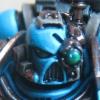
barry_hhh Posted March 5, 2009 Author Share Posted March 5, 2009 , i dont think i have ever painted this fast in my life. . here is another wip probably a captain or commander at this stage , http://i278.photobucket.com/albums/kk108/barry_hhh/IMG_1754.jpg now , what do you all think i should arm him with in his right hand ,i was thinking combimelta.. Link to comment https://bolterandchainsword.com/topic/149206-shadow-guard-diy-chapternew-crusadepic-page-3-cc-please/#findComment-1907679 Share on other sites More sharing options...
Julgolax Posted March 5, 2009 Share Posted March 5, 2009 Id use an ink on that tabard to give it some more depth, other than that, it looks good. I would try to get some highlights on those major edges such as the knee pads, collar, power fist fingers/knuckles, and the feet. Edges look so good with highlights, even better with some chipping if you want. Link to comment https://bolterandchainsword.com/topic/149206-shadow-guard-diy-chapternew-crusadepic-page-3-cc-please/#findComment-1908269 Share on other sites More sharing options...
Recommended Posts
Archived
This topic is now archived and is closed to further replies.