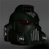
Brother 'Ussell Posted October 12, 2009 Share Posted October 12, 2009 Hello Fellow BnC'ers I'd like to present my little homage to the mighty Bolter and Chainsword "Melta" I've seen it used a few times around here over the years (not on me thankfully) EDIT: I managed to brighten it up a bit I think. Link to comment https://bolterandchainsword.com/topic/181415-artwork-bnc-meltamarine/ Share on other sites More sharing options...
Kurgan the Lurker Posted October 12, 2009 Share Posted October 12, 2009 I like it. However I think the barrel may need to be a bit brighter along the top there -- right now it is somewhat difficult to pick up. A little "too hidden in the shadows" right now I think. Link to comment https://bolterandchainsword.com/topic/181415-artwork-bnc-meltamarine/#findComment-2147673 Share on other sites More sharing options...
Brother 'Ussell Posted October 12, 2009 Author Share Posted October 12, 2009 Yeah your right, uploading it to my album darkened it for some reason, it's not compressed or anything. I'll try to brighten it up a bit, you can't even see the smoke drifting out of the barrel. Link to comment https://bolterandchainsword.com/topic/181415-artwork-bnc-meltamarine/#findComment-2147690 Share on other sites More sharing options...
TheDarkApostle Posted October 12, 2009 Share Posted October 12, 2009 Awesome :P TDA Link to comment https://bolterandchainsword.com/topic/181415-artwork-bnc-meltamarine/#findComment-2147860 Share on other sites More sharing options...
StratoKhan Posted October 12, 2009 Share Posted October 12, 2009 Good idea, I like the image. Your 3D art is interesting, I know next to nothing about it myself but it seems like you're getting some good practice in. I think there's some things that could be improved on of course. I'd look at modifying the MkVI helmet shape slightly, the current shape is not altogether convincing. A tiny bit more detail on the chest Aquila wouldn't hurt either. That said, it has a good feel to it. Was the glossy finish on the red paint intentional? Keep up the good work! Link to comment https://bolterandchainsword.com/topic/181415-artwork-bnc-meltamarine/#findComment-2148022 Share on other sites More sharing options...
Magnus Thane Posted October 12, 2009 Share Posted October 12, 2009 Looks quite nice, it could use a bit more details though. But I like how it turned out. Link to comment https://bolterandchainsword.com/topic/181415-artwork-bnc-meltamarine/#findComment-2148060 Share on other sites More sharing options...
OwenCrute Posted October 13, 2009 Share Posted October 13, 2009 Interesting that Kurgan is first to reply in the 'marine with a meltagun' topic :sweat: Nicely made, but the following nitpicks: As Kurgan said, make the whole barrel visible, maybe lighten the entire thing up and provide a background. Make the eyes brighter (I think it'd look better that way, but YMMV) Soften the rather abrupt line of shadow down the Marine's snout- it's a rounded surface, so the shadow should probably be more gradual. Just my two demicredits. Link to comment https://bolterandchainsword.com/topic/181415-artwork-bnc-meltamarine/#findComment-2149505 Share on other sites More sharing options...
Brother 'Ussell Posted October 13, 2009 Author Share Posted October 13, 2009 Thanks for the comments guys. With this Image I wanted to capture the feeling of him stepping out of the shadows. It made it a bit difficult to light, not technicaly difficult but as far as capturing the feeling I was going for without losing him too much in the shadows. Also the odd darkening effect that keeps happening is'nt helping matters. I did rework him a bit this morning, I brightened the eyes a bit and managed to bring a wee bit more light over the top of the barrel. I can't seem to eliminate the line down the middle of the helmet without adding more light to the scene which I'm trying to avoid. I guess I could photoshop it out but overall I don't think it's too bad, it really is a result of the minimal lighting I'm using. I'm thinking of setting up a place where I can put higher resolution versions of this that people can download then if they like. Link to comment https://bolterandchainsword.com/topic/181415-artwork-bnc-meltamarine/#findComment-2150329 Share on other sites More sharing options...
Tutteman Posted October 13, 2009 Share Posted October 13, 2009 Haha, I like it :) The mods are waiting in the shadows...and they carry big guns :D Link to comment https://bolterandchainsword.com/topic/181415-artwork-bnc-meltamarine/#findComment-2150435 Share on other sites More sharing options...
Brother Nihm Posted October 13, 2009 Share Posted October 13, 2009 I like it, beaky and melta! You just can't go wrong with a beaky and a melta.. Link to comment https://bolterandchainsword.com/topic/181415-artwork-bnc-meltamarine/#findComment-2150598 Share on other sites More sharing options...
madscuzzy Posted October 14, 2009 Share Posted October 14, 2009 Something like this always interesting to see, as it sends a message across. One thing to note is what this message is. Do you want it to be just a pretty beaky marine? Or do you want it to focus on the melta? How do you want to affliate it with BnC? The small shield is a nice touch, although it is fairly generic. BnC's logo has always been more of a diagonal design, so that should at least have that, if not the skulls as well. As for theme, the idea is important. If it doesn't get it's message across effective enough, it fails. Right now the focus is the marine, with the melta secondary... but rather, it should probably the melta first and marine second, as well... marines are a context, with the melta the focus. Perhaps having the melta glow red hot, with that as the source light would make this even stronger. Gives a warm deadly ambience too! Good job anyways! Something along these lines perhaps...? http://www.scuzworks.com/SL40K/ART/test.jpg Link to comment https://bolterandchainsword.com/topic/181415-artwork-bnc-meltamarine/#findComment-2150869 Share on other sites More sharing options...
Brother 'Ussell Posted October 14, 2009 Author Share Posted October 14, 2009 Good idea, I like the image. Your 3D art is interesting, I know next to nothing about it myself but it seems like you're getting some good practice in. I think there's some things that could be improved on of course. I'd look at modifying the MkVI helmet shape slightly, the current shape is not altogether convincing. A tiny bit more detail on the chest Aquila wouldn't hurt either. That said, it has a good feel to it. Was the glossy finish on the red paint intentional? Keep up the good work! I think more detail on the helmet would probably make it feel better for you as far as the shape of it goes, maybe my persistant center line is throwing it off as well. As far as the glossy finish It was on purpose. Something like this always interesting to see, as it sends a message across. One thing to note is what this message is. Do you want it to be just a pretty beaky marine? Or do you want it to focus on the melta? How do you want to affliate it with BnC? The small shield is a nice touch, although it is fairly generic. BnC's logo has always been more of a diagonal design, so that should at least have that, if not the skulls as well. As for theme, the idea is important. If it doesn't get it's message across effective enough, it fails. Right now the focus is the marine, with the melta secondary... but rather, it should probably the melta first and marine second, as well... marines are a context, with the melta the focus. Perhaps having the melta glow red hot, with that as the source light would make this even stronger. Gives a warm deadly ambience too! Good job anyways! The main ways I was trying to associate the marine with the BnC was with colors, I have to admit that the direction of the stripes on the shield were just easier for me to put that way, looking at it now and coupled with your words I think I'll rework it, and maybe give the glowing barrel a shot too. Thanks for the C & C guys! Link to comment https://bolterandchainsword.com/topic/181415-artwork-bnc-meltamarine/#findComment-2150901 Share on other sites More sharing options...
Brother 'Ussell Posted October 19, 2009 Author Share Posted October 19, 2009 I missed your edit with your altered version Madscuzzy, I like it, my glowing effects on the melta are more subdued than yours however. http://i593.photobucket.com/albums/tt17/bro_ussell/melta5b.jpg I did fix the shield though. Link to comment https://bolterandchainsword.com/topic/181415-artwork-bnc-meltamarine/#findComment-2155927 Share on other sites More sharing options...
Sigismund Himself Posted October 20, 2009 Share Posted October 20, 2009 Brilliant work, I think Kurgan may have found a new avatar for himself :) Link to comment https://bolterandchainsword.com/topic/181415-artwork-bnc-meltamarine/#findComment-2156577 Share on other sites More sharing options...
Recommended Posts
Archived
This topic is now archived and is closed to further replies.