commander alexander Posted December 24, 2009 Share Posted December 24, 2009 i think the red is getting too pink, a bunch of glazes to bring it back the realm of reddy reddishness imo. I actually think it looks quite nice, and has given the models armor a nice "sheen: effect. Only thing I can criticize is the models right shoulder looks like it could use some cleaning up on both sides, and the yellow cape. From what I know, yellow is a hard color to paint, and I haven't painted it before, so I cant really elaborate or help. Link to comment https://bolterandchainsword.com/topic/184226-pig-of-spartas-gbe-blood-angels-captain-gaius/page/3/#findComment-2224874 Share on other sites More sharing options...
verpine Posted December 24, 2009 Share Posted December 24, 2009 i think the red is getting too pink, a bunch of glazes to bring it back the realm of reddy reddishness imo. I agree it is a little pinkish. At first i was like, the yellow is overpowering the red, then i was like good, you highlighted. I think it looks nice now, the red really pops, but its quite pinkish around the edges. Blood red wash, maybe? And you're going to put something on the banner, right? Overall i totally love it you have my vote. Link to comment https://bolterandchainsword.com/topic/184226-pig-of-spartas-gbe-blood-angels-captain-gaius/page/3/#findComment-2224876 Share on other sites More sharing options...
Starks333 Posted December 24, 2009 Share Posted December 24, 2009 PLEASE DONT GLAZE OVER THAT RED!!!! Thats the first and biggest mistake people make with red. Red has to go through pink, pink doesnt mean hot flamingo pink, even skin tones are pinks(well some). The problem isnt that the highlights are this or that, its where you place them. the reason your colour appears more pink is because you have bright highlights in places they would not be, specifically the edge highlight on the shoulder pad at the bottom. The way your eye interprets colour is not random, and so placing colours, highlights and so on more correctly, creates a more natural result. This also helps the viewer to understand whats going on, or for you to deliver the right idea. contrast in terms of speed of highlights(how fast you go from main colour to bright) determines texture, the reason you get a more "shimmer" effect if because you go from red to bright bright highlight, very quickly....this isnt bad, this is just something to remember for now, keep going with what you have learned, and finish him...and then you may feel that interest or inspiration to grab another piece and go to work on him its looking MUCH better already in just one thread, i must say it takes a lot of character to put your mind to the task and take up a challenge congrats and keep up the great work Alex Link to comment https://bolterandchainsword.com/topic/184226-pig-of-spartas-gbe-blood-angels-captain-gaius/page/3/#findComment-2224926 Share on other sites More sharing options...
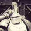
twistinthunder Posted December 24, 2009 Share Posted December 24, 2009 Double post I'm afraid, but I do have some new photos of the latest work. Re-highlighting of everything else will start in earnest after christmas, but in the mean time here's the red now finished (I hope...) http://i347.photobucket.com/albums/p456/pigofsparta/Golden%20Bolter%20Entries/GBSMEnewestredright.jpghttp://i347.photobucket.com/albums/p456/pigofsparta/Golden%20Bolter%20Entries/GBSMEnewestredfront.jpghttp://i347.photobucket.com/albums/p456/pigofsparta/Golden%20Bolter%20Entries/GBSMEnewestredleft.jpghttp://i347.photobucket.com/albums/p456/pigofsparta/Golden%20Bolter%20Entries/GBSMEnewestredback.jpg Happy now Alex :)? Merry Christmas everyone, hope you all have a good one cheers James i thik thats amazing and the way the armour look like its metal (i love NMM it looks great on space marines) is insane. also as starks said DONT glaze over the red! Link to comment https://bolterandchainsword.com/topic/184226-pig-of-spartas-gbe-blood-angels-captain-gaius/page/3/#findComment-2225190 Share on other sites More sharing options...
Melchiah Posted December 24, 2009 Share Posted December 24, 2009 Completely missed this thread... That is amazingly wonderful work, gotta agree, don't glaze the red, it looks awsome!! Red is my favourite colour and couldn't agree with you more about how challenging/fun/taxing/rewarding it is to get right. :D Very envious of your abilities, and agree with Starks, alot of painters (myself included), are a little scared of getting things wrong so don't 'push' their skills, remember: fear is the mind killer!! Fantastic work and an inspiring thread. Merry Xmas. Link to comment https://bolterandchainsword.com/topic/184226-pig-of-spartas-gbe-blood-angels-captain-gaius/page/3/#findComment-2225378 Share on other sites More sharing options...
Iacton Qruze Posted December 24, 2009 Share Posted December 24, 2009 That red looks great. Don't glaze over it. Link to comment https://bolterandchainsword.com/topic/184226-pig-of-spartas-gbe-blood-angels-captain-gaius/page/3/#findComment-2225389 Share on other sites More sharing options...
TheDarker Posted December 24, 2009 Share Posted December 24, 2009 Hell, it´s gonna be hard to win with this minis!!! Great work! (I usually prefer a darker red, but this is also great!) Link to comment https://bolterandchainsword.com/topic/184226-pig-of-spartas-gbe-blood-angels-captain-gaius/page/3/#findComment-2225591 Share on other sites More sharing options...
LunchBox Posted December 25, 2009 Share Posted December 25, 2009 I know the subtitle to Starks was tongue-in-cheek...but anyone wishing to become a better artist should REALLY listen to what he has to say. *trust me Link to comment https://bolterandchainsword.com/topic/184226-pig-of-spartas-gbe-blood-angels-captain-gaius/page/3/#findComment-2226060 Share on other sites More sharing options...
Pig Of Sparta Posted January 1, 2010 Author Share Posted January 1, 2010 HAPPY NEW YEAR EVERYONE! Thanks to everyone who commented following my previous post. Don't worry, I haven't glazed the red and I'm now working on wrapping up this project. @LunchBox: I firmly and whole-heartedly agree with you. Without Alex's (Starks333) advice and gentle prodding, I would never have achieved the work I've done; I'm incredibly grateful and indebted to him. I'm definately going to continue to push myself on and with 'display' mini's. I've uploaded some new photos tonight, they aren't the best quality I'm afraid, but hopefully you'll be able to tell what I've done: http://i347.photobucket.com/albums/p456/pigofsparta/Golden%20Bolter%20Entries/GBSMEiconsright.jpghttp://i347.photobucket.com/albums/p456/pigofsparta/Golden%20Bolter%20Entries/GBSMEiconsfront.jpghttp://i347.photobucket.com/albums/p456/pigofsparta/Golden%20Bolter%20Entries/GBSMEiconsleft1.jpghttp://i347.photobucket.com/albums/p456/pigofsparta/Golden%20Bolter%20Entries/GBSMEiconsleft2.jpghttp://i347.photobucket.com/albums/p456/pigofsparta/Golden%20Bolter%20Entries/GBSMEiconsback.jpg I'm still not finished yet, but I'd appreciate any comments or criticism anyone has :D thanks James Link to comment https://bolterandchainsword.com/topic/184226-pig-of-spartas-gbe-blood-angels-captain-gaius/page/3/#findComment-2232035 Share on other sites More sharing options...
Terminatorinhell Posted January 2, 2010 Share Posted January 2, 2010 *wipes a tear from his eye* It's beautiful! Link to comment https://bolterandchainsword.com/topic/184226-pig-of-spartas-gbe-blood-angels-captain-gaius/page/3/#findComment-2232072 Share on other sites More sharing options...
Starks333 Posted January 2, 2010 Share Posted January 2, 2010 i dont think people would of guessed both(the original and the newest one) were done by the same person, there is such a difference between them the very last thing ill leave you with is skin... for the face try and highlight a bit brighter, and use glazes of colour(depending no the desired skin tone) to bring out the fleshy feel redish cheeks is generic but helpful, as is slightly purpley red around the eyes, and orangey tones on the sides of the forehead just some softer glazes, dont colour heavy or it will look a bit weird :) it will help you gain extra contrast between your colour and highlights without having to go to pure white, which doesnt look the best on skins saturated glazes will help as well(so less dull colours) Alex Link to comment https://bolterandchainsword.com/topic/184226-pig-of-spartas-gbe-blood-angels-captain-gaius/page/3/#findComment-2232081 Share on other sites More sharing options...
Capt. Lysander Posted January 2, 2010 Share Posted January 2, 2010 Happy (late) New Year! That is amazing! Link to comment https://bolterandchainsword.com/topic/184226-pig-of-spartas-gbe-blood-angels-captain-gaius/page/3/#findComment-2232147 Share on other sites More sharing options...
Pig Of Sparta Posted January 7, 2010 Author Share Posted January 7, 2010 Thanks guys. I've tried to glaze the face as you've suggested Alex, I think it's worked ok, subtle but not too subtle... I've put him on a small base just to get an idea of how he'll look, but I don't think it befits the paint job I've given him, so I'm gonna try and come up with something grander. I need to re-highlight the Blood Angels swymbol because it doesn't seem to be standing out enough yet. But other than that I think he's pretty much done now, unless anyone can see anyhthing I've missed. http://i347.photobucket.com/albums/p456/pigofsparta/Golden%20Bolter%20Entries/DSCF7612.jpghttp://i347.photobucket.com/albums/p456/pigofsparta/Golden%20Bolter%20Entries/DSCF7613.jpghttp://i347.photobucket.com/albums/p456/pigofsparta/Golden%20Bolter%20Entries/DSCF7614.jpghttp://i347.photobucket.com/albums/p456/pigofsparta/Golden%20Bolter%20Entries/DSCF7615.jpg I'm sorry if the photos are too large for anyone, but I wanted to see what he looks like in 800x600 :D James Link to comment https://bolterandchainsword.com/topic/184226-pig-of-spartas-gbe-blood-angels-captain-gaius/page/3/#findComment-2237546 Share on other sites More sharing options...
commander alexander Posted January 7, 2010 Share Posted January 7, 2010 Not to say that the model is bad in any way, but for some reason I think the transitions from yellow to brown on the cloak need to be smoother, but thats just a personal opinion. As far as the base.... Maybe he could be on a stone "platform" just slightly above the field of battle :D ? Other than that, he's looking good. :D Link to comment https://bolterandchainsword.com/topic/184226-pig-of-spartas-gbe-blood-angels-captain-gaius/page/3/#findComment-2237549 Share on other sites More sharing options...
GumbaFish Posted January 7, 2010 Share Posted January 7, 2010 What a vast improvement from the initial stages, sometimes it just takes a little outside prodding to get you to push yourself further. I really like all of it, but if I had to nitpick I would agree the back of the cloak is probably still a little weaker than the rest of the mini. I am not sure I could offer any suggestions though as I have never gone about painting yellow in that manner. I hate to nitpick, its a lovely mini really and makes me think I should get off my duff and see if I can't challenge myself like you have for this competition too. Link to comment https://bolterandchainsword.com/topic/184226-pig-of-spartas-gbe-blood-angels-captain-gaius/page/3/#findComment-2237613 Share on other sites More sharing options...
Capt. Lysander Posted January 7, 2010 Share Posted January 7, 2010 That yellow is amazingly crisp. Link to comment https://bolterandchainsword.com/topic/184226-pig-of-spartas-gbe-blood-angels-captain-gaius/page/3/#findComment-2237815 Share on other sites More sharing options...
commander alexander Posted January 7, 2010 Share Posted January 7, 2010 Is there any way you could get clearer, closer, and better lit pictures? Maybe the yellow might look better. :tu: Link to comment https://bolterandchainsword.com/topic/184226-pig-of-spartas-gbe-blood-angels-captain-gaius/page/3/#findComment-2238756 Share on other sites More sharing options...
Neophyte of Slaanesh Posted January 8, 2010 Share Posted January 8, 2010 No criticism, these are gorgeous! Link to comment https://bolterandchainsword.com/topic/184226-pig-of-spartas-gbe-blood-angels-captain-gaius/page/3/#findComment-2238865 Share on other sites More sharing options...
Drudge Dreadnought Posted January 8, 2010 Share Posted January 8, 2010 It is very good. I do not feel the quality of the powersword's effect matches up to the rest of the paint job though. Link to comment https://bolterandchainsword.com/topic/184226-pig-of-spartas-gbe-blood-angels-captain-gaius/page/3/#findComment-2238881 Share on other sites More sharing options...
Badaab Posted January 8, 2010 Share Posted January 8, 2010 My initial reaction is that you've come a long way with this project since the initial images, and you look to be experimenting with new techniques, which is a step forward for sure. However, below I'm going to offer some criticism: -The red came out entirely too pink. While this could be a couple of different issues (photography. white balance on your camera, etc.), red is a tricky color that I dislike a lot because its difficult do to correctly. I would recommend a glaze over the model's armor to tone down the pink effect. -You also picked yellow, which can be tricky. The photo I think is letting you down here, as the cape looks very flat- especially the inside. I'd recommend a simple pattern or even a border to this portion, as right now it's entirely too bright and is detracting from the model when you view it from the front. The head should always be your focal point, and right now, its not. -That green gem... its a nice touch, but you really need to balance it with more green bits on the model. The grenades would be a good second place for this, and then potentially also something on the plasma pistol to get a nice triad effect going on (power coils maybe?) -The armor on the backpack also looks unfinished. If it is going to stay black, you should definitely push the highlights further on it to bring them up to the standard you have on the remainder of the armor. Overall though, you have a very solid model going here. The positioning and bits you've used with the model compliment it nicely, and the base is simple, yet effective. The power sword could have been a sticking point, but the color you have selected keeps it from detracting from the model. Almost makes me wish I had enough time to get something together for this competition. Almost. -Joe Link to comment https://bolterandchainsword.com/topic/184226-pig-of-spartas-gbe-blood-angels-captain-gaius/page/3/#findComment-2238905 Share on other sites More sharing options...
igotsmeakabob!! Posted January 8, 2010 Share Posted January 8, 2010 What model did you use for the main body? Link to comment https://bolterandchainsword.com/topic/184226-pig-of-spartas-gbe-blood-angels-captain-gaius/page/3/#findComment-2238957 Share on other sites More sharing options...
Starks333 Posted January 8, 2010 Share Posted January 8, 2010 -The red came out entirely too pink. While this could be a couple of different issues (photography. white balance on your camera, etc.), red is a tricky color that I dislike a lot because its difficult do to correctly. I would recommend a glaze over the model's armor to tone down the pink effect. all a glaze will do is ruin the contrast...it will not change the colour...the issue isnt the colour of highlight but placement of highlight, which is something that will be learned after more practice on future work :P There are two general varieties of red, the blued red which highlights towards a stronger pink, and a yellowish red which highlights towards a more skintone kind of pink, this includes the orangey ones as well. red MUST go through some form of pink to get brighter, its as simple as that, what shade of pink is simply a result of what shade of red, what lighting and so on -You also picked yellow, which can be tricky. The photo I think is letting you down here, as the cape looks very flat- especially the inside. I'd recommend a simple pattern or even a border to this portion, as right now it's entirely too bright and is detracting from the model when you view it from the front. The head should always be your focal point, and right now, its not. while i do agree overall that it may not of been the best choice of yellow(it could of been less saturated/darker etc) adding a border will add to the bland surface of the cape, but it wont do much to tone it down...the yellow is bright, and a large surface so will be in your face slightly no matter what...its a bold attempt and i think the changes taken have been in the right direction, while the yellow may not of turned out as nice, or as beautiful as it could in the future, its a very good start(my advice is use less bright a yellow, its easier to work with) you dont always need the head to be a focal point but its a very good general rule to things, its the simplest and most straight forward, i agree here for sure :P and just to touch back on the point, a border would help with the plain large surface, and break it up, or freehand in general, it makes a large boring surface a bit more interesting, so if you feel like trying another thing on this piece then go for it...if not then dont feel bad youve made enough strides! -That green gem... its a nice touch, but you really need to balance it with more green bits on the model. The grenades would be a good second place for this, and then potentially also something on the plasma pistol to get a nice triad effect going on (power coils maybe?) i agree heavily with the point, but i disagree on the method somewhat....while the green does seem out of place, its not because theres no other green coloured objects on him its more so because the colour green doesnt seem to exist anywhere else at all...a good way to work colours in is to use similar colours when doing everything....so for example if you had a yellowish green gem, and had more greenish colours apparent on your yellow cape(this wont work as well with a bright yellow cape tho) and also had some green apparent in the reds, whn you look at the piece your eye will see more green even tho you dont have a green cape or green armour or other green details, and it should still satisfy the balance you could paint other objects green, but then you start to deal with things like overall composition, everyone associates green and red as christmassy, or colour balance...using the colours in other ways helps you maintain balance without painting a bunch of other objects the same green colour right now i must say initial colour choice is fantastic, the thing that needs to be worke don is hue and saturation of said colour...so for example, a toned down yellow, more saturation in the skin, a slightly different hue of beige, etc....things like this, its minor tweaking in your knowledge department, and it can be difficult and require a lot of focus -The armor on the backpack also looks unfinished. If it is going to stay black, you should definitely push the highlights further on it to bring them up to the standard you have on the remainder of the armor. good point! make sure to avoid highlighting all edges or else your eye will tell you its dark grey...keep highlights to where they are supposed ot be, where the light is, and you will be fine...also i suggest avoiding blues for the bright highlights....you can use blued highlights for the edges that arent hit by light I do not mean to counter point everything and make it seem incorrect or poor info, there was just many good points brought forth I thought I could further add to! Alex Link to comment https://bolterandchainsword.com/topic/184226-pig-of-spartas-gbe-blood-angels-captain-gaius/page/3/#findComment-2238983 Share on other sites More sharing options...
Death Spectre Posted January 8, 2010 Share Posted January 8, 2010 This has been a really great thread to follow and learn from, and it's inspiring to see someone challenge themselves, Pig Of Sparta. Thinking through your last question from first principles: To make the chapter symbol stand out on the back-banner and shoulder-pad you need contrast between the figure and ground, in either hue or saturation but preferably both. In general, a good rule of thumb is to follow the heraldic rules regarding metals and colours. That is; to never place a metal on a metal or a colour on a colour, where the metals are yellow and white, and the colours are black, red, blue, purple, brown, and green. Obviously the Blood Angel chapter insignia doesn't follow this rule which is why they're usually painted with a different shade of red of brighter intensity, to enhance the contrast. My suggestion would be to outline the black chapter symbol with a bright gold: you could use a metallic paint but given your work on the NMM I'd use a fine line built up of brown, yellow and white. If you keep it fine enough the juxtaposition of black and red won't be lost. Good luck! Link to comment https://bolterandchainsword.com/topic/184226-pig-of-spartas-gbe-blood-angels-captain-gaius/page/3/#findComment-2239022 Share on other sites More sharing options...
commander alexander Posted January 8, 2010 Share Posted January 8, 2010 -The red came out entirely too pink. While this could be a couple of different issues (photography. white balance on your camera, etc.), red is a tricky color that I dislike a lot because its difficult do to correctly. I would recommend a glaze over the model's armor to tone down the pink effect. all a glaze will do is ruin the contrast...it will not change the colour...the issue isnt the colour of highlight but placement of highlight, which is something that will be learned after more practice on future work ;) There are two general varieties of red, the blued red which highlights towards a stronger pink, and a yellowish red which highlights towards a more skintone kind of pink, this includes the orangey ones as well. red MUST go through some form of pink to get brighter, its as simple as that, what shade of pink is simply a result of what shade of red, what lighting and so on -You also picked yellow, which can be tricky. The photo I think is letting you down here, as the cape looks very flat- especially the inside. I'd recommend a simple pattern or even a border to this portion, as right now it's entirely too bright and is detracting from the model when you view it from the front. The head should always be your focal point, and right now, its not. while i do agree overall that it may not of been the best choice of yellow(it could of been less saturated/darker etc) adding a border will add to the bland surface of the cape, but it wont do much to tone it down...the yellow is bright, and a large surface so will be in your face slightly no matter what...its a bold attempt and i think the changes taken have been in the right direction, while the yellow may not of turned out as nice, or as beautiful as it could in the future, its a very good start(my advice is use less bright a yellow, its easier to work with) you dont always need the head to be a focal point but its a very good general rule to things, its the simplest and most straight forward, i agree here for sure :) and just to touch back on the point, a border would help with the plain large surface, and break it up, or freehand in general, it makes a large boring surface a bit more interesting, so if you feel like trying another thing on this piece then go for it...if not then dont feel bad youve made enough strides! -That green gem... its a nice touch, but you really need to balance it with more green bits on the model. The grenades would be a good second place for this, and then potentially also something on the plasma pistol to get a nice triad effect going on (power coils maybe?) i agree heavily with the point, but i disagree on the method somewhat....while the green does seem out of place, its not because theres no other green coloured objects on him its more so because the colour green doesnt seem to exist anywhere else at all...a good way to work colours in is to use similar colours when doing everything....so for example if you had a yellowish green gem, and had more greenish colours apparent on your yellow cape(this wont work as well with a bright yellow cape tho) and also had some green apparent in the reds, whn you look at the piece your eye will see more green even tho you dont have a green cape or green armour or other green details, and it should still satisfy the balance you could paint other objects green, but then you start to deal with things like overall composition, everyone associates green and red as christmassy, or colour balance...using the colours in other ways helps you maintain balance without painting a bunch of other objects the same green colour right now i must say initial colour choice is fantastic, the thing that needs to be worke don is hue and saturation of said colour...so for example, a toned down yellow, more saturation in the skin, a slightly different hue of beige, etc....things like this, its minor tweaking in your knowledge department, and it can be difficult and require a lot of focus -The armor on the backpack also looks unfinished. If it is going to stay black, you should definitely push the highlights further on it to bring them up to the standard you have on the remainder of the armor. good point! make sure to avoid highlighting all edges or else your eye will tell you its dark grey...keep highlights to where they are supposed ot be, where the light is, and you will be fine...also i suggest avoiding blues for the bright highlights....you can use blued highlights for the edges that arent hit by light I do not mean to counter point everything and make it seem incorrect or poor info, there was just many good points brought forth I thought I could further add to! Alex How about making the gem a more bluish-green, and tying into it with another cool color (blues, or purples) on the cape, which would contrast nicely in my opinion with the colors present? <_< Link to comment https://bolterandchainsword.com/topic/184226-pig-of-spartas-gbe-blood-angels-captain-gaius/page/3/#findComment-2239078 Share on other sites More sharing options...
Pig Of Sparta Posted January 8, 2010 Author Share Posted January 8, 2010 Thanks to everyone who replied. I just wrote out a huge reply and my browser stopped responding and I lost it all, so I'm going to summarise it I'm afraid. You've definately given me a lot to think about. I might try a free-hand design on the front edge of his cloak and I will sort out the black armour on his backpack. I could change the green gemstone on his chest to blue, it might fit better with the over-all colour scheme. I've taken some (much?) better photos of him tonight (with the exception of the right view, that angle just doesn't seem to want to look right :) ): http://i347.photobucket.com/albums/p456/pigofsparta/Golden%20Bolter%20Entries/CaptainGaiusfront.jpghttp://i347.photobucket.com/albums/p456/pigofsparta/Golden%20Bolter%20Entries/CaptainGaiusleft2.jpghttp://i347.photobucket.com/albums/p456/pigofsparta/Golden%20Bolter%20Entries/CaptainGaiusleft.jpghttp://i347.photobucket.com/albums/p456/pigofsparta/Golden%20Bolter%20Entries/CaptainGaiusback.jpghttp://i347.photobucket.com/albums/p456/pigofsparta/Golden%20Bolter%20Entries/CaptainGaiusright-1.jpg I really wish I'd read the post about using NMM to border the Blood Angels symbol, as I think my clumsy highlighting is ruining it just now. I'm getting a little afraid to work on him again because if I make a mistake on the cloak, red armour or banner, I've no real way of correcting it now. I hope you can understand my fear. I think I might make one more pass on this mini and then leave him alone. James Link to comment https://bolterandchainsword.com/topic/184226-pig-of-spartas-gbe-blood-angels-captain-gaius/page/3/#findComment-2240226 Share on other sites More sharing options...
Recommended Posts
Archived
This topic is now archived and is closed to further replies.