Starks333 Posted January 9, 2010 Share Posted January 9, 2010 yup, just finish him and be done, move on to a new one...over working or trying to improve too much usually ends in mistakes and dissapointment! Alex Link to comment https://bolterandchainsword.com/topic/184226-pig-of-spartas-gbe-blood-angels-captain-gaius/page/4/#findComment-2240300 Share on other sites More sharing options...
smallvictory Posted January 9, 2010 Share Posted January 9, 2010 Call it done my brother, you have set a new standard for yourself, congradulations on a fine mini. Now just make sure you post the next one as well, I don't want to miss out. Link to comment https://bolterandchainsword.com/topic/184226-pig-of-spartas-gbe-blood-angels-captain-gaius/page/4/#findComment-2240309 Share on other sites More sharing options...
Badaab Posted January 9, 2010 Share Posted January 9, 2010 -The red came out entirely too pink. While this could be a couple of different issues (photography. white balance on your camera, etc.), red is a tricky color that I dislike a lot because its difficult do to correctly. I would recommend a glaze over the model's armor to tone down the pink effect. all a glaze will do is ruin the contrast...it will not change the colour...the issue isnt the colour of highlight but placement of highlight, which is something that will be learned after more practice on future work ;) There are two general varieties of red, the blued red which highlights towards a stronger pink, and a yellowish red which highlights towards a more skintone kind of pink, this includes the orangey ones as well. red MUST go through some form of pink to get brighter, its as simple as that, what shade of pink is simply a result of what shade of red, what lighting and so on -You also picked yellow, which can be tricky. The photo I think is letting you down here, as the cape looks very flat- especially the inside. I'd recommend a simple pattern or even a border to this portion, as right now it's entirely too bright and is detracting from the model when you view it from the front. The head should always be your focal point, and right now, its not. while i do agree overall that it may not of been the best choice of yellow(it could of been less saturated/darker etc) adding a border will add to the bland surface of the cape, but it wont do much to tone it down...the yellow is bright, and a large surface so will be in your face slightly no matter what...its a bold attempt and i think the changes taken have been in the right direction, while the yellow may not of turned out as nice, or as beautiful as it could in the future, its a very good start(my advice is use less bright a yellow, its easier to work with) you dont always need the head to be a focal point but its a very good general rule to things, its the simplest and most straight forward, i agree here for sure :) and just to touch back on the point, a border would help with the plain large surface, and break it up, or freehand in general, it makes a large boring surface a bit more interesting, so if you feel like trying another thing on this piece then go for it...if not then dont feel bad youve made enough strides! -That green gem... its a nice touch, but you really need to balance it with more green bits on the model. The grenades would be a good second place for this, and then potentially also something on the plasma pistol to get a nice triad effect going on (power coils maybe?) i agree heavily with the point, but i disagree on the method somewhat....while the green does seem out of place, its not because theres no other green coloured objects on him its more so because the colour green doesnt seem to exist anywhere else at all...a good way to work colours in is to use similar colours when doing everything....so for example if you had a yellowish green gem, and had more greenish colours apparent on your yellow cape(this wont work as well with a bright yellow cape tho) and also had some green apparent in the reds, whn you look at the piece your eye will see more green even tho you dont have a green cape or green armour or other green details, and it should still satisfy the balance you could paint other objects green, but then you start to deal with things like overall composition, everyone associates green and red as christmassy, or colour balance...using the colours in other ways helps you maintain balance without painting a bunch of other objects the same green colour right now i must say initial colour choice is fantastic, the thing that needs to be worke don is hue and saturation of said colour...so for example, a toned down yellow, more saturation in the skin, a slightly different hue of beige, etc....things like this, its minor tweaking in your knowledge department, and it can be difficult and require a lot of focus -The armor on the backpack also looks unfinished. If it is going to stay black, you should definitely push the highlights further on it to bring them up to the standard you have on the remainder of the armor. good point! make sure to avoid highlighting all edges or else your eye will tell you its dark grey...keep highlights to where they are supposed ot be, where the light is, and you will be fine...also i suggest avoiding blues for the bright highlights....you can use blued highlights for the edges that arent hit by light I do not mean to counter point everything and make it seem incorrect or poor info, there was just many good points brought forth I thought I could further add to! Alex Interesting choice of comments there at the end, Alex... considering how they're framed. I understand that your approach to the craft is entirely different than how I work. Anyhoo, the newer photos do a much better job of showing the actual color of the model. The armor is still entirely too pink for my liking, and the placement of the highlighting on the shoulder pads I think contributes to this. For the next model, I'd consider keeping the highlighting sharper, especially on a model with so much sculpted on detail, as its looking a bit too busy. The sculpt on the face I think is also letting you down a little, especially with the creases in the face beside the mouth- the shading there is much to drastic to the remainder of the flesh tone you have going on. Maybe jump one step lighter for the creases in the coloring for these shadows since they're such deep, prominent lines? Or you could even add a little stubble to the beard area to offset a bit. Another thing I seem to be picking up from your photos... how much of the 'sharpen' filter are you using on the models in your editing software? I think you may be going overboard with either that or the macro function on the camera. If you want sharper, brighter images (especially minis), I recommend overexposing the shots by a few aperture stops on the camera (F stops), and then auto-levelling after that in the software. You shouldn't ever need more than maybe one (or two at the most for larger images) application of the sharpen filter. Just be careful, as things can occasionally get too pixellated, and detail can be lost in the photo. I don't mean to keep harping on this, but I see a lot of improvement in your work as of late, so congrats! -Joe Link to comment https://bolterandchainsword.com/topic/184226-pig-of-spartas-gbe-blood-angels-captain-gaius/page/4/#findComment-2240321 Share on other sites More sharing options...
commander alexander Posted January 9, 2010 Share Posted January 9, 2010 Well you have certainly painted a beautiful model, and have managed to push yourself, and make more progress in your painting skills than most of us. Like starks said, maybe try what you have learned, and some of the suggestions people have given you on the next one. Just a quick personal opinion, if you were to do another Blood Angel with a cloak (which by all means I hope you do) I think a black, or dark grey cloak, with a blue pattern around the edge, and maybe even something like a subtle Aquila in the middle would look great. And I sincerely hope you do well in the competition ;) . Oh, but wait ;)! What about the base? :) Link to comment https://bolterandchainsword.com/topic/184226-pig-of-spartas-gbe-blood-angels-captain-gaius/page/4/#findComment-2240341 Share on other sites More sharing options...
Capt. Lysander Posted January 11, 2010 Share Posted January 11, 2010 Magnificent. The finished product's colouring is precise, sharp and clear. For now, I would suggest you start another mini ;) Link to comment https://bolterandchainsword.com/topic/184226-pig-of-spartas-gbe-blood-angels-captain-gaius/page/4/#findComment-2242967 Share on other sites More sharing options...
ThirtySixNights Posted January 11, 2010 Share Posted January 11, 2010 Thats a great red you've done there, its not too plain and not too busy.. just right. my only criticism would be the cape, the highlights you've done look less like shading and more like dirt, of course it looks fantastic like that and will it makes perfect sense how this could happen just wanted to let you know ;) it looks fantastic, and good luck with the contest. Link to comment https://bolterandchainsword.com/topic/184226-pig-of-spartas-gbe-blood-angels-captain-gaius/page/4/#findComment-2242972 Share on other sites More sharing options...
Pig Of Sparta Posted January 18, 2010 Author Share Posted January 18, 2010 @ everyone: Thank you for your understanding responses Brothers. I'm currently working on a new more scenic base for the mini, then I'm gonna tackle the highlights on the back pack. Once these are done I will put up some final pictures. Rest assured I have learned a lot from painting this mini, and whatever happens in the competition, I've got a new, higher standard of painting to aspire to on every display model* I paint, which in my opinion is it's own reward, winning anything in this competition would just be a bonus. James *mini's I want to sit on my small, child proof shelf for people to see. My new Wolves army will be painted using the same quick and dirty method I used for the test mini :) Link to comment https://bolterandchainsword.com/topic/184226-pig-of-spartas-gbe-blood-angels-captain-gaius/page/4/#findComment-2252124 Share on other sites More sharing options...
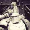
Pig Of Sparta Posted January 19, 2010 Author Share Posted January 19, 2010 Double post I'm afraid, but I need a little help with something. With the deadline for this comp fast approaching, I've been trying take some clearer, better photos and I'd like to know which of these two examples looks better. http://i347.photobucket.com/albums/p456/pigofsparta/Golden%20Bolter%20Entries/GBEBasefront1.jpghttp://i347.photobucket.com/albums/p456/pigofsparta/Golden%20Bolter%20Entries/GBEBasefront2.jpg One's with the flash on my camera turned on, the other is with it turned off, both have the macro function enabled, and are taken with the 'auto' setting on the camera. I'm sure you can probably guess which is which. The problem is I've always steered clear of using the flash because I know it can flasely light the colours of things, which in my opinion is bad. But having read through a couple of 'taking better photos' tutorials it seems that if the light is poor where you're taking photos you should use it. (this my seem blindingly obvious, but taking into account the above I hope some of my ignorance/stupidity can be mitigated :)) So after waffling for far to long, I'd like to return to my original question, which looks better, the top one or the bottom one? I really appreciate the assistance, James Link to comment https://bolterandchainsword.com/topic/184226-pig-of-spartas-gbe-blood-angels-captain-gaius/page/4/#findComment-2253338 Share on other sites More sharing options...
TheDarker Posted January 19, 2010 Share Posted January 19, 2010 Ok, that´s a marvellous piece (and a serious rival too ;)) About the photo... take the one who better fits the real mini. I mean, the first one is the better for me, but maybe the mini is more similar to the second one... only you can tell ;)). But my opinion? first. It gives the mini a metallical-good looking feeling ;) Link to comment https://bolterandchainsword.com/topic/184226-pig-of-spartas-gbe-blood-angels-captain-gaius/page/4/#findComment-2253367 Share on other sites More sharing options...
GumbaFish Posted January 19, 2010 Share Posted January 19, 2010 Bottom looks better, no matter what the situation I don't think I could recommend using a flash for miniature photography. Link to comment https://bolterandchainsword.com/topic/184226-pig-of-spartas-gbe-blood-angels-captain-gaius/page/4/#findComment-2253369 Share on other sites More sharing options...
sgtNACHO Posted January 19, 2010 Share Posted January 19, 2010 Love this guy PoS! I prefer the first one, it gives the mini actually a less pink appearance, because that red is pushing past the pink. the second one looks too salmon for my liking. The flash I think adds, not detracts this particular instance. Good job Pig of Sparta! Link to comment https://bolterandchainsword.com/topic/184226-pig-of-spartas-gbe-blood-angels-captain-gaius/page/4/#findComment-2253378 Share on other sites More sharing options...
Starks333 Posted January 19, 2010 Share Posted January 19, 2010 the second pic has more natural colours, but is out of focus...the first one is too intense Link to comment https://bolterandchainsword.com/topic/184226-pig-of-spartas-gbe-blood-angels-captain-gaius/page/4/#findComment-2253383 Share on other sites More sharing options...
Jokersminis Posted January 19, 2010 Share Posted January 19, 2010 #2 Nice model, BTW... :P Link to comment https://bolterandchainsword.com/topic/184226-pig-of-spartas-gbe-blood-angels-captain-gaius/page/4/#findComment-2253419 Share on other sites More sharing options...
twistinthunder Posted January 19, 2010 Share Posted January 19, 2010 @Pig of Sparta: it depends really what your going for, if your going for a grim dark picture set then number 2 it also looks a bit mor natural, if your going to a 'pop' set of picture the number 1. either way it's a great model! :P Link to comment https://bolterandchainsword.com/topic/184226-pig-of-spartas-gbe-blood-angels-captain-gaius/page/4/#findComment-2253439 Share on other sites More sharing options...
Captain Mike Posted January 19, 2010 Share Posted January 19, 2010 Absolutely great, but the black is a bit of a let down, TBH. It jsut doesn't 'wow' like the rest of the model, And pic 2 Link to comment https://bolterandchainsword.com/topic/184226-pig-of-spartas-gbe-blood-angels-captain-gaius/page/4/#findComment-2253552 Share on other sites More sharing options...
Capt. Lysander Posted January 21, 2010 Share Posted January 21, 2010 Very nice miniature. The red stands out more in the 1st photo, but loses the mellowness of the yellow in the 2nd photo. Link to comment https://bolterandchainsword.com/topic/184226-pig-of-spartas-gbe-blood-angels-captain-gaius/page/4/#findComment-2256018 Share on other sites More sharing options...
commander alexander Posted January 21, 2010 Share Posted January 21, 2010 If you can, try to take the picture outside while its overcast. Link to comment https://bolterandchainsword.com/topic/184226-pig-of-spartas-gbe-blood-angels-captain-gaius/page/4/#findComment-2256715 Share on other sites More sharing options...
Pig Of Sparta Posted January 23, 2010 Author Share Posted January 23, 2010 Thanks for the responses guys. I'm sorry I've been so lax in my replying. @ commander alexander: at this time of year in my place in the world overcast is a given, trouble is it's either raining, snowing or blowing a gale just now :P. @ Capt. Lysander, twistinthunder, Joker, sgtNACHO and TheDarker: I'm gonna go for the second style of photo, because having thought about it, it looks more natural and is closer to the actual look of the mini in real life. The enhanced metallic look of the top photo looks cool in my opinion as well, but it's not how the mini looks on my shelf ;). @ GumbaFish: I thought it kinda strange as well, but figured it was worth a go just to see whether it'd make a difference, I'm going to go with natural light though. @ starks333: thanks for pointing that out. I thought something looked off about the photo. I think it's out of focus cause of the base, I'm gonna have another go at taking photos next week once I've finished working on the backpack and soft armour areas, I'm redoing the highlights to try and bring them up to the same standard as the rest of the mini. @ Captain Mike: As I said above, I'm spending a little more time on the soft armour and backpack to bring them up a little more. I've only really highlighted black once before so it's a still new to me. My next 'showcase' mini will hopefully give me some more practice at it :P once again, thanks for all your responses and opinions, they are highly valued and always appreciated, James Link to comment https://bolterandchainsword.com/topic/184226-pig-of-spartas-gbe-blood-angels-captain-gaius/page/4/#findComment-2258852 Share on other sites More sharing options...
Hubernator Posted January 23, 2010 Share Posted January 23, 2010 Oh Christ now I know I haven't won -_- Here's hoping then that you win :) It is truly epic, well done him. Link to comment https://bolterandchainsword.com/topic/184226-pig-of-spartas-gbe-blood-angels-captain-gaius/page/4/#findComment-2258888 Share on other sites More sharing options...
Pig Of Sparta Posted January 24, 2010 Author Share Posted January 24, 2010 You never know Hubernator, folks might not like the Captain at all. These are the last set of pics I'm gonna put up I think. I'm going to declare him finished and send them off on friday of next week so if I've missed anything, or something doesn't look right, I'd be grateful if you could point it out to me :D http://i347.photobucket.com/albums/p456/pigofsparta/Golden%20Bolter%20Entries/GBEFinalFront.jpg http://i347.photobucket.com/albums/p456/pigofsparta/Golden%20Bolter%20Entries/GBEFinalLeft.jpg http://i347.photobucket.com/albums/p456/pigofsparta/Golden%20Bolter%20Entries/GBEFinalRight.jpg http://i347.photobucket.com/albums/p456/pigofsparta/Golden%20Bolter%20Entries/GBEFinalBack.jpg thanks, James Link to comment https://bolterandchainsword.com/topic/184226-pig-of-spartas-gbe-blood-angels-captain-gaius/page/4/#findComment-2259446 Share on other sites More sharing options...
GumbaFish Posted January 24, 2010 Share Posted January 24, 2010 Looking good, it is a shame they limit you to 4 photos as it doesn't really allow you to get the freehand symbol you did on his shoulder. Link to comment https://bolterandchainsword.com/topic/184226-pig-of-spartas-gbe-blood-angels-captain-gaius/page/4/#findComment-2259501 Share on other sites More sharing options...
ikik Posted January 24, 2010 Share Posted January 24, 2010 that my friend, is a masterpiece, from the red on the armour to the "I'm gonna kill you!" expresion on is face, everything is nearing perfection great work ;) Link to comment https://bolterandchainsword.com/topic/184226-pig-of-spartas-gbe-blood-angels-captain-gaius/page/4/#findComment-2259762 Share on other sites More sharing options...
Rob_Loken Posted January 24, 2010 Share Posted January 24, 2010 That face is incredible. Like ikik said it looks like he's saying "I'm gonna kill you". The whole piece looks awesome mind. Good luck in the comp. Link to comment https://bolterandchainsword.com/topic/184226-pig-of-spartas-gbe-blood-angels-captain-gaius/page/4/#findComment-2259808 Share on other sites More sharing options...
Captain Mike Posted January 24, 2010 Share Posted January 24, 2010 The black is definately improved, and now you have one perfic model! Any flaws to be found are obviosly hidden under the epic base. Link to comment https://bolterandchainsword.com/topic/184226-pig-of-spartas-gbe-blood-angels-captain-gaius/page/4/#findComment-2259857 Share on other sites More sharing options...
Pig Of Sparta Posted January 26, 2010 Author Share Posted January 26, 2010 Thanks for your comments guys, @ captain mike: really? I wasn't sure about the base, it was more of a desperate 'throw sand and fine slate at this and hope it works like I want it to' attempt. @ ikik: exactly how I wanted him to look. He is a loyal son of sanguinius after all :D @ Brother Duncs: from you brother, that is praise indeed, thankyou :). I still think I've got a lot of room for improvement with faces, but I feel happier and more comfortable painting them now which makes it easier to take the necessary time on them. @ gumbafish: I know what you mean, although that might not be a bad thing, the freehand on the shoulder looks a little funny cause I highlighted it slightly wrong, so it's kinda good that it's hidden at the same time :rolleyes: James Link to comment https://bolterandchainsword.com/topic/184226-pig-of-spartas-gbe-blood-angels-captain-gaius/page/4/#findComment-2261620 Share on other sites More sharing options...
Recommended Posts
Archived
This topic is now archived and is closed to further replies.