sKP Posted January 4, 2010 Share Posted January 4, 2010 Well where to begin? I'm relatively new to this forums.. been viewing peoples work and well like many new people... have decided to post my WIP's.. Abit about me... im 22, from the UK, and been doing graphics for around 3/4 years.. Abit about this project.. after watching alot of Speed painting videos on youtube.. ive decided to give it ago myself.. not exactly speed painting just... photoshop painting in general... this is my first ever attempt at it, i corrently use a mouse to do my painting :D but i am looking to get a graphics tablet within the next month or so!! :cuss like i said this is my first ever attempt so please C&C is welcome! http://img245.imageshack.us/img245/502/spacemarinea.jpg Link to comment https://bolterandchainsword.com/topic/188781-skps-artwork-wips-updated-09012010/ Share on other sites More sharing options...
jester_prince Posted January 4, 2010 Share Posted January 4, 2010 Reminds me of some of the old 3rd edition rulebook art. Its kinda groovy and stylistic. I got myself a tablet a few years back, it takes some getting used to, but it is certainly worth it. Im saveing up for a moniter i can draw straight onto. Link to comment https://bolterandchainsword.com/topic/188781-skps-artwork-wips-updated-09012010/#findComment-2233831 Share on other sites More sharing options...
Chaptermaster Graymantle Posted January 4, 2010 Share Posted January 4, 2010 Its a very good start and could well be a standalone image. There is little to say as far as feedback goes though, except keep working on it and if you need advice on specifics then ask and I'm sure people here will give you some good advice and feedback. Oh and get a Wacom tablet! You will not be disappointed! Keep it up! :lol: Link to comment https://bolterandchainsword.com/topic/188781-skps-artwork-wips-updated-09012010/#findComment-2233851 Share on other sites More sharing options...
Capt. Lysander Posted January 4, 2010 Share Posted January 4, 2010 Nice work on the faceshield. The crack is nicely put. Link to comment https://bolterandchainsword.com/topic/188781-skps-artwork-wips-updated-09012010/#findComment-2234131 Share on other sites More sharing options...
sKP Posted January 5, 2010 Author Share Posted January 5, 2010 Thanks for the comments guys, i will definitely keep practicing! cheers for all the praises and i will definitely be getting a wacom at some point :) More to come sKP Link to comment https://bolterandchainsword.com/topic/188781-skps-artwork-wips-updated-09012010/#findComment-2235287 Share on other sites More sharing options...
sKP Posted January 5, 2010 Author Share Posted January 5, 2010 Sorry mistake. Link to comment https://bolterandchainsword.com/topic/188781-skps-artwork-wips-updated-09012010/#findComment-2235375 Share on other sites More sharing options...
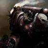
sKP Posted January 5, 2010 Author Share Posted January 5, 2010 Sorry about triple post, http://img121.imageshack.us/img121/1355/spacemarine.jpg Updated, almost finished, would you recommend anything else to be added? Also what would you guys recommend i paint next? examble: bolter/pistol/ shoulder pad etc... just so i can get a "feel" to painting them. C&C Welcome. More to come sKP Link to comment https://bolterandchainsword.com/topic/188781-skps-artwork-wips-updated-09012010/#findComment-2235694 Share on other sites More sharing options...
Viva La Jade Posted January 5, 2010 Share Posted January 5, 2010 Oooh I like ur art work :) i love the green glow and the glare on the eyes Link to comment https://bolterandchainsword.com/topic/188781-skps-artwork-wips-updated-09012010/#findComment-2235696 Share on other sites More sharing options...
sKP Posted January 6, 2010 Author Share Posted January 6, 2010 Thanks mate more to come shortly.. im running out of ideas tho.... any ideas anyone? :) Link to comment https://bolterandchainsword.com/topic/188781-skps-artwork-wips-updated-09012010/#findComment-2236481 Share on other sites More sharing options...
Capt. Lysander Posted January 6, 2010 Share Posted January 6, 2010 Yes, those eyes are quite well lit. Ideas? Maybe a rough sketch of a marine? <_< Link to comment https://bolterandchainsword.com/topic/188781-skps-artwork-wips-updated-09012010/#findComment-2236500 Share on other sites More sharing options...
sword brethren Posted January 6, 2010 Share Posted January 6, 2010 the glow looks fantastic, really eerie yet tough :) Link to comment https://bolterandchainsword.com/topic/188781-skps-artwork-wips-updated-09012010/#findComment-2236632 Share on other sites More sharing options...
Starks333 Posted January 6, 2010 Share Posted January 6, 2010 the problem i see is that you havent made the shapes feel like 3D shapes, they all look flat this is mostly due to the straight on view, as well as the incorrect lighting...you have the head highlighted implying light from in front and below, and yet the face is in darkness this is by no means a bad attempt, i just thought id point some things out for you :mellow: so perspective and lighting..those are the most important things to cover, dont even worry about colour, thats a whole new ballpark hahaha Alex Link to comment https://bolterandchainsword.com/topic/188781-skps-artwork-wips-updated-09012010/#findComment-2236758 Share on other sites More sharing options...
sKP Posted January 6, 2010 Author Share Posted January 6, 2010 Cheers for the comments people ;) @Sharks333 How would you recommend making them more 3D, which i want to learn.. also do you have references? More to come sKP Link to comment https://bolterandchainsword.com/topic/188781-skps-artwork-wips-updated-09012010/#findComment-2236964 Share on other sites More sharing options...
Starks333 Posted January 6, 2010 Share Posted January 6, 2010 well theres a couple things from a drawing standpoint you need to have more overlapping shapes, this creates the sense of depth, thats why the eyes have a bit...to do this it will need to be on a slight angle so that everything isnt straight on, which will emphasize flatness...angles also requires a bit of perspective work but you can use a model to help with that at the start as for lighting, this is the major thing that determines shape, the more even the light the more flat the object is...also the direction of any lines of highlight or shading etc, will also emphasize the shape, for example the highlight under the eye...it implies an angle to the face mask that gets further outwards from the eye the more downwards it goes and this confuses what happens exactly a syou get closer to the "nose" portion alot of your edges are far too crisp, this emphasizes any errors in your shapes, so unsmooth/straight lines and so on, you wanna have them a tiny bit blurred...its hard to explain but instead of a flat ______ you wanna hae that same line, but with some cross hatching it to cancel out the sharpness, but maintain the edge for things like learning about lighting, you are gonna have to do a lot of research of actual living physical objects and how they interact with light(same thing for colour) there is no book that will ever do a better job explaining to you how something looks than teaching yourself to look at things in front of you....books can be helpful to unlock the ability to see things however...as such i recommend anything by burne hogarth and if i could remember the title of this drawing anatomy book id recommend it too but i forget the name!! Alex Link to comment https://bolterandchainsword.com/topic/188781-skps-artwork-wips-updated-09012010/#findComment-2237002 Share on other sites More sharing options...
Colrouphobic Posted January 7, 2010 Share Posted January 7, 2010 Sorry about triple post, http://img121.imageshack.us/img121/1355/spacemarine.jpg Updated, almost finished, would you recommend anything else to be added? Also what would you guys recommend i paint next? examble: bolter/pistol/ shoulder pad etc... just so i can get a "feel" to painting them. C&C Welcome. More to come sKP Yes, those eyes are quite well lit. Ideas? Maybe a rough sketch of a marine? :) the glow looks fantastic, really eerie yet tough :) It's a promising start. But the light is not good at all. If you would make the image black&white then the glow vanish or look darker then the surroundings. For it to glow you need it to be brighter then how it is now. Keep up the work though, you will get there :) Link to comment https://bolterandchainsword.com/topic/188781-skps-artwork-wips-updated-09012010/#findComment-2237654 Share on other sites More sharing options...
blackblade68 Posted January 7, 2010 Share Posted January 7, 2010 I didn't read through all of the posts...But you can't really see the "grill" or rebreather mask. Link to comment https://bolterandchainsword.com/topic/188781-skps-artwork-wips-updated-09012010/#findComment-2237663 Share on other sites More sharing options...
sKP Posted January 9, 2010 Author Share Posted January 9, 2010 Ok still very WIP What do you guys think? CnC most welcome as always! im trying to stick to lighting as much as i can... the lighting will be coming from the top. http://img704.imageshack.us/img704/180/mariney.jpg More to come. sKP Link to comment https://bolterandchainsword.com/topic/188781-skps-artwork-wips-updated-09012010/#findComment-2240699 Share on other sites More sharing options...
Capt. Lysander Posted January 11, 2010 Share Posted January 11, 2010 Nice work so far, but perhaps a bit more hard brush strokes? It's a bit hard to make out certain parts. Also, try not to stick with static poses. Link to comment https://bolterandchainsword.com/topic/188781-skps-artwork-wips-updated-09012010/#findComment-2242973 Share on other sites More sharing options...
ThirtySixNights Posted January 11, 2010 Share Posted January 11, 2010 the marines body is looking very rounded, the Armour is rounded although not to that extent. i also suggest you separate the chestplate and torso like so: http://lh4.ggpht.com/_w52z2ezBXbQ/Sbowtc24NaI/AAAAAAAAAT0/vqsvK_BdH28/DSCN0669.JPG Remember to make the pose very dynamic and if its possible try to mimic the running style assault marine legs. keep checking with pictures of the models to make sure everything is scaled right and you're not missing any important detail.. Good Luck. Link to comment https://bolterandchainsword.com/topic/188781-skps-artwork-wips-updated-09012010/#findComment-2242983 Share on other sites More sharing options...
Recommended Posts
Archived
This topic is now archived and is closed to further replies.