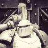
Pig Of Sparta Posted March 13, 2010 Share Posted March 13, 2010 Salutations Brothers! It feels so good to be back after my week's sojurn without the internet :D. So to celebrate my return, I thought I might share some photos of a little something I've been working on over the last couple of weeks or so... http://i347.photobucket.com/albums/p456/pigofsparta/Blood%20Angels/TopQualityfront.jpghttp://i347.photobucket.com/albums/p456/pigofsparta/Blood%20Angels/TopQualityback.jpg http://i347.photobucket.com/albums/p456/pigofsparta/Blood%20Angels/TopQualityleft.jpghttp://i347.photobucket.com/albums/p456/pigofsparta/Blood%20Angels/TopQualityright.jpg obviously there's still a few bits and pieces still to be finished off, but he's getting there. As usual, any and all comments are welcome. thanks James Link to comment https://bolterandchainsword.com/topic/194756-my-redemption-khorne-terminator-wip/ Share on other sites More sharing options...
Hellios Posted March 13, 2010 Share Posted March 13, 2010 Looking really nice so far (not a surprise your stuff normally is) although pretty hARMLESS if I do say so myself. I'm sorry I'll go sit in the corner... Link to comment https://bolterandchainsword.com/topic/194756-my-redemption-khorne-terminator-wip/#findComment-2317299 Share on other sites More sharing options...
Pig Of Sparta Posted March 13, 2010 Author Share Posted March 13, 2010 Thanks Hellios, ...although pretty hARMLESS if I do say so myself. I'm sorry I'll go sit in the corner... there's no need, that put a really big smile on my face. I should explain though, I have no vanilla marine arms kicking about just now, only Space Wolves ones, so doint this 'bust' was the easiest thing I could think of. I've even put together a base that reflects his 'not actually a real space marine' status :P James Link to comment https://bolterandchainsword.com/topic/194756-my-redemption-khorne-terminator-wip/#findComment-2317311 Share on other sites More sharing options...
Lord Commander Vulkus Dorn Posted March 14, 2010 Share Posted March 14, 2010 I like your orange-ish scheme, it reminds me of 2nd ed era BAs Link to comment https://bolterandchainsword.com/topic/194756-my-redemption-khorne-terminator-wip/#findComment-2317409 Share on other sites More sharing options...
Shortsonfire79 Posted March 14, 2010 Share Posted March 14, 2010 Wow! Cool bust! (whered the Sons of Orar go?) At first, I was like "dammnn this guy has some great shading!" then I realized it was Mr. Sparta, and I was like "oh...its just his normal quality of work. :D" Great stuff Sparta! -Shorts Link to comment https://bolterandchainsword.com/topic/194756-my-redemption-khorne-terminator-wip/#findComment-2317557 Share on other sites More sharing options...
Pig Of Sparta Posted March 14, 2010 Author Share Posted March 14, 2010 @ Shortsonfire79: Thanks mate. Don't worry the Sons still exist, along with 1500 points of Wolves I'm about halfway through painting as well. It's nice to paint something else sometimes though don't ya think? I also like single mini projects because I can lavish attention on them in a way that just wouldn't work when painting a whole army :cuss. As and when I get around to completeing units for either army I'll put pics in the respective threads in the Hall of Honour. @ Lord Commander Vulkus Dorn: thanks. I actually based these colours on a painting guide that was in WD when the Foundation Paints got released and the 'Eavy Metal way of painting Huron Blackheart, but then took it a little further till it looked right to me. I didin't realise BA's had changed colour (albeit subtly) till I was admiring all the shiny new stuff on the GW website the other day :) James Link to comment https://bolterandchainsword.com/topic/194756-my-redemption-khorne-terminator-wip/#findComment-2317639 Share on other sites More sharing options...
Boomsly Posted March 14, 2010 Share Posted March 14, 2010 this looks very nice as usual, i must ask how to do you manage to get such a smooth blend between colours, when i try it looks rather stark and to obvious Link to comment https://bolterandchainsword.com/topic/194756-my-redemption-khorne-terminator-wip/#findComment-2317681 Share on other sites More sharing options...
Pig Of Sparta Posted March 14, 2010 Author Share Posted March 14, 2010 Thanks very much wargamingbunker. I can't claim to be a painting master, but these are my top three bits of advice that I think will result in smoother blending are: 1) really thin your paints. When I was doing each layer of the red (there were on average 3 on each part of the mini), orange (two layers of different shades) and finally the edge highlighting, my paints were thinned so they flowed off of the brush. I'd say they were around 3:1 water to paint. This means that each layer dries nice and smooth without brush-strokes, but it also means you can 'push' the paint before it starts to dry, allowing you to blur the edges of each layer. There is a more advanced way of doing this called 'wet blending' where both layers are still wet at the same time, but I've yet to use that so I won't pretend to know how to do it. 2) Hold the mini under the light source you're using to paint and look at how the light reacts to it. I have a light above and slightly behind the table I use for painting (but it's an annoyingly dim energy saver bulb) and one to the right that's a lot brighter cause it's a strip light. This can cause problems when highlighting minis, but what I usually do before I put paint anywhere near the mini is to stand under on of them and let the light play over the mini, then I try to memorise where the lighter areas are and how the light reacts to the different colours already present. It takes time, patience and practice, but I think it's worth the effort. 3) practice, practice, practice. Up until I joined this forum 2 years ago I'd rarely highlighted anything. Now if I'm paintint a display mini, I try to highlight everything. I find that if you want to learn how to do something, you should find a mini you really want to paint and will enjoy painting an just let loose on it. Use everything you already know, then try some new techniques on it. You;ll be surprised how much you can improve becasue you want the mini to look as good as possible. Then you find another one and repaeat the process. Thanks James Link to comment https://bolterandchainsword.com/topic/194756-my-redemption-khorne-terminator-wip/#findComment-2317697 Share on other sites More sharing options...
Boomsly Posted March 14, 2010 Share Posted March 14, 2010 yeah i use a wet pallette and thin my paints down already it seems to be the transitions between each red layer than is to stark, ie to big a jump in colour that makes them that sharp lol looks like i need to get better at mixing up the next colour in line Link to comment https://bolterandchainsword.com/topic/194756-my-redemption-khorne-terminator-wip/#findComment-2317700 Share on other sites More sharing options...
twistinthunder Posted March 14, 2010 Share Posted March 14, 2010 too orange for my tatse but the paintings and i think you should stick with the colour lest someone mistake them for you sons of orar. Link to comment https://bolterandchainsword.com/topic/194756-my-redemption-khorne-terminator-wip/#findComment-2317727 Share on other sites More sharing options...
shiningstorm101 Posted March 14, 2010 Share Posted March 14, 2010 as has been said i think its a bit to orange, that is the only minor fault of an amazing peice. the work you have done is fantastic and the gold looks fab! well done Edit: i say fault, by that i mean it is just not my cup of tea, personal opinion and all that Link to comment https://bolterandchainsword.com/topic/194756-my-redemption-khorne-terminator-wip/#findComment-2317896 Share on other sites More sharing options...
Zazel Posted March 14, 2010 Share Posted March 14, 2010 Very nice, love the colour especially. whats the recipe? Link to comment https://bolterandchainsword.com/topic/194756-my-redemption-khorne-terminator-wip/#findComment-2318025 Share on other sites More sharing options...
Pig Of Sparta Posted March 14, 2010 Author Share Posted March 14, 2010 @ twistinthunder and shiningstorm101: thanks guys, I know he's on the orange side of things but I'm trying to keep away from being too 'pink' (hence the title of the topic :devil: ) @ Zazel: Cheers mate: the recipe is as follows: Undercoat Chaos Black Basecoat Mechrite Red Shade recesses with watered down Scorched Brown/Chaos Black mix (1:1:1 paint:water)* Layer armour with thinned Blood Red (will take around 3-5 layers to get a nice smooth red) Highlight Layer armour with thinned 1:1 Blood Red and Blazing Orange mix Highlight Layer armour with thinned pure Blazing Orange Highlight edges of armour with thinned 1:1 mix of Blazing Orange and Skull White * a tiny, tiny bit of Washing Up Liquid added to this will break the surface tension of the paint/water mix and enable it to flow in an easier and more controllable way. After the (appreciated) orange comments I'm now contemplating trying a glaze of Baal Red to tie all the layers together but I'm hesitant to go for it in case it ruins the look I already have. Feel free to try it out yourself though. James Link to comment https://bolterandchainsword.com/topic/194756-my-redemption-khorne-terminator-wip/#findComment-2318069 Share on other sites More sharing options...
SnorriSnorrison Posted March 14, 2010 Share Posted March 14, 2010 Hey PoS, very nice technique on this one...but, as others said, it looks very orange. I´ve tried Baal Red on earlier occasions, and found it to leave stains on the red when applied too thickly. After a few years without any washes on my red stuff, I just recently got back into Baal Red, used only in thinned down layers, but 3 or 4 of them and I found it a very appealing finish. Maybe you still want to try that. :lol: Snorri Link to comment https://bolterandchainsword.com/topic/194756-my-redemption-khorne-terminator-wip/#findComment-2318088 Share on other sites More sharing options...
Starks333 Posted March 14, 2010 Share Posted March 14, 2010 the main issue is you are starting with what appears to be blood red, which is very orangey....so highlighting it further with orange will make your eye see the orange tint of blood red in a stronger amount.... think of blood red as half orange, half red....the more yellow you put around the orangier it gets, the more blue, the redder so basically, your red isnt deep enough to be what most consider red right now the second issue is a common one, and difficult at first...you are covering a bit too much ground with the orangery highlights, which makes yor eye interpret the colour as more orangey than you want as well your work has VASTLY improved regardless to illustrate some things, i edited it....dont worry i dont plan on doing this to everything you do, this is just a handy teaching device so here we go: -adding brighter highlights or a greater range in highlights(i use the rule of 7--->3 shadows, main colour and 3 highlights) will help you create more differentiation, while maintaining orangier highlights...so basically, highlighting brighter actually helps you zap some of the orange out even tho you are still using orange in your highlight -using a bit more red in your original mix...i colour modified the image with a bit more magenta and red overall...so it will be a bit more red, and a bit deeper because of the blue(magenta is blue+red) ...while the colour may not be exactly blood red, its pretty close, maybe a bit darker and more red...you can always tint it a bit after, but starting with a deeper red may help you out, its hard to tint an orange back to a good deep red, but easy to tint a red slightly orange -using a bit of purples, or blues....blues will deepen anything...so mixing a blue into the reds a bit to create volume in shadowy areas helps...also when you find yourself highlighting in "shadows" or areas not hit directly with light...for simplicity, assume you need to blue it....i did this with the bottom edge of the shoulder pads and the torso..the highlight is more like a magenta pinkish colour.....this is a neat trick to help you keep the contrast and shape(and add further depth), without ruining your colour or going "too bright" in shadows http://i6.photobucket.com/albums/y218/Starks3333/TopQualityfront.jpg regardless, this is great improvement already, blending is much much much better Alex Link to comment https://bolterandchainsword.com/topic/194756-my-redemption-khorne-terminator-wip/#findComment-2318331 Share on other sites More sharing options...
Pig Of Sparta Posted March 14, 2010 Author Share Posted March 14, 2010 Thanks for your comments Alex. I don't mind you editing my photos :blink: it helps me to see where I can improve. I've placed both images side by side below, and I can see straight away what you mean about the over-zealous use of the orange in the highlights, and lack of depth in the original red. http://i347.photobucket.com/albums/p456/pigofsparta/Blood%20Angels/TopQualityfront.jpghttp://i6.photobucket.com/albums/y218/Starks3333/TopQualityfront.jpg Reading what you've said and looking at the edited image, I think the easiest way to take some of the orange away is to go with your first bullet point and add another, lighter layer of highlights to the armour. I'm thinking maybe thinned Skull White with a tiny amount of Blazing Orange (just enough to tint it) might move it in the right direction. Can I take it from your lack of mentioning it that glazing with Baal Red would be a bad idea? Once again thanks for the comments and for the much appreciated guiadance :( James Link to comment https://bolterandchainsword.com/topic/194756-my-redemption-khorne-terminator-wip/#findComment-2318493 Share on other sites More sharing options...
verpine Posted March 14, 2010 Share Posted March 14, 2010 I don't mind you editing my photos I was about to say, where's he get your model? But that looks good although orangey. But you're really good at detail work. Link to comment https://bolterandchainsword.com/topic/194756-my-redemption-khorne-terminator-wip/#findComment-2318592 Share on other sites More sharing options...
Starks333 Posted March 15, 2010 Share Posted March 15, 2010 glazing with red is fine...just dont glaze over the highlights so much, you arent trying to reduce contrast with the glaze, but add colour after highlighting further, it will help establish how much you need to glaze with red to re-establish the redness Alex Link to comment https://bolterandchainsword.com/topic/194756-my-redemption-khorne-terminator-wip/#findComment-2318742 Share on other sites More sharing options...
Pig Of Sparta Posted March 15, 2010 Author Share Posted March 15, 2010 @ starks333: Cool, I'll hit it with some brighter highlights and then some glazes of red tonight. @ verpine: thanks hopefully I'll have the orange-ness sorted tonight :D as for the detail, I try, I've still got room for improvement though, for example I'm still trying to figure out highlighting black, the chest eagle on this mini was a combination of harsh edge highlighting and drybrushing. I think it's effective but not as smooth as I would have liked. James Link to comment https://bolterandchainsword.com/topic/194756-my-redemption-khorne-terminator-wip/#findComment-2319851 Share on other sites More sharing options...
IronKobra Posted March 15, 2010 Share Posted March 15, 2010 This looks ACE! I will try this on my sternguards! To be honest, to orange red isn't much of a problem for me. Back in 2nd Ed BA's were actually an orange colour. Anyone remember the colour 'Blood Angels Orange'? Like a half half mix of blood red and blazing orange. Link to comment https://bolterandchainsword.com/topic/194756-my-redemption-khorne-terminator-wip/#findComment-2320033 Share on other sites More sharing options...
Pig Of Sparta Posted March 16, 2010 Author Share Posted March 16, 2010 Thanks IronKobra, hopefully you'll like the new red too. All I've done is take the highlights up another level on the very brightest parts, then used a few strategically placed glazes to try and bring the red a little more depth. I'm not sure how well it's worked, so I'll let you guys be the judge ;) http://i347.photobucket.com/albums/p456/pigofsparta/Blood%20Angels/newred.jpg Still a couple of bits to finish off, but I'm nearly done now (I hope/think) :sweat: James Link to comment https://bolterandchainsword.com/topic/194756-my-redemption-khorne-terminator-wip/#findComment-2320898 Share on other sites More sharing options...
Rob_Loken Posted March 16, 2010 Share Posted March 16, 2010 Looking good PoS. That would make a very cool objective marker. Link to comment https://bolterandchainsword.com/topic/194756-my-redemption-khorne-terminator-wip/#findComment-2321105 Share on other sites More sharing options...
Pig Of Sparta Posted March 16, 2010 Author Share Posted March 16, 2010 Thanks Brother Duncs, I think it'd be pretty cool to fight over it too, if only I had an Angels army. No. No, I can't start another one without finishing at least one of the ones I've started :). Truth be told this mini serves two purposes, one of which is to try and redeem myself in the eyes of all the Blood Angels fans who didn't like Captain Gaius. It is also the test mini for a potential commission. Thought I'd update with some better photos as the one I took last night wasn't very well lit and I rushed to take it before the camera's battery died.... http://i347.photobucket.com/albums/p456/pigofsparta/Blood%20Angels/redwithbaseleft.jpghttp://i347.photobucket.com/albums/p456/pigofsparta/Blood%20Angels/redwithbasefront.jpghttp://i347.photobucket.com/albums/p456/pigofsparta/Blood%20Angels/redwithbaseback.jpghttp://i347.photobucket.com/albums/p456/pigofsparta/Blood%20Angels/redwithbaseright.jpg I'll hopefully have his chapter and company markings done tonight. Thanks James Link to comment https://bolterandchainsword.com/topic/194756-my-redemption-khorne-terminator-wip/#findComment-2321135 Share on other sites More sharing options...
IronKobra Posted March 16, 2010 Share Posted March 16, 2010 awesome...to the max! and other such eighties compliments! Link to comment https://bolterandchainsword.com/topic/194756-my-redemption-khorne-terminator-wip/#findComment-2321336 Share on other sites More sharing options...
Boomsly Posted March 16, 2010 Share Posted March 16, 2010 i like the change in colour, looks very nice. looking at your SoO stuff and this i see great improvement, did you read much about techniques or just tried it out? do you happen to know of any good places to get good info/tutorials on feathering and wet blending at all? cheers Link to comment https://bolterandchainsword.com/topic/194756-my-redemption-khorne-terminator-wip/#findComment-2321349 Share on other sites More sharing options...
Recommended Posts
Archived
This topic is now archived and is closed to further replies.