Terminatorinhell Posted March 26, 2010 Share Posted March 26, 2010 Your painting has improved by leaps and bounds (a bit redundant wording but thats how the expression works i guess) since you joined the BnC, kudos! I love the face on the termie. Link to comment https://bolterandchainsword.com/topic/194756-my-redemption-khorne-terminator-wip/page/3/#findComment-2334110 Share on other sites More sharing options...
Boomsly Posted March 26, 2010 Share Posted March 26, 2010 after googling "trompe l'oeil " i no understand what you where going for :) i really really like this model alot the khone icons look good but i would say imo they are too bright, not sure why its just a feeling but i can honestly say i hope that i can get that good as id be well happy with that. are you going to try a golden demon at some stage? Link to comment https://bolterandchainsword.com/topic/194756-my-redemption-khorne-terminator-wip/page/3/#findComment-2334140 Share on other sites More sharing options...
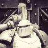
smallvictory Posted March 26, 2010 Share Posted March 26, 2010 I do like that red, I get why some may see it as too bright, but I think the dark and dirty Khorne thing can get out of hand in a hurry. If you are feeling brave you may want to try some more extreme shading, might sell the sceptics and draw the eye to the source light (personally, I'd leave it). The free hand on the shoulder looks fantastic, it looks darker and realistic. The Khorne symbols seem bright and cartoony in comparison. I think the reason is the black outline on the shoulder seems to blend in and the symbols on the claws is just an outline adding all that contrast. I super dig it as is, but if I could add one thing, that perfect shiny bald forehead is just screaming to have a scar or a tatoo. Nice work. Link to comment https://bolterandchainsword.com/topic/194756-my-redemption-khorne-terminator-wip/page/3/#findComment-2334263 Share on other sites More sharing options...
Pig Of Sparta Posted March 26, 2010 Author Share Posted March 26, 2010 Some mixed opinions on the gauntlets. I wonder if I re-outline them with Scorched Brown if they'll blend in a little better and look less cartoonish. @ wargamingbunker: thanks, ripped straight from Wikipedia: Trompe-l'œil, which can also be spelled without the hyphen in English as trompe l'oeil,[1] (French for 'trick the eye', pronounced [tʁɔ̃p lœj]) is an art technique involving extremely realistic imagery in order to create the optical illusion that the depicted objects appear in three dimensions, instead of actually being a two-dimensional painting So I was trying to give a 3d effect like this. but if just turned in to an epic fail. I would love to try entering the GD contest, but just now it'd be a lot of hassle I think, do you not have to go through heats in your local store and stuff to qualify? My 'local' store is 60.66 miles away according to GW's website! @ smallvictory: Thanks mate. I hear you, I really want to give him a Khorne symbol carved into his head, might try and work on that. I was gonna try battle damage and paint chips on him, but after the fiasco last night I think I'm safer leaving him until I've mastered it a little better. Besides if you look closely in the set of pics before the most recent ones you can see some physical damage to his armour. @Terminatorinhell: thanks mate, don't worry about the wording, I agree with you, this forum makes me push myself much harder than anything else. I used to hate painting faces, but I feel a lot more comfortable doing them now and I think that's what is showing through this one. It only took about an hour and a half as well, but I find speed come with familiarity, once you've done something a few times you can get quicker at it and still stay neat. @the akratic: cheers mate, I'm gonna try and blend the edges of them into the red a little more, but I think I'll keep the grey the same as it is just now. I want them to stand out against the red, but not too far :lol: thanks for all the comments guys, although more will still be appreciated ;) James Link to comment https://bolterandchainsword.com/topic/194756-my-redemption-khorne-terminator-wip/page/3/#findComment-2334375 Share on other sites More sharing options...
lord gunthar Posted March 26, 2010 Share Posted March 26, 2010 The khorne terminator is drop dead amazing ! what i said before still applies , it has gone from a stunning model to stunningly painted model. Bravo. Link to comment https://bolterandchainsword.com/topic/194756-my-redemption-khorne-terminator-wip/page/3/#findComment-2334388 Share on other sites More sharing options...
Pig Of Sparta Posted March 26, 2010 Author Share Posted March 26, 2010 @lord gunthar: thanks mate, just a couple of bits left to finish on him now, then I just need to come up with a base epic enough to match the mini now. I've got a couple of ideas though. James Link to comment https://bolterandchainsword.com/topic/194756-my-redemption-khorne-terminator-wip/page/3/#findComment-2334572 Share on other sites More sharing options...
Starks333 Posted March 26, 2010 Share Posted March 26, 2010 massive improvements from the past work again, while theres many things i could suggest, ill leave it at that you have made good strides again, im looking forward to the next :rolleyes: Alex Link to comment https://bolterandchainsword.com/topic/194756-my-redemption-khorne-terminator-wip/page/3/#findComment-2335139 Share on other sites More sharing options...
Pig Of Sparta Posted March 26, 2010 Author Share Posted March 26, 2010 Thanks Alex, I know I'm making progress cause you've not had to photoshop this guy ;). Joking aside, I'd be interested to know what suggestions you do have though, I'd feel happier knowing what I am improving, and where I'm still not quite there (not that you can ever stop learning in a hobby like this) and even though it's too late for this mini (he's very close to being declared 'finished') it may help with the next marine I paint. James Link to comment https://bolterandchainsword.com/topic/194756-my-redemption-khorne-terminator-wip/page/3/#findComment-2335225 Share on other sites More sharing options...
Starks333 Posted March 27, 2010 Share Posted March 27, 2010 well freehands a nice addition, a bit cartoony with the outline tho the red is not bad, still afraid to go brighter, not just edges but the actual space/area black is a pretty meh way to shade red, its also high contrast to the red so makes the model look outlined, rather than shaded since you didnt do much area more so edges and cracks brighter highlights for points of reflection on the gold would help just absic stuff like that Alex Link to comment https://bolterandchainsword.com/topic/194756-my-redemption-khorne-terminator-wip/page/3/#findComment-2335439 Share on other sites More sharing options...
Pig Of Sparta Posted March 27, 2010 Author Share Posted March 27, 2010 thanks for the reply Alex, I'll see if I can address the points: I'm gonna go back and re-define the edges of the gauntlet icons with red to bring them into the mini a little more. I'm keeping the one on his shoulder the way it is though. I decided to stick with the blood red on this mini, I could go brighter, but it's actually turned into a test mini of sorts for a commission so I'm gonna finish him to how the client wants his mini's done so he can see what he could get. The shading is actually blue, I decided to try something different from my usual black brown 'ink' I thought it was working quite well, but maybe I need to make it a bit more obvious it's blue. I did highlight up brighter on the brass and then made the mistake of washing it with Devlan Mud. I think I will re-do the spot highlights on it though. please don't think I'm ranting, more replying to the points you've made . I appreciate the feedback you give because you keep pushing me to go further :) James Link to comment https://bolterandchainsword.com/topic/194756-my-redemption-khorne-terminator-wip/page/3/#findComment-2335675 Share on other sites More sharing options...
Pig Of Sparta Posted March 28, 2010 Author Share Posted March 28, 2010 Double post again.... Just a quick photo update. http://i347.photobucket.com/albums/p456/pigofsparta/KTwBase.jpg Decided to get rid of the Khorne symbols on his gauntlets, the more I looked at them the more I thought they didn't sit right, so I went and tried to blend them into the red a bit more. Couldn't get them to look any better so they're gone. I'm almost ready to call time on this guy so I'll get his base done, and stick him on the shelf I think. James Link to comment https://bolterandchainsword.com/topic/194756-my-redemption-khorne-terminator-wip/page/3/#findComment-2337406 Share on other sites More sharing options...
Recommended Posts
Archived
This topic is now archived and is closed to further replies.