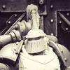
Pig Of Sparta Posted June 11, 2010 Share Posted June 11, 2010 Some of you might remember me wittering on about starting commission work. I've decided to put some photos of what is hopefully just the first of many and see what people thing of them. The customer asked that the Noise Marines be done in the same sort of style as the ones on the GW Website. So I decided (after checking with him) to follow in the spirit of the aforementioned style, but with enough difference to make them his own models and not just copies of the studio ones. Please bear in mind that they are still WIP, although apart from a few remaining details they mainly require highlighting now. The whole squad:http://i347.photobucket.com/albums/p456/pigofsparta/Commission%20Work/DSCF8475.jpg Slightly closer pictures: http://i347.photobucket.com/albums/p456/pigofsparta/Commission%20Work/DSCF8470.jpghttp://i347.photobucket.com/albums/p456/pigofsparta/Commission%20Work/DSCF8471.jpg http://i347.photobucket.com/albums/p456/pigofsparta/Commission%20Work/DSCF8472.jpghttp://i347.photobucket.com/albums/p456/pigofsparta/Commission%20Work/DSCF8473.jpg http://i347.photobucket.com/albums/p456/pigofsparta/Commission%20Work/DSCF8468.jpghttp://i347.photobucket.com/albums/p456/pigofsparta/Commission%20Work/DSCF8469.jpg http://i347.photobucket.com/albums/p456/pigofsparta/Commission%20Work/DSCF8466.jpghttp://i347.photobucket.com/albums/p456/pigofsparta/Commission%20Work/DSCF8467.jpg any opinions appreciated thanks James Link to comment https://bolterandchainsword.com/topic/203904-emperors-children-noise-marines/ Share on other sites More sharing options...
twistinthunder Posted June 11, 2010 Share Posted June 11, 2010 Gratz on the first commission dude, can't wait to see how this pans out. Link to comment https://bolterandchainsword.com/topic/203904-emperors-children-noise-marines/#findComment-2431067 Share on other sites More sharing options...
Pig Of Sparta Posted June 11, 2010 Author Share Posted June 11, 2010 Was kinda hoping for a bit more of a response, but thanks twistinthunder. I'll have some more pics up as I progress with them :mellow: James Link to comment https://bolterandchainsword.com/topic/203904-emperors-children-noise-marines/#findComment-2431470 Share on other sites More sharing options...
Dan The Deamon Posted June 11, 2010 Share Posted June 11, 2010 Those are looking good. You seem to be on the right track with the pink and i'd like to see how it turns out. How are you going to make them individual for the client? I think a little freehand slaanesh symbol somewhere on each of them would be neat. Black freehand on pink, and pink on black. Are you going to go with harsh colors the the eye lenses and cabling? or keep them somewhat uncluttered and keep the pink/black prevalent? Link to comment https://bolterandchainsword.com/topic/203904-emperors-children-noise-marines/#findComment-2431501 Share on other sites More sharing options...
Pig Of Sparta Posted June 11, 2010 Author Share Posted June 11, 2010 Thanks Dan, I think I'll keep the cables and hoses more subdued than the rest of the details, not so they blend in but so they don't distract too much. I'm thinking cool blue for the eye lenses to add a splash of colour and because the black is being highlighted with Hawk Turquoise. I like the idea of the freehand, I might have to get practicing Slaaneshi symbols :) thanks James Link to comment https://bolterandchainsword.com/topic/203904-emperors-children-noise-marines/#findComment-2431709 Share on other sites More sharing options...
Dan The Deamon Posted June 11, 2010 Share Posted June 11, 2010 This project is in good hands. I can't wait to see how it turns out. Link to comment https://bolterandchainsword.com/topic/203904-emperors-children-noise-marines/#findComment-2431757 Share on other sites More sharing options...
twistinthunder Posted June 11, 2010 Share Posted June 11, 2010 Was kinda hoping for a bit more of a response, but thanks twistinthunder. I'll have some more pics up as I progress with them :ph34r: James hehe, sorry man i would have said more but i needed to catch a bus... sorry :woot:. the pink's going the right way for the studio scheme which would be a feat normally (to me at least) but what with tentacle pink being pulled out of the paint range it became harder so grats. guns could do with being darker and you should make the eyes 'black'. bring me a HQ choice! lols. Link to comment https://bolterandchainsword.com/topic/203904-emperors-children-noise-marines/#findComment-2431785 Share on other sites More sharing options...
Pig Of Sparta Posted June 12, 2010 Author Share Posted June 12, 2010 thanks Dan ^_^ hehe, sorry man i would have said more but i needed to catch a bus... sorry :(. Don't worry mate, I wasn't meaning just from you :D. Luckily I happened to have access to a pot of Tentacle pink which is making this a lot easier. The guns will be getting their trim and some of their detailing picked out in bronze/gold so the contrast should help to balance them a little. I usually do the eyes last, but I'll take black under advisement and see what suits them when they're 'finished'. thanks James Link to comment https://bolterandchainsword.com/topic/203904-emperors-children-noise-marines/#findComment-2432140 Share on other sites More sharing options...
Chaplain Desmodus Posted June 12, 2010 Share Posted June 12, 2010 Nice work so far. Some years back I painted a single squad of EC marines. I bought enough models for an army, including FW stuff, but then only painted these guys. :woot: :( Hope you have better success with your guys. :P Anyway, here's a link to a gallery with painting instructions, if you're interested. ++ LINK ++ And an appetizer: http://flesheaters.net/ec/minis/squad1/squad_01.jpg Link to comment https://bolterandchainsword.com/topic/203904-emperors-children-noise-marines/#findComment-2432433 Share on other sites More sharing options...
Pig Of Sparta Posted June 17, 2010 Author Share Posted June 17, 2010 Thanks Chaplain Desmodus, those are some nice EC there, I'm going with paler pink on these ones, but I've bookmarked your page for future reference :P Some updated pics: http://i347.photobucket.com/albums/p456/pigofsparta/Commission%20Work/DSCF8480.jpghttp://i347.photobucket.com/albums/p456/pigofsparta/Commission%20Work/DSCF8481.jpghttp://i347.photobucket.com/albums/p456/pigofsparta/Commission%20Work/DSCF8482.jpg http://i347.photobucket.com/albums/p456/pigofsparta/Commission%20Work/DSCF8484.jpghttp://i347.photobucket.com/albums/p456/pigofsparta/Commission%20Work/DSCF8485.jpg http://i347.photobucket.com/albums/p456/pigofsparta/Commission%20Work/DSCF8486.jpghttp://i347.photobucket.com/albums/p456/pigofsparta/Commission%20Work/DSCF8487.jpg http://i347.photobucket.com/albums/p456/pigofsparta/Commission%20Work/DSCF8488.jpghttp://i347.photobucket.com/albums/p456/pigofsparta/Commission%20Work/DSCF8489.jpg Still bits left to do but I'm getting there ;) thanks James Link to comment https://bolterandchainsword.com/topic/203904-emperors-children-noise-marines/#findComment-2438353 Share on other sites More sharing options...
twistinthunder Posted June 18, 2010 Share Posted June 18, 2010 very nice! keep up the good work. Link to comment https://bolterandchainsword.com/topic/203904-emperors-children-noise-marines/#findComment-2438637 Share on other sites More sharing options...
Pig Of Sparta Posted June 18, 2010 Author Share Posted June 18, 2010 I think I must be working on an unpopular project again B) Thanks twistinthunder. Theres a couple more layers of highlights to go on (the black and the pink) but mostly is just down to the details now. Should have these wrapped up by the deadline of the end of june :) thanks James Link to comment https://bolterandchainsword.com/topic/203904-emperors-children-noise-marines/#findComment-2438974 Share on other sites More sharing options...
twistinthunder Posted June 18, 2010 Share Posted June 18, 2010 i think people may just be busy working on their own projects (which im not, I've no money atm and all of it's going towards a WHFB army for the new edition) or are simply on other boards basking in the new edition.... Link to comment https://bolterandchainsword.com/topic/203904-emperors-children-noise-marines/#findComment-2439129 Share on other sites More sharing options...
dlfleetw Posted June 18, 2010 Share Posted June 18, 2010 At present, they seem, well bland. I think it is partially due to your background, grab a neutral gray or darker backdrop and that will help. I'd almost deepen your shadows some (on the pink) to get some more contrast. Link to comment https://bolterandchainsword.com/topic/203904-emperors-children-noise-marines/#findComment-2439201 Share on other sites More sharing options...
Pig Of Sparta Posted June 18, 2010 Author Share Posted June 18, 2010 @ twistinthunder: Quite possible that folk are busy I suppose, I know I am... was just hoping to get some more crits or support on my first commercial venture. Saying that with guys like winterdyne and bohun posting up their commissions I can see why mine is getting passed over, their work quality is far exceeding mine just now. @ dlfleetw I can see what your saying, I'll stick some more photos up once the next couple of layers are on the pink and the black, hopefully the highlights on the pink areas in particular will detract from the blandness of them but I'll if that fails I'll think about trying to deepen the shading perhaps with Warlock Purple, although ultimately it depends how their owner feels about them. I'm planning on adding freehand slaanesh symbols to each marine bar the champion (as he already has the metal disc on this shoulder pad), so with a bit of luck this will add a bit of a slaaneshi jazz to them as well. I know that as worshipers of the Prince of Pleasure they could be much more colourful, but my customer has requested that they be painted in the same style as the ones pictured on the GW website, so that's what I'm aiming for. James Link to comment https://bolterandchainsword.com/topic/203904-emperors-children-noise-marines/#findComment-2439383 Share on other sites More sharing options...
Pig Of Sparta Posted June 24, 2010 Author Share Posted June 24, 2010 (Lots) more new photos await in this double post (apologies to all viewers), these'll probably be the last before the mini's are finished and returned to the customer; http://i347.photobucket.com/albums/p456/pigofsparta/Commission%20Work/DSCF8521.jpghttp://i347.photobucket.com/albums/p456/pigofsparta/Commission%20Work/DSCF8522.jpghttp://i347.photobucket.com/albums/p456/pigofsparta/Commission%20Work/DSCF8523.jpghttp://i347.photobucket.com/albums/p456/pigofsparta/Commission%20Work/DSCF8524.jpghttp://i347.photobucket.com/albums/p456/pigofsparta/Commission%20Work/DSCF8525.jpghttp://i347.photobucket.com/albums/p456/pigofsparta/Commission%20Work/DSCF8526.jpghttp://i347.photobucket.com/albums/p456/pigofsparta/Commission%20Work/DSCF8527.jpghttp://i347.photobucket.com/albums/p456/pigofsparta/Commission%20Work/DSCF8528.jpghttp://i347.photobucket.com/albums/p456/pigofsparta/Commission%20Work/DSCF8529.jpghttp://i347.photobucket.com/albums/p456/pigofsparta/Commission%20Work/DSCF8530.jpghttp://i347.photobucket.com/albums/p456/pigofsparta/Commission%20Work/DSCF8531.jpghttp://i347.photobucket.com/albums/p456/pigofsparta/Commission%20Work/DSCF8532.jpg and a slightly closer shot of the test for blue eye lenses: http://i347.photobucket.com/albums/p456/pigofsparta/Commission%20Work/DSCF8533.jpg I think the blue turned out quite well, so pending approval from my client I'll finish up the rest of the helmets in the same way. I'm particularly proud of the freehand I've done as normally I fail miserably when it comes to detail like that. Just goes to show what you can do when you apply yourself I suppose. Anyway, please feel free to voice your opinions thanks James Link to comment https://bolterandchainsword.com/topic/203904-emperors-children-noise-marines/#findComment-2444919 Share on other sites More sharing options...
Dan The Deamon Posted June 24, 2010 Share Posted June 24, 2010 the pink/black armor looks awesome. I like the eyes and the freehand turned out good. What color are you planning on painting that topknot? Link to comment https://bolterandchainsword.com/topic/203904-emperors-children-noise-marines/#findComment-2444929 Share on other sites More sharing options...
Pig Of Sparta Posted June 24, 2010 Author Share Posted June 24, 2010 Thanks Dan it's going to be a turqoise-y (ish) shade of blue and will match the ones on the chainsword pommels. I won't go too blue though as I don't want to detract from the eyes. It's mainly to add a spriklink of colour to the unit as a whole. James Link to comment https://bolterandchainsword.com/topic/203904-emperors-children-noise-marines/#findComment-2444931 Share on other sites More sharing options...
Brother Kovash Posted June 24, 2010 Share Posted June 24, 2010 These look great, the freehand looks really good on the shoulders. I would paint the hair on the guy with the top knot to give a personal touch, maybe blazing orange or snot green to create another focus point. Link to comment https://bolterandchainsword.com/topic/203904-emperors-children-noise-marines/#findComment-2444970 Share on other sites More sharing options...
Yogi Posted June 25, 2010 Share Posted June 25, 2010 It think they look good. I think the lack of basing has made them look like they are blending into the black base. But obviously they are WIPs so when based they should look fantastic. Link to comment https://bolterandchainsword.com/topic/203904-emperors-children-noise-marines/#findComment-2445496 Share on other sites More sharing options...
Pig Of Sparta Posted June 25, 2010 Author Share Posted June 25, 2010 @ Brother Kovash: Hmmm... I never thought of using orange on the top knot. I guess I could give it a shot. I'll speak to the client and see what he thinks about it. @ Yogi: I'll take some final pictures of them when I finish painting them, but I'll have to see if I can get some from the client after that as he's basing them to match his army. Either way I'll put some photos in the Hall of Honour when they're done :) JAmes Link to comment https://bolterandchainsword.com/topic/203904-emperors-children-noise-marines/#findComment-2445512 Share on other sites More sharing options...
dlfleetw Posted June 25, 2010 Share Posted June 25, 2010 My only critique is still based on contrast (and your white background... gaah :) .) I feel that the armor could use some muted edge highlighting to make them pop more. I don't know what color you used for the highlight (scaly green/ hawk turquoise -ish) but the additional of a muted bone color mixed in to that, followed by a few thin glazes of your mid tone highlight (I think I see two layers there, can't tell from the pictures for sure) to keep it from screaming will benefit the overall scheme and make them show up more. Good clean work overall. :cuss Link to comment https://bolterandchainsword.com/topic/203904-emperors-children-noise-marines/#findComment-2445544 Share on other sites More sharing options...
Pig Of Sparta Posted June 25, 2010 Author Share Posted June 25, 2010 I'll see if I can find something dark to use as a back drop for some photos as in real life the highlighting on the black is a little more defined and not so faded. I could add one more layer of harsh highlights to it (I'm loosely following Aerexis's painting black technique) which I wasn't going to because, as I said IRL they do look a bit better, curse my white bit of card :) JAmes Link to comment https://bolterandchainsword.com/topic/203904-emperors-children-noise-marines/#findComment-2445696 Share on other sites More sharing options...
Pig Of Sparta Posted June 27, 2010 Author Share Posted June 27, 2010 I know I said that my last lot of photos would be the last, but I couldn't resist throwing up a sneaky peek of the finished champion. I've taken them against a dark(er) background and it seems to have worked wonders for them. I'll have some better photos up in the Hall of Honour over the next couple of days as my camera's batteries are once again needing charged up. http://i347.photobucket.com/albums/p456/pigofsparta/Commission%20Work/DSCF8537.jpghttp://i347.photobucket.com/albums/p456/pigofsparta/Commission%20Work/DSCF8543.jpghttp://i347.photobucket.com/albums/p456/pigofsparta/Commission%20Work/DSCF8542.jpghttp://i347.photobucket.com/albums/p456/pigofsparta/Commission%20Work/DSCF8540.jpg As I mentioned in a previous post, the customer is basing the mini's so I'm just leaving the bases as they are. thanks James Link to comment https://bolterandchainsword.com/topic/203904-emperors-children-noise-marines/#findComment-2447383 Share on other sites More sharing options...
Rogan Posted June 27, 2010 Share Posted June 27, 2010 Wow - that's what I call improvement. Compared to the other squad members, the champion is really top notch! Link to comment https://bolterandchainsword.com/topic/203904-emperors-children-noise-marines/#findComment-2447418 Share on other sites More sharing options...
Recommended Posts
Archived
This topic is now archived and is closed to further replies.