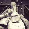
Pig Of Sparta Posted July 17, 2010 Share Posted July 17, 2010 After seeing Brother Captain's Assault Sergeant in the WIP forum I had to give his technique a try. You can find more information on it here in his WIP thread and here on his Blog. Here is what I came up with: http://i347.photobucket.com/albums/p456/pigofsparta/Viva9.jpg http://i347.photobucket.com/albums/p456/pigofsparta/Viva10.jpg I know that Sentinels of Sparta is a really poor name for an Astartes chapter, but it was all I could think of this evening as I was trying to come up with something. Any comments/criticism is appreciated, oh and if you feel like voting, he'll be up on CMON as soon as his photos are approved. There's a link to my gallery in my sig :lol: thanks James Link to comment https://bolterandchainsword.com/topic/206634-sentinels-of-sparta-veteran-sergeant/ Share on other sites More sharing options...
Stu Phoenix Posted July 17, 2010 Share Posted July 17, 2010 awesome model, awesome paintjob, kudos! :) Link to comment https://bolterandchainsword.com/topic/206634-sentinels-of-sparta-veteran-sergeant/#findComment-2465345 Share on other sites More sharing options...
Lestat Posted July 17, 2010 Share Posted July 17, 2010 Nice use of the Eldar decals. The inverted one kind of reminda of the arrow-head design Spartans used on thier shields. Link to comment https://bolterandchainsword.com/topic/206634-sentinels-of-sparta-veteran-sergeant/#findComment-2465349 Share on other sites More sharing options...
Replica Posted July 18, 2010 Share Posted July 18, 2010 Nice use of the Eldar decals. The inverted one kind of reminda of the arrow-head design Spartans used on thier shields. I agree, excellent model all round but the decals are a very nice touch Link to comment https://bolterandchainsword.com/topic/206634-sentinels-of-sparta-veteran-sergeant/#findComment-2465538 Share on other sites More sharing options...
Madwolf Shadowmane Posted July 18, 2010 Share Posted July 18, 2010 Awesome. I like the depth to the color. The white symbols create a stark contrast. Link to comment https://bolterandchainsword.com/topic/206634-sentinels-of-sparta-veteran-sergeant/#findComment-2465572 Share on other sites More sharing options...
Pig Of Sparta Posted July 18, 2010 Author Share Posted July 18, 2010 Thanks for the comments guys. To be honest I was a little apprehensive about using the eldar decals, I had visions of posting photos up and having people acuse me of heresy for putting xenos decals on a Space Marine :). But after going through all my decal sheets all I could think of using was the Cadian Gate symbol of the eldar one that I've used. The smaller on came about because I like to have something on the right shoulder pad other than just the tactical designation. Enough waffle, I'm glad they and the mini been well recieved :P. This was a fun experiment and I'm definately going to try this technique again. I've got a mini in mind for it although sadly it's not supported by this board.... If/when I get around to it it'll go up in my CMON gallery though thanks James Link to comment https://bolterandchainsword.com/topic/206634-sentinels-of-sparta-veteran-sergeant/#findComment-2465577 Share on other sites More sharing options...
Cpt. Lacerus Posted July 18, 2010 Share Posted July 18, 2010 Very nice model and the first words that came to mind were crisp and clean, well done. And I just noticed that I like that sculpt alot. Its nice and open. Link to comment https://bolterandchainsword.com/topic/206634-sentinels-of-sparta-veteran-sergeant/#findComment-2465621 Share on other sites More sharing options...
stinkenheim Posted July 18, 2010 Share Posted July 18, 2010 O.k, because it's you and I have seen how well you can paint I am going to be harsh. The colour scheme is nice and simple but to me it is lacking 'oomph'. I sort of like the reddish/blak colour but think it could have done with more definition. This looks almost unfinished (to me anyway) and looks like it needs a couple more highlights to define exactly what colours you were after. Then there is the gold, its a nice deep, old looking gold but its very plain. Especially noticable on the back of the banner thingy. It again looks like it needs a highlight or two to set it off. Then the bit that les it down for me is the silve, especially on the leg. The highlighting on that area needs so touching up, its a bit messy if you understand me... the lines are a bit all over the place, varying thicknesses... gah I can't explain it properly. Maybe use some glazes to add a bit more depth to the metalics, introduce some colours in there. I'm also not sold on the green. The model looks like it has red tones, and to me green doesn't sit right. Purple, blue or Red/orange would have been better in my opinion. The holster is nice, but I would have gone for a more Dark Fesh colour, it would be a bit brighter and stand out a bit more. The colours on the holster blend in a bit too much for me and I think the model could do with an injection of warmth, it is quite cold. Also I would put some scroll work on the purity seals. :devil: I like the painting and by no means is it a bad paintjob, I just honestly think it looks a bit unfinished in my opinion. I really like the crispness of the shoulder pads though especially the squad markings. I like the name too. Please don't think Im being rude, and I didn't just put a compliment at the end to 'balance out' my comments. I just thought I would be honest. Link to comment https://bolterandchainsword.com/topic/206634-sentinels-of-sparta-veteran-sergeant/#findComment-2465732 Share on other sites More sharing options...
Pig Of Sparta Posted July 18, 2010 Author Share Posted July 18, 2010 Honesty is always very much appreciated stinkenhiem. This was really just a quick project to try something out, but I can see what you're saying about the red armour. It does lack definition in places. Also the silver eagle on the leg does need tidying up. As for the golden Aquila, it did start off very bright, but I think you might be right it does need some very small harsh highlights possibly followed by another glaze of Scorched Brown. I might revisit him at some point in the future, but just now I've got some Wolf Guarrd to complete so I don't fail my COTI vow :) thanks James Link to comment https://bolterandchainsword.com/topic/206634-sentinels-of-sparta-veteran-sergeant/#findComment-2465776 Share on other sites More sharing options...
Azatoth Posted July 18, 2010 Share Posted July 18, 2010 Nice use of the Eldar decals. The inverted one kind of reminda of the arrow-head design Spartans used on thier shields. Arrowhead design? That is the greek letter for -L- standing for Laconia, (also called Lacedaemonia) which in ancient times was dominated by the city of Sparta. Link to comment https://bolterandchainsword.com/topic/206634-sentinels-of-sparta-veteran-sergeant/#findComment-2465969 Share on other sites More sharing options...
Recommended Posts
Archived
This topic is now archived and is closed to further replies.