DannyJZuko Posted August 19, 2010 Share Posted August 19, 2010 I have been a longtime lurker and have recently gotten into the hobby again after many years off. This is the first model completed in my efforts to recreate the Ultramarines Second Company. Please, if you have any thought at all, comment. Good. Bad. Indifferent. Just let me know. I am trying to grow as a painter. This model is mostly based on the single-handed Emperor's Champion model. I have added a chaos plasma pistol, Cypher's backpack, shortened the sword into a gladius, and added purity seals with green stuff. http://i742.photobucket.com/albums/xx66/dannyjzuko1/DSC04389.jpg http://i742.photobucket.com/albums/xx66/dannyjzuko1/DSC04392.jpg http://i742.photobucket.com/albums/xx66/dannyjzuko1/DSC04391.jpg http://i742.photobucket.com/albums/xx66/dannyjzuko1/DSC04390.jpg Thanks in advance, gang! ++EDIT++ Here is a picture with flash... not sure which is better. http://i742.photobucket.com/albums/xx66/dannyjzuko1/DSC04393.jpg Link to comment https://bolterandchainsword.com/topic/208911-ultramarines-veteran-sergeant/ Share on other sites More sharing options...
S. Bloodhowl Posted August 19, 2010 Share Posted August 19, 2010 Looks good mate, for painting I would say you need to add in some edge highlights (my personal way would be to highlight all edges slightly brighter that the brightest you've gone there and then do a brighter still highlight on the upper edges to show the light source if you know wht I mean). Also some of the paint seems a bit thick in places so I would suggest watering the paints down a bit. Your freehand is great by the way Hopes this helps. Link to comment https://bolterandchainsword.com/topic/208911-ultramarines-veteran-sergeant/#findComment-2492468 Share on other sites More sharing options...
Aramis_the_Red Posted August 19, 2010 Share Posted August 19, 2010 I like it, tho I do have to say I don't care for cypher's backpack on the model. I could see it on a chaplain or a LotD model, or may be on a BA death company model, but not so much on an Ultramarine captain. Link to comment https://bolterandchainsword.com/topic/208911-ultramarines-veteran-sergeant/#findComment-2492472 Share on other sites More sharing options...
DannyJZuko Posted August 19, 2010 Author Share Posted August 19, 2010 @S. Bloodhowl - I am currently working on a custom chaplain and have tried your hard-edged highlighting. I like it for the dar of the Chaplain as it is hard to gain much contrast, but I am hesitant to do it on a blue Ultra. Luckily, I have plenty of bitz I can practice on. Also, I would agree with the thickness of the paint. It is one of those things you don't realize until you have several layers going. I have been watering down since. @Aramis_the_Red - I am also somewhat hot & cold about the Cypher pack. I wanted something special for this model and it was the only thing I had. It is a shame that we don't have all too many different types of backpacks available. I have seen teh new Forgeworld stuff. Might have to drop some cash. Thanks for the support so far! Link to comment https://bolterandchainsword.com/topic/208911-ultramarines-veteran-sergeant/#findComment-2492505 Share on other sites More sharing options...
peers Posted August 19, 2010 Share Posted August 19, 2010 Hey there , as mentioned before some edge highlighting on the blue, red, tabard and particularly the laurel would add more definition to the miniature, because of the scale of the miniatures we paint it is always worth exaggerating the highlights slightly I have found, and also as mentioned before thin your paints a bit more to help with the blending transitions as its looking a little patchy in places (which is having a funny effect of complementing the battle damage here, apologies if you intended it to be this way! :P ). Also the mud effect is a bit overdone in my opinion given the depth of the mud on the base, I would recommend trying to make it look less caked on higher up ( blend or glaze in some blue? ), or just go up to the the ankles maybe. On the positive side I like the Vibrant colours you have achieved and their placement looks good, its also obvious that you have decent brush control from the free-hands and general neatness. Anyhow the best way to get better as I'm sure you know is to just keep painting. You will learn something more on every miniature :huh: J Link to comment https://bolterandchainsword.com/topic/208911-ultramarines-veteran-sergeant/#findComment-2492682 Share on other sites More sharing options...
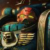
Myxx Posted August 20, 2010 Share Posted August 20, 2010 Maybe its the picture angle, but the sword looks... stubby... Link to comment https://bolterandchainsword.com/topic/208911-ultramarines-veteran-sergeant/#findComment-2492840 Share on other sites More sharing options...
Critically_hit Posted August 20, 2010 Share Posted August 20, 2010 I think the pose of your model is well done, at least to me he seems to have gotten that commanding attitude. Should you want to change the backpack, I'd like to suggest the backpack from the death company sprue with the iron halo kind of decoration. Personally I find the skelleton just a little too 'chaos' for an ultramarine. As said above, this model deserves some extra highlighting. Great job overall though, very good for returning after years! Link to comment https://bolterandchainsword.com/topic/208911-ultramarines-veteran-sergeant/#findComment-2492847 Share on other sites More sharing options...
SELECT * Posted August 20, 2010 Share Posted August 20, 2010 The pose is very good, i like it. Speaking about the paintjob, i think it's kinda dull - adding some contrast, small details, highlits can make it really outstanding. Of course it's just what i think, and i can understand it, if you see Commander in more "serious" and darker way. And maybe this is just a photo, or my monitor, making the model look like this. Link to comment https://bolterandchainsword.com/topic/208911-ultramarines-veteran-sergeant/#findComment-2492909 Share on other sites More sharing options...
Brother Valerius Posted August 20, 2010 Share Posted August 20, 2010 This is really well done! How do you get your freehand to come out so well-shaped? Whenever I try to do the chapter symbol it just comes out looking misshapen. Link to comment https://bolterandchainsword.com/topic/208911-ultramarines-veteran-sergeant/#findComment-2493446 Share on other sites More sharing options...
small_dog Posted August 20, 2010 Share Posted August 20, 2010 I really like it. Highlights could help, but evem as is this is a very good looking piece. Link to comment https://bolterandchainsword.com/topic/208911-ultramarines-veteran-sergeant/#findComment-2493458 Share on other sites More sharing options...
Gareth Posted August 21, 2010 Share Posted August 21, 2010 The red helmet and red skull within his U icon marks him out as a sergeant, and the gold shoulder trim marks him out as from the 2nd company, whilst the arrow and the II on his other shoulder pad says he is from the 2nd Tactical Squad. It's a nicely painted tactical marine sergeant though. But no 1st company veteran Captain I'm afraid. Link to comment https://bolterandchainsword.com/topic/208911-ultramarines-veteran-sergeant/#findComment-2493950 Share on other sites More sharing options...
ThatGingerDude Posted August 21, 2010 Share Posted August 21, 2010 Very interesting. Where is the backpack from? Link to comment https://bolterandchainsword.com/topic/208911-ultramarines-veteran-sergeant/#findComment-2494006 Share on other sites More sharing options...
DannyJZuko Posted August 21, 2010 Author Share Posted August 21, 2010 @peers - Thanks, mate. I think the mud effect did not translate well on camera, but I also agree that it should be toned down. Future models will be altered. @Myxx - I intentionally shortened it. It is a gladius style sword which were popular in Rome and Greece. They were shorter than most swords to provide better maneuverability. @critically_hit - Thanks! I appreciate your kind words and advice. I just finished up a custom Chaplain that has a iron halo on it. Will be curious to see what you think. @SELECT * - I think these photos are making it look even more dull. I do like my models to be dark and brooding, but these pics definitely make it worse. I am thinking about getting a new camera as this one is quite old. Maybe I will add new pictures if this is the case. @Brother Valerius - Thank you, sir! To paint the chapter badge I usually start with a white circle or oval. Then I paint a smaller circle/oval in the top portion. Similar to this: http://ventris-4thcompany.blogspot.com/200...nes-symbol.html @small_dog - Thank you! @Gareth - The word "captain" in the title was a brain-fart. I am sorry. But, I assure you, this is the proper markings for a veteran sergeant. A sergeant can be given veteran status and not be a member of the First Company. This sometimes happens when the First Company is at full strength and not in need of new recruits" Therefore, the marine gains veteran status and remains with his original squad/company until the First needs him. So, the red helmet and red skull do signify sergeant status as you correctly pointed out. But, then the white laurel displays his veteran status as is seen on page 21 of the 5th Edition Codex: Space Marines. Then, as you also correctly pointed out, the trim colours are that of the Second Company, which I intended. And, since he is the sergeant of the second tactical squad from the Second Company I also marked him accordingly. I hope this clears things up. @ThatGingerDude - It is the metal backpack from the Cypher model. Link to comment https://bolterandchainsword.com/topic/208911-ultramarines-veteran-sergeant/#findComment-2494128 Share on other sites More sharing options...
tiny sam Posted August 24, 2010 Share Posted August 24, 2010 @Myxx - I intentionally shortened it. It is a gladius style sword which were popular in Rome and Greece. They were shorter than most swords to provide better maneuverability. and to greatly reduce the cost of equiping an army. if he's a Sergent Veteran, shouldn't he has a white stripe on his helmet? I would change the plasma pistol for a loyalist one, this one looks like it overheat to much in it's life.(it's bending...) I would also put a normal back pack. or maybe the one with eagle headed vents to make it look less chaosy (they did not turn to chaos, did they??) as for the painting I think pretty much every thing have been said. Good job on the overall, This champions has always been my favorite model! Link to comment https://bolterandchainsword.com/topic/208911-ultramarines-veteran-sergeant/#findComment-2495637 Share on other sites More sharing options...
Recommended Posts
Archived
This topic is now archived and is closed to further replies.