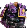
elfatto Posted October 18, 2010 Share Posted October 18, 2010 After a 2 year break, I've decided to get back into 40k (or 30k as it were). I had painted most of the purple armour on the mini I was planning on using as a SM captain before my break, and I finished the rest of it this week and I'm really happy with the results. The pose of the mini was pretty similar to that of the Lucius the eternal mini, so this is my interpretation of a pre-heresy Lucius, in all his fabulous blinged out glory. I also have a bunch of pre-heresy EC marines from the army that I was/am building, I'll post those as well when I can take some non-terrible photos of them. http://img.photobucket.com/albums/v167/elfatto/40k/lucius1.jpg http://img.photobucket.com/albums/v167/elfatto/40k/lucius2.jpg http://img.photobucket.com/albums/v167/elfatto/40k/lucius3.jpg One thing that I noticed was that my paints seemed to have changed colour during their time in storage. For example, the newly painted stuff, like the purple on the shield and backpack, appear to be a bit darker than the purple on the rest of the model, which was painted earlier. I really noticed this when I took the photos. I thought it might be because the paints had dried and gotten more concentrated in pigment, but none of them had dried up noticeably, and I water them down on a palette when I paint anyways. Anybody else had any experience with this? Link to comment https://bolterandchainsword.com/topic/213396-pre-heresy-emperors-children-captain/ Share on other sites More sharing options...
Alpha PTP Posted October 18, 2010 Share Posted October 18, 2010 The purple is not dark enough for the pre-heresy Emperor's Children for my tastes. I personally like the purple on the shield a lot more than the purple you have. The only reason I can think of that the purple are two different shades is because you mixed up the recipe, but only you know the answer to that. The NMM looks fantastic, but I think it could be darker in some parts to show a huge contrast and it will make the model "pop" a lot more, especially if you darken the purple some how. Not too much darker, but just a wee bit more. I have said this a thousand times on here, but contrast is the biggest thing in miniature painting because the models are so small. The blade you have on there is a perfect example of how good contrast makes great models. Paint some more stuff. We're waiting! ;) Link to comment https://bolterandchainsword.com/topic/213396-pre-heresy-emperors-children-captain/#findComment-2539053 Share on other sites More sharing options...
Inquisitor Engel Posted October 18, 2010 Share Posted October 18, 2010 Forget the guy above, this looks amazing. I might recommend some brighter lighting for photography though. ;) Link to comment https://bolterandchainsword.com/topic/213396-pre-heresy-emperors-children-captain/#findComment-2539055 Share on other sites More sharing options...
Captain Mick Posted October 18, 2010 Share Posted October 18, 2010 If the colour is dark enough yes or not doesnt matter, u did a fantastic job on him :ermm: . Link to comment https://bolterandchainsword.com/topic/213396-pre-heresy-emperors-children-captain/#findComment-2539117 Share on other sites More sharing options...
Natanael Posted October 18, 2010 Share Posted October 18, 2010 Super-awesome! I really really like it. The model really suits the EC as well. - Natanael Link to comment https://bolterandchainsword.com/topic/213396-pre-heresy-emperors-children-captain/#findComment-2539176 Share on other sites More sharing options...
tiny sam Posted October 18, 2010 Share Posted October 18, 2010 well acording to the lexicanum the EC were dark Pink and not Purple. http://wh40k.lexicanum.com/mediawiki/images/thumb/4/44/EmperorsChildrenPreheresy.jpg/150px-EmperorsChildrenPreheresy.jpg But personaly I like more your color scheme. At least we don't have to put sun glasses to look at them... Link to comment https://bolterandchainsword.com/topic/213396-pre-heresy-emperors-children-captain/#findComment-2539247 Share on other sites More sharing options...
Firepower Posted October 18, 2010 Share Posted October 18, 2010 Gorgeous. How'd you paint that purple? It's pretty much exactly the shade I'm shooting for on my DIY chapter. Link to comment https://bolterandchainsword.com/topic/213396-pre-heresy-emperors-children-captain/#findComment-2539289 Share on other sites More sharing options...
Alpha PTP Posted October 18, 2010 Share Posted October 18, 2010 Forget the guy above, this looks amazing. I might recommend some brighter lighting for photography though. :) I was in no way saying that the model wasn't amazing. I honestly like it a lot, but sitting here and praising him without giving him any constructive criticism makes this forum unproductive and it won't do him any good as a painter. I've been on here for six years, and I have improved my painting by leaps and bounds thanks to people giving me advice. Regardless, its a beautiful model. Link to comment https://bolterandchainsword.com/topic/213396-pre-heresy-emperors-children-captain/#findComment-2539292 Share on other sites More sharing options...
DeathTyrant Posted October 18, 2010 Share Posted October 18, 2010 I really like it. Looks like a man that really takes fighting, and his own pride to heart, as it should be. :) Link to comment https://bolterandchainsword.com/topic/213396-pre-heresy-emperors-children-captain/#findComment-2539318 Share on other sites More sharing options...
VtrAxX Posted October 18, 2010 Share Posted October 18, 2010 Mister Elfatto. You have returned eh? Well for a 3-year break with a returning model I must say its quite good. I concur with Alpha PTP on the CC Otherwise great job and glad to see you've come back. Vtraxx out Link to comment https://bolterandchainsword.com/topic/213396-pre-heresy-emperors-children-captain/#findComment-2539329 Share on other sites More sharing options...
DV8 Posted October 18, 2010 Share Posted October 18, 2010 I can't believe you two are still around (Jon and Victor). Haven't seen either of you on in ages. I guess work/school/world of warcraft has kept y'all in various stages of busy eh? :) I'm really digging the purple on the model, and the NMM is looking really sharp. I like that you've really started pushing the blends and less "edging". I would like to see smoother transitions though, either adding in more intermediary stages, or by thinning your paints a bit more and layering up more transparent coats of paint. Either way though, great work man. DV8 Link to comment https://bolterandchainsword.com/topic/213396-pre-heresy-emperors-children-captain/#findComment-2539383 Share on other sites More sharing options...
VtrAxX Posted October 18, 2010 Share Posted October 18, 2010 I am still around. hahahahaha. Painting is still going, just not as much since school is killer. Link to comment https://bolterandchainsword.com/topic/213396-pre-heresy-emperors-children-captain/#findComment-2539733 Share on other sites More sharing options...
Solid Zaku Posted October 18, 2010 Share Posted October 18, 2010 Gorgeous model. It actually kind of reminds me of that Slaanesh Champion in the WFB line...Sigurd or something like that? Either way, the paint is fantastic, and I can't believe what I'm reading about purple differentiation...you did a masterful work. Link to comment https://bolterandchainsword.com/topic/213396-pre-heresy-emperors-children-captain/#findComment-2539787 Share on other sites More sharing options...
elfatto Posted October 18, 2010 Author Share Posted October 18, 2010 Thanks for all the comments. I actually noticed that my previous attempts at NMM usually ended up too much on the bright/yellow side, so I was actually trying to get more of a dark/light contrast with the NMM with this guy. Maybe I'll try using a darker brown as a base next time, or use a larger area for the transition from brown to yellow, I guess I'll have to try it out and see what'll work best. For the colours I used, the purple on the armour is liche purple blended with increasing amounts of tentacle pink for hilights. The gold is bestial brown to golden yellow to white. @DV8: What do you mean 'still around'? You think I died or something? If you're still in T.O., I'm frequenting the GW store on Yonge pretty often now, mainly Thurs and Fri afternoon to try to get some games in with my horrible horrible Thousand Sons list until I can build this army up to 1500 points. Link to comment https://bolterandchainsword.com/topic/213396-pre-heresy-emperors-children-captain/#findComment-2539829 Share on other sites More sharing options...
DV8 Posted October 19, 2010 Share Posted October 19, 2010 @Vtraxx I know what you mean. When I was working 9-5 I had no time whatsoever for gaming. I've worked it out with my Art Director though so I now work 8 to 4, meaning I can actually hit up a GW in the evenings and get a few decent games in (assuming I go to GW STC). @Elfatto Heh I meant around on the Bolter and Chainsword forum. And I haven't seen you in a while is all, I think since Eaton's Center closed down. I've been to the GW on Yonge a few times since it opened, but it's just too much of a hassle for me to get down to after work, plus I have to pay for parking (going home and then bussing down also means I'll usually get there by about 6:30/7...waste of time in my opinion considering cost of bus fare). I usually frequent the GW at Scarborough Town (it's close enough on my route from home that I can usually get there by 4:45/5 on weekdays..typically Tuesday and/or Thursday), and I'm there Saturdays/Sundays if I have free time (since they're running a 40k campaign right now). I'm actually working on my Death Korp right now and should have them more or less finito by months end, at which point they'll become my primary army for a while (I am bored to death of my Wolves right now). As to the NMM, I think your color choices have always been rad. The key with NMM is you need that smooth blend, and that sharp contrast. You need to bring it from a super dark to a super light, and the blending needs to be flawless or it ends up looking really sloppy. Also having super darks beside super lights makes the colors "pop", giving that much-needed shine that NMM needs to really get the illusion of metallics across. Whether the colors are more muted/desaturated, or more yellow or whatever is irrelevant. DV8 Link to comment https://bolterandchainsword.com/topic/213396-pre-heresy-emperors-children-captain/#findComment-2539904 Share on other sites More sharing options...
bulley Posted October 19, 2010 Share Posted October 19, 2010 What are you using for the NMM ? I am assuming something like a snakebite base and then building up with a yellow to white? Also how are you getting that purple, I really like the finishes would work well for my weapons in my army but couldnt get them to work in my test models. Link to comment https://bolterandchainsword.com/topic/213396-pre-heresy-emperors-children-captain/#findComment-2540653 Share on other sites More sharing options...
psychoplatypus Posted October 20, 2010 Share Posted October 20, 2010 Beautiful! Link to comment https://bolterandchainsword.com/topic/213396-pre-heresy-emperors-children-captain/#findComment-2540829 Share on other sites More sharing options...
DV8 Posted October 20, 2010 Share Posted October 20, 2010 What are you using for the NMM ? I am assuming something like a snakebite base and then building up with a yellow to white? Also how are you getting that purple, I really like the finishes would work well for my weapons in my army but couldnt get them to work in my test models. You know what really grinds me gears? People who don't bother to read through a thread (particularly one so short) before posting questions that were literally answered 2 posts ago (3 if you include this one). DV8 Link to comment https://bolterandchainsword.com/topic/213396-pre-heresy-emperors-children-captain/#findComment-2541060 Share on other sites More sharing options...
Gorax Posted October 22, 2010 Share Posted October 22, 2010 Very nice indeed. I'm loving the NMM. Good Job :) Link to comment https://bolterandchainsword.com/topic/213396-pre-heresy-emperors-children-captain/#findComment-2542594 Share on other sites More sharing options...
pattison Posted October 22, 2010 Share Posted October 22, 2010 Gorgeous. Link to comment https://bolterandchainsword.com/topic/213396-pre-heresy-emperors-children-captain/#findComment-2542693 Share on other sites More sharing options...
Recommended Posts
Archived
This topic is now archived and is closed to further replies.