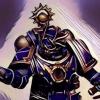
AlanofAngels Posted May 30, 2011 Share Posted May 30, 2011 Hey guys. Havn't posted in a while because of school, but seeing as the Summer put a stop to that, I should be able to get a lot done. This is my first painted Grey Knight; the first of what I expect to be an upcoming army. Anywho I thought I would throw him up here so yall could C&C him for me before I get too deep into this project. Thanks! Again C&C very much welcome. :( Link to comment https://bolterandchainsword.com/topic/230887-my-first-grey-knight/ Share on other sites More sharing options...
Olis Posted May 30, 2011 Share Posted May 30, 2011 Barrels drilled: Check. Paints thinned: Check. Word squiggles on purity seals and diddy books: Nope. Pardon my fascetiousness, brother (it's the cider talking). :P He looks pretty good so far barring the word squiggles and a little highlighting (red on the stormbolter, maybe, and some silver armour highlighting?). The use of blue wash looks textbook and his right shoulder pad is quite nice. So, if this is intended for, primarily, the tabletop I'd say he's good enough by a long way. :) Link to comment https://bolterandchainsword.com/topic/230887-my-first-grey-knight/#findComment-2775786 Share on other sites More sharing options...
Highborn Mergula Posted May 30, 2011 Share Posted May 30, 2011 Is that you're first miniature ever?!? Awesome then! :) Criticism: Try washing the red parts like the weapon and the shoulderpad. Also i recomend against using Mecherite red! Horrible horrible paint IMO..... But really that cant be youre first miniatyre ever painted. :P :D Link to comment https://bolterandchainsword.com/topic/230887-my-first-grey-knight/#findComment-2775801 Share on other sites More sharing options...
Olis Posted May 30, 2011 Share Posted May 30, 2011 Is that you're first miniature ever?!? I think it's just his first Grey Knight... Link to comment https://bolterandchainsword.com/topic/230887-my-first-grey-knight/#findComment-2775817 Share on other sites More sharing options...
Lysimachus Posted May 30, 2011 Share Posted May 30, 2011 Very nice. I think the only thing I'd say is looking at the first pic it looks like he needs a little more work on the eyes, as a focal point on any mini they could 'pop' a bit more? Might just be the pic though. Very nice clean paint job in general. Link to comment https://bolterandchainsword.com/topic/230887-my-first-grey-knight/#findComment-2775822 Share on other sites More sharing options...
Brother Xeones Posted May 30, 2011 Share Posted May 30, 2011 Not too bad! :lol: I'd echo the other's general critiques, and I'd also suggest you add a lens color to the eyes of the helmet. As it is, it looks a bit odd to have the eyes the same color as the helmet. Also, would you be terribly offended if I told you that, to me, he looks like he's standing on a giant granola bar? 'cuz he does... ;) Maybe add some variation in color to your basing. Still, it's looking good. Hope to see more in the months ahead. Link to comment https://bolterandchainsword.com/topic/230887-my-first-grey-knight/#findComment-2776094 Share on other sites More sharing options...
BrotherSargeantDaro Posted June 7, 2011 Share Posted June 7, 2011 I dont think this is your first model buddy! very well done though! Find a very striking color for the eyes... Im thinking flourescent green.... and very good job with everything... im about to go grey knight crazy... Link to comment https://bolterandchainsword.com/topic/230887-my-first-grey-knight/#findComment-2785227 Share on other sites More sharing options...
sniperhavens Posted June 7, 2011 Share Posted June 7, 2011 Very clean paint job, good looking pose as well, keep it up brother. Link to comment https://bolterandchainsword.com/topic/230887-my-first-grey-knight/#findComment-2785414 Share on other sites More sharing options...
barry_hhh Posted June 8, 2011 Share Posted June 8, 2011 looking great , i would suggest a wash in the golden script to make the letters pop a bit more , maybe devlan mud , also a light highlight of mithril silver on the silver wouldnt go amiss a squad of these will look awesome ! Link to comment https://bolterandchainsword.com/topic/230887-my-first-grey-knight/#findComment-2785605 Share on other sites More sharing options...
ItCameFrom1994 Posted June 21, 2011 Share Posted June 21, 2011 Bit too much blue. It's distracting from the rest of the painting. I read something helpful in the GW blog: "Suffice to say, Dan did get The Island of Blood set, but only succeeded in painting a couple of the miniatures before he got distracted again. The Standard Bearer from the Swordmasters unit was one of those lucky few. The metal has a simple but effective recipe: Boltgun Metal for the base, followed by an Asurmen Blue wash, a Badab Black wash and a highlight of Chainmail." http://www.games-workshop.com/gws/content/...p?aId=16800117a The mini in reference is in the bottom right. Very nice silver on that. Link to comment https://bolterandchainsword.com/topic/230887-my-first-grey-knight/#findComment-2798735 Share on other sites More sharing options...
Recommended Posts
Archived
This topic is now archived and is closed to further replies.