recon0321 Posted March 4, 2012 Share Posted March 4, 2012 http://i871.photobucket.com/albums/ab278/ski1391/photo.jpg here is my DIY chapter i just wanted everyone's opinion of my test mini Link to comment https://bolterandchainsword.com/topic/248231-dark-angel-successor/ Share on other sites More sharing options...
Droma Posted March 4, 2012 Share Posted March 4, 2012 Personally I'm not a fan. It feels incomplete though. If you're not done painting it then I'd finish and then see. Test minis are best when they're finished. Link to comment https://bolterandchainsword.com/topic/248231-dark-angel-successor/#findComment-3006951 Share on other sites More sharing options...
Brother Caliban Posted March 4, 2012 Share Posted March 4, 2012 I concur with Droma, this is not a good idea. Why do you feel the need to create your own? The existing successors are very striking, Angels of Vengeance in particularly look brilliant. Well met brother. Link to comment https://bolterandchainsword.com/topic/248231-dark-angel-successor/#findComment-3007414 Share on other sites More sharing options...
Droma Posted March 5, 2012 Share Posted March 5, 2012 I concur with Droma, this is not a good idea. Why do you feel the need to create your own? The existing successors are very striking, Angels of Vengeance in particularly look brilliant. Well met brother. Don't get me wrong I'm not against creating your own successor chapter. My own army is a self created successor chapter and I've seen a lot of good ones. The model just looks unfinished. If you're a new painter I'd caution against trying to go for a complicated color scheme like you're currently doing. If you still want to go complicated then paint sections of the mini the same color, as in don't paint the leg different colors in three different spots. Same goes for the arms. I'd stick with painting the armor all one color and then do the details like the chest eagle and shoulder trim a different color, maybe the helmet too. Whatever you're using for your white/bone color just doesn't look good though. There are a bunch of different ways to paint bone and I'd look at how some of the other people here do it and copy one you like. Link to comment https://bolterandchainsword.com/topic/248231-dark-angel-successor/#findComment-3007660 Share on other sites More sharing options...
Captain Semper Posted March 5, 2012 Share Posted March 5, 2012 Why do you feel the need to create your own? ^^^Non-constructive comment you should completely ignore. Don't get me wrong I'm not against creating your own successor chapter. My own army is a self created successor chapter and I've seen a lot of good ones. The model just looks unfinished. If you're a new painter I'd caution against trying to go for a complicated color scheme like you're currently doing. If you still want to go complicated then paint sections of the mini the same color, as in don't paint the leg different colors in three different spots. Same goes for the arms. I'd stick with painting the armor all one color and then do the details like the chest eagle and shoulder trim a different color, maybe the helmet too. Whatever you're using for your white/bone color just doesn't look good though. There are a bunch of different ways to paint bone and I'd look at how some of the other people here do it and copy one you like. ^^^Constructive comment you should consider. I still beleive however that the flash did damage the picture. Try again without and let us see the result. The chest Eagle for example: is it finished or is the white from the armour overlapping with the undercoated black? It's a matter of photography as much as anything else. Personally I like the paint scheme. It has strong references to the DAs and it is kind of unique. Badab Black wash maybe on the green areas? Your test model should be as close to the "standard" models as possible to really give you the impression of what you're going for and how long does your basic marine take you to paint. Link to comment https://bolterandchainsword.com/topic/248231-dark-angel-successor/#findComment-3007671 Share on other sites More sharing options...
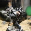
recon0321 Posted March 5, 2012 Author Share Posted March 5, 2012 http://i871.photobucket.com/albums/ab278/ski1391/photo-1.jpg ok well here is one without the flash believe it or not...i understand that it may seem un-finished but i didn't want to complete the smaller details there is a reason i call it a "test" mini. i was testing the main colors that way all!! the smaller details i feel i don't need to show Link to comment https://bolterandchainsword.com/topic/248231-dark-angel-successor/#findComment-3007679 Share on other sites More sharing options...
Myxx Posted March 5, 2012 Share Posted March 5, 2012 but without all the small details, the over all look of the mini isn't "judgeable", its often the small details that make 'meh' mini or a 'wow' mini... Link to comment https://bolterandchainsword.com/topic/248231-dark-angel-successor/#findComment-3007692 Share on other sites More sharing options...
Brother-Sergeant Bohemond Posted March 5, 2012 Share Posted March 5, 2012 I say complete it, I dont want to pass judgement until its been fully painted! Once you have done the detail, we will be in a better position to judge the colouring of the Chapter. I say go for it and make your own Chapter! Have you posted in the Liber Astartes yet? If so, I will have to come pass judgement on your work :) Link to comment https://bolterandchainsword.com/topic/248231-dark-angel-successor/#findComment-3007709 Share on other sites More sharing options...
Harleqvin Posted March 5, 2012 Share Posted March 5, 2012 I would agree with showing a more complete painted model for the scheme you are trying. 1: it gives a much better look to the model for showing it off and 2: you will see how long it takes to paint the model and to see if that's time you want to invest in all your models... I think the weathered bone does look neat, although a little charred like. Maybe that's why I like that color... but the more detail shown on the model will give it a better look. Also, maybe when taking the picture, have the light a bit further back so you don't get too much shine, light reflection, on the model. What Captain Semper has said pretty much. :) Without more of the details done, it's a little hard to see what you are wanting to portray/convey. Link to comment https://bolterandchainsword.com/topic/248231-dark-angel-successor/#findComment-3007717 Share on other sites More sharing options...
Isiah Posted March 5, 2012 Share Posted March 5, 2012 Well for a basic scheme the model is OK as is :) I have some comments on it (hopefully constructive) I like the shins and knee pads white/bone, but the forearms don't work so well 'cause the areas is too small - perhaps if the gauntlets were white/bone too? And for that reason the boots would look better matching the shins/kneepads too. I'm not sure I like the two differently coloured shoulderpads - so pick either left (white/bone) or right (green edged white/bone) and run with it. The chest aquila needs to stand out much more than it does. I'd suggest a red... ... and red eye lenses to match. That's all I have now :tu: [edit] By the way, name suggestion: The Blades of Caliban. [/edit] Might be better to fiddle around with the B&C's excellent Space Marine Painter tool until you get a scheme that suits - and feel free to post here for more discussion. Best of luck Cheers I Link to comment https://bolterandchainsword.com/topic/248231-dark-angel-successor/#findComment-3007887 Share on other sites More sharing options...
Bryan Blaire Posted March 6, 2012 Share Posted March 6, 2012 I have some comments on it (hopefully constructive) I like the shins and knee pads white/bone, but the forearms don't work so well 'cause the areas is too small - perhaps if the gauntlets were white/bone too? And for that reason the boots would look better matching the shins/kneepads too. I'm not sure I like the two differently coloured shoulderpads - so pick either left (white/bone) or right (green edged white/bone) and run with it. The chest aquila needs to stand out much more than it does. I'd suggest a red... ... and red eye lenses to match. That's all I have now :unsure: [edit] By the way, name suggestion: The Blades of Caliban. [/edit] I'll echo most of Isiah's comments as well. I'd expand the white/bone to at least the hands as well as the boots. I have a somewhat similar coloring scheme on my Boneseekers, if you want to take a gander. I'd also drop the differently colored shoulder pads, but what I want to know is whether you were trying for a divided color scheme on the chest plate? It somewhat appears so, there's white along the edges but it appears that there's green in the center of the plate. For the aquila, I think you need to decide if you want to be subdued or vibrant. For the more vibrant, I would go with red, as Isiah suggested, or even a yellow. For a more subdued color, I think that continuing the bone onto the chest piece (unless the chest is going to be white) or even a dark metal would work. On the eye lenses, red would be good with the red, bone or dark metal aquila, but for a yellow aquila, I'd match the lenses to it. On the names, oddly enough, I have a list of possible successors written out, and one of those was "Blades of Caliban", but I also had Angels Penitent, Blades Penitent as well as Blades Resolute (or Order of the Resolute Blade). I'm not sure whether choosing a Successor name might not help you solidify a color scheme, but I personally feel that a scheme should represent something about the Chapter, so if you can settle on something you want to represent, you may find that some part of your color choice just comes to you. Also, way back in December, you asked me a question in one of my WiP threads, and I didn't intend to ignore you, I just wasn't really posting for the last couple of months, but to answer your question, the shoulder pads on my Land Speeder crew came from the Ravenwing Battleforce, which is an awesome value if you can get your hands on it. Regarding the Chapter's background, I'm still working on that some, but I may post some of what I have sometime soon. Hope that any of that helps you in some way! Link to comment https://bolterandchainsword.com/topic/248231-dark-angel-successor/#findComment-3008433 Share on other sites More sharing options...
recon0321 Posted March 6, 2012 Author Share Posted March 6, 2012 ok well i guess my other scheme was to different for people to accept but i came up with this.... they remind me of the Deathwing/AOA so i am going to give them black robes and their vehicles are going to be green to give the army some contrast what do you guys think thanks for the comments the vast majority were great Link to comment https://bolterandchainsword.com/topic/248231-dark-angel-successor/#findComment-3008519 Share on other sites More sharing options...
MadDoc Posted March 6, 2012 Share Posted March 6, 2012 I think the big problem is that your initial pic didn't show your colour scheme very clearly. Is this what you had in mind? http://i1194.photobucket.com/albums/aa365/MadDocNZ/40K/spacemarine.jpg It doesn't look too bad. Link to comment https://bolterandchainsword.com/topic/248231-dark-angel-successor/#findComment-3008549 Share on other sites More sharing options...
Captain Semper Posted March 6, 2012 Share Posted March 6, 2012 I'm with MadDoc on this one. There is nothing wrong with your initial pattern. Tidy it up and your good to go! Link to comment https://bolterandchainsword.com/topic/248231-dark-angel-successor/#findComment-3008556 Share on other sites More sharing options...
recon0321 Posted March 6, 2012 Author Share Posted March 6, 2012 Well my idea was the entire chest plate in green... Link to comment https://bolterandchainsword.com/topic/248231-dark-angel-successor/#findComment-3008564 Share on other sites More sharing options...
JaM_TW Posted March 6, 2012 Share Posted March 6, 2012 I think you should still consider a different colour for the wings. You dont have to 'pop' them (red, for example), but they should at least be grey, or greyish (for example). The wings are more or less the symbols of the emperor, no normal marine (except CSM) would like to subdue those wings. green is good, but hte wings should then be... dunn, at least lighter green. But a grey is almost always good. Hope it helps! And check out the GW washes. They are really 'cheating in a pot' :). Link to comment https://bolterandchainsword.com/topic/248231-dark-angel-successor/#findComment-3009227 Share on other sites More sharing options...
Brother Caliban Posted March 7, 2012 Share Posted March 7, 2012 but without all the small details, the over all look of the mini isn't "judgeable", its often the small details that make 'meh' mini or a 'wow' mini... The model in question is judged as not worthy because of the colours selected, this is also not helped by the fact that the paint has been applied with little care making the appearance messy. BC. Link to comment https://bolterandchainsword.com/topic/248231-dark-angel-successor/#findComment-3009868 Share on other sites More sharing options...
Recommended Posts
Archived
This topic is now archived and is closed to further replies.