magnefjord Posted November 17, 2012 Share Posted November 17, 2012 C&C are always welcome, please let me know what you guys think Link to comment https://bolterandchainsword.com/topic/266027-the-works-of-the-mighty-magnefjord-new-artwork-30092014/ Share on other sites More sharing options...
smallvictory Posted November 18, 2012 Share Posted November 18, 2012 Nice model, you didn't shy away from any details at all either, every little thing is highlighted. Give that guy a nice base, some company and you're good. Link to comment https://bolterandchainsword.com/topic/266027-the-works-of-the-mighty-magnefjord-new-artwork-30092014/#findComment-3240835 Share on other sites More sharing options...
Grimdarkness Posted November 18, 2012 Share Posted November 18, 2012 Love it never understood the bone color when the story has them using ash. Link to comment https://bolterandchainsword.com/topic/266027-the-works-of-the-mighty-magnefjord-new-artwork-30092014/#findComment-3240868 Share on other sites More sharing options...
TRIBUN Posted November 18, 2012 Share Posted November 18, 2012 Really nice work dude, even if I really dislike da...cause I'm a wolf :). Link to comment https://bolterandchainsword.com/topic/266027-the-works-of-the-mighty-magnefjord-new-artwork-30092014/#findComment-3240999 Share on other sites More sharing options...
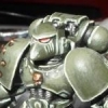
Brother Caliban Posted November 18, 2012 Share Posted November 18, 2012 A striking piece, solid work, and a lot of time spent. Good attention to detail. My constructive critique if I may... The contrast between the armour is to great. You can have even black in the shutlines if you like but it will take a lot of work to make it look correct. The overall colour is nice. If you are happy with it then that's what counts. However look at the Terminator's right hand (on the ass cannon) it looks as though you have opted to ink shade the small detail for speed, but look at this beautiful subtle shading. This is an example of how subtlety can still provide a great contract and striking piece. If you mix a medium brown with a dark grey and accurately wash this into the darkest area you could lower the contrast and create a more natural look. None the less a great model the way it is and certainly a paint job that will stand out from a far in the gaming area as well. Keep it up! An example of my meaning of more subtle contrast: http://i429.photobucket.com/albums/qq11/Andrew_K2008/40k/termintor_ass_01_zpscca5f928.jpg Link to comment https://bolterandchainsword.com/topic/266027-the-works-of-the-mighty-magnefjord-new-artwork-30092014/#findComment-3241386 Share on other sites More sharing options...
magnefjord Posted November 21, 2012 Author Share Posted November 21, 2012 Thanks all for your comments, makes me really glad to hear that you like it soo much, I really appreciate it <_< Thankyou once again A striking piece, solid work, and a lot of time spent. Good attention to detail. My constructive critique if I may... The contrast between the armour is to great. You can have even black in the shutlines if you like but it will take a lot of work to make it look correct. The overall colour is nice. If you are happy with it then that's what counts. However look at the Terminator's right hand (on the ass cannon) it looks as though you have opted to ink shade the small detail for speed, but look at this beautiful subtle shading. This is an example of how subtlety can still provide a great contract and striking piece. If you mix a medium brown with a dark grey and accurately wash this into the darkest area you could lower the contrast and create a more natural look. None the less a great model the way it is and certainly a paint job that will stand out from a far in the gaming area as well. Keep it up! An example of my meaning of more subtle contrast: http://i429.photobucket.com/albums/qq11/Andrew_K2008/40k/termintor_ass_01_zpscca5f928.jpg Thanks for the tip, I'll keep that in mind and maybe try it out on some future figurine, but the shutlines are not in black, it's just dark brown, I painted it in bleached bone first, then heavy wash with devlan mud befor bleached bone again, I'm pretty happy with the result and it's probably one of my best figurines so far. But as it's my first try at Deathwing I really appreciate any critique I get so thankyou for your tip ;) Link to comment https://bolterandchainsword.com/topic/266027-the-works-of-the-mighty-magnefjord-new-artwork-30092014/#findComment-3243217 Share on other sites More sharing options...
Mithrilforge Posted November 21, 2012 Share Posted November 21, 2012 great Stuff, Brother caliban has some merit...up close the contrast and highlights look really stark...BUT im going to say that 100% if you looked at this model from 12" to 24" away on the tabletop then its going to hit the spot exactly for looks :tu: and isnt that what were aiming for ? looking perfect on the table.... cheers Mithril Link to comment https://bolterandchainsword.com/topic/266027-the-works-of-the-mighty-magnefjord-new-artwork-30092014/#findComment-3243228 Share on other sites More sharing options...
Adeptus-Alaska Posted November 23, 2012 Share Posted November 23, 2012 i for one love the purple eye lenses, unique! Link to comment https://bolterandchainsword.com/topic/266027-the-works-of-the-mighty-magnefjord-new-artwork-30092014/#findComment-3244918 Share on other sites More sharing options...
magnefjord Posted November 26, 2012 Author Share Posted November 26, 2012 i for one love the purple eye lenses, unique! Thanks, I wanted to do something different for the eye lenses, I'm glad you liked it ^_^ Link to comment https://bolterandchainsword.com/topic/266027-the-works-of-the-mighty-magnefjord-new-artwork-30092014/#findComment-3247346 Share on other sites More sharing options...
magnefjord Posted November 30, 2012 Author Share Posted November 30, 2012 great Stuff,Brother caliban has some merit...up close the contrast and highlights look really stark...BUT im going to say that 100% if you looked at this model from 12" to 24" away on the tabletop then its going to hit the spot exactly for looks :D and isnt that what were aiming for ? looking perfect on the table.... cheers Mithril Thanks Mithril, I'm glad you like it, and I'll think of that in the future :P Link to comment https://bolterandchainsword.com/topic/266027-the-works-of-the-mighty-magnefjord-new-artwork-30092014/#findComment-3250170 Share on other sites More sharing options...
Unknown Chronicler Posted November 30, 2012 Share Posted November 30, 2012 I love the white colour scheme you gave it, but to it doesn't have that bone feeling to it as they describe the Deathwing company. But screw it, unique is what we all should strive for, great job ;), can't wait to see more of those Dark Angels being painted! Link to comment https://bolterandchainsword.com/topic/266027-the-works-of-the-mighty-magnefjord-new-artwork-30092014/#findComment-3250303 Share on other sites More sharing options...
Master Chaplain Astador Posted December 1, 2012 Share Posted December 1, 2012 He looks good! I think with a little bit of practice and fine tuning you have yourself a winner! :P I like what I assume was attempt to do a Patina effect on the gun barrel. It needs some work, but it's a good start. Not to hijack your thread, but here's my own version of this guy. Hopefully it inspires you to finish the unit! http://www.coolminiornot.com/315559 Link to comment https://bolterandchainsword.com/topic/266027-the-works-of-the-mighty-magnefjord-new-artwork-30092014/#findComment-3250806 Share on other sites More sharing options...
magnefjord Posted December 4, 2012 Author Share Posted December 4, 2012 I love the white colour scheme you gave it, but to it doesn't have that bone feeling to it as they describe the Deathwing company. But screw it, unique is what we all should strive for, great job ;), can't wait to see more of those Dark Angels being painted! Thankyou very much, and it's not really white, it's painted in bleached bone, and high lighted with skull white. It's the damn camera that make things look brighter than they are. And there will be more Dark Angels coming up at some point, unfortunally I'm a very slow painter, only this one took me 3 days to make. But thankyou once again for your comment :cuss Link to comment https://bolterandchainsword.com/topic/266027-the-works-of-the-mighty-magnefjord-new-artwork-30092014/#findComment-3253396 Share on other sites More sharing options...
magnefjord Posted December 4, 2012 Author Share Posted December 4, 2012 Sorry, double post Link to comment https://bolterandchainsword.com/topic/266027-the-works-of-the-mighty-magnefjord-new-artwork-30092014/#findComment-3253397 Share on other sites More sharing options...
magnefjord Posted December 9, 2012 Author Share Posted December 9, 2012 He looks good! I think with a little bit of practice and fine tuning you have yourself a winner! ;)I like what I assume was attempt to do a Patina effect on the gun barrel. It needs some work, but it's a good start. Not to hijack your thread, but here's my own version of this guy. Hopefully it inspires you to finish the unit! http://www.coolminiornot.com/315559 Thanks for the picture, and it's an amazing figurine, and I know I need to practise on alot of things on this one, it's my first try ever on "bone" colored armor, such as the Deathwing, and the Patina effect too, I've never tried it befor, just thought I'd try it on this one for fun :) And I'll finish the unit at some point, but as I said I'm a very very slow painter so that might take a while. But thatnkyou soo much for your comment! Merry christmas on you :D Link to comment https://bolterandchainsword.com/topic/266027-the-works-of-the-mighty-magnefjord-new-artwork-30092014/#findComment-3257046 Share on other sites More sharing options...
Adeptus-Alaska Posted December 9, 2012 Share Posted December 9, 2012 i for one love the purple eye lenses, unique! Thanks, I wanted to do something different for the eye lenses, I'm glad you liked it :) Yeah, I might be tealing that! Link to comment https://bolterandchainsword.com/topic/266027-the-works-of-the-mighty-magnefjord-new-artwork-30092014/#findComment-3257115 Share on other sites More sharing options...
Vadskær Posted December 9, 2012 Share Posted December 9, 2012 For your first DW model, I like it a lot! Very good color control and nice neat lines. The discoloring around the muzzles could perhaps be augmented further with washes of black, brown and purple. An idea could be to look at real life images of heated metal discoloration. Good job - let's see some more! /vadskær Link to comment https://bolterandchainsword.com/topic/266027-the-works-of-the-mighty-magnefjord-new-artwork-30092014/#findComment-3257229 Share on other sites More sharing options...
Xenith Posted December 13, 2012 Share Posted December 13, 2012 Great looking model. I thin kthat the eye lenses do not contrast enough with the armour They both seem to be highlighted with white/vream, so they kind of merge together. Id maybe darken the lenses slightly, or put a dark wash around them to make them stand out. Nice discolouration of the barrels. It does end a little too abruptly, though, maybe a very thin wash of blue a little further down the barrel, and add more colours (a puple or mud wash would work, with black at the very end, as per Vad above) The pruple would also tie in nicely with the eye lenses for a very warm figure. Link to comment https://bolterandchainsword.com/topic/266027-the-works-of-the-mighty-magnefjord-new-artwork-30092014/#findComment-3260259 Share on other sites More sharing options...
magnefjord Posted December 20, 2012 Author Share Posted December 20, 2012 i for one love the purple eye lenses, unique! Thanks, I wanted to do something different for the eye lenses, I'm glad you liked it B) Yeah, I might be tealing that! hahaha you can steal that all you like :( Link to comment https://bolterandchainsword.com/topic/266027-the-works-of-the-mighty-magnefjord-new-artwork-30092014/#findComment-3266066 Share on other sites More sharing options...
Firepower Posted December 20, 2012 Share Posted December 20, 2012 Not half bad :) Agreed that the shading could be a bit more subtle. Link to comment https://bolterandchainsword.com/topic/266027-the-works-of-the-mighty-magnefjord-new-artwork-30092014/#findComment-3266083 Share on other sites More sharing options...
magnefjord Posted December 27, 2012 Author Share Posted December 27, 2012 For your first DW model, I like it a lot! Very good color control and nice neat lines. The discoloring around the muzzles could perhaps be augmented further with washes of black, brown and purple. An idea could be to look at real life images of heated metal discoloration. Good job - let's see some more! /vadskær Thanks for the tip, this was just an idea I had when I made the model, and I've never tried anything like it befor, but thanks again and I'll think about that the next time I give it a try. And i have pictures up in the Hall of Fame of my newest creation, a Grey knight terminator. Link to comment https://bolterandchainsword.com/topic/266027-the-works-of-the-mighty-magnefjord-new-artwork-30092014/#findComment-3271150 Share on other sites More sharing options...
magnefjord Posted January 2, 2013 Author Share Posted January 2, 2013 Not half bad :) Agreed that the shading could be a bit more subtle. Yes, I'll try that with the next one, see what it looks like, thanks ;) Link to comment https://bolterandchainsword.com/topic/266027-the-works-of-the-mighty-magnefjord-new-artwork-30092014/#findComment-3277158 Share on other sites More sharing options...
magnefjord Posted January 14, 2013 Author Share Posted January 14, 2013 I love the white colour scheme you gave it, but to it doesn't have that bone feeling to it as they describe the Deathwing company. But screw it, unique is what we all should strive for, great job , can't wait to see more of those Dark Angels being painted! It is actually in bone color, the armor is painted in beached bone, and is highlighted with skull white, it's the flash from the camera that makes everything seem brighter than they are. But thankyou for your comment Link to comment https://bolterandchainsword.com/topic/266027-the-works-of-the-mighty-magnefjord-new-artwork-30092014/#findComment-3283414 Share on other sites More sharing options...
magnefjord Posted September 18, 2013 Author Share Posted September 18, 2013 Q&Q are always most welcome :) Link to comment https://bolterandchainsword.com/topic/266027-the-works-of-the-mighty-magnefjord-new-artwork-30092014/#findComment-3467119 Share on other sites More sharing options...
Seleucus Posted September 18, 2013 Share Posted September 18, 2013 Looks great!! My only suggestion is possibly use a watered down wash/glaze to merge the various highlights a bit more? Link to comment https://bolterandchainsword.com/topic/266027-the-works-of-the-mighty-magnefjord-new-artwork-30092014/#findComment-3467238 Share on other sites More sharing options...
Recommended Posts
Archived
This topic is now archived and is closed to further replies.