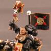
march10k Posted October 1, 2013 Share Posted October 1, 2013 So after a lengthy hiatus from painting due to a packed schedule of business trips, I spent the last week painting my first mini in a while...man, am I rusty! Here it is, my first painted deathwing knight: now I just need four more, plus a tactical terminator squad and a new (to replace the one from 1998 that has been hurting my painting scores) crusader in time for Adepticon...oh, and my basing kit is in storage in the USA, so I'll have to base ten termies, too... Link to comment https://bolterandchainsword.com/topic/281258-my-first-painted-model-sinceapril/ Share on other sites More sharing options...
Tanhausen Posted October 1, 2013 Share Posted October 1, 2013 Good effort! Some parts I like a lot (like the wings in the right leg's sheen) whilst others I think simply need a bit more subtle detail... Examples: - The feathers in the shield, if you give them a soft blueish/violet wash and just pick back up with a light grey...would go a long way. Could use the same "techinque" on the shoulder pad - I'd try and go for some contrast on the shield edge...what about white/light grey base with blue energy crackling lightningbolts? - Some devaln mud, sephia or brown wash to tone down the gold in the spiked mace...which will probably help the red look smoother also. Just constructive critiques obviously...and I hope t helps in some way! Link to comment https://bolterandchainsword.com/topic/281258-my-first-painted-model-sinceapril/#findComment-3481943 Share on other sites More sharing options...
march10k Posted October 1, 2013 Author Share Posted October 1, 2013 Thanks! I am pretty dissatisfied with the lack of contrast in the wings. I will try your suggestion. As for the shield, I like that the edge ties the shield to the armor color, and it doesn't "disappear" into the model when viewed from 2-3' away from above (tabletop) the way that it does in the first photo. I am more concerned with the lack of contrast between the gunmetal and the edge, though. I think I will darken that up a bit. And I might use your crackling lightning idea (purple and white instead of blue, since there is already blue on the shield?) on the silver parts above and below the angel, instead. I agree about the gold needing to be toned down. I'm extremely disappointed in the metallic paints in Citadel's current line. Although the line overall is an improvement, the metallics were fine before, and are horrible now. I've ordered alternates from several companies (the silver in this picture is actually the first sample to arrive) to try. Someone must have decent metallic paints! I'll try the sepia wash on this one. Link to comment https://bolterandchainsword.com/topic/281258-my-first-painted-model-sinceapril/#findComment-3481961 Share on other sites More sharing options...
Dragon Claw Posted October 1, 2013 Share Posted October 1, 2013 If you haven't tried them yet the vallejo metallics are fantastic, especially the old gold and natural steel, definitely recommend them. Link to comment https://bolterandchainsword.com/topic/281258-my-first-painted-model-sinceapril/#findComment-3482011 Share on other sites More sharing options...
Tanhausen Posted October 1, 2013 Share Posted October 1, 2013 Vallejo Model Air...shiniest silver you'll ever get! Honest, its a great effort and we all know it takes a couple of models to get back into shape! Keep pushing! Don't give up! Nevah surrendaaaah! (in goes the Maiden...bonus point for whomever gets the connection) Link to comment https://bolterandchainsword.com/topic/281258-my-first-painted-model-sinceapril/#findComment-3482068 Share on other sites More sharing options...
Recommended Posts
Archived
This topic is now archived and is closed to further replies.