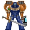
Rhaine Posted March 9, 2014 Share Posted March 9, 2014 Hello everyone, I'm a new poster, longtime lurker of the forums. I've finally worked up the gumption to post here and get some C&C for a Space Marine Chapter. It's a theme that's been used before (spear wielders), but with what is hopefully a new twist (NOT Spartans in Space). Unfortunately, aside from going with a mechanized cavalry idea ("Everyone into the Stormravens!"), as well as it being a crusading chapter, I don't have much else formed at the moment. I plan to use a combination of GK and BA sprues to build the models, and this is going to primarily be for a beer and pretzels group at my FLGS, which generally plays loose with the Force Org chart. For now, I'm just looking for C&C on the paint scheme: As for the Chapter Icon, I was thinking of painting a spear underneath the standard BA blood drop. Actual colours would be (Bases) Jokaero Orange, Kantor Blue, Caliban Green (Eyes), Leadbelcher, and Balthasar Gold. Thank you all in advance! Link to comment https://bolterandchainsword.com/topic/287820-spears-of-sanguinius-wip/ Share on other sites More sharing options...
Beta galactosidase Posted March 9, 2014 Share Posted March 9, 2014 That's neat. I really like top-heavy schemes like that one or the flesh tearers', since they reflect the models more than most. I don't get what you mean by armored cavalry and storm ravens, since that usually means tank units. Yeah spears are nice. There are lots of ways to go with them. The thing with the insignia is that a spear is really just a line, so you should either have it bisecting the blood drop or use only the spear tip. Link to comment https://bolterandchainsword.com/topic/287820-spears-of-sanguinius-wip/#findComment-3615783 Share on other sites More sharing options...
TDF Posted March 10, 2014 Share Posted March 10, 2014 I like the idea of Space Marines jumping out of Stormravens and stabbing people in the face with spears. Maybe I need help... Link to comment https://bolterandchainsword.com/topic/287820-spears-of-sanguinius-wip/#findComment-3616277 Share on other sites More sharing options...
Rhaine Posted March 10, 2014 Author Share Posted March 10, 2014 That's neat. I really like top-heavy schemes like that one or the flesh tearers', since they reflect the models more than most. I don't get what you mean by armored cavalry and storm ravens, since that usually means tank units. Yeah spears are nice. There are lots of ways to go with them. The thing with the insignia is that a spear is really just a line, so you should either have it bisecting the blood drop or use only the spear tip. Hmm... Ah! I meant Air Assault/Air Cavalry, not Mechanized. Sorry about that. The whole army would be deploying from Stormravens (which I would have models for) or overflying Thunderhawks (represented by models deep striking). The insignia is going to be a little problematic... What about a spear with a stylized tip (to emphasize that it's a spear) contained within the blood drop? The spear could be different colours to annotate assigned company. --- Thanks for the compliment, TDF! I wouldn't say you need help, unless that would mean that we BOTH need help! Link to comment https://bolterandchainsword.com/topic/287820-spears-of-sanguinius-wip/#findComment-3616856 Share on other sites More sharing options...
Plague Angel Posted March 20, 2014 Share Posted March 20, 2014 The world needs more BA successors in non-red colors. Link to comment https://bolterandchainsword.com/topic/287820-spears-of-sanguinius-wip/#findComment-3627293 Share on other sites More sharing options...
JeffTibbetts Posted March 20, 2014 Share Posted March 20, 2014 For the logo, what about the tip of a spear with the blood drop dripping from it? Not overlaid, but have the spear tip diagonal or horizontal? BA have used similar iconography on old-school banners. Maybe take a queue from that? As for the colors, I can't say I'm in love with just how in your face the blue and orange are, but maybe if they're more muted? It's hard to say without seeing some paint. It's def different, and that's a good thing. Link to comment https://bolterandchainsword.com/topic/287820-spears-of-sanguinius-wip/#findComment-3628075 Share on other sites More sharing options...
Sergeant Lowe Posted March 21, 2014 Share Posted March 21, 2014 it seems that JeffTibbetts has beaten me to the suggestion for the chapter icon. Link to comment https://bolterandchainsword.com/topic/287820-spears-of-sanguinius-wip/#findComment-3628818 Share on other sites More sharing options...
Rhaine Posted March 21, 2014 Author Share Posted March 21, 2014 For the logo, what about the tip of a spear with the blood drop dripping from it? Not overlaid, but have the spear tip diagonal or horizontal? BA have used similar iconography on old-school banners. Maybe take a queue from that? As for the colors, I can't say I'm in love with just how in your face the blue and orange are, but maybe if they're more muted? It's hard to say without seeing some paint. It's def different, and that's a good thing. I'm working on the first model now, so I should have a test model done, along with a horrible picture, by Sunday afternoon. I'll have to see about putting together a mock-up of your idea for the Chapter Icon. Link to comment https://bolterandchainsword.com/topic/287820-spears-of-sanguinius-wip/#findComment-3629505 Share on other sites More sharing options...
Rhaine Posted March 23, 2014 Author Share Posted March 23, 2014 Okay! First, apologies for the double post. Here is the first model, an Assault Marine from the Second Company, minus his jump pack (can't decide if it should be orange or blue). I also didn't use a shoulder pad that would have any BA iconography on it, nor did I attempt to paint on a Chapter Icon yet. Still fiddling with Jeff's idea. Here is the face on pic,which hopefully gives the overall look. This was done with an iPhone for the camera, with a white USPS box background, so be gentle. http://i772.photobucket.com/albums/yy2/rhainekovakal/Spears%20of%20Sanguinius/911e9172-7871-4eaf-9756-28bb9b6f194e.jpg Here's the left arm, which gives a good idea of how the orange looks. It was Jokaero Orange, wash with carroburg since i didn't realize I was missing the orange wash, layer over with Trollslayer. http://i772.photobucket.com/albums/yy2/rhainekovakal/Spears%20of%20Sanguinius/7bec0d68-f419-479f-9915-460d507ef294.jpg Finally, the right arm, which is to showcase my first attempt at kitbashing a "chain-spear". It looks okay to me, and was done with a normal chain-sword arm, with the lower haft of the GK staff attached. Might actually be on straight, too. http://i772.photobucket.com/albums/yy2/rhainekovakal/Spears%20of%20Sanguinius/d84fbb0d-fcaf-4e1e-a715-e4b2d8b76361.jpg C&C welcome! EDIT: Moved the pics around on my photobucket, needed to update links. Link to comment https://bolterandchainsword.com/topic/287820-spears-of-sanguinius-wip/#findComment-3631095 Share on other sites More sharing options...
JeffTibbetts Posted March 24, 2014 Share Posted March 24, 2014 Okay, that color works much better on the model. I'd like to see the backpack on as it will bridge the arms around behind the back of the head. Might look pretty cool. Keep it up! Link to comment https://bolterandchainsword.com/topic/287820-spears-of-sanguinius-wip/#findComment-3631691 Share on other sites More sharing options...
Reyner Posted April 10, 2014 Share Posted April 10, 2014 Go for an orange backpack. Link to comment https://bolterandchainsword.com/topic/287820-spears-of-sanguinius-wip/#findComment-3648420 Share on other sites More sharing options...
Rhaine Posted April 14, 2014 Author Share Posted April 14, 2014 Hello all. I just recently got orders to a new station, so I've been away, and will continue to be away until July, which is about the time I will get all of my household goods. So this project is sadly going to be on hold until then. More to follow once I'm settled back down. Link to comment https://bolterandchainsword.com/topic/287820-spears-of-sanguinius-wip/#findComment-3651899 Share on other sites More sharing options...
Rhaine Posted July 20, 2014 Author Share Posted July 20, 2014 I know this is a double post, but I brought pics, so it's okay, right? http://i772.photobucket.com/albums/yy2/rhainekovakal/Spears%20of%20Sanguinius/photo1.jpg The front view, to showcase the orange wrapping around the head and hopefully, bringing it all together and not being too much. http://i772.photobucket.com/albums/yy2/rhainekovakal/Spears%20of%20Sanguinius/photo2.jpg The rear view, to provide another look at the 'detail'. I also tried to do some OSL with the exhausts, but since this is the test model, i used two different glazes at the end, and now the right exhaust looks awful, whereas the left only looks bad. Here's the tutorial I used, at least, to show what it SHOULD look like: OSL Jump Pack Link to comment https://bolterandchainsword.com/topic/287820-spears-of-sanguinius-wip/#findComment-3750581 Share on other sites More sharing options...
Lord-Captain Cepinari Posted July 25, 2014 Share Posted July 25, 2014 While I'm all for creative paint schemes, I'm having a hard time seeing how this particular paint job ties into the Chapter Theme. By creating a Blood Angels Successor Chapter, you are implicitly stating that at it's core your Chapter is about angsty berserker vampires. Traditionally, this has been shown through elegance, refined behavior, and an obsessive compulsion to cover everything in blood and angel motifs. The most notable deviance from this norm are the Flesh Tearers, who's schtick is that they've abandoned their angelicness in exchange for being non-angsty berserker vampires. Hence their color scheme of dried blood. You want to get away from the cliche of Sanguinius' kids always painting their stuff blood red. I get that. However, blue and orange doesn't seem to work. Rather than complementing the theme, it seems to clash with it. The traditional Blood Angel color replacements have always been black, white and gold. If you want your Chapter to, thematically speaking, be Sanguinius' outstretched hand striking at Mankind's distant foes, maybe you ought to look into something less chromatically 'heavy'. That shade of blue is very lovely, but it seems very solid. I'd recommend something much lighter as the basic color, with a few darker colors here and there as accents. Perhaps, as a starting point, I could suggest the thought-exercise: White Scars with Blood Angels iconography. Link to comment https://bolterandchainsword.com/topic/287820-spears-of-sanguinius-wip/#findComment-3755853 Share on other sites More sharing options...
oldschoolsavant Posted July 25, 2014 Share Posted July 25, 2014 Irn-Bru Marines ! Made from girders. /awaits Tunnocks Teacake chapter Joking aside, it's a nice scheme, but I'll echo the comments about turning to a WS successor. An air cav divergent force with chainglaives would benefit from ponytails and moustaches no end. Link to comment https://bolterandchainsword.com/topic/287820-spears-of-sanguinius-wip/#findComment-3755894 Share on other sites More sharing options...
JeffTibbetts Posted July 25, 2014 Share Posted July 25, 2014 I don't really have a huge problem with the color scheme on a BA successor, but I def see where they're coming from. Do you like BA because of fluff, codex preference and style of play, or both? If you're not playing their dex, may be easiest to switch to someone else. Anyway, in terms of the look, I think the jetpack proves the point that the orange shoulders, rounding out the back, looks pretty dope. I think it's fresh and it'd be a shame to change it. Link to comment https://bolterandchainsword.com/topic/287820-spears-of-sanguinius-wip/#findComment-3755993 Share on other sites More sharing options...
Rhaine Posted August 2, 2014 Author Share Posted August 2, 2014 Alright, I'm finally back from my hectic vacation week. It was supposed to be nice and relaxed, where I would've had plenty of time to respond to you guys, paint some models, and get some work done around the house. My wife had other plans, and we barely spent anytime at home, except for the sleeping. At any rate, I'll respond to each post individually, which hopefully addresses everything nicely. A small note about this WIP, I started this while 6th Ed was still a thing (or maybe it was 5th?), which was one of the main reasons I went with C:BA. I don't have the newest C:SM, so I'm not sure if what I say below will work or not. Anyway, on to the responses! I don't really have a huge problem with the color scheme on a BA successor, but I def see where they're coming from. Do you like BA because of fluff, codex preference and style of play, or both? If you're not playing their dex, may be easiest to switch to someone else. Anyway, in terms of the look, I think the jetpack proves the point that the orange shoulders, rounding out the back, looks pretty dope. I think it's fresh and it'd be a shame to change it. I was going with BA in order to take Assault Squads as Troops. Obviously, with Unbound Lists, I could easily just use C:SM and make what I want for an army. At this point, I still would want to use C:BA mainly for the options the Assault Marines get, hand flamers, inferno guns, etc. If C:SM allows those same options, then I don't see why I couldn't move away from C:BA. I completely agree about the jetpack wrapping the whole model together! Thanks for the idea! Irn-Bru Marines ! Made from girders. /awaits Tunnocks Teacake chapter Joking aside, it's a nice scheme, but I'll echo the comments about turning to a WS successor. An air cav divergent force with chainglaives would benefit from ponytails and moustaches no end. As much as I would normally agree with you, this is actually my second army, with my first being Space Wolves. No offense to the Khan, but I'm sick of ponytails and mustaches. Other than that, though, you're right. The White Scars as a primogenitor would make more sense. As I mentioned above, I've kind of been away for a while and a lot lately. Has the Stormraven been added to all of the Astartes Lists? If so, then adjusting their fluff wouldn't be as bad. I'll have to research the WS a little more, though (oh noes!). While I'm all for creative paint schemes, I'm having a hard time seeing how this particular paint job ties into the Chapter Theme. By creating a Blood Angels Successor Chapter, you are implicitly stating that at it's core your Chapter is about angsty berserker vampires. Traditionally, this has been shown through elegance, refined behavior, and an obsessive compulsion to cover everything in blood and angel motifs. The most notable deviance from this norm are the Flesh Tearers, who's schtick is that they've abandoned their angelicness in exchange for being non-angsty berserker vampires. Hence their color scheme of dried blood. You want to get away from the cliche of Sanguinius' kids always painting their stuff blood red. I get that. However, blue and orange doesn't seem to work. Rather than complementing the theme, it seems to clash with it. The traditional Blood Angel color replacements have always been black, white and gold. If you want your Chapter to, thematically speaking, be Sanguinius' outstretched hand striking at Mankind's distant foes, maybe you ought to look into something less chromatically 'heavy'. That shade of blue is very lovely, but it seems very solid. I'd recommend something much lighter as the basic color, with a few darker colors here and there as accents. Perhaps, as a starting point, I could suggest the thought-exercise: White Scars with Blood Angels iconography. Yes, the main reason for the paint scheme was to get away from all the various red chapters out there. Red is well used, and possibly a bit overused, IMHO. I was going to reference the Lamenters, here, but you did say "traditionally", so I'll leave them be. In regards to blue and orange not working, I'm guessing you mean as a scheme on these guys, rather than strictly as complementary colors. Okay. Next, when you said that the shade of blue was too 'solid', how would you change it? Maybe use this palette: Caledor Sky, Hoeth Blue, Lothern Blue. Different highlight color choices? I know you said lighter as the basic, but how much lighter were you thinking? Something reminiscent of a clear sky, perhaps. Alright, so WS with BA iconography. So WS fluff, BA models, C:SM list? Again, depending on how C:SM has been changed for 6th/7th Ed, that could work. This guy was light on the iconography, since he's going to be the rearguard for the first Assault Squad. The rest of the unit has a little more 'bling' and looks a little more like Blood Angels. ======= Okay, hope I didn't step on toes too badly. This is probably the first time I've had strangers C&C anything of mine, so the drive to defend my choices to my last breath was strong. I did have an idea after I'd finished him that may alleviate or change what you guys think.:1. Glaze the orange areas with Bloodletter. Would tone down the 'in-your-face' aspect of it, but I haven't tried it yet, so I don't have a pic for an example. Link to comment https://bolterandchainsword.com/topic/287820-spears-of-sanguinius-wip/#findComment-3764017 Share on other sites More sharing options...
deathspectersgt7 Posted August 2, 2014 Share Posted August 2, 2014 Like the Scheme KEEP IT !!! waiting for more. Link to comment https://bolterandchainsword.com/topic/287820-spears-of-sanguinius-wip/#findComment-3764148 Share on other sites More sharing options...
Lord Janos Posted August 3, 2014 Share Posted August 3, 2014 Whilst its true that the more traditional blood angels successors have gone for replacement colours along the lines of black, a deeper shade of red, gold, MORE RED, and white, there really isn't any reason that these stereotypes have to be conformed to. Fluffwise at least you could come up with any number of reasons as to why they have such a radically different colour scheme, maybe they want to distance themselves from their parent chapter because they blame them for the black rage/red thirst? Obviously if you feel changing them to a White Scars Successor "fits" better, rock on. But the only main difference is that White Scars are more hit and run and Blood Angels are more assault troops. Either way lots and lots of flyers/assault marines. In any case love the colour scheme and keep up the good work! Link to comment https://bolterandchainsword.com/topic/287820-spears-of-sanguinius-wip/#findComment-3764434 Share on other sites More sharing options...
Rhaine Posted August 23, 2014 Author Share Posted August 23, 2014 Well, I've finally gotten time to make more progress on this WIP (stupid Space Wolves with their new codex and whatnot!) I haven't painted anything new, since I was hoping for responses to my last post, but I DID finish clipping out models for the rest of this guy's squad. http://i772.photobucket.com/albums/yy2/rhainekovakal/Spears%20of%20Sanguinius/eb96e100-552c-4ded-b3b1-c8636ddc9047.jpg This first one has a few more 'bling' pieces to it, in order to tie in more closely to the BA. He's also the bearer of the unit's hand flamer. http://i772.photobucket.com/albums/yy2/rhainekovakal/Spears%20of%20Sanguinius/photo3.jpg Another generic ASM. The chain-spear at the bottom has only had the pin placed, it hasn't yet been glued or GS'd yet. http://i772.photobucket.com/albums/yy2/rhainekovakal/Spears%20of%20Sanguinius/photo4.jpg This model is a tad ambitious, as I still wanted him to have the chain-spear, but I didn't have enough random bitz to just fashion a haft onto the sword. So he's going to dual-wield pistols, and the spear will be mag-locked to him (somehow). That single piece of paperclip is, in theory, going to go through the middle piece and connect to the two ends. http://i772.photobucket.com/albums/yy2/rhainekovakal/Spears%20of%20Sanguinius/photo2-1.jpg The sergeant of the unit, and what is probably the most ambitious kit-bash I've ever attempted. The smaller piece of paperclip will be for the arms/weapon, and the longer one will go into his greave to post him on his base, which will only have the daemon head glued onto it. Haven't done any drilling yet, but it looks like it will work. I may have to go hunt down some terrain to have it slot into, rather than just the base. Lastly, I don't know yet if that monstrous thing is going to be just a power weapon, or go full on and call it a counts-as Thunder Hammer. Thoughts? I'm going to finish cleaning these guys up, and start drilling on the easier pair before trying those last two. Link to comment https://bolterandchainsword.com/topic/287820-spears-of-sanguinius-wip/#findComment-3787047 Share on other sites More sharing options...
Recommended Posts
Archived
This topic is now archived and is closed to further replies.