Doctor Perils Posted September 25, 2015 Share Posted September 25, 2015 Ohhh, I like that symbol, maybe have it drawn that its like carved into the shield? I'll be honest, I'm not sure how an artist can show the difference between a painting and an engraving on a picture with the shield angled like that. Still, engraving seems to be the way to go when it comes to Primarch armor. You'd have different shading. Link to comment https://bolterandchainsword.com/topic/309261-the-warriors-of-the-renegade-legion-and-their-allies/page/2/#findComment-4181013 Share on other sites More sharing options...
simison Posted October 1, 2015 Author Share Posted October 1, 2015 Last sketch before we move onto coloring! Link to comment https://bolterandchainsword.com/topic/309261-the-warriors-of-the-renegade-legion-and-their-allies/page/2/#findComment-4185571 Share on other sites More sharing options...
AlphariusOmegon108 Posted October 1, 2015 Share Posted October 1, 2015 Wow! He is a rather good looking man he looks badass! Link to comment https://bolterandchainsword.com/topic/309261-the-warriors-of-the-renegade-legion-and-their-allies/page/2/#findComment-4185572 Share on other sites More sharing options...
Chandrian Posted October 1, 2015 Share Posted October 1, 2015 Simison that looks amazing!!! Link to comment https://bolterandchainsword.com/topic/309261-the-warriors-of-the-renegade-legion-and-their-allies/page/2/#findComment-4185583 Share on other sites More sharing options...
MikhalLeNoir Posted October 1, 2015 Share Posted October 1, 2015 *sigh* wish I could afford those too. Really cool. Thanks to the goatee his smile doesn't take the majority of his face anymore and therefore the wish to smash this smile on his face had faded ;) Link to comment https://bolterandchainsword.com/topic/309261-the-warriors-of-the-renegade-legion-and-their-allies/page/2/#findComment-4185622 Share on other sites More sharing options...
simison Posted October 1, 2015 Author Share Posted October 1, 2015 I'm actually surprised how well the beard came out. Link to comment https://bolterandchainsword.com/topic/309261-the-warriors-of-the-renegade-legion-and-their-allies/page/2/#findComment-4185667 Share on other sites More sharing options...
Sigismund229 Posted October 3, 2015 Share Posted October 3, 2015 For some reason Alex reminds me of Tony Stark with that beard... Aside from that the sketch looks brilliant Link to comment https://bolterandchainsword.com/topic/309261-the-warriors-of-the-renegade-legion-and-their-allies/page/2/#findComment-4187360 Share on other sites More sharing options...
MikhalLeNoir Posted October 3, 2015 Share Posted October 3, 2015 Lol, now that you mention it ;) Now we really could forge avengers For some reason Alex reminds me of Tony Stark with that beard... Aside from that the sketch looks brilliant Link to comment https://bolterandchainsword.com/topic/309261-the-warriors-of-the-renegade-legion-and-their-allies/page/2/#findComment-4187390 Share on other sites More sharing options...
simison Posted October 4, 2015 Author Share Posted October 4, 2015 For some reason Alex reminds me of Tony Stark with that beard... Aside from that the sketch looks brilliant HA! I was wondering if anyone would catch it. That is the Tony Stark beard. My wife is a huge fan, and it does look cool, so I went with it. Link to comment https://bolterandchainsword.com/topic/309261-the-warriors-of-the-renegade-legion-and-their-allies/page/2/#findComment-4187627 Share on other sites More sharing options...
Sigismund229 Posted October 4, 2015 Share Posted October 4, 2015 Well, as my brother says, there's no man who can't be improved with a beard Link to comment https://bolterandchainsword.com/topic/309261-the-warriors-of-the-renegade-legion-and-their-allies/page/2/#findComment-4187836 Share on other sites More sharing options...
simison Posted October 7, 2015 Author Share Posted October 7, 2015 Color coming soon, but here's an inked drawing. I like most of what I'm seeing except the Skulls on the backpack and perhaps too many lightning bolts. Thoughts? Link to comment https://bolterandchainsword.com/topic/309261-the-warriors-of-the-renegade-legion-and-their-allies/page/2/#findComment-4190597 Share on other sites More sharing options...
AlphariusOmegon108 Posted October 7, 2015 Share Posted October 7, 2015 He looks fantastic, the skulls on the backpack are actually a great touch, maybe they couls represent, if you turn your back on the imperium, prepare to die. So they work great.. In my mind at least and thunderbolts? Never enough thunderbolts! Link to comment https://bolterandchainsword.com/topic/309261-the-warriors-of-the-renegade-legion-and-their-allies/page/2/#findComment-4190625 Share on other sites More sharing options...
MikhalLeNoir Posted October 7, 2015 Share Posted October 7, 2015 Hmmmm....the skulls look great but I think they doesn't fit to the character. Would Alex really adorn his armor with symbols of death? Maybe find something other.wings or something like that. The bolts are good. Not too much and not to few. The right balance before it is overloaded. Not tony stark was your base...this guy was it :)http://cdn2-www.wrestlezone.com/assets/uploads/2009/11/file_187255_4_milliondollarman_o.jpg Link to comment https://bolterandchainsword.com/topic/309261-the-warriors-of-the-renegade-legion-and-their-allies/page/2/#findComment-4190647 Share on other sites More sharing options...
simison Posted October 7, 2015 Author Share Posted October 7, 2015 They do look good, but as Mikhal pointed out, the skulls really don't fit the character. And who the heck is that fat guy? Link to comment https://bolterandchainsword.com/topic/309261-the-warriors-of-the-renegade-legion-and-their-allies/page/2/#findComment-4190721 Share on other sites More sharing options...
MikhalLeNoir Posted October 7, 2015 Share Posted October 7, 2015 The Milliondollar man. Famed wrestler when the sport was more than the show ;) Link to comment https://bolterandchainsword.com/topic/309261-the-warriors-of-the-renegade-legion-and-their-allies/page/2/#findComment-4190776 Share on other sites More sharing options...
simison Posted October 13, 2015 Author Share Posted October 13, 2015 Behold! Color! As of right now, I prefer the second one. But this whole process has made me realize just how much I screwed myself over as far as the Legion Symbol is concerned. Now, originally, the Legion Crest was supposed to be the three rings interlocked on a shield of some sort. I've found a different artist who was working with me on this. It's when I saw an early draft that I realized my mistake... I was putting a purple shield right on purple armor. Furthermore, having a tiny shield on each Warden's pauldron seems a little silly to me. I don't know, maybe I'm overreacting. Either way, I'm not sure what to do. Link to comment https://bolterandchainsword.com/topic/309261-the-warriors-of-the-renegade-legion-and-their-allies/page/2/#findComment-4196106 Share on other sites More sharing options...
Athrawes Posted October 13, 2015 Share Posted October 13, 2015 I think you shouldn't be afraid to change things that don't work. There are always ideas which seem great in concept but can't be easily made practicable. If you need to change your legion crest, I'd say go for it. Originally, the Lightning Bearers symbol was a blue shield bisected by a lightning bolt, but I changed that half way through the project. Look on the bright side, at least you didn't have to resculpt a legion symbol on 50 shoulder pads. My suggestion would be to tone down the number of colors involved, look at the other legion symbols, they are relatively simplistic by comparison to yours, the only ones which really stand out detail wise, would be the word bearers and Alpha Legion, but even then, most Legions limit their Basic heraldry to 1 or 2 dominant colors. I think you should rethink the colors of it, and maybe the complexity. For example, make it a contrasting colored shield (to the purple armor) with three rings inside all of the same color. or Maybe drop the shield entirely and make it three different colored rings. Link to comment https://bolterandchainsword.com/topic/309261-the-warriors-of-the-renegade-legion-and-their-allies/page/2/#findComment-4196124 Share on other sites More sharing options...
simison Posted October 13, 2015 Author Share Posted October 13, 2015 Originally, the Lightning Bearers symbol was a blue shield bisected by a lightning bolt, but I changed that half way through the project. Look on the bright side, at least you didn't have to resculpt a legion symbol on 50 shoulder pads. For example, make it a contrasting colored shield (to the purple armor) with three rings inside all of the same color. or Maybe drop the shield entirely and make it three different colored rings. Yikes, that's a lot of shoulder pads. But yeah, I'm leaning toward just doing away with the shield entirely and having three different colored rings. Link to comment https://bolterandchainsword.com/topic/309261-the-warriors-of-the-renegade-legion-and-their-allies/page/2/#findComment-4196154 Share on other sites More sharing options...
Demus Ragnok Posted October 13, 2015 Share Posted October 13, 2015 My random thoughts... I had always pictured Alex in bronze/brass colored armor with purple shoulder plates. His facial expression in the sketch...he looks...smug. I don't know maybe he is chuckling at his own internal monologue. Link to comment https://bolterandchainsword.com/topic/309261-the-warriors-of-the-renegade-legion-and-their-allies/page/2/#findComment-4196244 Share on other sites More sharing options...
MikhalLeNoir Posted October 13, 2015 Share Posted October 13, 2015 Hmm.maybe change the facial hair a bit? Lighten it up? The contrast is very hard. On the color question: i lome the second better. But demus vision of the brass with purple i like too. About the legion symbol: make it easy. If you ever habe to paint those complicated symbol. Then you will hate it;) of course you alwys could make custom decals at fallouthobbies. If they deliver ... Link to comment https://bolterandchainsword.com/topic/309261-the-warriors-of-the-renegade-legion-and-their-allies/page/2/#findComment-4196253 Share on other sites More sharing options...
simison Posted October 13, 2015 Author Share Posted October 13, 2015 My random thoughts... I had always pictured Alex in bronze/brass colored armor with purple shoulder plates. His facial expression in the sketch...he looks...smug. I don't know maybe he is chuckling at his own internal monologue. Hmm, interesting thoughts on the color. It's supposed to be a confident/easy-going grin. Link to comment https://bolterandchainsword.com/topic/309261-the-warriors-of-the-renegade-legion-and-their-allies/page/2/#findComment-4196299 Share on other sites More sharing options...
simison Posted October 16, 2015 Author Share Posted October 16, 2015 I have decided to get rid of the shield as far as the emblem is concerned. After reviewing the other legions, I've discovered that there are two emblems per legion. There's essentially a battle emblem and a dress emblem, like how a soldier has a battle uniform and a dress uniform. I had forgotten that the Wardens' pauldrons are red in color. Which I just realized is a kind of reversal of the World Eaters' color scheme. Who so happens to be the 12th legion compared to the 2nd legion of the Wardens. (Illuminati confirmed!) Anyway, with that in mind, I think Grifft's portrayal of the emblem in the FW pages would be the battle style: three black rings interlocked. The dress emblem is a little harder to decide on. I want more colors, but which ones? What should the background color be? Purple or red? More thoughts are required... Link to comment https://bolterandchainsword.com/topic/309261-the-warriors-of-the-renegade-legion-and-their-allies/page/2/#findComment-4198955 Share on other sites More sharing options...
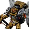
simison Posted October 20, 2015 Author Share Posted October 20, 2015 Next one up. Now, this is the original hair color I had imagined when creating Alex, but now I'm not so sure. I was aiming for originality, and there seems to be a soft connection between red hair and the Warp, kinda like in the old days red hair was connected to evil magic. If nothing else, I think I'm certain I want the dress emblem to be a purple ring on bottom, white on right, while black on left. I picked gold this time to represent the Imperium, but it doesn't work here, and I prefer the duality of the black-white rings, while the purple is more representative of the Wardens as opposed to the red. How does the bronze look chest piece work? Link to comment https://bolterandchainsword.com/topic/309261-the-warriors-of-the-renegade-legion-and-their-allies/page/2/#findComment-4202294 Share on other sites More sharing options...
Demus Ragnok Posted October 20, 2015 Share Posted October 20, 2015 I like it. And I can concur with red heads being bad magic. I have a red headed younger brother. Now. I gotta build that guy a suit of terminator plate. Link to comment https://bolterandchainsword.com/topic/309261-the-warriors-of-the-renegade-legion-and-their-allies/page/2/#findComment-4202304 Share on other sites More sharing options...
simison Posted October 20, 2015 Author Share Posted October 20, 2015 I like it. And I can concur with red heads being bad magic. I have a red headed younger brother. Now. I gotta build that guy a suit of terminator plate. I have faith in your abilities. Although, did we ever establish the rules for it? Link to comment https://bolterandchainsword.com/topic/309261-the-warriors-of-the-renegade-legion-and-their-allies/page/2/#findComment-4202305 Share on other sites More sharing options...
Recommended Posts
Archived
This topic is now archived and is closed to further replies.