jbaeza94 Posted July 19, 2016 Share Posted July 19, 2016 so after seeing brother arkleys blades get their new pads, i thought, wow, i need some too! ha, but first i need a badge! the lions have been a thought in my head for a long time now, and after seeing you guys help mehman, i thought you guys could help me too. so a bit about the lions. they're dark angels successors (duh) they have a close tie to a forge world, that dates to prior to the great crusade (well the home planet does), they have mechanicus influence in their personality traits i would like the badge to show their tie to the mechanicum, but also have something of a lion (get it? iron lions?) i had a few ideas, here is what i came up with on MS paint the cog is pretty mechanicus and not too crazy. top left and bottom center took the simple rout. i played with the mechanicum symbol a bit , removing the human element, and adding a lion head on to the top right, and adding a lion skull on the bottom left. finally i took the dark angel sword and placed a lion image in the front. i surrounded the whole thing by a cog. inputs, ideas, and even your own images are welcome. Link to comment https://bolterandchainsword.com/topic/324031-help-designing-a-chapter-emblem/ Share on other sites More sharing options...
Chaplain Lucifer Posted July 19, 2016 Share Posted July 19, 2016 I like the middle bottom one and the bottom right one. :) Link to comment https://bolterandchainsword.com/topic/324031-help-designing-a-chapter-emblem/#findComment-4445890 Share on other sites More sharing options...
DavianCool Posted July 19, 2016 Share Posted July 19, 2016 You could go for a manticore/sword sort of thing. 'Cause dark angels are all about wings, swords and lions... I don't know. I'm just a poor ignorant Blood Ravens player. Link to comment https://bolterandchainsword.com/topic/324031-help-designing-a-chapter-emblem/#findComment-4445893 Share on other sites More sharing options...
Quixus Posted July 19, 2016 Share Posted July 19, 2016 I like the middle bottom one and the bottom right one. Me too. Do the three lion heads have a significance? If not ,maybe combine the cog, the single lion head and the sword. it wouldn't look as overloaded. Additionally, you wouldn't be able to see if the sword is broken ;) That way you have nothing that is unique to the DA making "codex hopping" easier. The half-head symbols look silly to me. Link to comment https://bolterandchainsword.com/topic/324031-help-designing-a-chapter-emblem/#findComment-4445902 Share on other sites More sharing options...
jbaeza94 Posted July 19, 2016 Author Share Posted July 19, 2016 You could go for a manticore/sword sort of thing. 'Cause dark angels are all about wings, swords and lions... I don't know. I'm just a poor ignorant Blood Ravens player.Don't steal any of our relics! Haha.But I do like the idea of the manticore. I've never heard of it until now and a winged lion with a scorpion tail is just awesome! I'll look for some stock images and see if they have any that might work and show you guys what I come up with. I like the middle bottom one and the bottom right one. Me too. Do the three lion heads have a significance? If not ,maybe combine the cog, the single lion head and the sword. it wouldn't look as overloaded. Additionally, you wouldn't be able to see if the sword is broken ;) That way you have nothing that is unique to the DA making "codex hopping" easier. The half-head symbols look silly to me. It would be very da, you know, the whole hiding stuff and what not... ;) I'll try to add the sword to the bottom middle image and see what we all think. The 3 headed lion is of no significance. Just some stock images I found. Link to comment https://bolterandchainsword.com/topic/324031-help-designing-a-chapter-emblem/#findComment-4445908 Share on other sites More sharing options...
DavianCool Posted July 19, 2016 Share Posted July 19, 2016 You could go for a manticore/sword sort of thing. 'Cause dark angels are all about wings, swords and lions... I don't know. I'm just a poor ignorant Blood Ravens player.Don't steal any of our relics! Haha.But I do like the idea of the manticore. I've never heard of it until now and a winged lion with a scorpion tail is just awesome! I'll look for some stock images and see if they have any that might work and show you guys what I come up with. No problem, glad you like the idea. But what relics... what do you mean you can't find the Final Absolution of Caliban. What do you mean it's missing? Link to comment https://bolterandchainsword.com/topic/324031-help-designing-a-chapter-emblem/#findComment-4445930 Share on other sites More sharing options...
Major_Gilbear Posted July 19, 2016 Share Posted July 19, 2016 I would personally leave the Mechanicus cog out of the symbol - it makes the design far too busy, especially as such a small size (i.e., for a shoulder pad). Ideally you want a design that can be made in just two colours and that you can see clearly enough from about two feet away (i.e., arm's length). Instead, the Mechanicus influence can be added to the shoulder pad trim or other similar areas. That way you show the ties to the AdMech, but the logo is kept more simplified and is more visible as a result. For banners, you can trim them in the crenellated style of the AdMech, and on the larger lion motifs perhaps add a bionic eye to the lion? Link to comment https://bolterandchainsword.com/topic/324031-help-designing-a-chapter-emblem/#findComment-4445970 Share on other sites More sharing options...
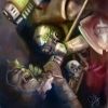
SnakeChisler Posted July 19, 2016 Share Posted July 19, 2016 I found this online searched for lion skull Thought it might get the creative juices going Link to comment https://bolterandchainsword.com/topic/324031-help-designing-a-chapter-emblem/#findComment-4445986 Share on other sites More sharing options...
Quixus Posted July 19, 2016 Share Posted July 19, 2016 I would personally leave the Mechanicus cog out of the symbol - it makes the design far too busy, especially as such a small size (i.e., for a shoulder pad). Ideally you want a design that can be made in just two colours and that you can see clearly enough from about two feet away (i.e., arm's length). Instead, the Mechanicus influence can be added to the shoulder pad trim or other similar areas. That way you show the ties to the AdMech, but the logo is kept more simplified and is more visible as a result. For banners, you can trim them in the crenellated style of the AdMech, and on the larger lion motifs perhaps add a bionic eye to the lion? your idea made me think about these and those shoulder pads. Link to comment https://bolterandchainsword.com/topic/324031-help-designing-a-chapter-emblem/#findComment-4446018 Share on other sites More sharing options...
DavianCool Posted July 19, 2016 Share Posted July 19, 2016 You have me really interested. What colour scheme are you going for. Link to comment https://bolterandchainsword.com/topic/324031-help-designing-a-chapter-emblem/#findComment-4446023 Share on other sites More sharing options...
Major_Gilbear Posted July 19, 2016 Share Posted July 19, 2016 I would personally leave the Mechanicus cog out of the symbol - it makes the design far too busy, especially as such a small size (i.e., for a shoulder pad). Ideally you want a design that can be made in just two colours and that you can see clearly enough from about two feet away (i.e., arm's length). Instead, the Mechanicus influence can be added to the shoulder pad trim or other similar areas. That way you show the ties to the AdMech, but the logo is kept more simplified and is more visible as a result. For banners, you can trim them in the crenellated style of the AdMech, and on the larger lion motifs perhaps add a bionic eye to the lion? your idea made me think about these and those shoulder pads. Sure, although the design can just be painted into/onto the trim as well - perhaps saving the moulded ones for character or more elite units. Additionally the trim can be just along the top, or along the bottom - doesn't need to be all-round. :) Something like this maybe, which could be shaved and have a suitable chapter badge added instead? There's lots of these knocking about, and they'd be good for characters. Link to comment https://bolterandchainsword.com/topic/324031-help-designing-a-chapter-emblem/#findComment-4446054 Share on other sites More sharing options...
Guest Posted July 19, 2016 Share Posted July 19, 2016 Thanks for the shout... I like the bottom middle myself. https://www.shapeways.com/shops/popbits?sort=newest§ion=--+Mech+Hand+Legion&s=0 These are for Iron Hands but it might give you an idea of what they will look like. I have to admit a soft spot for Iron Manticores (But I did create that one for my Blades to take over) But if you like it I will rewrite my Chapters origins :) If you did go Manticore, you could have the badge like the banner for the Red Scorpions, but a lion head into a scorp tail with a cog behind. Link to comment https://bolterandchainsword.com/topic/324031-help-designing-a-chapter-emblem/#findComment-4446062 Share on other sites More sharing options...
Dark Rage Posted July 19, 2016 Share Posted July 19, 2016 I was also thinking mechanical shoulder trims instead of the cog in the logo, as for ideas perhaps a lions head with a bionic eye from a sideways point of view. Link to comment https://bolterandchainsword.com/topic/324031-help-designing-a-chapter-emblem/#findComment-4446086 Share on other sites More sharing options...
jbaeza94 Posted July 19, 2016 Author Share Posted July 19, 2016 Major_Gilbear: when I read your comment I instantly thought pads techmarine style, kinda like the other guys suggested. Snake_Chisler: that skull reminds me of our da roots, with the feathers and stuff. Nice find! DavianCool: color scheme, the Marines are painted a slightly darker than leadbelcher. Shoulder pads will be either black or red, depending on the cohort (special organization in my chapter, 6 company's including a deat/ravenhwing equivalent in each cohort. 2 cohorts in the Legion) the marine belongs to. Brother_Arkley: funny you mention the Iron Hands. They alongside the Iron Warriors had a bit of influence in my early days of brewing last year when conceived the Iron Lions. As for the manticore red scorpions idea, I think that'll look beautiful! I'll see if I can come up something along those lines :) Dark_Rage: I'll do my best at attempting a mechanical eye Link to comment https://bolterandchainsword.com/topic/324031-help-designing-a-chapter-emblem/#findComment-4446180 Share on other sites More sharing options...
Guest Posted July 19, 2016 Share Posted July 19, 2016 Me personally I would see if the guy could do a Techmarine style pad with the Lion head/Scorp Tail. So the Chapter badge gives you the full attention and the Forgeworld alliance can be seen in the crenellations on the pad like Link to comment https://bolterandchainsword.com/topic/324031-help-designing-a-chapter-emblem/#findComment-4446194 Share on other sites More sharing options...
jbaeza94 Posted July 19, 2016 Author Share Posted July 19, 2016 hey guys, after going back and revising some of the images, i decided to make a pad... opinions? i added the sword to the single head lion, and i think i like it quite a bit. for the pad i decided to add some mechanicum edging like some of you suggested. i also designed a manticore style pad, featuring the lion head and a scorpion tail. it could look better, but my picture editing skills are pretty limited, especially on paint. finally i made just a simple manticore in the pad. thoughts? Link to comment https://bolterandchainsword.com/topic/324031-help-designing-a-chapter-emblem/#findComment-4446347 Share on other sites More sharing options...
Guest Posted July 19, 2016 Share Posted July 19, 2016 Pad wise 2 and 4 for me ;) Link to comment https://bolterandchainsword.com/topic/324031-help-designing-a-chapter-emblem/#findComment-4446349 Share on other sites More sharing options...
Bryan Blaire Posted July 19, 2016 Share Posted July 19, 2016 In this situation, I'm of the opinion that more simplistic = better. It's a shoulder pad, you shouldn't be trying to examine it for a ton of detail, that's what a Chapter Banner is for. I would go with something like a simple lion's head (stylistic, not many lines) and maybe a sword or stinger or something behind it. Anything more than that is probably too much. Link to comment https://bolterandchainsword.com/topic/324031-help-designing-a-chapter-emblem/#findComment-4446522 Share on other sites More sharing options...
DavianCool Posted July 19, 2016 Share Posted July 19, 2016 DavianCool: color scheme, the Marines are painted a slightly darker than leadbelcher. Shoulder pads will be either black or red, depending on the cohort (special organization in my chapter, 6 company's including a deat/ravenhwing equivalent in each cohort. 2 cohorts in the Legion) the marine belongs to. Sounds really cool. Link to comment https://bolterandchainsword.com/topic/324031-help-designing-a-chapter-emblem/#findComment-4446640 Share on other sites More sharing options...
jbaeza94 Posted July 20, 2016 Author Share Posted July 20, 2016 Bryan Blair: of course the pads would be simpler. The designer of the pad would have liberties to make it work. These are just brainstorms. I'm thinking of dropping the cogs from the shoulder pads, since the trim will have the mechanicum trim. The big emblems such as vehicles and banners would have the cog. Brother Arkley: I'm growing fond of pad 2 quite a bit:) DavianCool: thanks brother! Link to comment https://bolterandchainsword.com/topic/324031-help-designing-a-chapter-emblem/#findComment-4446686 Share on other sites More sharing options...
Bryan Blaire Posted July 20, 2016 Share Posted July 20, 2016 I realize it is yours to do with what you want, but considering the Unforgiven Chapters' distrust of the TechMarines and their connection to the Mechanicum, do you have a story reason for why this Successor is more tightly entwined as a whole with the Mechanicum? It seems like a slight deviation that could make for an interesting story point of "using the Mechanicum" or some such if done right. Otherwise it just seems very un-Unforgiven. Maybe the are the Unforgiven's "in" with the Mechanicum, the Chapter that they point to and go "Nah, we like you guys just fine, see, Chapter connected?" or something. They help the Unforgiven watch the Mechanicum and the like. Or perhaps the Iron Lions are looked at askance by the Unforgiven as a whole and not really let in due to the distrust of the Mechanicum connection? Regarding the pad, are you considering a lion head more like the Astral Claws normal icon? That combined with a simple curved scorpion tail would probably look pretty good. You could look at the Lion Warriors, and instead of having a mane, have it be the scorpion tail that curves around the head. Link to comment https://bolterandchainsword.com/topic/324031-help-designing-a-chapter-emblem/#findComment-4446701 Share on other sites More sharing options...
jbaeza94 Posted July 20, 2016 Author Share Posted July 20, 2016 I do have a story. It starts before the great crusade. The home planet is visited by mechanicus lost forgeworld and an alliance was made. Mechanicum culture influenced slightly the the invictumos, such as veneration for the omnissiah. Fast forward to the chapter founding, this part followed the chapter . these havent been toic5hed upon much. Now the story I called the Iron and the lion (the story that inspired the chapter). An explorator fleet from the Allied forgeworld request aid to recover and ancient nuclear power plant for a warhound. The lions had a different reason to help, the renegades were led by a fallen angel. Mechanicum gets their prize as do the lions.but the magos caught a glimpse of what the lions did, capturing the angel.he backed up his memory, prepared it for sending. Kinda blackmail. Mention it to the chapter master. He said he didn't care oe know what the lions were up to, but he knew it had to remain a secret. If he was harmed ,his memory would be sent to other explorator fleets. But he offered an alternative. He pledged his fleet to the lions and their cause. Skitarri are perfect because the can be mind wiped easily and efficiently. However, in return, tech priest being greedy and wanting the best finds for their glory, he asked for all stc's and archaic finds presented to him. After consideration from the master and present captains, they swore to keep this from all other unforgiven. So an alliance with the forgeworld that they inherited from their home world and culture, and alliance from an explorator fleet forged in battle and secrecy. The fleshed out story is floating around somewhere here. I know it's not a perfect, it has a few holes. But I know it can be polished up to be plausible and fit into the duality which is a common theme in the Legion of the Iron Lion. Edit: I never considered how the Iron lions would be looked at by the other unforgiven. I'd say possibly a lack of trust. This could be shown by the version of the truth they are taught. Not all unforgiven know the same amount. Layers within layers. Edit 2: the alliance they inherited has benefited the lions and homeworld alot. They have become a type of arms and technology supplier to invictumos. This explains the wide use of older patterns of vehicles, weapons, and armor of the astartes and pdf. Link to comment https://bolterandchainsword.com/topic/324031-help-designing-a-chapter-emblem/#findComment-4446715 Share on other sites More sharing options...
Major_Gilbear Posted July 20, 2016 Share Posted July 20, 2016 I think Bryan Blaire is right in his comments about the simplicity and clarity of the logo (I said as much earlier as well). Giving it some more thought, I tried a few ideas out for you: http://i407.photobucket.com/albums/pp154/MajorGilbear/Misc/Iron%20Lions%20Logos%201_zpsqwpjohmm.jpg These are obviously just some initial concepts, but I tried to incorporate the lion (central to the Chapter's identity) into all of them. The ones of the right have some more separators, although I suspect that ones on the left will look better when reduced very small. The upper ones incorporate the sword, and the ones on the bottom incorporate the cog (I know, I know; I did suggest using the shoulder pad trim instead, but having the lion's head face-on rather then in profile gave me a cool opportunity to marry the two icons!). Obviously, you can also try the lion's head in profile, and you can also consider adding other DA iconography too/instead - wings, keys, crossed swords, etc. I would like to try one with a key actually, but it's difficult to get that and the lion's head together so that it looks coherent as a badge. I've ignored the scorpion tail because unless it's the focus of the logo (think the Brotherhood of NOD logo from C&C...), it just lacks impact and becomes indistinct against the lion's head and other details. I also think that unless it can stylistically be incorporated to the lion logo directly, it looks confusing (i.e., it doesn't immediately jump out as "manticore", and therefore loses all impact). Ideally, your chapter badge should be something that could potentially be freehanded - if it is too detailed and fiddly, then I'm afraid it's not a very good design. Harsh to say, and I honestly don't mean to be rude, but look at all the other official studio chapter badges and you'll see what I mean. Howling Griffons are borderline in being too fiddly, as are the Lions of Caliban - and they only get away with it because those logos are (were) available for WHFB Bretonnia as transfers! Link to comment https://bolterandchainsword.com/topic/324031-help-designing-a-chapter-emblem/#findComment-4446864 Share on other sites More sharing options...
Chaplain Lucifer Posted July 20, 2016 Share Posted July 20, 2016 While I absolutely love the Mantycore pad, your Chapter is not the Mantycore,so I would just keep it a Lion, so pad 1 or 3. If you change your Chapter To Iron Mantycores then pad 4 is win! Link to comment https://bolterandchainsword.com/topic/324031-help-designing-a-chapter-emblem/#findComment-4446875 Share on other sites More sharing options...
shabbadoo Posted July 20, 2016 Share Posted July 20, 2016 I agree with Major_Gilbear. You should keep the Chapter logo very simple so that it shows up well as a decal on the very small shoulder pads of your troops. Use a larger and more detailed/stylized version of the logo on Company/Chapter standards. I prefer Major_Gilbear's two top logos, a I think they would show up best at shoulder pad decal size. The bottom two are okay, but the lion look is lost a bit too much in my opinion, and looks more like a "Gear Cougars" Chapter logo. i would leave out the gear ring, as it would be too busy for a shoulder pad (once again, save it for a larger logo on a standard). Link to comment https://bolterandchainsword.com/topic/324031-help-designing-a-chapter-emblem/#findComment-4446885 Share on other sites More sharing options...
Recommended Posts
Archived
This topic is now archived and is closed to further replies.