Dr_Ruminahui Posted March 12 Share Posted March 12 (edited) Really liking your lords - what's the original sculpt of the guy on the right? Thanks for sharing your game - I'm really liking 10th ed too, but also feel the terrain rules need to be tweaked somewhat (though perhaps not in the same way - I think there should be more passable but movement slowing terrain). I generally play with terrain lighter boards as well... probably because my gaming group dates back to 3rd ed., where terrain was typically much more sparse and we haven't gotten into the habit of using more (plus, I'm generally lacking in tall terrain). Your opponent's nurgle knights are glorious, BTW... love them. Edited March 13 by Dr_Ruminahui Firedrake Cordova and Aarik 1 1 Back to top Link to comment https://bolterandchainsword.com/topic/384294-aariks-wips-word-bearers-and-other-heresy-goodness/page/2/#findComment-6099620 Share on other sites More sharing options...
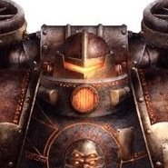
Aarik Posted March 13 Author Share Posted March 13 @Dr_Ruminahui Thank you! For the guy on the right, his body is the Havoc sergeant (and I cut his little toe claws off), the hammer head is from the other lord on the left, and the rest of him is from the Chosen kit (the shoulderpads might be from the Legionaries kit, those bits ended up mixed with the Chosen ones). I'm using the rest of the Havoc bodies as Chosen since that kit comes with weapons for basically 10 dudes. Word of warning though about the Havoc heavy weapons, they do not fit easily on the normal legionary bodies. The legionaries are narrower in the torso and have different poses, so the Havoc parts don't line up correctly, and end up pointing down a bit. Yeah, I'm really most used to 3rd/4th edition terrain levels too. But even the couple tournaments I attended in 8th and 9th had noticeably less terrain, as well. And I like your suggestion of more passable but movement slowing terrain. I think we're both getting at the same general idea, make it a bit easier to move around and bring some more variety. 100% crowded ruins is great for a city fight game, but I don't want every game to be a city fight one. And one of my hot takes is that models and armies are getting to be too big (and spindly) to be practical for storage, transportation, and gaming -- but the ostensible justification is that we'll be able to use cooler models on the table, so we at least get some benefit. But now GW is making it harder to use those bigger models on the table too, so we're really getting it from both directions. One of the next things I've been working on is a Daemon Prince who's still WIP. Good lord, this kit was a huge PITA to build. The parts did not go together intuitively, and a lot of the connection points for the body are so narrow that it was tough to get them glued. The lower legs also make me think this dude is wearing capri pants, and I would have really liked the option for normal power armor lower legs and feet. The clawed feet are okay, but I think the hooves are too small and don't look quite right. There is a good amount of variety, but a lot of it doesn't land well with me. The legs and feet as mentioned above, and of the five heads only two are good IMO (the other undivided head is one, and I would give this undivided one and the slaanesh one a 0.5 each). The rest look pretty goofy. It also annoys me that we ended up with some compromises in the model so it could fit fantasy and 40k, and each of the four gods and undivided. GW is fine making one kit to be shared for 10 armies here, but we can't have basic heresy vehicles in marine armies (absent legends) or the (far cooler IMO) mechanicum models in admech I'd love some feedback on the wings, particularly. I've been going back and forth on whether to do the fingers/spines of the wings in a darker color -- maybe black, or at least a wash of some sort (Poxwalker?) -- what do we think? Right now, they just have a Payne's grey oil wash over the airbrush work, and I don't dislike how they are now. And if I don't highlight all the little ridges on the wings, and maybe just do some minimal edge highlights and scratches on the bottom edge -- so they'd look pretty close to how they do now -- do the wings look half-finished? Tallarn Commander, Firedrake Cordova, WBRBloom and 1 other 2 1 1 Back to top Link to comment https://bolterandchainsword.com/topic/384294-aariks-wips-word-bearers-and-other-heresy-goodness/page/2/#findComment-6099769 Share on other sites More sharing options...
Dr_Ruminahui Posted March 13 Share Posted March 13 (edited) That combination of havoc and chosen bits makes a great lord base - I never would have guessed it wasn't originally a character model. Totally fits in. As for terrain, I don't mind so much for them being more generic - I hated how they did terrain in 9th, for while the various terrain rules were perhaps an okay idea conceptually, they were a fiddly mess that was a nightmare in practice, much of which was largely irrelevant and all of which was hard to remember and even harder to explain (in my very casual gaming group, I'm the one whose role is to explain the rules (and rules changes) to my opponents). It was like a flash back to 6th and 7th edition, which are editions that I personally loathe and were part of the reason I bowed out of the hobby for a while. I've assembled my demon prince and remember him being difficult to assemble (and having to closely follow the instructions while doing so) but not being super annoying. Haven't started painting him yet, though. I too went with the clawed feet and don't really remember the hooves, probably thinking I would use those if I ever got a second model for a foot DP. I do wish there was a way to get repose the model more easily - I would prefer my eventual two models to look more different than just different feet and an absence of wings... though I suppose I can give them different melee weapons as well (I've magnetized mine, in case they ever get their own profiles again). That said, its a huge upgrade over the previous model, so I can't complain too much. I like the wings, but its a bit hard to comment on how they should be different when the rest of the model isn't finished - for me, large relatively blank surfaces of models really serve as accents to the overall look of the model, so I have a really hard time figuring out how they should look until the rest of the model is done. That said, the only bits of them that look unfinished to me at the moment are the various black parts - the bands around the wing struts, and the claws at the wing tips which I feel could use some highlighting or some light striation in bone, brown or gray. And if I want to be super picky, it looks like the colour on the underside of the wings goes farther from its points of origin (so, for example, down the wing further from the top wing tip) than it does on the top of the wing - so perhaps some more colour on the top to even it out? Edited March 13 by Dr_Ruminahui Aarik 1 Back to top Link to comment https://bolterandchainsword.com/topic/384294-aariks-wips-word-bearers-and-other-heresy-goodness/page/2/#findComment-6099789 Share on other sites More sharing options...
Firedrake Cordova Posted March 14 Share Posted March 14 (edited) Your lords look great - it's a really nice red, and the plasma coils/power effect/eyes/hammer head all look really nice 21 hours ago, Aarik said: I don't want every game to be a city fight one Well that's just heresy (unsurprising, coming from a Word Bearer). (j/k) Edited March 14 by Firedrake Cordova Aarik 1 Back to top Link to comment https://bolterandchainsword.com/topic/384294-aariks-wips-word-bearers-and-other-heresy-goodness/page/2/#findComment-6099939 Share on other sites More sharing options...
Aarik Posted June 25 Author Share Posted June 25 Hello fraters, I'm back with a small update! Work has been proceeding faster than my ability to document it in pictures I am happy with. I've been bouncing between a few projects, but have made some meaningful progress on my Deathless Cohort Solar Auxilia. I've been playing around trying to find a photo setup I'm happy with, and although I'm not completely satisfied yet, I figured I'd throw up a few here and celebrate the fact that I've managed to actually fully complete a number of models -- bases and edge highlights too! I'll try to get some good pics of the rest of the finished stuff soon, and a longer writeup to go with them. But in the meantime, I hope you enjoy and let me know what you think! Rusted Boltgun, Tallarn Commander, Urauloth and 4 others 2 5 Back to top Link to comment https://bolterandchainsword.com/topic/384294-aariks-wips-word-bearers-and-other-heresy-goodness/page/2/#findComment-6118445 Share on other sites More sharing options...
Firedrake Cordova Posted June 26 Share Posted June 26 They came out great - the more-or-less monochromatic palette works really well Aarik 1 Back to top Link to comment https://bolterandchainsword.com/topic/384294-aariks-wips-word-bearers-and-other-heresy-goodness/page/2/#findComment-6118521 Share on other sites More sharing options...
Aarik Posted June 26 Author Share Posted June 26 @Firedrake Cordova Thank you! I really like how it turned out too, the Deathless scheme is a cool one. The regular troops are even more monochrome too. I didn't appreciate how much trim and bling the command section guys have until I painted it all and the amount of gold slapped me in the face haha. A part of me is thinking I should have done more of it in silver instead. The color plate that WarCom put out for them in the series of Solar Auxilia heraldry articles has it that way, so maybe I'll try it out on a lasrifle section sergeant and see which I prefer. And speaking of lasrifle sections, I have 20 of those dudes painted and based too. I planned to try to get some pics of them too last night, but tragedy befell them while I was taking them out of the cabinet. I started moving them, and out of the first six I took out, I dropped and popped the bases off two of them At that point, I got frustrated, decided that discretion is the better part of valor, and temporarily gave up on the pictures. We lived to fight another day. And speaking of which, I'm really starting to develop a love-hate relationship with these Unreal Wargaming resin bases. I absolutely love the way they look, and they were pretty easy to batch paint, all things considered. But actually using them is slowly driving me a bit crazy. I was hoping that I could get away with not pinning the models to their bases, but I think I'll have to do that on the future ones. The models are just so fiddly and numerous that I'm definitely going to drop more. And I've been wracking my brain trying to figure out a good way to magnetize them without either (a) using cutouts of those flexible magnetic sheets on the bottoms, since they're too think and would mess with the height of the bases and I think annoy me, or (b) having to drill a ton of 3mm magnet holes in each base, since that's the largest size drill bit I can find that actually works. Larger ones either skip/stutter around too much while drilling, rather than just drilling a hole nicely, or if they have a little spike on the tip to keep them centered, would poke through the top of the base by the time they would drill a hole deep enough for a magnet. So if anyone has any tips about how to drill a 6-12mm by 1-2mm hole in a resin base, please let me know! Or if there's some other magnetizing solution I've missed. I feel like there has to be a tool or drill bit that would do the job, but I just can't find it. Firedrake Cordova and Dr_Ruminahui 1 1 Back to top Link to comment https://bolterandchainsword.com/topic/384294-aariks-wips-word-bearers-and-other-heresy-goodness/page/2/#findComment-6118584 Share on other sites More sharing options...
Recommended Posts
Create an account or sign in to comment
You need to be a member in order to leave a comment
Create an account
Sign up for a new account in our community. It's easy!
Register a new accountSign in
Already have an account? Sign in here.
Sign In Now