Bonehead Posted August 4, 2025 Author Share Posted August 4, 2025 Thanks mate. I'm glad someone enjoys the nonsense. God knows I'm powerless to stop it coming out, so I guess it's better that people actually like it... Firedrake Cordova and Gnasher 2 Back to top Link to comment https://bolterandchainsword.com/topic/386175-bonehead-scrambles-to-light-up-a-table/page/2/#findComment-6126176 Share on other sites More sharing options...
Bonehead Posted August 7, 2025 Author Share Posted August 7, 2025 A surprisingly non-zero quantity of people asked for a tutorial on making the shipping containers, so naturally I told them I had better things to do and even though I wasn't lying, I made the tutorial anyway. It's in the tutorial section, if you can believe it. Here's a link for the terminally lazy and/or apathetic: Dr_Ruminahui, Firedrake Cordova, Gnasher and 5 others 3 5 Back to top Link to comment https://bolterandchainsword.com/topic/386175-bonehead-scrambles-to-light-up-a-table/page/2/#findComment-6126750 Share on other sites More sharing options...
Bonehead Posted August 8, 2025 Author Share Posted August 8, 2025 I painted up the first coats on the container I made for the tutorial. I put out a request for suggestions of pop-culture companies to put on it and someone suggested something from Lost. Never watched it myself, but it was easy enough to google. Here we are: You'll not the serial numbers are different on each side; therre're apparently significant numbers on Lost, so I just put them all on. That makes 11 containers now. I think the next one I make I'll try and work out how to do it with an accessible interior. That's going to take some proper thining, so I'm giong to move onto trying to get the warehouse done next. Meanwhile, I'd appreciate some more suggestions for real-world companies (with very simple logos) to spoof or pop-culture ones to refer to. Dr_Ruminahui, Rusted Boltgun, deathspectersgt7 and 1 other 4 Back to top Link to comment https://bolterandchainsword.com/topic/386175-bonehead-scrambles-to-light-up-a-table/page/2/#findComment-6126995 Share on other sites More sharing options...
Gnasher Posted August 9, 2025 Share Posted August 9, 2025 Looking forward to seeing the warehouse progress! Here's are a couple of logos I think would look good. One of the best companies I've ever worked for Sun Microsystems & Apple Hope they help! Brother Anderson, Tallarn Commander, Bonehead and 1 other 3 1 Back to top Link to comment https://bolterandchainsword.com/topic/386175-bonehead-scrambles-to-light-up-a-table/page/2/#findComment-6127099 Share on other sites More sharing options...
Rusted Boltgun Posted August 9, 2025 Share Posted August 9, 2025 How about a cocked dice as a logo? Given your success with the Lost logo, I reckon it would be achievable (not for me!). Or to cross into another IP, the Weyland Yutani W / L in grey / yellow? Bonehead 1 Back to top Link to comment https://bolterandchainsword.com/topic/386175-bonehead-scrambles-to-light-up-a-table/page/2/#findComment-6127185 Share on other sites More sharing options...
Bonehead Posted August 9, 2025 Author Share Posted August 9, 2025 (edited) How to spoof Apple... I guess, maybe just do the outline of a lemon instead? Or have a worm in the apple? No, no businees would have a logo with deliberately bad connotations. Hmm. That's actually a tricky one. I'm going to have to think about that a bit. You got any ideas? As for the SUN one, I don't want to take the piss out of them if you actually like them, that would seem a bit crappy. Plus it looks absolutely hard as hell to cut out of vinyl masking material. But man, is it tempting to just have it say 'BUM' instead... Meanwhile, I got in an hour or so of painting time on a few containers today. Did some sponge chipping on lots of different colours to see how it would go: It's just the first stage of weathering and wearing them, but I like how it both ages them and brings them all together with a shared colour. I was also very happy about how I could use the chipping effect to cover up most of the cock-ups on the yellow container door. Next will be chipping with metallics, then washes, then weathering powders. Seeing as most of the weathering powders are going to be brown earth or rust, the red containers aren't going to show it all that well, so I decided to just have them be less beaten up in general. Similarly, on the grey container I might try the initial paint chipping in dark brown instead, for more contrast. Can anyone think of any more pop culture companies to spoof- like, what's the Sam Rockwell character in the Avengers movies called, he's got a company, right? Is there something like that in any other film or tv series you can think of? I was thinking I might try one of the Westworld logos. What about the company in Severance, does that have a logo that looks pretty easy to rip off? 24 minutes ago, Rusted Boltgun said: How about a cocked dice as a logo? Given your success with the Lost logo, I reckon it would be achievable (not for me!). Or to cross into another IP, the Weyland Yutani W / L in grey / yellow? Weyland-Yutani! Perfect! Nice one, I'll see what I can do... EDIT: just googled it and look what popped up. Goldmine here: I believe this will do just fine. Edited August 9, 2025 by Bonehead Brother Anderson, Tallarn Commander and deathspectersgt7 3 Back to top Link to comment https://bolterandchainsword.com/topic/386175-bonehead-scrambles-to-light-up-a-table/page/2/#findComment-6127189 Share on other sites More sharing options...
Brother Anderson Posted August 10, 2025 Share Posted August 10, 2025 These are looking great! The weathering is really effective, plus it's good to have the option to weather over any mistakes (as well I know!) Bonehead 1 Back to top Link to comment https://bolterandchainsword.com/topic/386175-bonehead-scrambles-to-light-up-a-table/page/2/#findComment-6127323 Share on other sites More sharing options...
Bonehead Posted August 11, 2025 Author Share Posted August 11, 2025 Thanks BA. Yeah, you're not wrong there, the joy of any stage by stage weathering process is how each step covers up the mistakes of the previous one. Meanwhile I got an hour free unexpectedly this afternoon and decided to sand and paint the warehouse base. Once it was sanded (400 grit, boring) I gave it an undercoat of mech. standrd grey, then sort of blended a bit of white and zandri dust over the top until it was patchy and uneven, but not pure white or khaki anywhere. Then I got some vallejo black ink and just applied that directly over the top, straight out the bottle. Following application I gave it a rub down with a paper tissue. That took it from dark grey to the medium splotchy tone it is here: The patchiness and visible lines don't matter at all: next it's going to get a light drybrush with an off-white and that should soften any transitions from one shade to another, leaving it still patchy but rather more unified. I will be leaving the areas along the walls of the structure more muted; a bit of forced shadow, basically. It does look like there's a load of very obvious outstanding areas, but that's mostly flash from the camera. The washes will mute those down and they'll just be more texture. Then I'll wedge the skeleton back in and finish building the lower parts so they all line up with the floor; then out one last time to undercoat/basecoat/wash most of it. Pleased to note it will still go in the base: I might have a go at some extremely worn hazard stripes along the front edge of the loading dock. We'll have to see how lazy I'm feeling. Cheers Tallarn Commander, Stef Coudou and Dr_Ruminahui 3 Back to top Link to comment https://bolterandchainsword.com/topic/386175-bonehead-scrambles-to-light-up-a-table/page/2/#findComment-6127481 Share on other sites More sharing options...
Dr_Ruminahui Posted August 11, 2025 Share Posted August 11, 2025 (edited) Your crates are looking great! As is your warehouse - for it, to keep it usuable, you may want to make the side/roof removable for the placement and movement of models. Another fictional corporation you might want to include is the Umbrella Corporation from Resident Evil - though its logo may be too close the Lost one. Looking forward to seeing the Zildous industrial conglomerate represented. Edited August 11, 2025 by Dr_Ruminahui Tallarn Commander 1 Back to top Link to comment https://bolterandchainsword.com/topic/386175-bonehead-scrambles-to-light-up-a-table/page/2/#findComment-6127495 Share on other sites More sharing options...
Bonehead Posted August 13, 2025 Author Share Posted August 13, 2025 I did get that one done actually, Doctor- but I think it ended up on the last post on the last page. I'll have a look at Umbrella's logo, but I never really got on with the RE games so I might be minded to sub in something from System Shock or Deus Ex instead. Might be showing my age a bit with those references. There are a ton of video game companies to choose from, of course. As for the warehouse, it has been troubling me a little, how to keep the interior fully accessible. I'm planning a completely removable roof, and big doors in the walls on three sides, which I sincerely hope will do the job. I've also been thinking that I may find it wise to fill up quite a lot of the interior space on the bottom level with stacks of crates and such, just to remove the need for access. if I do that a lot towards the rear, it should make placing models inside much easier. Dr_Ruminahui 1 Back to top Link to comment https://bolterandchainsword.com/topic/386175-bonehead-scrambles-to-light-up-a-table/page/2/#findComment-6127734 Share on other sites More sharing options...
Dr_Ruminahui Posted August 13, 2025 Share Posted August 13, 2025 Indeed you did - sorry I missed it. It looks great - way neater than mine. Bonehead 1 Back to top Link to comment https://bolterandchainsword.com/topic/386175-bonehead-scrambles-to-light-up-a-table/page/2/#findComment-6127750 Share on other sites More sharing options...
Bonehead Posted August 13, 2025 Author Share Posted August 13, 2025 Well, in due course it's going to look a lot older and more beaten up than yours, anyway. Dr_Ruminahui 1 Back to top Link to comment https://bolterandchainsword.com/topic/386175-bonehead-scrambles-to-light-up-a-table/page/2/#findComment-6127770 Share on other sites More sharing options...
Dr_Ruminahui Posted August 13, 2025 Share Posted August 13, 2025 (edited) But less like it was painted by gorillas. (that's the sense that I meant "neater", but I can see how there was room for confusion). Edited August 13, 2025 by Dr_Ruminahui Bonehead 1 Back to top Link to comment https://bolterandchainsword.com/topic/386175-bonehead-scrambles-to-light-up-a-table/page/2/#findComment-6127773 Share on other sites More sharing options...
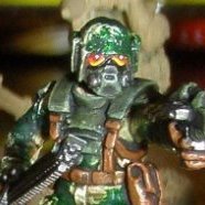
Bonehead Posted September 26, 2025 Author Share Posted September 26, 2025 (edited) I had a long think about it, and I came up with a method to make the shipping containers have opening doors. Which is, as I believe the kids say, 'a good thing'. Took a lot of it up before I got it right though. Here's the result: To shorten it all down so I'm not actually writing the tutorial here as opposed to in the actual tutorial, you basically have to build a box that's about 1.5mm smaller in every dimension and then build the shipping container around the outside, so the halfway stage is this: For the less imaginative, the reason is it's good is because you can have models hiding in containers during games and visually represent it: Mutant ambush! I think this one's going to get sprayed up in a Wayland-yutani stylee. Edited October 3, 2025 by Bonehead Heraclite, Firedrake Cordova, Dr_Ruminahui and 1 other 1 3 Back to top Link to comment https://bolterandchainsword.com/topic/386175-bonehead-scrambles-to-light-up-a-table/page/2/#findComment-6133861 Share on other sites More sharing options...
Firedrake Cordova Posted September 30, 2025 Share Posted September 30, 2025 They look great. I like the opening doors making it possible for models to use it as cover, too. Bonehead 1 Back to top Link to comment https://bolterandchainsword.com/topic/386175-bonehead-scrambles-to-light-up-a-table/page/2/#findComment-6134336 Share on other sites More sharing options...
Bonehead Posted October 1, 2025 Author Share Posted October 1, 2025 Thanks! I've realised I'm going to have to make another one because I didn't get good photos for the tutorial. What do we reckon for the branding: Nakatomi, Cyberdyne, or Tyrell? Firedrake Cordova 1 Back to top Link to comment https://bolterandchainsword.com/topic/386175-bonehead-scrambles-to-light-up-a-table/page/2/#findComment-6134555 Share on other sites More sharing options...
Firedrake Cordova Posted October 2, 2025 Share Posted October 2, 2025 Cyberdyne, and it must contain a Necron hitchhiker The Pounder, Dr_Ruminahui, Rusted Boltgun and 1 other 2 1 1 Back to top Link to comment https://bolterandchainsword.com/topic/386175-bonehead-scrambles-to-light-up-a-table/page/2/#findComment-6134601 Share on other sites More sharing options...
The Pounder Posted October 2, 2025 Share Posted October 2, 2025 Your table is going to look amazing! I’m with @Firedrake Cordova, Cyberdyne all the way! Bonehead 1 Back to top Link to comment https://bolterandchainsword.com/topic/386175-bonehead-scrambles-to-light-up-a-table/page/2/#findComment-6134609 Share on other sites More sharing options...
Bonehead Posted January 5 Author Share Posted January 5 Ok, so things stalled out a bit there. Had to go to my brother's wedding and then work got pretty overwhelming for a few months. Then, my mate was ill over christmas (and so was I) and he missed my birthday. So we had a late new year thing instead; he hosted a big evening game for four players. Usually we do a four-sided kill-team/necromunda adventure. And when I say usually, I mean twice a year if we're lucky. And usually, the game is run by someone who has subsequently moved house a hundred miles away. So I had to step up as the only person capable of making sure a game goes nice and quickly, so we're not there forever. I decided to create a custom scenario using 2nd ed rules (the last version of 40k that I played regularly) becuase 1) I have the rulebooks and 2) it's basically the same as necromunda. I designed a commando raid with three sides. One player with a mystery alignment would be retrieving a high-value cargo from the freight yard. Oneplayer would be sending an IG commando team to turn on the fuel pumping station to send fuel back to the main army to invade town. And one would be sending a marine team to assassinate the leader of a chaos cult in his corrupted church of baddieness. As a bonus objective they could also purify the church with fire. I was the baddies, a horde of squishy chaos cultists with traitor guard backup. Of course, as seen in the log previously, the pumping station and freight yards already exist. Well, in as much as my eleven shipping containers and my mate's four imperial ones constitute an entire shipping yard. No church. Thus: The main model already existed, made of modular parts from... somewhere. But the roof had to be custom built. Took half a day, but it got done. Of course, me being me and this log being this log, building a roof was half of it. What's a corrupted church without the eerie glow of bad magic things going on? Obviously there were LEDs wired in. Obviously. The colours were a mix of green, pink, and blue, because they all draw the same current and can therefore all be wired in one simple circuit, parallel. There was about an hour left to fit all the wiring in and solder it so corners needed to be cut. It did make for a good atmosphere Needless to say, the cult leader (who I dubbed the Crime Pope) ran out the back the moment a marine burst in the front, waving a flamer and several thoroughly used knives. I mean, he'd wiped out about ten sentries by this point. We named him Staberto. Obviously this was when the alarm went off and my tanks woke up, and my traitor guard and cultist reinforcements turned up. The imperials had co-ordinated and pumped the fuel at the same time as burning the church. Hilarity ensued as the Crime Pope unexpectedly weathered the deliberate setting off of two stored seige mortar shells a marine sniper laid a couple of rounds into, a direct hit from a missile launcher fired by a guard commando who was aiming at something else, and several guard snipers, and radioed mortar strikes. I gave him a displacer field for comedy value, so he kept bouncing around the streets. He actually collided with two of his reinforcements, who died from the impact. This led to a lot of people saying things that could get you in serious trouble in the wrong context, like 'man, this Pope is just impossible to kill,' and 'damn it, all I wanted was to kill the Pope,' so it's just as well we didn't record any of it. Eventually I was able to announce 'you have just successfully murdered the Pope,' following a piece of pretty terrible decision making on my part when the marine player asked if, seeing as his captain was standing next to a crate of tank shells, he could just hoy one of those at the Crime Pope. I decided to let fun rule the day, as opposed to the more usual rules ruling the day. The Crime Pope's displacer field caused him to inadvertently headbutt yet another cultist minion, but unfortunately this one proved to have a very haard head indeed and the dark pontiff's hat of office was stained with his own blood. The scenario was really supposed to be about escaping in the face of massive waves of reinforcements after successfully pulling off a tough job, but the imperials rolled so many ones that the crime pope lived about four turns longer than expected and was only five inches from the board edge and safety. Unfortunately I'd set the precedent and now the marine leader, still standing next to the crate of tank shells, proceeded to earn the name 'Captain Murdertron' as he used the shells to account for a Demolisher, a Vanquisher, the seven Khorne berzerkers who were supposed to teleport in and tear him to pieces as soon as the Pope bought it, and about thirty cultists. During this time he survived direct hits from two demolisher cannons, two lascannons, about eighty lasgun shots (one crew of sixteen cultists simply stood in the same spot and piled rounds into him for three turns in a row at one point) and he was only stopped when a third demolisher shell finally got the job done. Meanwhile the secretive crew heading for the freight yard were able to bust into the shipping crate, freeing the cargo who was revealed to be a purestrain genestealer leading their cult, and hop it off the chaos cultists' board edge with impunity, pausing only to completely mince a squad of traitor guard. The imperials were given a ton of cryptic hints about what the genestealer cult player was up to, but completely failed to take advantage of the many, many opportunities they had to snipe, mortar, or otherwise disrupt them. They literally sat and watched through sniper scopes as the not even remotely suspicious crew of heavily armed 'dockworkers' spent a turn breaking into a shipping container in the middle of the night. First game I ever GM'd. Probably didn't ought to have been drinking quite so much, but there you go. I won't be learning a lesson from that, not today. Valkia the Bloody, Gnasher, Firedrake Cordova and 2 others 1 4 Back to top Link to comment https://bolterandchainsword.com/topic/386175-bonehead-scrambles-to-light-up-a-table/page/2/#findComment-6150069 Share on other sites More sharing options...
Firedrake Cordova Posted January 5 Share Posted January 5 Sounds great Bonehead and Dr_Ruminahui 1 1 Back to top Link to comment https://bolterandchainsword.com/topic/386175-bonehead-scrambles-to-light-up-a-table/page/2/#findComment-6150080 Share on other sites More sharing options...
Bonehead Posted January 25 Author Share Posted January 25 Well, you know what they say. The reward for doing a good job is usually getting to do it again. Beerhammer was popular enough that we're doing it again. This time, we've already used the church and the pumping station, so we need a different objective. And also I need to re-evaluate what makes for a serious challenge, but that's my own fault. Perhaps making captain Murdertron and his crew sit this one out might be a good start. Therefore, the warehouse needs finishing. Warehouse? What warehouse, the public cries. The one I forgot about for like six months, obviously. Needs finishing, and quick. Therefore, progress: Still looks like the same skeleton, honestly mate. Well, yes, but it didn't used to have the wires all over it. Seriously, that took hours to sort out. I learned an imortant lesson about wiring LEDs; that if every LED has a resistor of equal value, then the circuit will happily include LEDs with all sorts of different current draws, or, to put it more simply, different colours. So here we are, lots of inline 470r resistors paired with LEDs. Not quite so clear what their jobs will be without the actual skin and guts of the building in there, I grant you, but it is at least proof that I wasn't just twiddling my thumbs this whole time. Jobs include: 2 exterior fire exit lights in red; two top floor genral purpose lights for the whole building, one light for the site office, one light for the second floor side door/ catwalk linking spot, and two as yet not wired up lights for the big front door. This was the start of the site office, and it rapidly accrued detail: The little box in the foreground is from an old sentinel kit, if anyone's interested. It does fine as the control box for the big door. Rear detail on the site office is essentially just the interior doorway: And interior detail is basically just the desk, some shelves and a couple of random techy bits as mis-en-scene to make the place look lived in: Getting a bit bogged down in small details here, but that's how I like to roll. Things yet to build include: the two bottom floor fire exit doors and surroundings; some kind of battery housing that'll be easily accessible (probably a pile of crates at the back of the main floor, with some kind of large electrical panel on the outside); interior floors and stairs; and of course the damn building itself. Rome wasn't built in a day. Burnt down in a few pretty easily though. Firedrake Cordova and Dr_Ruminahui 2 Back to top Link to comment https://bolterandchainsword.com/topic/386175-bonehead-scrambles-to-light-up-a-table/page/2/#findComment-6153734 Share on other sites More sharing options...
Bonehead Posted January 25 Author Share Posted January 25 Curious observers may wish to know: how in the name of Ahura Mazda are you going to paint that detail squished in there so closely, Bonehead? Well, yes, good point. Mostly spray paint. But fo rthe little techy doodads and whatnot, well I did have a moderate quantity of foresight and didn't actually glue the building to the foundation yet. So I can carry on finishing off the bottom floor detailing, then spray everything up and do the little details with hopefully at least a cursory bit of attention. Probably. maybe. With a following wind. Look, there's some time pressure on, alright? Anyway, I ran out of photo storage space in the last post, so here is one of the fire exits basically done: Like I said, the building comes out of the foundation. Handy. Here's a different angle: Only the most improbably eagle-eyed viewers will have noticed that there's now a piece of white plastic in place above the office/exit; this is the start of the second floor going in. I've used the old diamond pattern treadplate plasticard, so it should be easy to paint; mask up and give it a coat of leadbelcher, then sponge some chips of a brighter mettalic, and go to town with washes. The plan for the girder frame is just dark red and lots of chips, and the interior walls in grey. Bosh. Bosh! Tallarn Commander, The Pounder, Rusted Boltgun and 1 other 2 2 Back to top Link to comment https://bolterandchainsword.com/topic/386175-bonehead-scrambles-to-light-up-a-table/page/2/#findComment-6153737 Share on other sites More sharing options...
The Pounder Posted January 25 Share Posted January 25 Your attention to detail is commendable! I’m not sure I’d have the patience to do a project like this! Firedrake Cordova and Bonehead 1 1 Back to top Link to comment https://bolterandchainsword.com/topic/386175-bonehead-scrambles-to-light-up-a-table/page/2/#findComment-6153750 Share on other sites More sharing options...
Bonehead Posted January 26 Author Share Posted January 26 Nothing like a desperate rush to really motivate you! As for having the patience, well, I clearly ran out of it bout six months ago. Fingers crossed I can keep up the enthusiasm long enough to finish it for Friday.. Firedrake Cordova, Rusted Boltgun, Gnasher and 1 other 4 Back to top Link to comment https://bolterandchainsword.com/topic/386175-bonehead-scrambles-to-light-up-a-table/page/2/#findComment-6153887 Share on other sites More sharing options...
Bonehead Posted January 31 Author Share Posted January 31 Things got quite rushed towards the end there. So rushed that I forgot to put in a way of getting up to or down from the top floor... I mean, as a 'warehouse' it kind of doesn't make amy sense, but I don't care, it makes for good gameplay. You have to be able to reach down inside it to position models, so ther's a surprising lack of floor storage space. Bit hard to see the difference, but at this point the metallic paint had gone on. At that point, time got really tight so I stopped taking photos. How tight? I built and painted a roof for it in half an hour, then immediately left for the game. The box of scenery still smalled of spray paint propellant by the time we arrived, an hour later. There wasn't even time to paint the walls in the end, and forget the idea of giving it a wash and some weathering. Still, it did make for a pretty decent table in the end, wiht all the new catwalks I also made while waiting for paint to dry on the warehouse frame: Three mcGuffins, one Warehouse, three ways in and about forty cultists patrolling the ground level. Made for a pretty tense game. Went on until about 4 in the morning. Atmosphere was pretty good: Not too shabby Firedrake Cordova, Tallarn Commander and Dr_Ruminahui 3 Back to top Link to comment https://bolterandchainsword.com/topic/386175-bonehead-scrambles-to-light-up-a-table/page/2/#findComment-6154525 Share on other sites More sharing options...
Recommended Posts
Create an account or sign in to comment
You need to be a member in order to leave a comment
Create an account
Sign up for a new account in our community. It's easy!
Register a new accountSign in
Already have an account? Sign in here.
Sign In Now