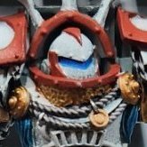
Khulu Posted January 31, 2022 Share Posted January 31, 2022 After a ton of Guardians as test models, I think I have the general color scheme I'm going with for Craftworld Aiam-Varr. The bone colored stuff is just Agrax over white and it is kind of splotchy in places but it looks better than anything else I tried, so I'm hoping I'll keep getting more consistent results as I do more models. I haven't decided how to do my Aspect Warriors yet, but I have some ideas. This is my second attempt at using bone as the primary color of an army but previously I was trying to just do as little work as possible so the whole project was purely contrast and didn't turn out great. Now I'm trying to push myself and take my time more. The test Guardian I settled on. Troops would probably all have about this level of highlighting but characters get more. Cloth is purple, armor is bone, head and shoulders are blue (inspired by Crimson Fists). I am pretty happy with it overall, I painted probably a dozen different schemes and this one I kept coming back to. The quality of highlights is bad but I was using a really old gw brush that I probably should just throw out, so I think I can do better. I've been afraid to break out my nice brushes I've accumulated over the years but I'm trying to convince myself to use them now. Once I settled on that I went through and primed a bunch of stuff I had and started working on it. I ended up using this Warlock as another test model since that Guardian scheme didn't really translate well to a model covered in robes so I just kind of decided on a whim what to paint each color and I think it turned out better than it ought to have. I'm not thrilled with how I did the highlight on the edge of the blue robes but since I wanted the inside of the robe a different color I wasn't sure how to highlight it Next time it will be a thinner highlight, but it's alright for now. I'm not a huge fan of the color balance on the base but the molded detail didn't give me much room to work with it. Most bases will be mostly pink but I have some blue grass tufts to go with it. The army has been cut off from the Craftworld so they're fighting on a crone world to try to find forgotten Webway portals in the hopes of getting home, so I figured a more alien base design would be fitting. I have some Dark Eldar that have mostly the same bases, just the rocks are different colors. This is Ganelien, the Fated Blade. Emboldened by how much I liked that Warlock, I started on a Wave Serpent. That was probably a mistake. I don't think I was ready for trying to paint so many big flat panels with Agrax or all the highlighting on it, but it turned out alright so far. I started out just putting blue on the panels with the worst results from the Agrax and then added a bunch more to get the color balance I wanted. I don't know yet what I'm doing with the cockpit. This was an ebay rescue so it didn't have a pilot, so I had to paint over the glass. I'm thinking either silver trim with purple glass (since there's no cloth to be purple on the model) or the same pink as the Warlock's spirit stone and gems. I might do the base before I decide on that since it will be pink, might help me decide if I want more of that or purple instead. This is very much a WIP still, I'm deciding as I go what is what. More to come Bouargh, Mithrilforge, Doctor Perils and 4 others 7 Back to top Link to comment https://bolterandchainsword.com/topic/373153-craftworld-aiam-varr/ Share on other sites More sharing options...
WrathOfTheLion Posted January 31, 2022 Share Posted January 31, 2022 Looking cool! I think you should bring out the good brushes, a better brush will definitely help with the highlights. Especially on vehicles like your Wave Serpent, I think it'll make a difference. Even if you just pick up some not-so-good brushes that are newer than the one you've been using, I think it'll work better. Can't wait to see more! Khulu 1 Back to top Link to comment https://bolterandchainsword.com/topic/373153-craftworld-aiam-varr/#findComment-5791461 Share on other sites More sharing options...
Pearson73 Posted January 31, 2022 Share Posted January 31, 2022 Off to a really good start, I like the colour choices a lot. I second @WrathOfTheLion even super cheap brushes are decent enough when new. Khulu 1 Back to top Link to comment https://bolterandchainsword.com/topic/373153-craftworld-aiam-varr/#findComment-5791472 Share on other sites More sharing options...
Doctor Perils Posted January 31, 2022 Share Posted January 31, 2022 That's a very nice colour scheme! I wonder if you could do some touch ups of the blotchiness by mixing your white and agrax together, but as you say it's not a huge deal - you could even go all out with it and do extra "blotchiness" and call it "naturalistic patterns" of your Craftworld, like how Biel-Tan do the vines and things Khulu 1 Back to top Link to comment https://bolterandchainsword.com/topic/373153-craftworld-aiam-varr/#findComment-5791534 Share on other sites More sharing options...
Khulu Posted January 31, 2022 Author Share Posted January 31, 2022 Thanks, everyone! Eldar was my first army and I've always regretted trading them away. I do still have some metal Fire Dragons and I picked up some old metal Warlocks recently from ebay, but other than that I'm starting from scratch here. And sorry for miscommunication, I was half asleep when I was writing this. I did switch out brushes after doing the Guardians, but only to a GW brush I found I hadn't used yet. The sloppiness of the highlights on the Warlock and Wave Serpent is all me, haha. I never really painted my models until Contrast came out, so I just need more practice with highlighting. I have some W&N series 7 brushes and I think some other high end brushes I got as gifts over the years that I haven't ever used because I don't want to ruin them. That's a very nice colour scheme! I wonder if you could do some touch ups of the blotchiness by mixing your white and agrax together, but as you say it's not a huge deal - you could even go all out with it and do extra "blotchiness" and call it "naturalistic patterns" of your Craftworld, like how Biel-Tan do the vines and thingsI might need to try mixing like that. I hadn't considered it. Might help overall to just use that as a base color if it works! For Aspect Warriors I might leave the bone the same but replace the blue with a color more appropriate to the Aspect (green for Scorpions orange for dragons, et cetera) or maybe replace the blue with black and just do hair/cloth/other details in the Aspect colors. I think I'm leaning more towards the former than the latter. Link to comment https://bolterandchainsword.com/topic/373153-craftworld-aiam-varr/#findComment-5791712 Share on other sites More sharing options...
Urkh Posted February 2, 2022 Share Posted February 2, 2022 Those colors are really cool together, especially the highlight color. Once that gets cleaned up, those minis are going to go from sweet, to delectable. As for aspect warriors, I am doing mine almost completely in the color of my craftworld (orange), but the helms and under armor will be the color of the aspects. Each craftworld is different, right? Apsect warriors should reflect their craftworld somehow, yah? Khulu 1 Back to top Link to comment https://bolterandchainsword.com/topic/373153-craftworld-aiam-varr/#findComment-5792403 Share on other sites More sharing options...
Khulu Posted February 2, 2022 Author Share Posted February 2, 2022 Had a little time last night I squeezed out for painting so I worked on the Wave Serpent a little. Started on the first set of guns and tried to put some stripes on the door but I screwed that up a little (tape wasn't flush in spots it looks like) so I did this asymmetrical thing instead. I had too much paint on the pallette so I started on a Farseer also. How do you guys highlight the round parts (i.e. the power nodes and helmet cones and stuff like that)? I put a little highlight color on them and I don't know if it looks right. The clothes that are blue are going to have a different (somewhat darker) highlight so it looks a little distinct from the armor panels, which is why I haven't started those. . Those colors are really cool together, especially the highlight color. Once that gets cleaned up, those minis are going to go from sweet, to delectable. As for aspect warriors, I am doing mine almost completely in the color of my craftworld (orange), but the helms and under armor will be the color of the aspects. Each craftworld is different, right? Apsect warriors should reflect their craftworld somehow, yah? Yeah, I love the idea of shrines and I think it's a shame we don't see more variety in the official art, but I guess that might get confusing to people who aren't super familiar. My Craftworld is small and unimportant so I figure it will have had little contact with the main Craftworlds, so it probably has its own shrines that aren't as connected to others as normal, so they take more inspiration from the Craftworld colors. As far as highlights go I just need more practice. I never really tried to paint my models very much before Contrast came out so my tiny Dark Eldar army that is maybe 1/3 painted is the only thing I've ever tried highlighting before so it's just gonna take time. I haven't tried mixing Agrax with White yet but if I can't get a good basecoat out of that I may make my Wraiths have a sort of inverted scheme (mostly blue with bone colored heads) because the Wraiths I've started on have the most pooling and splotches since the paint just wants to run straight down the model. I think I need to get some pipettes to mix it more precisely so that if it works I can make up a big batch all at once to ensure color matching. I'm off Fridays so that might be when I try it. Kallas, Mithrilforge, Bryan Blaire and 1 other 4 Back to top Link to comment https://bolterandchainsword.com/topic/373153-craftworld-aiam-varr/#findComment-5792542 Share on other sites More sharing options...
Dread Posted February 3, 2022 Share Posted February 3, 2022 O personally like the screw up on the door. Personality is a key point and i like this one. Also the farseer is coming along nicely. Khulu 1 Back to top Link to comment https://bolterandchainsword.com/topic/373153-craftworld-aiam-varr/#findComment-5792750 Share on other sites More sharing options...
Zebulon Posted February 3, 2022 Share Posted February 3, 2022 This is cool. Where did you get the name Aiam-Varr from? Does it have a meaning? I ask as I embarked upon a DIY craftworlds project years back that I never finished; its name was Aiel-Fas (which was meant to translate as “Touching the Void”) Khulu 1 Back to top Link to comment https://bolterandchainsword.com/topic/373153-craftworld-aiam-varr/#findComment-5792786 Share on other sites More sharing options...
Khulu Posted February 3, 2022 Author Share Posted February 3, 2022 (edited) I definitely agree, Dread! It's definitely the kind of screw up that turns out for the best. All of my names for this army are inspired by Roger Zelazny's Chronicles of Amber books. Well word the read! I got snowed in today so I've been painting a bit. I tried mixing agrax and white and after 4 or 5 tries I couldn't get it to look right. I tried again with Ivory instead of white and still didn't get anything I could use to touch up. So I guess for now, just gotta be careful. I did make a little more progress on the Wave Serpent. The more I paint the more I like it. There are still little spots to fix but at tabletop distance it's great to me. I just hope I can make the rest look as good! For now I'm building more stuff while I decide how to do my Aspects. I also need to decide how to make the metallic parts of the Wave Serpent have a little more visual depth. Edited February 3, 2022 by Nemesor Tyriks Zebulon, TrawlingCleaner, Doctor Perils and 3 others 6 Back to top Link to comment https://bolterandchainsword.com/topic/373153-craftworld-aiam-varr/#findComment-5792964 Share on other sites More sharing options...
Dread Posted February 4, 2022 Share Posted February 4, 2022 (edited) We had a freeze alert here. Still went to work but sent home at dark to avoid slick stuff. In Texas were not used to that kinda weather. I havent heard of those books but really like you took a name that way. I named mine Kurom Kiam. Loosely translates to dragons breath. Got it from an online elf dictionary years ago. Keep up the good work. Edited February 4, 2022 by Dread Khulu 1 Back to top Link to comment https://bolterandchainsword.com/topic/373153-craftworld-aiam-varr/#findComment-5793016 Share on other sites More sharing options...
TrawlingCleaner Posted February 4, 2022 Share Posted February 4, 2022 The blue and the bone go together really well Brother Tyriks. For me, vehicles should look a bit more battered and worn especially Eldar Vehicles that take a battering to keep the gooey insides safe! I'd go for a Brass/Bronze for metallics, it would compliment the bone+blue colour quite well IMO Khulu 1 Back to top Link to comment https://bolterandchainsword.com/topic/373153-craftworld-aiam-varr/#findComment-5793065 Share on other sites More sharing options...
Mithrilforge Posted February 6, 2022 Share Posted February 6, 2022 Heya Tyriks Looking good there, Have you tried Mixing Lahmian medium in with the Agrax when you wash the vehicles etc, it pools less and lets you wick away the excess easier while still retaining that cool bone look you have. The blue/bone does look good and as TC said above, a Bronze colour may match it well...i wouldn't go shiny bronze though...keep it Muted and dark. Look forward to seeing this army come to life, i enjoyed watching your Necron army being built up !! Cheers, Mithril Khulu 1 Back to top Link to comment https://bolterandchainsword.com/topic/373153-craftworld-aiam-varr/#findComment-5793935 Share on other sites More sharing options...
Khulu Posted February 7, 2022 Author Share Posted February 7, 2022 (edited) Thanks! I don't have any bronze but I did get the Monument Pro Acryl metallic medium so I might try mixing some. I have been increasingly impressed with the Pro Acryl line and just ordered more of their paints so I have some color options there. I did try mixing medium with agrax but I think I had too much medium so it just made it not flow how I expected. Maybe I should try again sometime. Over the last few days I got some stuff built (second Wave Serpent but I only magnetized the first pair of guns so far, plus some Wraithguard) and started stripping my old metal models. I have some Fire Dragons and I think all the metal Warlock variants excluding some of the really early ones so I might start on those soon. I also just got some metal Striking Scorpions on ebay so I'm excited to work on those when they come. Might have to finish building my Banshees and paint them while I wait! I also picked up some cheap sculpey knockoff to make rocks for bases with the Green Stuff World Eldar roller but the stuff I got isn't as brittle as I expected so it isn't snapping, just bending. I'm freezing it right now so hopefully that'll help break it in a way that looks natural. I kept playing around with Aspect Warrior paint schemes in impcat and decided to just slap some paint on models instead. I couldn't make anything I was really happy with so I just painted a variation on the Craftworld scheme and I think I am happy with it. Different Aspects will replace the purple stuff with a color more suited to their shrine (since my regular color is blue I didn't want to use blue for the Dire Avengers so I tried purple instead). Here is Exarch Eracin of the Shrine of the Cleansing Storm. The guns will be black, I just have to work early tomorrow so I didn't want to start working on those. The rest of the squad is less far along than he is, I decided to stop batch painting and just try to get him close to done instead. Edited March 19, 2022 by Nemesor Tyriks Prot, Dwango, Doctor Perils and 2 others 5 Back to top Link to comment https://bolterandchainsword.com/topic/373153-craftworld-aiam-varr/#findComment-5793967 Share on other sites More sharing options...
Doctor Perils Posted February 7, 2022 Share Posted February 7, 2022 A nice alien metallic recipe I've tried in the past for eldar was Balthazar Gold pin-washed with Druchii Violet Khulu 1 Back to top Link to comment https://bolterandchainsword.com/topic/373153-craftworld-aiam-varr/#findComment-5794060 Share on other sites More sharing options...
Prot Posted February 10, 2022 Share Posted February 10, 2022 That bone scheme worked well. Sometimes it can get a bit chalky but you managed to keep it looking nice and consistent. Khulu 1 Back to top Link to comment https://bolterandchainsword.com/topic/373153-craftworld-aiam-varr/#findComment-5795238 Share on other sites More sharing options...
Khulu Posted February 22, 2022 Author Share Posted February 22, 2022 So I have been working on these a lot, I just don't have a ton to show for it. Lots of test models for various colors of Aspects and bronzes and different techniques. I do think I've found some improvements for the scheme overall. Putting a bit of Contrast Medium into the Agrax helps the problems I was having (it creates new ones but they seem easier to fix so I'm sticking with it for now). I also tried a bit of volumetric highlighting. I liked it a lot but it wasn't quite the look I was imagining for my Eldar, and I don't know how I would have done that on the bone parts so I thought it'd look weird. That said, it looks better than I expected so I will be returning to the method. Maybe when I get to my Harlequins I'll try it. The scheme I have in mind for them is more simple so a more technical paint scheme might be easier for me to pull off while also helping them not look plain. I do think maybe for cloaks I'll keep it, this looks pretty good to me. But after playing around a lot with bronzes, I found one I liked enough that I think I am going to replace the black for my guns with this. I also tried my hand at freehand for the first time outside of giant models like my Imperial Knights to paint my worldrune on the tabards. I had designed a more complicated one than that which I realized in painting them I couldn't reproduce on a model so I changed it on the fly. I definitely need a lot of work in that area; each one is noticeably different than the rest, some details aren't coming across well, and I spent a lot longer touching up around the worldrune than actually painting it, but I am definitely happy with the result. I figure the visual discrepancies can be rationalized that the Eldar are a hugely individualistic people so they each have their own slightly varied take on the rune, but I'd like to get better enough that I can choose those variations myself. I did bust out the W&N S7 brushes. I pulled out two #2s and one #1 and the first #2 I used was not very impressive (maybe because it's been sitting in a box for 3+ years) but the #1 was really nice. I definitely foresee grabbing more, or some other kind of high end brush. On a related note, what are good brushes for metallics? I am currently using a trashed GW brush to avoid damaging any others but it's a real slog to get through the guns on these with that. Dwango, Halandaar, Bouargh and 4 others 7 Back to top Link to comment https://bolterandchainsword.com/topic/373153-craftworld-aiam-varr/#findComment-5798937 Share on other sites More sharing options...
Mithrilforge Posted February 23, 2022 Share Posted February 23, 2022 OOH that bronze looks awesome, it contrasts well with your other colours 2x The freehand looks good too, that will get more precise as you do more of em...unfortunately Volumetric highlights are really good, i like it a lot, I'd keep that up if i were you!! Looking really great so far, look forwards to seeing more, makes me want to go home and start on my Eldar stuff Also I'd suggest a good "synthetic" brush for metallics, it'll be cheaper than your W&N 7's but good enough to get quality work from ...W&N sell good ones its the Cotman series ... Cheers, Mithril Khulu 1 Back to top Link to comment https://bolterandchainsword.com/topic/373153-craftworld-aiam-varr/#findComment-5799153 Share on other sites More sharing options...
Pearson73 Posted February 23, 2022 Share Posted February 23, 2022 This paintscheme keeps getting better and better! The highlighting of the blue on the Wraith warriors looks ace and that bronze works really nicely too. Link to comment https://bolterandchainsword.com/topic/373153-craftworld-aiam-varr/#findComment-5799198 Share on other sites More sharing options...
Bryan Blaire Posted February 23, 2022 Share Posted February 23, 2022 The scheme is looking really nice! I really like the blue you achieved on the Ranger and Wraith helms, that came out really well. To my eyes though, the line highlight at the bottom of the Wraith helm looks off, not sure I would necessarily do that, but if it works for you, keep it up! The bronze looks really good, but I’m not personally keen on entirely metallic weapons, that’s just me. Your freehand looks great, don’t sell yourself short! I really dislike curves on freehand, and you’ve jumped straight in with two pretty large ones! My suggestions would be as follows: - Do all your freehand before shading, highlighting, or weathering, that way you can clean up by using your base color without trying to match a spot of shading or highlighting and getting it all blended back in. - Use small color dots to set up your pattern before you start drawing the lines in - if I’m doing an entire unit, I usually do this for all of them before I start any of the lines - then you can start playing connect the dots, then thicken the line work after. I look at the dots on all of the unit as a whole and try and get those as consistent as possible before doing the line work. - Draw your freehand out on paper numerous times trying to mimic your dots and brush strokes as much as you can to practice. - Just keep doing it - you’re doing really well and will only improve! On the brushes question - I have liked Mimik Kosinski by Creative Mark Artist Products for metallic work, and keep a size 1 and 2/0 of it in my brush stand, however, my current favorite for metallics is the Escoda Prado synthetic line. Those brushes have been fantastic for metallics! I use their size 4, 2, 1, and 2/0, and all have been great and I haven’t noticed any significant hooking in the tips in the three or so months since I bought them - they are definitely on the more expensive side of brushes though. Khulu and Mithrilforge 2 Back to top Link to comment https://bolterandchainsword.com/topic/373153-craftworld-aiam-varr/#findComment-5799257 Share on other sites More sharing options...
Khulu Posted February 24, 2022 Author Share Posted February 24, 2022 The scheme is looking really nice! I really like the blue you achieved on the Ranger and Wraith helms, that came out really well. To my eyes though, the line highlight at the bottom of the Wraith helm looks off, not sure I would necessarily do that, but if it works for you, keep it up! The bronze looks really good, but I’m not personally keen on entirely metallic weapons, that’s just me. Your freehand looks great, don’t sell yourself short! I really dislike curves on freehand, and you’ve jumped straight in with two pretty large ones! My suggestions would be as follows: - Do all your freehand before shading, highlighting, or weathering, that way you can clean up by using your base color without trying to match a spot of shading or highlighting and getting it all blended back in. - Use small color dots to set up your pattern before you start drawing the lines in - if I’m doing an entire unit, I usually do this for all of them before I start any of the lines - then you can start playing connect the dots, then thicken the line work after. I look at the dots on all of the unit as a whole and try and get those as consistent as possible before doing the line work. - Draw your freehand out on paper numerous times trying to mimic your dots and brush strokes as much as you can to practice. - Just keep doing it - you’re doing really well and will only improve! On the brushes question - I have liked Mimik Kosinski by Creative Mark Artist Products for metallic work, and keep a size 1 and 2/0 of it in my brush stand, however, my current favorite for metallics is the Escoda Prado synthetic line. Those brushes have been fantastic for metallics! I use their size 4, 2, 1, and 2/0, and all have been great and I haven’t noticed any significant hooking in the tips in the three or so months since I bought them - they are definitely on the more expensive side of brushes though. The highlight on the bottom of the Wraith heads was definitely a mistake. I knew it wasn't something that would catch the light when I was highlighting it but I was thinking at the time it was OK because it's Eldar and they use materials that don't really make sense and that I'd rather over highlight than under. The last point is probably true still because I need the practice and on the table more contrast means more visibility. But it does look off. I might paint over it, I've been back and forth on it. At the very least I'm going to keep painting other stuff in the meantime. I decided to try the freehand because of the Altansar index making it look easy with the dots and for some reason the dots kept getting me mixed up when I was doing it on paper so I just skipped it but I definitely want to figure out what I was doing wrong there. I think just having the same dots each time would probably help Thanks for the brush ideas! I have heard great things about a few brands in the UK and EU that end up costing a ton for me because I'm in the US, but I think I saw a pack of Mimiks recently for a good price. Just need to see if I can find that again I guess. Link to comment https://bolterandchainsword.com/topic/373153-craftworld-aiam-varr/#findComment-5799484 Share on other sites More sharing options...
Bryan Blaire Posted February 24, 2022 Share Posted February 24, 2022 The highlight on the bottom of the Wraith heads was definitely a mistake. I knew it wasn't something that would catch the light when I was highlighting it but I was thinking at the time it was OK because it's Eldar and they use materials that don't really make sense and that I'd rather over highlight than under. The last point is probably true still because I need the practice and on the table more contrast means more visibility. But it does look off. I might paint over it, I've been back and forth on it. At the very least I'm going to keep painting other stuff in the meantime. I decided to try the freehand because of the Altansar index making it look easy with the dots and for some reason the dots kept getting me mixed up when I was doing it on paper so I just skipped it but I definitely want to figure out what I was doing wrong there. I think just having the same dots each time would probably help Thanks for the brush ideas! I have heard great things about a few brands in the UK and EU that end up costing a ton for me because I'm in the US, but I think I saw a pack of Mimiks recently for a good price. Just need to see if I can find that again I guess. I think a less contrasting fine line highlight might work okay along the bottom edge to do a sort of “ambient light bounce from the surroundings” effect - maybe blend a 2:1 mix of your dark blue base with the brighter highlight color (or do a 1:1 of it if that’s a bit too subtle). Definitely don’t stop painting though, you’re doing great (and have already finished more minis than I did in the last two years)! For the dots, I tend to place my initial dots down for the outer parts of my freehand, and then some of the center points, and then work back out to the outer edges again. And then I fill in the points in between with more dots, and I liberally correct with my base coat color when things look odd. I’m not sure that makes sense - so like for your upper crescent, I might make the two dots on the points at the ends, and then put the dot in the bottom center of the curve, then I work out from the center on either side and put another dot in the center of the space between the two dots to start forming the shape of the curve. Then I put another two dots on either side of that one forming more curve, working back and forth until I have a pretty well defined shape before I ever actually start painting lines. Then if I’m doing a squad with the same free hand, I do all the other squad members at the same time with the dots the same way, and do a LOT more corrections trying to get it all to look pretty consistent. Only then, when all satisfy me with the way I’ve got them laid out, do I actually start filling the lines in. And I do a lot more painting back with the base color to correct. Also, I do the dots in a lighter color than what I’m going to paint over them with - in your case though, you may have to actually do a light grey, since it looks like the symbol is either that or a pure white. Not sure that will help any, but it’s what I’ve got - others can probably explain better. For the brushes, I’m also US based, so I ordered the brushes off Amazon - had good service, although did have to return one brush since it looked like the handle had gotten smashed some in a roller somewhere along the way: Escoda Prado (can select sizes): https://www.amazon.com/Escoda-Prado-Watercolor-Acrylic-Synthetic/dp/B004K4C406/ref=sr_1_2?crid=4MOJKHEERLML&keywords=escoda%2Bprado%2Bwatercolor%2Bbrushes&qid=1645680744&s=arts-crafts&sprefix=Escoda%2Bprado%2Carts-crafts%2C92&sr=1-2&th=1 Long Handle Mimik Kolinsky (can select sizes): https://www.amazon.com/Creative-Mark-Kolinsky-Professional-Synthetic/dp/B01359UV2O/ref=sr_1_33?crid=3OLKB2K3ZH7FW&keywords=mimik%2Bkolinsky%2Bwatercolor%2Bcreative%2Bmark%2Bshort%2Bhandle&qid=1645681888&s=arts-crafts&sprefix=mimik%2Bkolinsky%2Bwatercolor%2Bcreative%2Bmark%2Bshort%2Bhandle%2Carts-crafts%2C69&sr=1-33&th=1 I actually couldn’t find the short handle Mimiks that I have via Amazon, I may have actually ordered that from a supplier directly or picked them up in store. Either way, I take care of them exactly like I would a regular sable brush, and they have managed to hold off hooking too bad so far (the Prados are all still in top condition, without any hooking at all, but it’s only been a few months with them). They are on the pricier end of synthetics though, getting really close to full price of a true sable. I did get a huge back of mixed sizes from Royal and Langnickel that do a huge amount of work for me for base coating and slapping shades or Contrast around. I wouldn’t do shades or Contrast with either of the brushes I was talking about, too easy to ruin them. Hope that helps or at least gives you some ideas! Khulu 1 Back to top Link to comment https://bolterandchainsword.com/topic/373153-craftworld-aiam-varr/#findComment-5799496 Share on other sites More sharing options...
Khulu Posted February 27, 2022 Author Share Posted February 27, 2022 I am really struggling to paint my Rangers and Shroud runners. I only recently started to like painting and I feel like working on them is killing my excitement. It just feels really tedious and time consuming. For the Rangers I started with the bone color and then came in with the blue, which ended up taking forever for each mini to avoid the bone parts. So I took a break to paint the Shroudrunners and did the cloaks first and found it not to be any less tedious. It feels like every time I touch up the white parts I make mistakes on the blue and when I touch up the blue I hit some white parts. There's just so many spots that are visible but not very accessible. I'm trying to push myself to get half of each done, then I'll reward myself with the Fire Dragons or something else I vowed. But I'm glad I at least have no plans to add any more of these! As far as brushes go, I got lucky and my FLGS gave me a set of Monument Synthetic brushes for cheap enough that I'm sure it was a loss for them. I do buy a lot there even outside of the hobby so they were likely thinking it'll pay off in the long run. Since the new Warlocks are so expensive and so limited in poses I'm thinking about using leftover bits from my Guardians to get a box of Lumineth and steal this idea for a Conclave. I'll keep my metal Warlocks for individual characters and make a squad of these so they all match without spending a ton: Mithrilforge and Dread 2 Back to top Link to comment https://bolterandchainsword.com/topic/373153-craftworld-aiam-varr/#findComment-5800256 Share on other sites More sharing options...
Dread Posted February 27, 2022 Share Posted February 27, 2022 Dont get discouraged on the painting side. Just enjoy yourself while painting. If you're happy with what youve done then thats all that matters. What ive seen so far your doing good on them, not good, great so keep at it. As for the conversion idea, go for it. They will look the part as well as cool. Link to comment https://bolterandchainsword.com/topic/373153-craftworld-aiam-varr/#findComment-5800259 Share on other sites More sharing options...
Mithrilforge Posted February 27, 2022 Share Posted February 27, 2022 Now they would make very fancy warlocks… without blowing the budget !! , I can’t believe the price of those new warlocks… this idea is much better !! Mithril Link to comment https://bolterandchainsword.com/topic/373153-craftworld-aiam-varr/#findComment-5800271 Share on other sites More sharing options...

Recommended Posts
Create an account or sign in to comment
You need to be a member in order to leave a comment
Create an account
Sign up for a new account in our community. It's easy!
Register a new accountSign in
Already have an account? Sign in here.
Sign In Now