Bheta-Decima: Terrain review (Sort of)
Hi Folks,
I lately received a copy of the Bheta-Decima terrain boxed-set.
I mainly bought it in order to complete my collection of Sector mechanicus Terrain, adding a fourth Ferromantic Furnace with a big platform and setting more gantries, but this time at intermediate height.
Let´s see what comes into the box and how I have ambivalent feelings about the content.
1. What do we have inside?
The GW website is exhaustive enough so no need to give too much details. I will focus on what looks like "oddities" to me:
- First, the molding quality is uneven between sprues: the straight platforms are clearly aligned (Staright/aligned.. you get it ![]() ?) with the older models. No change there. But the round platform looks odd. details may appear being less developped and bottom side is... More about that latter on.
?) with the older models. No change there. But the round platform looks odd. details may appear being less developped and bottom side is... More about that latter on.
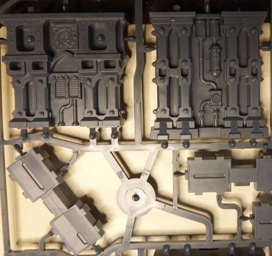
- Second, the change of look for the pillars: it is not really rocket design. Clearly it looks like a lazy work here. However one cannot really say that there are less details than on the former pillars. So why this feeling? I guess, at least for me, that it is related to the lack of void areas. These have been filled as pannels and pillars are resulting bulky (I guess on puerpose). But not getting any hollow area leaves a curious outlook to the whole stuff. While the Boarding action terrain had treated these plain areas in a very good looking fashion, here it is not the case. Additionally all accessories have disappeared: so no handrails, not freed cables hanging around or ladders... Instead you have some square add-ons to represent entry points. In the end it is not really a big deal. I found that mounting the handrails has been a painful process both for storage and gaming ergonomy in general. But it looks better on pics for sure.
- Third, the Furnace. No change; the same sprue as before. Nothing to add.
- Fourth, the specific "objective markers" sprue. You get a substancial amoount of objective markers. They are large, bulky, and may eventually be used as LoS blocking terrain. It is once again less subtle in design than previous Objective markers designed by GW. I will personaly try not to use them as such, rather putting them on other pieces of terrain to give more volume (for example as hatches on STC Ryza bunkers). Shall you look for Objetcive markers, better buy the Hachette "Imperial Objective" spure on ebay or some Gallowdark terrain (Shadowvault is nice for that). They will look better.
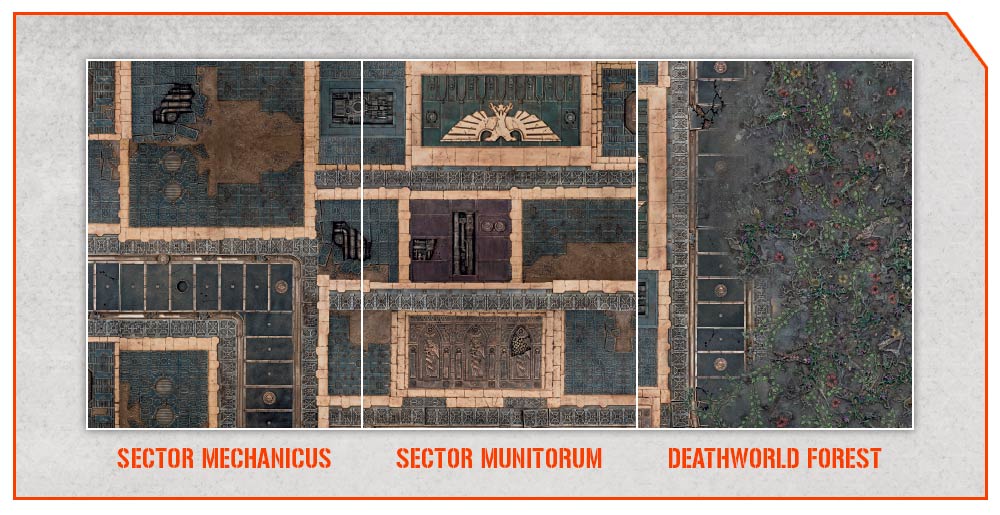
- Finally, the mat. We saw the head side. Tail side is in the same mood but eventually with less "open sea" area. Here too, more about that latter.
2. Is it the molding quality or the molding philosophy?
The uneasy discrepancy between the sprues is not necesary an issue. But as it sorts out obvious because it comes in the same box. Well, you can´t hide the forest behind the tree, right? There is IMHO a clear and deliberate will of slimming the plastic chunks. The round platform is globally OK on the gaming side but bellow, it is made at the economy. To get less plastic. The consequence is something lighter in terms of weight (which may end up being a benefit as mounting a stable paltforms on the Furnace looks like being a Perious Hike in Perious Environement. I will see when the time will come to paint and glue). But looks by yourself, comparing a "old design platform" with this "new design plaform":
The drastic sliming is eventually relevant as the round platform looks like not being design for another purpose than fitting on the furnace. Do not look for any kind of modularity here. It is done to go there, on top of the cylinder, and that´s all. Period. Click Bait design. This is a little bit of a deception, especially if you look at the pillars´ design that may hide something in plain sight.
3. The Pillars.
OK, they look odd. But this is secondary. After all, the older ones looked better but once set bellow a platform, you do not really take any benefit of the amount of details available. So More is eventually not Better. What is puzzeling with the Pillars is the poptential purpose behind the design features. You have 2 types of pilars. One type molded into a single piece whilethe another type molded in 2 parts: a Piedestal and the main structure to be set on top.

They can be stacked in order to reach twice the height and equalize the old Sector Mechanicus pillars. But for that you need one type of each. This is not anyway making the diffrent design necesary, isn´t it? So, what is the purpose there? Shall we foresee another (future) set using these 2 types of pillars in a distinct manner? Something that may jsutify not using the piedestal? Questions, questions... ![]()
4. The mat
There is no need to talk about the colours... This is a very personal judgment. But liking it or not there is something striking with this mat: at the moment it is useful only for Kill Team. This is a very important evolution in the design philosophy I feel. And it reached its climax with this set. Initial Kill zones released had a 2 side mat with one side uniformized to be used in conjunction to other kill zone mats (more or less). Thank you WarCom:

This is over. This is over for a while some may tell me. Sure, but at least the previous zones were not too marked and still usable in 40k too. Here, a plain sea area and only that on the mat may start to be problematic as you cannot match it with anything. With anything, yet (?). I guess this is one key feature of the "Seasonality" of KT: get the future mats along this one to be able getting a combined area worth playing a 2k pts games of 40k maybe....
5. Conclusions
Well, it is a set that serves its purpose: getting an environement for KT under Perious Environement zones´ rules. The associated "fog of war" rules affecting LoS make useless most of other LoS blocking elements. So why bother putting some into the set? The simplified rules for terrain from 10th also looks like they imprinted their influence: get rid of too much details such as handrails as anyway stuff on gantries will benefit of cover. So there is no need of handrails, isn´t it?
Price wise, it is not badly priced. 2 sets of gantries, one ferratonic furnace and its large platform and a mat plus objective markers. If you can get it under discount from a FLGS you might get it for the same price as past edition kill zone environements. And the quantity of stuff is higher that in some past killzones. So, no rant there. This set is not cheap but it ain´t overpriced neither (only if compared with other GW internal references of course...).
But the overall impression it left me is the one of a product designed to be temporal, fast consumed and fast forgotten. If it does not cut the heredity bound with past Mechanicus Sector, it does not however looks like it is meant to be a installed in perenity. Said that, I see value in 2 cases mainly:
1. for people like me, already owning some terrain and wishing to have some punctual additions that give something not already included (half height gantries mainly)
2. for pure KT players that do not necesarily need more than that to get a gaming arena
But as a base for starting a collection of terrain for 40k... I would advise passing.
What do you think?
PS: Ohh, and BTW, as a side note: my set came labelled "made in UK", if it is of any relevancy.


0 Comments
Recommended Comments
There are no comments to display.
Create an account or sign in to comment
You need to be a member in order to leave a comment
Create an account
Sign up for a new account in our community. It's easy!
Register a new accountSign in
Already have an account? Sign in here.
Sign In Now