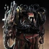
Daemon Smith Posted January 1, 2011 Share Posted January 1, 2011 I came up with this scheme for a chapter called the "Silver Destroyers", but I'm not so sure that I like it. What do you guys think: http://i758.photobucket.com/albums/xx225/Loken48/SilverDestroyers.jpg Link to comment https://bolterandchainsword.com/topic/218335-good-scheme-or-not/ Share on other sites More sharing options...
Dave the Twisted Posted January 1, 2011 Share Posted January 1, 2011 Personally I would advise against the helmet crown and faceplate being two different colors, since things that look good on the B&C Painter don't always look good on a real model. I'd suggest using a red helmet for your Battle Companies and black helms for the First Company. Alternatively, your scheme looks quite similar to the Silver Skulls which have a pretty interesting background if you're not afraid of your chapter dabbling in some rampant trophy-taking and some fortune-telling. Link to comment https://bolterandchainsword.com/topic/218335-good-scheme-or-not/#findComment-2603665 Share on other sites More sharing options...
Grey Mage Posted January 1, 2011 Share Posted January 1, 2011 Its the eyes that cause issue for me, though I agree- go with a solid color if you can for the helmet. Id say making them a light blue, like the hold hawk turquoise would work better. Link to comment https://bolterandchainsword.com/topic/218335-good-scheme-or-not/#findComment-2603743 Share on other sites More sharing options...
TemplarCoyote Posted January 2, 2011 Share Posted January 2, 2011 Using a greenish eyes will help contrast with the red (complimentary colors; art 101) in a "pleasing" manner. Also agree on one color for the head... and using different colors to differentiate between roles. Link to comment https://bolterandchainsword.com/topic/218335-good-scheme-or-not/#findComment-2604852 Share on other sites More sharing options...
Recommended Posts
Archived
This topic is now archived and is closed to further replies.