Rhetoricus Posted November 23, 2013 Author Share Posted November 23, 2013 Yeah, i think im gonna get the VGC range in the not too distant future. I was a bit reticent to change at first. But i'm actually looking forwards to trying to recreate the yellow ive got going in that range now. Done some highlighting today and a few minor details. Link to comment https://bolterandchainsword.com/topic/252731-%E2%80%8Bimperial-fists-1st-company/page/5/#findComment-3529467 Share on other sites More sharing options...
chaplainmikey Posted November 23, 2013 Share Posted November 23, 2013 Really nice work, still think you've nailed that sweet spot between too bright and too sandy with the yellow. If you find your process works and gived you the results you desire, stick with it and don't compromise on the quality unless you think changing it up will yield a better paintjob. Keep up the good work mate. :) Mike. Link to comment https://bolterandchainsword.com/topic/252731-%E2%80%8Bimperial-fists-1st-company/page/5/#findComment-3529489 Share on other sites More sharing options...
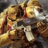
Dark Scipio Posted November 23, 2013 Share Posted November 23, 2013 I can say two things: - I never saw the Space Hulk Terminators made to Imperial Fists until now - I still not saw the Space Hulk Terminators made to Imperial Fists not looking great. Link to comment https://bolterandchainsword.com/topic/252731-%E2%80%8Bimperial-fists-1st-company/page/5/#findComment-3529538 Share on other sites More sharing options...
Rob_Loken Posted November 24, 2013 Share Posted November 24, 2013 Lovely work mate. You've got a great tone there. Link to comment https://bolterandchainsword.com/topic/252731-%E2%80%8Bimperial-fists-1st-company/page/5/#findComment-3529576 Share on other sites More sharing options...
Major_Gilbear Posted November 24, 2013 Share Posted November 24, 2013 They look very good, well done! In fact, looking at these, I'm surprised at your earlier comment that you're not a very experienced painter... :) In terms of method, I don't think you need to cover all the yellow with the brown wash, only to overpaint it all yellow again. I think if you thin the wash with a little water, matte medium and some flow release, you can try something like this: - Spray on yellow undercoat - Yellow paint basecoat - Line in the brown wash. Keep it thin, repeat if necessary for darker tones - Tidy up any brown overpaint with your yellow highlights - Apply final highlights Essentially, the only parts of the brown left are in the recesses, so just apply it there. If the paint is thin and translucent, even a little overspill won't matter much. You can also repeat this if you want darker tones, or even use a darker brown in loaclised areas. This is a step you'll get the hang of pretty fast - I'd say within about two models. Also, as the highlights will include a little white/ivory, they will cover small colour differences better than the yellow on its own, so use this to your advantage to avoid overpainting brown overspill with normal yellow first - it'll be on the edges that you want to highlight anyway! Best of all, the colours are the same as you're using now, and will give the same effect at the end, so you should have no issues matching. What it also does is reduce the number of paint layers on each of the big surfaces, and avoids having to overpaint the brown panels with yellow again (which must surely take you a few passes currently?!). Link to comment https://bolterandchainsword.com/topic/252731-%E2%80%8Bimperial-fists-1st-company/page/5/#findComment-3529931 Share on other sites More sharing options...
hushrong Posted November 24, 2013 Share Posted November 24, 2013 These guys are still looking awesome! Link to comment https://bolterandchainsword.com/topic/252731-%E2%80%8Bimperial-fists-1st-company/page/5/#findComment-3530004 Share on other sites More sharing options...
Rhetoricus Posted November 24, 2013 Author Share Posted November 24, 2013 Thanks all, your support and encouragement mean the world to me. @Mikey + Duncs Thanks guys, the yellow tone ive got here is the thing i'm happiest about on these models. @Mikey Don't worry mate, I won't ever compromise. Everything I paint will be this good or better I promise. Or I simply won't post it. @Scipio Thanks for the kind words bro. I'm glad you like them. @Hushrong Thanks buddy, really pleased you're still along for the ride. You were amongst the first to offer your support and encouragement. It is hugely appreciated. @Gilbear Thanks for the kind words, means a lot. You're absolutely correct it is taking me 3 or 4 passes to recover the wash with yellow and that is why it's taking me so long to get anywhere with them. When I get my new paints I fully intend to experiment on a few models with the new colours/methods, to see if I can get my painting time down and my quality up. Of course if I can't accurately reproduce my scheme i'm in trouble as Lyanden Darksun and Golden Yellow are getting harder and harder to come by. The other thing that is really important to the overall effect is Gryphonne Sepia another OOP wash. I can't stress how important this colour is to the final tone of the yellow. A suitable analogue is a must have. If I can recreate what ive done here (or better it) with the VGC range I cannot tell you how happy I would be. Fingers crossed. Link to comment https://bolterandchainsword.com/topic/252731-%E2%80%8Bimperial-fists-1st-company/page/5/#findComment-3530234 Share on other sites More sharing options...
Major_Gilbear Posted November 25, 2013 Share Posted November 25, 2013 Gryphonne Sepia = Army Painter Light/Soft Tone I beleive! ;) As for the rest, I personally noticed a lot of detail improvement and better smoothness when I started to rationalise how I layer paints onto models. I used to paint a *lot* of red for various armies too, and whilst not as fussy as yellow, thinking more about how I paint it has definately led to better and easier results. Hopefully, you'll have a similar epiphany! ;) Link to comment https://bolterandchainsword.com/topic/252731-%E2%80%8Bimperial-fists-1st-company/page/5/#findComment-3530371 Share on other sites More sharing options...
Rhetoricus Posted November 25, 2013 Author Share Posted November 25, 2013 Hopefully! Would you be inclined to elaborate a little further and break the process down for me? Also if you have a link to anything you've painted I'd love to take a look. Finally I'd just like to say a massive thank you for all the help (in both threads) you've been great....so THANKS. :) Link to comment https://bolterandchainsword.com/topic/252731-%E2%80%8Bimperial-fists-1st-company/page/5/#findComment-3530445 Share on other sites More sharing options...
ephrael Posted November 25, 2013 Share Posted November 25, 2013 I really like the conversions you have going on here with the Space Hulk models, I haven't seen anyone else do the IF with them either. I also like the subtle use of the limited edition Citadel Brush Set Box in the background of the last few pics. I missed buying that one and regret it to this day, I snatched the newer one n the metal tin though. I highly recommend that you switch to the Vallejo line of paints as well. I made the switch years ago and gave away all of my GW paints. I also have one or two more recommendations for you if you don't mind. I use a household product called Future Floor Polish here in the states mixed 1:10 with distilled water as a clear coat before applying any washes. This allows the wash to flow into the creases and low spots of the mini and it won't pool on the surfaces. It helps 100% with my painting. I learned about it in the FW Masterclass Books. I believe the product is called Klear over in the UK, do a search for it. You might want to look into oil paint for your washes as well. I'm just learning about them myself but the results are pretty good from what I've seen. Link to comment https://bolterandchainsword.com/topic/252731-%E2%80%8Bimperial-fists-1st-company/page/5/#findComment-3530464 Share on other sites More sharing options...
Major_Gilbear Posted November 25, 2013 Share Posted November 25, 2013 Hopefully! Would you be inclined to elaborate a little further and break the process down for me? Also if you have a link to anything you've painted I'd love to take a look. Finally I'd just like to say a massive thank you for all the help (in both threads) you've been great....so THANKS. You're very welcome! I'm always happy to give people the benefits of my mistakes learning experience. :D I don't have many photographs of painted things, and consequently I feel that I've bandied out the same couple of pix far too much recently... However, a few figs here were painted about two years ago when I switched to mostly P3 paints if you want to have a look. I'm working on some Dark Angels at the moment that I hope to finish in the next week or so (fingers crossed!). As for breaking down the process for you, what do you mean exactly? Like a step-by step? Link to comment https://bolterandchainsword.com/topic/252731-%E2%80%8Bimperial-fists-1st-company/page/5/#findComment-3530508 Share on other sites More sharing options...
Rhetoricus Posted November 25, 2013 Author Share Posted November 25, 2013 @ Mikhail Love recommendations bro, so thanks. Anything that is going to help me become a better painter is very welcome indeed. I have a question about the polish though. Does it not make it more difficult to apply further layers of paint? I mean if the wash doesn't sit on the surface of the model, how does paint react? Just curious is all, Im guessing it must be fine or you wouldn't be recommending it but thought I'd ask anyway. I bought that limited edition masters set with good intentions of learning how to become a master painter haha, but life happened and it sat in a cupboard unloved for years. A situation I'm now working hard to remedy. Hell of a long way to go yet though, although I am happy with the progress I seem to be making. Thanks for taking a look bud. :) Link to comment https://bolterandchainsword.com/topic/252731-%E2%80%8Bimperial-fists-1st-company/page/5/#findComment-3530525 Share on other sites More sharing options...
Rhetoricus Posted November 25, 2013 Author Share Posted November 25, 2013 Hopefully! Would you be inclined to elaborate a little further and break the process down for me? Also if you have a link to anything you've painted I'd love to take a look. Finally I'd just like to say a massive thank you for all the help (in both threads) you've been great....so THANKS. :) You're very welcome! I'm always happy to give people the benefits of my mistakes learning experience. :D I don't have many photographs of painted things, and consequently I feel that I've bandied out the same couple of pix far too much recently... :blush: However, a few figs here were painted about two years ago when I switched to mostly P3 paints if you want to have a look. I'm working on some Dark Angels at the moment that I hope to finish in the next week or so (fingers crossed!). As for breaking down the process for you, what do you mean exactly? Like a step-by step? Yeah, if you can be bothered a step by step would be fab. I desperately want to sharpen up my skills. There more info I can sponge up the better. Link to comment https://bolterandchainsword.com/topic/252731-%E2%80%8Bimperial-fists-1st-company/page/5/#findComment-3530532 Share on other sites More sharing options...
Brother-Chaplain Kage Posted November 25, 2013 Share Posted November 25, 2013 The FFW contains a surfactant that breaks the water tension of your wash, which helps it get where you want and not pool and dry in splotches. Once it dries, it will be a bit glossy - and I've even used FFW straight from the bottle as a gloss coat - but you can put further layers of paint over it just fine. Link to comment https://bolterandchainsword.com/topic/252731-%E2%80%8Bimperial-fists-1st-company/page/5/#findComment-3530533 Share on other sites More sharing options...
Major_Gilbear Posted November 25, 2013 Share Posted November 25, 2013 I think Mikahil is suggesting that the Future goes on first, then the other washes will run off it more easily. Afterwards, you could lightly seal with Dullcote to make it matte again and regain the tooth you need for other coats of paint to grip. Personally though, I would rather make the wash flow more by using some flow release, as then the surface is left as usual for subsequent paints without having to seal it first. It's also at least one step less, and I'm lazy! :D I will see what I can do regarding a tutorial with some pix, but this is unlikely to happen for a week or two (I have to get those DAs finished first! ;) ). I am happy to describe the process though, as it is pretty straightforward to explain. I suppose the only other thing to mention is to use a good sharp sable brush, and to keep the paints thin - this makes putting the paint on the model neatly much easier, and you waste less time correcting mistakes. There are lots of good brands, and I can vouch personally for Winsor & Newton (size 1 is really the only brush I use for 25-30mm figs, even for painting highlights on eyes). I point this out only because you'll wanting neat placement of the shading wash in tight spots, so I figure you should make this as easy for yourself as possible. :P Link to comment https://bolterandchainsword.com/topic/252731-%E2%80%8Bimperial-fists-1st-company/page/5/#findComment-3530545 Share on other sites More sharing options...
ephrael Posted November 25, 2013 Share Posted November 25, 2013 I may not have been entirely clear about the polish so I'll explain. You put a coat of it on BS let it dry. Then you apply your shade if choice, mine is usually a GW wash. The polish causes the ink to flow better and run into the low spots. The ink dries and you paint over it with paint. No need for any sealer unless you are applying layers if ink. The polish isn't as smooth a gloss coat so there is no adhesion problems for acrylic paints. I hope that helps. Link to comment https://bolterandchainsword.com/topic/252731-%E2%80%8Bimperial-fists-1st-company/page/5/#findComment-3530564 Share on other sites More sharing options...
Gillyfish Posted November 25, 2013 Share Posted November 25, 2013 Coming to this late, but those are some excellent models, congratulations. The yellow (as many others have commented) really make them pop. I also think that, as it isn't too bright, it lends them a real-world tone that you could build on some more if you wished to. For example, your test mini had some battle damage (possibly a little to much). Adding a little of this throughout the force would enhance the real-world feel as would a little subtle weathering around the feet. Nothing major - just a little. You also mentioned several pages ago about contrast. The blue you've used in the eyes works well, but you might also want to consider a deep red from time to time as a spot colour. You have a limited pallette at present, which works really well, but the yellows, golds and whites look a little too similar, so a deep red might work for contrast. I emphasise the deep - a bright red might make them look cartoony, whereas a deep colour would look good. Green might be another colour for use on laurels etc and would enhance the look through contrast. That's just my opinion of course. :) They do look VERY good though. Link to comment https://bolterandchainsword.com/topic/252731-%E2%80%8Bimperial-fists-1st-company/page/5/#findComment-3530831 Share on other sites More sharing options...
Rhetoricus Posted November 25, 2013 Author Share Posted November 25, 2013 You're opinion is very welcome indeed. I really appreciate any feedback I can get and am always looking for ways to improve. I have only one issue with battle damage and weathering....I'm absolutely terrified I balls it up. I've never painted anything this good before and i'm scared I ruin it haha. I know i'm gonna have to grow a spine and go for it soon though. What would Dorn think eh? As for the contrast I agree with you 100% unfortunately the model above is quickly running out of areas to apply this, although there are still a couple of lenses and the targeting laser on his fore-arm. Do you think red could work here? Thanks for taking a look Gillyfish and thank you for the kind comments and advice. :) Link to comment https://bolterandchainsword.com/topic/252731-%E2%80%8Bimperial-fists-1st-company/page/5/#findComment-3530864 Share on other sites More sharing options...
Gillyfish Posted November 26, 2013 Share Posted November 26, 2013 Well, I wouldn't go overboard on the battle damage. A little here and there on the odd mini might look good. Same applies to weathering - keep it relatively subtle to enhance the look rather than detract. Think about where such things might be; chipped paint on powerfists, a little mud on the lower edges of feet/greaves. I'd also point out that spot colours don't need to be on every model either. You're looking for things that can be applied consistently to a number of models across the army. That's my suggestion anyway. :) For example, my DA obviously have bone, green, red and black as major colours, but I also use blue as a contrasting spot colour for targeter lenses, etc. and grey for areas of stone, particularly on termies. Gold also works well for my army, but not if I use too much. Some of it is about finding out what works to convince you about a colour scheme. I tried out a green chest eagle for my terminators but didn't like it, so went with gold instead. I found the green too dark and highlighting it made it look fake and spoiled the 'warmth' of the colour scheme I was aiming for. Link to comment https://bolterandchainsword.com/topic/252731-%E2%80%8Bimperial-fists-1st-company/page/5/#findComment-3531338 Share on other sites More sharing options...
Major_Gilbear Posted November 26, 2013 Share Posted November 26, 2013 I personally feel too many IF armies are spoilt by totally overdoing battle damage and weathering. When applying it, the old adage of "less is more" definitely holds true. So, a little dirt around boots, a bit of scuffing on elbows/hands, a bit of sooty residue around the backpack powerplant - all these look best when subtle IMO. Also, remember that these are IF, not DG! ;) As for spot colours... These can be hard to apply evenly across a whole force because basic TA armour is often plainer than basic PA. Picking out non-armour details in spot colours doesn't look quite the same as picking out armour details either. I think this is a key modelling reason that Veterans in many Codex chapters have white helmets - it applies to both armour types easily, whereas shoulder trims for example do not. Usually though, helmet lenses, weapon casings, power weapon glow colours, armour colour, and basing is enough to tie an army together even if something like one spot colour is missing on a particular troop type. Besides, you can always go back and do a little more if you need to when your force has grown and you can assess the overall look better! :D Link to comment https://bolterandchainsword.com/topic/252731-%E2%80%8Bimperial-fists-1st-company/page/5/#findComment-3531424 Share on other sites More sharing options...
Silver fang Posted November 26, 2013 Share Posted November 26, 2013 I'm loving the crispness of the yellow. Hats off to you sir. Link to comment https://bolterandchainsword.com/topic/252731-%E2%80%8Bimperial-fists-1st-company/page/5/#findComment-3531441 Share on other sites More sharing options...
Rhetoricus Posted November 29, 2013 Author Share Posted November 29, 2013 Getting to a point now where most of the squad is somewhere near this stage. Link to comment https://bolterandchainsword.com/topic/252731-%E2%80%8Bimperial-fists-1st-company/page/5/#findComment-3533899 Share on other sites More sharing options...
zxyogi Posted November 29, 2013 Share Posted November 29, 2013 Lovely! Link to comment https://bolterandchainsword.com/topic/252731-%E2%80%8Bimperial-fists-1st-company/page/5/#findComment-3533951 Share on other sites More sharing options...
disease Posted November 29, 2013 Share Posted November 29, 2013 Fantastic work is done here Link to comment https://bolterandchainsword.com/topic/252731-%E2%80%8Bimperial-fists-1st-company/page/5/#findComment-3533954 Share on other sites More sharing options...
Razblood Posted November 29, 2013 Share Posted November 29, 2013 Still going strong :) I advise care when using VGC paints as they are fond of seperating inside the bottle/on the palette if you even look at them funny. Also Major Gilbear was correct in regards to the army painter inks being exactly the same as the old GW washes - Devlan Mud = Strong Tone, Gryphonne Sepia = Soft Tone & Badab Black = Dark Tone. They've also got Red, Green, Blue & Purple ones now as well. I recommend you take a look at the Coat D'Arms range of paints as they are the exact same as the late 90's GW paints (which are still epic). Keep it up mate :) Link to comment https://bolterandchainsword.com/topic/252731-%E2%80%8Bimperial-fists-1st-company/page/5/#findComment-3534040 Share on other sites More sharing options...
Recommended Posts
Archived
This topic is now archived and is closed to further replies.