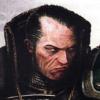
Inquisitor Eisenhorn Posted November 24, 2013 Share Posted November 24, 2013 I've started to paint up my Sisters that I've had waiting in the wings for years; my favorite scheme is this simple black/gold one found in the background of the John Blanche cover, but it seems a little boring when done to an actual miniature. Any ideas on how to punch it up? http://imageshack.us/a/img707/7391/gub4.jpg http://imageshack.us/a/img22/6553/fhk4.jpg Link to comment https://bolterandchainsword.com/topic/283755-hey-help-me-with-my-paint-scheme-too/ Share on other sites More sharing options...
Grotsmasha Posted November 24, 2013 Share Posted November 24, 2013 Perhaps 1 shade lighter on the loin cloth and maybe a white or grey bolter? I really do like what you have though. Perhaps change nothing of the paint scheme and achieve contrast with bright basing, maybe snow even... Cheers, Jono Link to comment https://bolterandchainsword.com/topic/283755-hey-help-me-with-my-paint-scheme-too/#findComment-3529960 Share on other sites More sharing options...
*Furyou Miko Posted November 24, 2013 Share Posted November 24, 2013 Use a highlight on her face and a lighter base - snow or sand, maybe, or a lighter ash waste type base. I love the colour scheme itself as it is. Edit: you could also change her hair colour to something contrasting, a light brunette or honey blonde for example. Link to comment https://bolterandchainsword.com/topic/283755-hey-help-me-with-my-paint-scheme-too/#findComment-3529964 Share on other sites More sharing options...
Major_Gilbear Posted November 24, 2013 Share Posted November 24, 2013 I think you have a lot of blacks which are the same, and a cloth colour that is essentialy your black highlight colour. The best way to add some interest is to make each black a little different. So the armour can be highlighted by adding a little dark turquoise to the black first, then adding a little light grey to that again. The colth is fine, but could be highlighted by adding a touch of ivory to it. the gun can be razor-hilghlighted sparingly in a flat grey, followed by a few white spots. Keep the highlights appropriate to the material too; small and very sharp on the gun, long and fairly sharp on the armour, and broad but soft on the cloth. Lastly, add in a little more silver and possibly a little cool white too, perhaps on some of the little details/icons. These will contrast with all the black colours and unify the scheme better at arm's length. If you want some suggestions on specific colours, I can make some, but you should be able to make what you have in your collection work I suspect! ;) This will also let you keep your current scheme, and although it might look brighter in hand than it is now, it will still look suitably dark and subdued on the tabletop. Link to comment https://bolterandchainsword.com/topic/283755-hey-help-me-with-my-paint-scheme-too/#findComment-3529969 Share on other sites More sharing options...
Inquisitor Eisenhorn Posted November 24, 2013 Author Share Posted November 24, 2013 Thanks good suggestions all! I've been tweaking it since this picture was taken but you all have given me some great food for thought. I have to plead guilty to not considering basing in terms of the color scheme often enough. @major, that's some deep thinking there brother, I will keep plugging away. I was just about to break and start adding red--glad I didn't. Link to comment https://bolterandchainsword.com/topic/283755-hey-help-me-with-my-paint-scheme-too/#findComment-3529976 Share on other sites More sharing options...
Major_Gilbear Posted November 24, 2013 Share Posted November 24, 2013 No probs; given your neat painting on that old Inquisitor, I look forward to your progress here! ;) Link to comment https://bolterandchainsword.com/topic/283755-hey-help-me-with-my-paint-scheme-too/#findComment-3529984 Share on other sites More sharing options...
Zincite Posted November 24, 2013 Share Posted November 24, 2013 Your colours are excellent. That black and muted gold is wonderful to behold. I don't think the issue is that you need more colour because that would reduce the impact of the muted scheme you've gone for. Instead, you need something to draw the eyes away from all the bland and dark spare space. I'd experiment with spots of detail. Find what works for you. You could colour in the bolter's exposed shells and the targeter. There's not a large amount of detail like that but there's lots of spare space on the bolter casing, cloth and even her legs. Try free-handing small icons or drawing purity seal-like script. If you'll forgive me abusing your excellent painting, I find that even this is much easier on my eyes. http://i1049.photobucket.com/albums/s397/Zincite/Warhammer/Battleister2.jpg As an aside, I wasn't sure about the flesh at first. It looked unfinished and bland. But after studying it I really like it. It reminds me of the old 3rd Edition artwork. Dark and grim. EDIT: I just noticed there's a grenade on her belt, too. Colour that in! Link to comment https://bolterandchainsword.com/topic/283755-hey-help-me-with-my-paint-scheme-too/#findComment-3529987 Share on other sites More sharing options...
Naminé Posted November 24, 2013 Share Posted November 24, 2013 I would change the face, make it lighter or with more colour. Then look at hair and finally the bolter and base. All of these should really help make the model stand out. Link to comment https://bolterandchainsword.com/topic/283755-hey-help-me-with-my-paint-scheme-too/#findComment-3530017 Share on other sites More sharing options...
Grgobart Posted November 24, 2013 Share Posted November 24, 2013 Most has been said already. Contrasting base colour, brighter metal parts, less pale face. A few things I did with my models (in case it might be helpful). Painting the bottom edge of the shin-guard gold, too. Applying some golden decoration to the edges of the cloth pieces. And for making one black different than the other, like in this case setting apart black hair from black armour, I tried using gloss varnish for the armour (while the hair was matt) and liked it so much, that I never painted my Sisters' armour otherwise, since. Link to comment https://bolterandchainsword.com/topic/283755-hey-help-me-with-my-paint-scheme-too/#findComment-3530090 Share on other sites More sharing options...
*Furyou Miko Posted November 24, 2013 Share Posted November 24, 2013 For a more subtle effect, you can try painting the varnish under the paint. The effect is very subtle, and only really noticeable when you go from one to the other on adjacent components. Link to comment https://bolterandchainsword.com/topic/283755-hey-help-me-with-my-paint-scheme-too/#findComment-3530118 Share on other sites More sharing options...
Inquisitor Eisenhorn Posted November 24, 2013 Author Share Posted November 24, 2013 Thanks for all the tips! This is my first trip into the Sisters forum and I'm impressed by this group. I've spent the afternoon working on all the tips, and I've made the base a sandy brown, and done quite a bit of highlighting. Frankly, I think that I just needed to up the contrast of the highlights. I also added gold to the center breather piece and upped the contrast in the face. http://imageshack.us/a/img22/6553/fhk4.jpg http://imageshack.us/a/img541/4489/9ecy.jpg So, better? Link to comment https://bolterandchainsword.com/topic/283755-hey-help-me-with-my-paint-scheme-too/#findComment-3530185 Share on other sites More sharing options...
W.A.Rorie Posted November 24, 2013 Share Posted November 24, 2013 A lot better needs red but not sure where...maybe her lips.... Link to comment https://bolterandchainsword.com/topic/283755-hey-help-me-with-my-paint-scheme-too/#findComment-3530216 Share on other sites More sharing options...
vonny Posted November 24, 2013 Share Posted November 24, 2013 a spot color (such as red) would indeed help that last little bit. As the whole of the miniature is quite cool in color, a warm color might indeed help. Maybe just making the skin tone a bit warmer would be enough to make it spring out. Unless of course you wish to keep it dark, gloomy and cold. The sharper highlights and the base did a lot of good though, I'll admit that. Looks like a twilight planet that's constantly close to freezing now :) Link to comment https://bolterandchainsword.com/topic/283755-hey-help-me-with-my-paint-scheme-too/#findComment-3530289 Share on other sites More sharing options...
*Furyou Miko Posted November 25, 2013 Share Posted November 25, 2013 Yes, much. :) Although I'm not sure how much of that is the difference in environmental light levels, lol. ... don't give her red lipstick, that's just blatantly idiotic. The end of her scope, maybe, or the eyeholes on her rebreather skull. Link to comment https://bolterandchainsword.com/topic/283755-hey-help-me-with-my-paint-scheme-too/#findComment-3530315 Share on other sites More sharing options...
Major_Gilbear Posted November 25, 2013 Share Posted November 25, 2013 http://imageshack.us/a/img22/6553/fhk4.jpg http://imageshack.us/a/img541/4489/9ecy.jpg So, better? Yes, although there could be a bit more distinction between the gun, the armour, the hair, and the tabard. Since the model looks like it's under moonlight, I think it would be fun to continue the look by adding a very subtle blue to the blacks; a different one to each of a couple of the main areas only (say armour and gun). I did the sheen on black hair with cool blue-grey and a white here, and it still reads as "black" to the viewer, despite clearly having some colour to it. So, as long as you use it carefully, a little colour isn't something to shy away from. I would avoid reds and other jarring colours though; unless you change the mood of this scheme quite a lot, it's going to keep distracting the viewer's eye from the rest of the model. Link to comment https://bolterandchainsword.com/topic/283755-hey-help-me-with-my-paint-scheme-too/#findComment-3530364 Share on other sites More sharing options...
Inquisitor Eisenhorn Posted November 25, 2013 Author Share Posted November 25, 2013 The general gist of the aesthetic I'm going for is the John Blanche look, if you are familiar with his miniatures. In that regard, I am not afraid of some jarring color choices like red--I just liked the threatening look of the all black Sister in his artwork. I am hesitant to add in blue greys because I'm afraid it will cool out the palette more than I am looking to do, although I definitely take your point about the distinction between the blacks on the gun, hair and armor. It's possible that it won't have the effect I'm afraid of though, so I'll experiment with it and see how it goes. The gun seems like the most problematic area to me. It just folds into the shape of the body too much, even with the sharper highlights. A different color for it seems desirable, but I don't want to use red, white and gold seem too extreme, grey has the same problem as black. Maybe hazard strips. Hah. Link to comment https://bolterandchainsword.com/topic/283755-hey-help-me-with-my-paint-scheme-too/#findComment-3530373 Share on other sites More sharing options...
Major_Gilbear Posted November 25, 2013 Share Posted November 25, 2013 What about a subtle texture in a colour very close to base colour on the gun casing? For example a simplified repeating fleur de lys motif? It would look like the casing is engraved, and would separate it from the smooth gloss of the armour. The other thing is that JB uses a lot of orange ink on both his models and his artwork. Maybe adding a small quantity to one of your blacks (turning it slightly brown) might do the trick? Link to comment https://bolterandchainsword.com/topic/283755-hey-help-me-with-my-paint-scheme-too/#findComment-3530383 Share on other sites More sharing options...
Inquisitor Eisenhorn Posted November 25, 2013 Author Share Posted November 25, 2013 The other thing is that JB uses a lot of orange ink on both his models and his artwork. Maybe adding a small quantity to one of your blacks (turning it slightly brown) might do the trick? Yes! That's a good idea--it keeps with the warm palette of the original art. I was worried the blue/black technique, while effective, took the model in the wrong direction from the source art. I'll see what I can do with some rust oranges, etc. might try some blue in the hair too. Link to comment https://bolterandchainsword.com/topic/283755-hey-help-me-with-my-paint-scheme-too/#findComment-3530415 Share on other sites More sharing options...
Major_Gilbear Posted November 25, 2013 Share Posted November 25, 2013 Well, blue and orange (done sensitively) can work well together, so you could use the orange to warm up the black of the gun, and a little cool grey to contrast the armour against it. I think that combined with the orange, that would help to capture the feel of the art too - often JB uses white paint on his artwork as well as orange ink, and over black ink the white paint can produce a smoky blue-ish hue. Link to comment https://bolterandchainsword.com/topic/283755-hey-help-me-with-my-paint-scheme-too/#findComment-3530497 Share on other sites More sharing options...
WarriorFish Posted November 25, 2013 Share Posted November 25, 2013 Looks very cool, like others have said just a little dash of colour is all that's needed I think. Hair colour is probably the easiest way to achieve this, and her lips make her look like she's been out in the cold a long time (though not lipstick for the love of the Emperor). I reckon if you spruced the base up a bit more then that would help too as you could do quite a bit with it without directly changing the model. How many models will you be doing? I'd like to see an army in this scheme! Link to comment https://bolterandchainsword.com/topic/283755-hey-help-me-with-my-paint-scheme-too/#findComment-3530555 Share on other sites More sharing options...
Vigrid Of Asgaror Posted November 25, 2013 Share Posted November 25, 2013 It definitely looks better. I look forward to seeing the next stage of the colour scheme. It is an interesting one. Link to comment https://bolterandchainsword.com/topic/283755-hey-help-me-with-my-paint-scheme-too/#findComment-3530624 Share on other sites More sharing options...
Inquisitor Eisenhorn Posted November 25, 2013 Author Share Posted November 25, 2013 Looks very cool, like others have said just a little dash of colour is all that's needed I think. Hair colour is probably the easiest way to achieve this, and her lips make her look like she's been out in the cold a long time (though not lipstick for the love of the Emperor). I reckon if you spruced the base up a bit more then that would help too as you could do quite a bit with it without directly changing the model. How many models will you be doing? I'd like to see an army in this scheme! Thanks. I've had a small kill team of Sisters since I was a kid. Always loved those models. Here's the model count: 10 Seraphim the OLD canoness Sister superior Sister with flamer 2 heavy bolters 2 heavy flamers 5 regulars But I paint slowly; by the time I'm done the new plastics will probably be released! Edit: The old Canoness, 1 heavy bolter and 1 heavy flamer are still in their blisters with 90s price stickers that would make you weep! Link to comment https://bolterandchainsword.com/topic/283755-hey-help-me-with-my-paint-scheme-too/#findComment-3530637 Share on other sites More sharing options...
*Furyou Miko Posted November 25, 2013 Share Posted November 25, 2013 http://img.photobucket.com/albums/v205/KaguraHakubi/IK%20and%2040K/Sororitas/pricelol_zpscb85e9f9.jpg Like so? Link to comment https://bolterandchainsword.com/topic/283755-hey-help-me-with-my-paint-scheme-too/#findComment-3530650 Share on other sites More sharing options...
Inquisitor Eisenhorn Posted November 25, 2013 Author Share Posted November 25, 2013 Alright kids, here's the updated, slightly orange inked armor and newly warmed and tattooed face, along with a little blue in the hair. Before and After. http://imageshack.us/a/img22/6553/fhk4.jpg http://imageshack.us/a/img541/4489/9ecy.jpg http://imageshack.us/a/img443/5469/wgqg.jpg Link to comment https://bolterandchainsword.com/topic/283755-hey-help-me-with-my-paint-scheme-too/#findComment-3530724 Share on other sites More sharing options...
tvih Posted November 25, 2013 Share Posted November 25, 2013 I definitely like the look. Link to comment https://bolterandchainsword.com/topic/283755-hey-help-me-with-my-paint-scheme-too/#findComment-3530825 Share on other sites More sharing options...
Recommended Posts
Archived
This topic is now archived and is closed to further replies.