minigun762 Posted June 12, 2014 Share Posted June 12, 2014 First (mostly) finished test model. First model I've painted in half a decade, so I could use any feedback you'd like to give. I'll admit while this is hardly an amazing job, I'm quite proud of myself as this was better than I thought I could do. Link to comment https://bolterandchainsword.com/topic/292355-wip-thread-for-miniguns-vows/ Share on other sites More sharing options...
Acebaur Posted June 12, 2014 Share Posted June 12, 2014 I know you said that it's mostly finished, but not knowing what you have left I'll just point out the stuff I see. The highlighting: If you are going for a worn down look then it works pretty nicely(though it's not my style of highlights). It could be the brightness of the camera shot but I would add a second layer of a slightly lighter or darker shade of highlights. That's simply because in the picture it the grey is very similar to unpainted plastic. Of course it could just be the picture and it might not be needed looking at it in RL. The eyes could use a bit of clean up on the bottom but are otherwise good The pads are nicely done. Crisp lines and smooth paint. Do you plan to use transfers or are you going to freehand the crosses? I like the base. Definitely different than I've seen before. What all did you do to it? It looks like it could either be blood soaked sand or just red rock from an alien planet(both cool btw) Like I said above I'm not sure what you have to finish but there are a lot of little details you can paint to really make it pop. Stuff I see: The chest straps, the skull on the bolter, drilling the bolter barrel, the pipes and "ear" pieces on his face, the studs on the armor, the soft armor in the joints, the spot on the backpack behind his head and the purity seal could use some script. Overall great job for not having painted a thing in 5 years! Looking forward to seeing more! Link to comment https://bolterandchainsword.com/topic/292355-wip-thread-for-miniguns-vows/#findComment-3716323 Share on other sites More sharing options...
HLVW Posted June 12, 2014 Share Posted June 12, 2014 Great job so far for your test mini, I'm with Ace on this one about being not to sure how much more you still plan on doing, but for your highlighting, if you want to keep using the drybrush method I would recommend using a second lighter shade of grey over top of the darker and then hitting them with a wash applying more to the areas that will have more shadow depending on where you have the light source coming from, it will also help to bring the armour colour back to a black. Again great job and look forward to seeing more of your work. Link to comment https://bolterandchainsword.com/topic/292355-wip-thread-for-miniguns-vows/#findComment-3716328 Share on other sites More sharing options...
minigun762 Posted June 12, 2014 Author Share Posted June 12, 2014 Thanks for the feedback, I really appreciate the kind words and advice. Some responses in no particular order. I'd like to try and freehand the cross but I'm a bit concerned of making it crisp and I'd hate to mess up my shoulders. Damn things had four layers of grey and six of ivory! Highlight was one quick drybrush with dark grey (charcoal). It looks very minor in person but I wasn't sure about two layers. Base is just dark red, blood red and dark wash over. Supposed to be Martian inspired but it looks too wet for that. A question, is there a good way to add definition in the inside rim of the shoulder pad? Something to break up the white and black contrast. Link to comment https://bolterandchainsword.com/topic/292355-wip-thread-for-miniguns-vows/#findComment-3716336 Share on other sites More sharing options...
Marshal Mattias Posted June 12, 2014 Share Posted June 12, 2014 Some of the guys here use a thin line of a brownish colour around the inside rim, it looks really good and slightly 'warms' the white. I suspect that a careful application of something like chestnut ink (if that still exists) might work, given that you already have your white nice and clean. Link to comment https://bolterandchainsword.com/topic/292355-wip-thread-for-miniguns-vows/#findComment-3716376 Share on other sites More sharing options...
Marshal_Roujakis Posted June 12, 2014 Share Posted June 12, 2014 Or a little bit of Nuln Oil applied with your Detail Brush around the inside rim, if you're going for a more Urban feel. Link to comment https://bolterandchainsword.com/topic/292355-wip-thread-for-miniguns-vows/#findComment-3716536 Share on other sites More sharing options...
Acebaur Posted June 12, 2014 Share Posted June 12, 2014 Thanks for the feedback, I really appreciate the kind words and advice. Some responses in no particular order. I'd like to try and freehand the cross but I'm a bit concerned of making it crisp and I'd hate to mess up my shoulders. Damn things had four layers of grey and six of ivory! Have you ever tried transfers? If not you might want to give it a whirl. They are quite easy and can look really great Highlight was one quick drybrush with dark grey (charcoal). It looks very minor in person but I wasn't sure about two layers. Yeah I'd try a second layer(lighter) and see how it looks Base is just dark red, blood red and dark wash over. Supposed to be Martian inspired but it looks too wet for that. Try shooting it with some dull coat A question, is there a good way to add definition in the inside rim of the shoulder pad? Something to break up the white and black contrast. I fount that my efforts with that were unsuccessful. I personally found that I prefer the start contrast Link to comment https://bolterandchainsword.com/topic/292355-wip-thread-for-miniguns-vows/#findComment-3716646 Share on other sites More sharing options...
minigun762 Posted June 12, 2014 Author Share Posted June 12, 2014 I haven't tried transfers, I always got the sense that they were frowned upon for some reason. Not sure where that comes from. My current goal is to get the army up to table top quality, maybe a half step above that. I'd hazard a guess that I'm almost at that point. I've learned a lot with just this one model, not the least of which is that painting white does in fact suck! Link to comment https://bolterandchainsword.com/topic/292355-wip-thread-for-miniguns-vows/#findComment-3716739 Share on other sites More sharing options...
Acebaur Posted June 12, 2014 Share Posted June 12, 2014 I love transfers. While some shapes are pretty easy to freehand(the Templar cross isn't so bad) others are nigh impossible so transfers add realism and depth to a model. I prefer them also because when doing multiple models it provided uniformity in size and shape. On the Templar cross this is great because nothing throws the eye off like having one part of the cross not be the same shape as the others. Also they allow you to have really small but detailed things that would otherwise be really difficult to pull off. Golden Daemon winners may frown on it, but we aren't trying to win awards are we? Also in the time they spend on a single model we can probably paint an entire army Here are some examples of things that IMO are much crisper as a transfer http://i85.photobucket.com/albums/k48/Acebaur/40K/20140612_101516_zpsiucrodgp.jpg http://i85.photobucket.com/albums/k48/Acebaur/40K/20140612_101533_zpslr4hfpl5.jpg If you decide to try them out let me know and I'll be happy to post a tutorial on how to do them Link to comment https://bolterandchainsword.com/topic/292355-wip-thread-for-miniguns-vows/#findComment-3716823 Share on other sites More sharing options...
HLVW Posted June 12, 2014 Share Posted June 12, 2014 Ace Is that transfer from the FW BT transfer sheet? If so I might actually start using them. Link to comment https://bolterandchainsword.com/topic/292355-wip-thread-for-miniguns-vows/#findComment-3716898 Share on other sites More sharing options...
Acebaur Posted June 12, 2014 Share Posted June 12, 2014 Ace Is that transfer from the FW BT transfer sheet? If so I might actually start using them. Yeah both of them are. It's a great transfer sheet, well worth the price. Link to comment https://bolterandchainsword.com/topic/292355-wip-thread-for-miniguns-vows/#findComment-3716935 Share on other sites More sharing options...
minigun762 Posted June 12, 2014 Author Share Posted June 12, 2014 If you decide to try them out let me know and I'll be happy to post a tutorial on how to do them Of course! Link to comment https://bolterandchainsword.com/topic/292355-wip-thread-for-miniguns-vows/#findComment-3717120 Share on other sites More sharing options...
Honda Posted June 12, 2014 Share Posted June 12, 2014 I'd also like to add my congratulations on your test model. In general I agree with and echo the others comments. I would consider adding a thin wash (like 1 drop black wash to 10 drops of water*) to tie all the black highlighting together. I would also add that I think you should also consider painting the bolter magazine silver as well. As far as painting crosses goes, "yes" people do that, "yes" it's difficult to get it to look like a decal, but I would take Ace up on his offer to do decals. Later on, you can always go back over the decals with paint for some practice and to weather them up if you want. Looking good! Welcome to the team. :) Link to comment https://bolterandchainsword.com/topic/292355-wip-thread-for-miniguns-vows/#findComment-3717299 Share on other sites More sharing options...
minigun762 Posted June 12, 2014 Author Share Posted June 12, 2014 I would also add that I think you should also consider painting the bolter magazine silver as well. The entire gun should be the same color. Gun metal then dark tone wash then dry brush with chain mail. At least that was the plan. Link to comment https://bolterandchainsword.com/topic/292355-wip-thread-for-miniguns-vows/#findComment-3717323 Share on other sites More sharing options...
minigun762 Posted June 13, 2014 Author Share Posted June 13, 2014 Tried a second dry brush highlight but it just seems so light and streaky. Could be too much paint on the brush or I'm just not dry brushing correctly. I like the look of the line highlighting but don't trust my skill level to make all those tiny crisp lines. Link to comment https://bolterandchainsword.com/topic/292355-wip-thread-for-miniguns-vows/#findComment-3717690 Share on other sites More sharing options...
Honda Posted June 13, 2014 Share Posted June 13, 2014 Ok, you are correct and I didn't pick up on that initially. So...since you have nothing else to do :P, I would offer for consideration that you should paint the plate on the side of the bolter "a" color. Black is pretty typical, could be white or red. But I think you should do something to distinguish the different parts...another possibility, is just use more wash on the side of the gun if you like the metallic look (and I think that works too), just so there is a differential there. Then the mag, barrel, back piece are a brighter metal, and the sides are a darker metal. Just a thought. I do think you are ready to take down the rest of the guys in your vow. "Critiques can occur while the master is working." - some pseudo Hollywood wise man Link to comment https://bolterandchainsword.com/topic/292355-wip-thread-for-miniguns-vows/#findComment-3717703 Share on other sites More sharing options...
minigun762 Posted June 13, 2014 Author Share Posted June 13, 2014 I would offer for consideration that you should paint the plate on the side of the bolter "a" color. Black is pretty typical, could be white or red. But I think you should do something to distinguish the different parts...another possibility, is just use more wash on the side of the gun if you like the metallic look (and I think that works too), just so there is a differential there. Then the mag, barrel, back piece are a brighter metal, and the sides are a darker metal. I thought about that. I've seen it a lot but I initially liked the idea of the simple all metallic color scheme. However I'm also aware that it might just be too much of the same color with no contrast so I'd definitely consider the idea if people think it would add more pop to the model. Link to comment https://bolterandchainsword.com/topic/292355-wip-thread-for-miniguns-vows/#findComment-3717715 Share on other sites More sharing options...
Honda Posted June 13, 2014 Share Posted June 13, 2014 I think it's worth looking into something that differentiates the sides from the other bits, what that is depends on what you are looking for. I think a darker metal on the sides (i.e. more wash) would look rather cool. I've done that before on other models and it works. It just may take another 1-2 washes on that bit to achieve the effect. Link to comment https://bolterandchainsword.com/topic/292355-wip-thread-for-miniguns-vows/#findComment-3717736 Share on other sites More sharing options...
Acebaur Posted June 13, 2014 Share Posted June 13, 2014 Tried a second dry brush highlight but it just seems so light and streaky. Could be too much paint on the brush or I'm just not dry brushing correctly. I like the look of the line highlighting but don't trust my skill level to make all those tiny crisp lines. Picture for reference? I think if you are going for a drybrush look then you definitely have too much paint. If you want a straight drybrush look take a look a HLVW's marines(correct me if I'm wrong) as I think he did that for his guys. Link below. http://www.bolterandchainsword.com/topic/286601-the-nemesis-crusade-vow-4-up/?p=3715813 I would offer for consideration that you should paint the plate on the side of the bolter "a" color. Black is pretty typical, could be white or red. But I think you should do something to distinguish the different parts...another possibility, is just use more wash on the side of the gun if you like the metallic look (and I think that works too), just so there is a differential there. Then the mag, barrel, back piece are a brighter metal, and the sides are a darker metal. I thought about that. I've seen it a lot but I initially liked the idea of the simple all metallic color scheme. However I'm also aware that it might just be too much of the same color with no contrast so I'd definitely consider the idea if people think it would add more pop to the model. Just use a black wash like the one GW has(Nuln oil it's called now? Used to be Badab Black) and wash the boltgun if you want an all metallic look. Depending on how dark you want it(use more or less wash) the wash will settle into the recesses and provide a nice contrast. Take a look at my Crusade thread for some shots of black washed weapons http://www.bolterandchainsword.com/topic/288402-the-jericho-crusade-sword-brethren-wip/?p=3695768 Link to comment https://bolterandchainsword.com/topic/292355-wip-thread-for-miniguns-vows/#findComment-3717773 Share on other sites More sharing options...
minigun762 Posted June 13, 2014 Author Share Posted June 13, 2014 Acebaur: I've given it one wash like you described. Are you saying to give different sections of the bolter another wash or two to differentiate the various bolter areas? Link to comment https://bolterandchainsword.com/topic/292355-wip-thread-for-miniguns-vows/#findComment-3717784 Share on other sites More sharing options...
HLVW Posted June 13, 2014 Share Posted June 13, 2014 Tried a second dry brush highlight but it just seems so light and streaky. Could be too much paint on the brush or I'm just not dry brushing correctly. I like the look of the line highlighting but don't trust my skill level to make all those tiny crisp lines. Like mentioned above, a picture would be great for reference. For your two dry brushes, (not sure what colours you are using) try out dawnstone for the base grey and then Administratum(not sure if i spelt that right) for the second and lighter. Ensure that you have almost next to no paint on your brush before applying either coat to your mini. Once both have dried, yes they will seem obscenely bright and streaky however that is where that wash comes into play. With slight layers of wash you start at the lighter areas and work your way down to the darker as the wash will slightly pool and where your brush lifts up will become darker. Keep doing this until you are happy with haver dark it is. This will take up some time but it is better to wait for the wash to dry and see how dark your layer is before smothering more on and then not being happy with it. The strakyness that you see with the drybrush will add a nice worn or weathered effect to your armour. As for the line highlighting, avoid using the tip of the brush and work with the side of it instead, you will have much more control of the paint and the effect is totally worth it. I hope this doesnt seem like I'm trying to teach you to suck eggs, just trying to help out a fellow brother. Best of luck Link to comment https://bolterandchainsword.com/topic/292355-wip-thread-for-miniguns-vows/#findComment-3717833 Share on other sites More sharing options...
minigun762 Posted June 13, 2014 Author Share Posted June 13, 2014 At work now but I'll post a picture soon of the second dry brush attempt and subsequent washing. Still no transfers, I'll do those last once everything else is done. I gotta remind myself that this is my first attempt at painting in a long time and the goal is table top quality so I don't get frustrated by comparing my skill level to some of the amazing work I've seen here. Link to comment https://bolterandchainsword.com/topic/292355-wip-thread-for-miniguns-vows/#findComment-3717897 Share on other sites More sharing options...
Honda Posted June 13, 2014 Share Posted June 13, 2014 Do your best. That is all you are striving for. It's not "do your perfect" or "do your amazing". Just do your best. In time, with practice you will improve. That's what makes a true victory taste so sweet, the fact that it comes after a great effort. That is where true appreciation comes from. ONWARDS! Link to comment https://bolterandchainsword.com/topic/292355-wip-thread-for-miniguns-vows/#findComment-3717921 Share on other sites More sharing options...
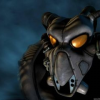
minigun762 Posted June 14, 2014 Author Share Posted June 14, 2014 This is my test model with a second dry brushing attempt (lighter grey) and a second wash. Nothing else has been changed. (no flash on this picture, so I hope it looks more realistic). Link to comment https://bolterandchainsword.com/topic/292355-wip-thread-for-miniguns-vows/#findComment-3718264 Share on other sites More sharing options...
Acebaur Posted June 14, 2014 Share Posted June 14, 2014 I think it looks pretty good. I can clearly see all the small details in his armor that would otherwise disappear in the black. Using a drybrush will have the effect of having a more greyish color than black, but that's ok. I think the head might have gotten a little too much but it's not bad. I notice you cleaned up the eyes and painted the chest straps. They look good. I guess the big question is, are you happy with it? ;) Link to comment https://bolterandchainsword.com/topic/292355-wip-thread-for-miniguns-vows/#findComment-3718357 Share on other sites More sharing options...
Recommended Posts
Archived
This topic is now archived and is closed to further replies.