The pilot is looking fantastic! I have wanted to see a pilot with a "cable-mane" like that for a long time, and this is an excellent proof of concept! This is all very inspiring.
Undivided Renegade Knight - Petey returns to Chaos
The pilot is looking fantastic! I have wanted to see a pilot with a "cable-mane" like that for a long time, and this is an excellent proof of concept! This is all very inspiring.
Thanks a ton, i've been a fan of your knights and khorne stuff for a while so that means a lot!
I'll be mimicking the look for the knight's head too, nothing says chaos like a bit of vanity right?
Edited by PeteySödesThat cockpit is super cool, nice sculpting skills on that!!
More fun progress!
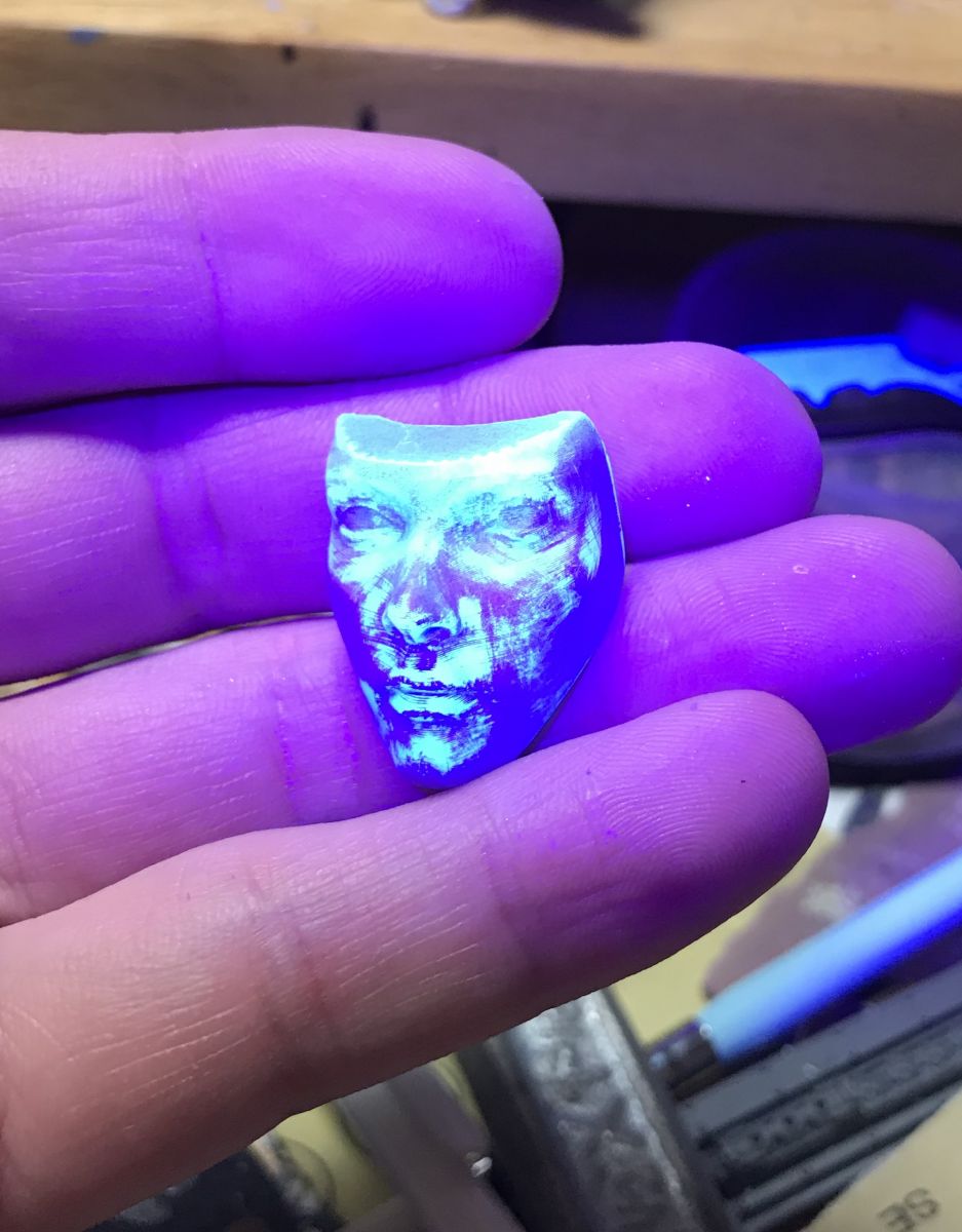
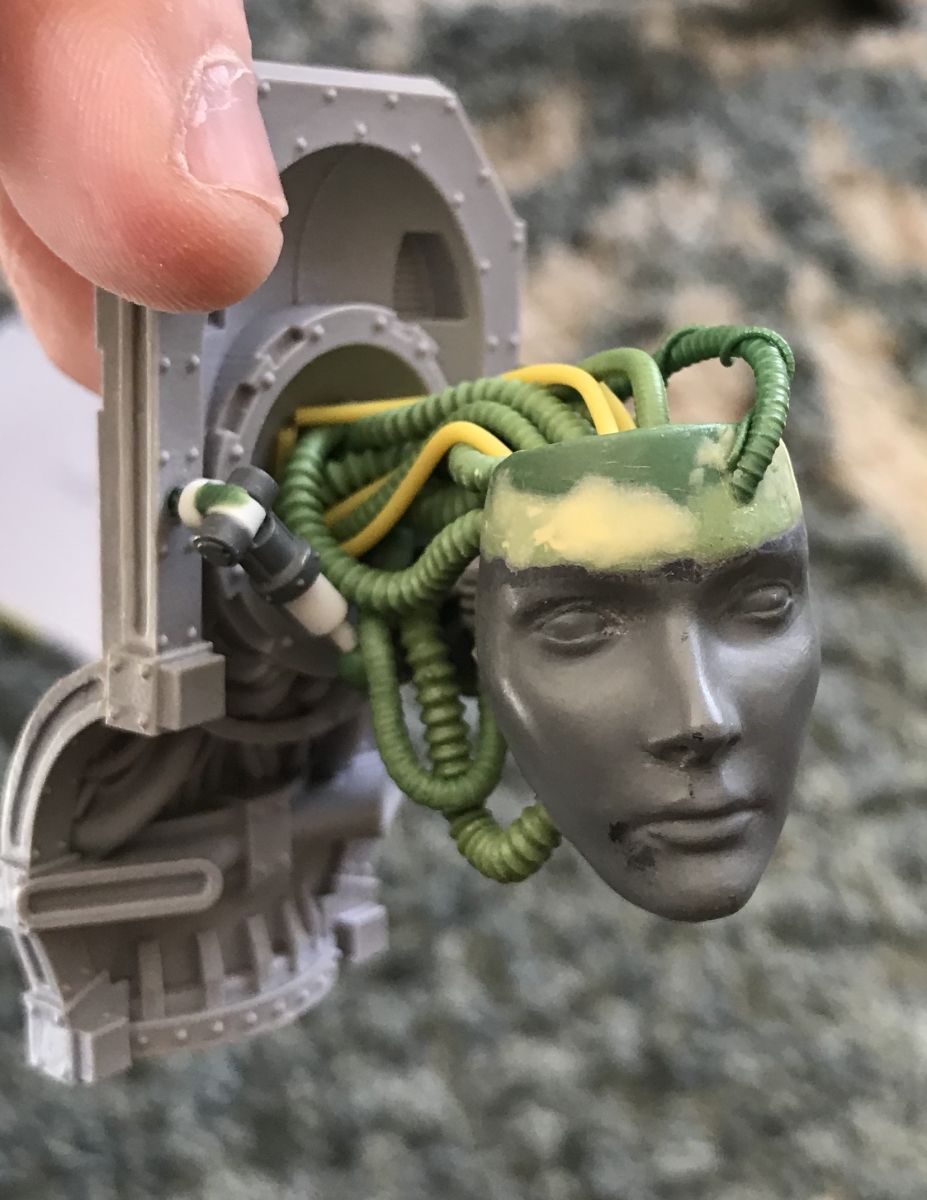
Started on the head, basically an artists blank but i tweaked it a bit. Thought this shot was cool though as in the process of sanding, sculpting and priming found the UV reactive resin underneath the primer made it look hot off the warp forge.
Then i got it in place and started making the rigging and structure for it. Detail i'm sure no one will ever see but its the stuff i love to make for some reason :P
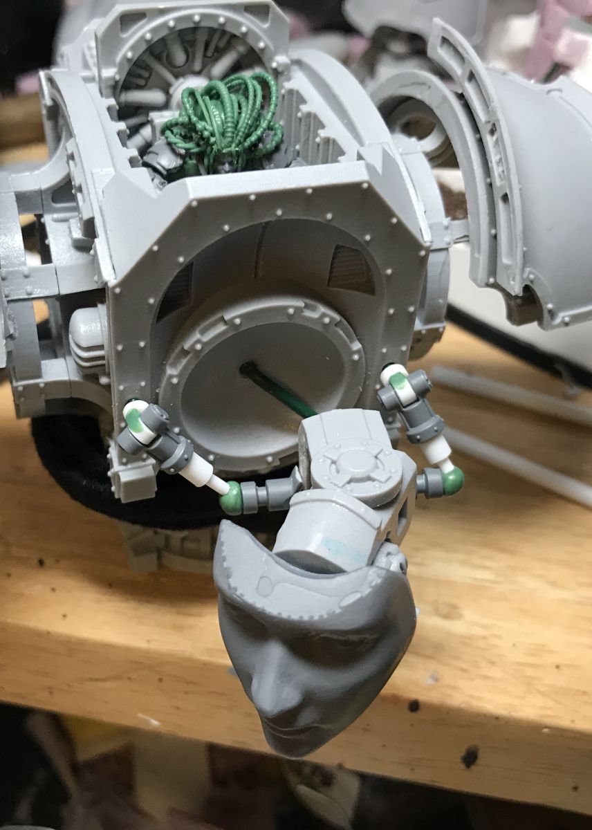
The top will be the wiring and cables echoing the pilot as grimdark hair. I'll be playing with it as i go. I really want a blanchy creep feel on her. Got some pin and structure in the sword arm too so was able to make a more meaningfull mock up too.
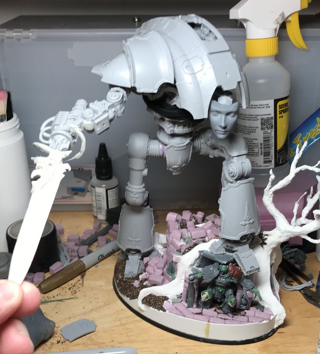
That angle is kind of off though as it reads back swing more than the threat or a challenge that i'm intending but its an easy adjustment. This week i hope to continue the head/neck section and maybe get the sword done. Whatever i end up with on the sword is going to influence what i do with the armor design.
Currently I'm thinking ill just be tweaking the trim to look more ornate in order to keep the general silhouette as much as possible and be able to really play on the flat spaces in paint. Who knows though, I'm just having fun with it!
- Lysimachus, KBA, infyrana and 11 others
-
 14
14
Great work so far can't wait to see it finished!
Oh wow, now that's some ace converting! The pilot looks top notch, very very cool Helm Mechanicum. I like the rigging for the head too (and very eery faceplate to boot). This looks very Slaaneshi thus far, particularly that beautifully crafted Power Sword.
First of all thanks a ton, I love your knights too!
Yea I knew it would lean that way given I’m adding a lot of feminine energy to it. I’m hoping to move away from the slaaneshi feel in paint with a darker and dirtier color scheme that will drive some of the horror. I wouldn’t be too bothered though if she still had a touch of favoritism though.
Currently I’m thinking deep grey or black with faint blood red, almost word bearers type markings. In the lore if I have it right Lorgar learned them only after his fall so it’d be not unheard of for the gift of that knowledge to have been given elsewhere too.
I’m planing on basically getting all the armor peices done separately last so I’ll be able to see and feel how the mechanicals/skeleton looks in paint before committing. Plus I’ll be using oils pretty heavily here and would want to practice any colors/effects anyways beforehand!
Thanks for the comments!
That head creeps me the hell out. Great stuff, man.
Goooood, gooood! :lol:
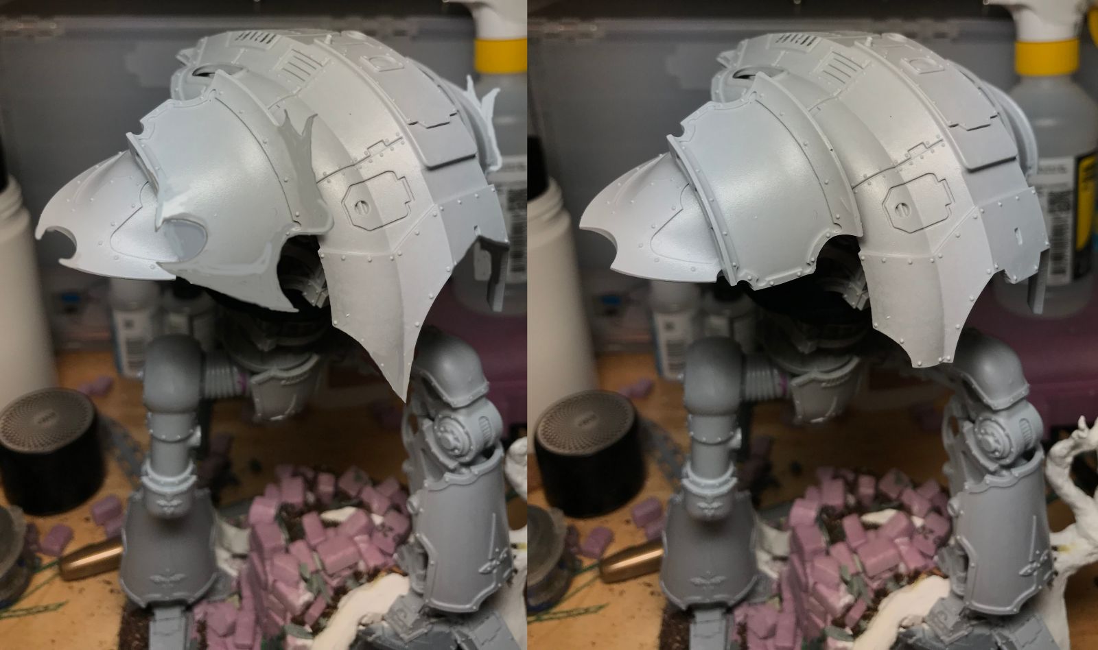
Did a little mock up earlier of what I'm thinking for the armor. Just doodles really, but i think it'd be cool.
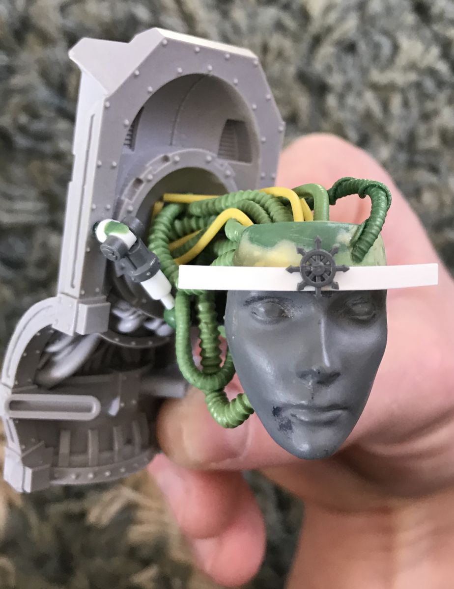
Ok seeking opinions. As I'm building up the helm mechanicum I had intended to add some sort of crown to the face. It was going to be the one traditional chaos symbol i was allowing myself too. As im planning it though im wondering if this is going to take away from the creep factor.
For context, color wise im thinking a lighter stained porcelain look with black eyes and some weathering. Crown would be either a dark brass or black iron. Planning on elaborating in the design below with the markings underneath the sigil like the mark of the everchosen.
Let me have it!
I like the creep factor without the crown. Very cool project.
What about no crown (band) but embedding the sigil into the forehead?
For me what makes the face stand out is the softness/blankness of the features and lack of hard angles. I’d have to see it, but I’d be worried the star would detract from that. Maybe it’s a feature you could add in the painting stage. Maybe even like in the meme Peter sodes posted on page 1.
Just my opinion.
Edited by Frostbit3The Knight looks spectacular! Awesome to see it taking shape.
As others have said, the face a great choice - it's down right eerie and a good juxtaposition with the base kit's aesthetic. I'd lean towards no crown, although it's tough to judge since we can see the face but have to imagine the crown; given your skill, it would be a good result, I'm sure.
If you do go forward with it, I'd suggest raising it a bit to leave the eyebrows clear, I think they convey some of the creepy serenity. Alternatively, the cowl above the head might be a space you could use.
I also have to say, the work on the sword is great, the new blade is really interesting and the energy effect looks really cool and dynamic. I the the armor you showed also looks good, I'm partial to the one on the left.
Keep it up!
I'd advise against the chaos star
I agree with most of the other guys that the crown probably isn't a good idea -- at least not if you base it on the "straight bandana" look from the mockup. If you want to incorporate some kind of crown, why not make it a crown of thorns, either going with a barbed wire look or making it look like some iron spikes punchin through the facial skin from below (maybe even drawing some kind of blood/oil/ichor)?!
One thing I would like to point out is that the juxtaposition of the mass of cabling against the serene facemask really makes for a rather disturbing effect, especially where than one cable feeds into the forehead -- maybe you could explore that effect even further?
Lastly, how about creating a look of cracked porcelain here and there by adding some crackle paint to the mask in a few places?
Anyway, keep this up! This is shaping up into a rather fantastic model! :)
-
Recently Browsing 0 members
- No registered users viewing this page.






Recommended Posts
Link to comment
https://bolterandchainsword.com/topic/360491-undivided-renegade-knight-petey-returns-to-chaos/page/2/#findComment-5473385Share on other sites