EnigmaShadow
-
Posts
205 -
Joined
-
Last visited
2 Followers


About EnigmaShadow

EnigmaShadow's Achievements
")


-
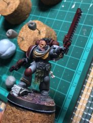
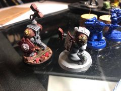
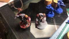
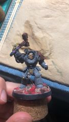
Space Wolf & night watch
Images added to a gallery album owned by EnigmaShadow in Adeptus Astartes / Legiones Astartes
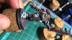
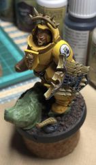
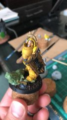
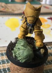
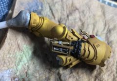
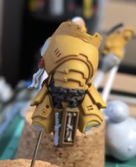
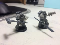
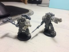
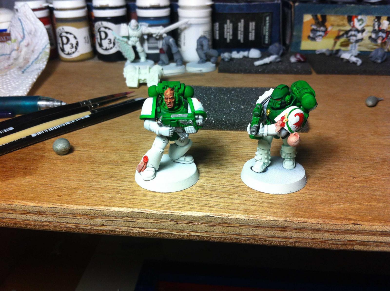
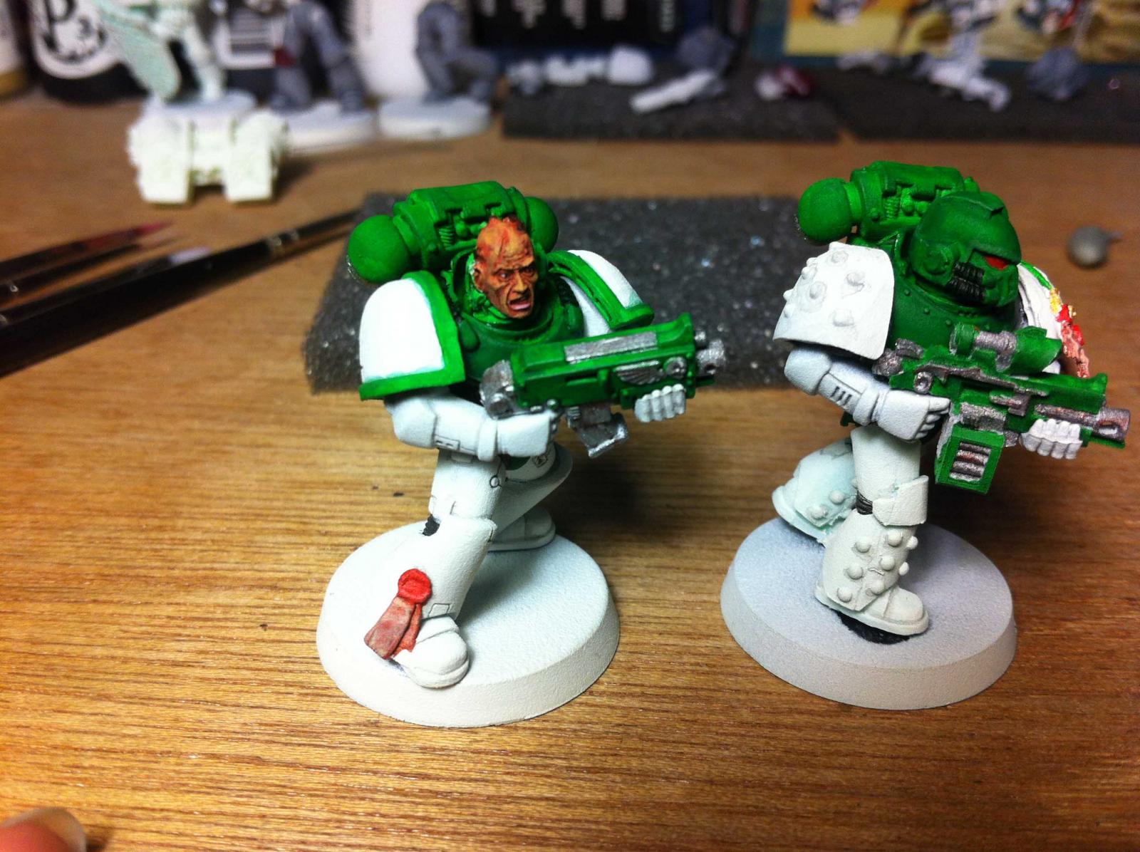
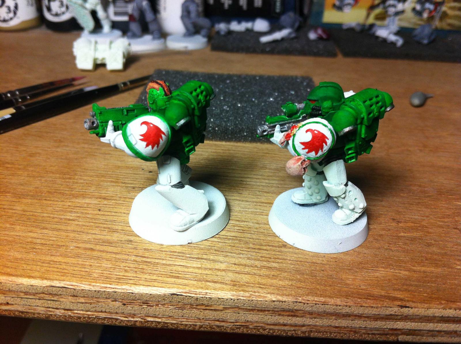
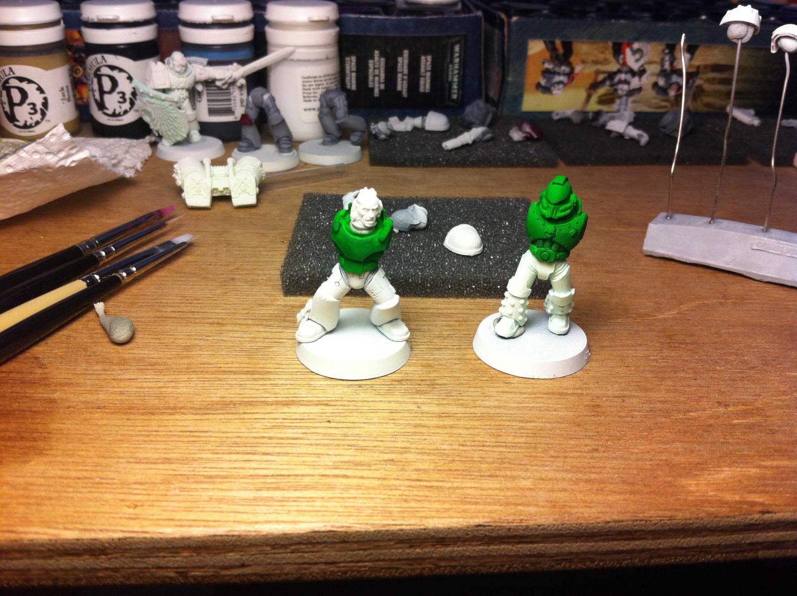
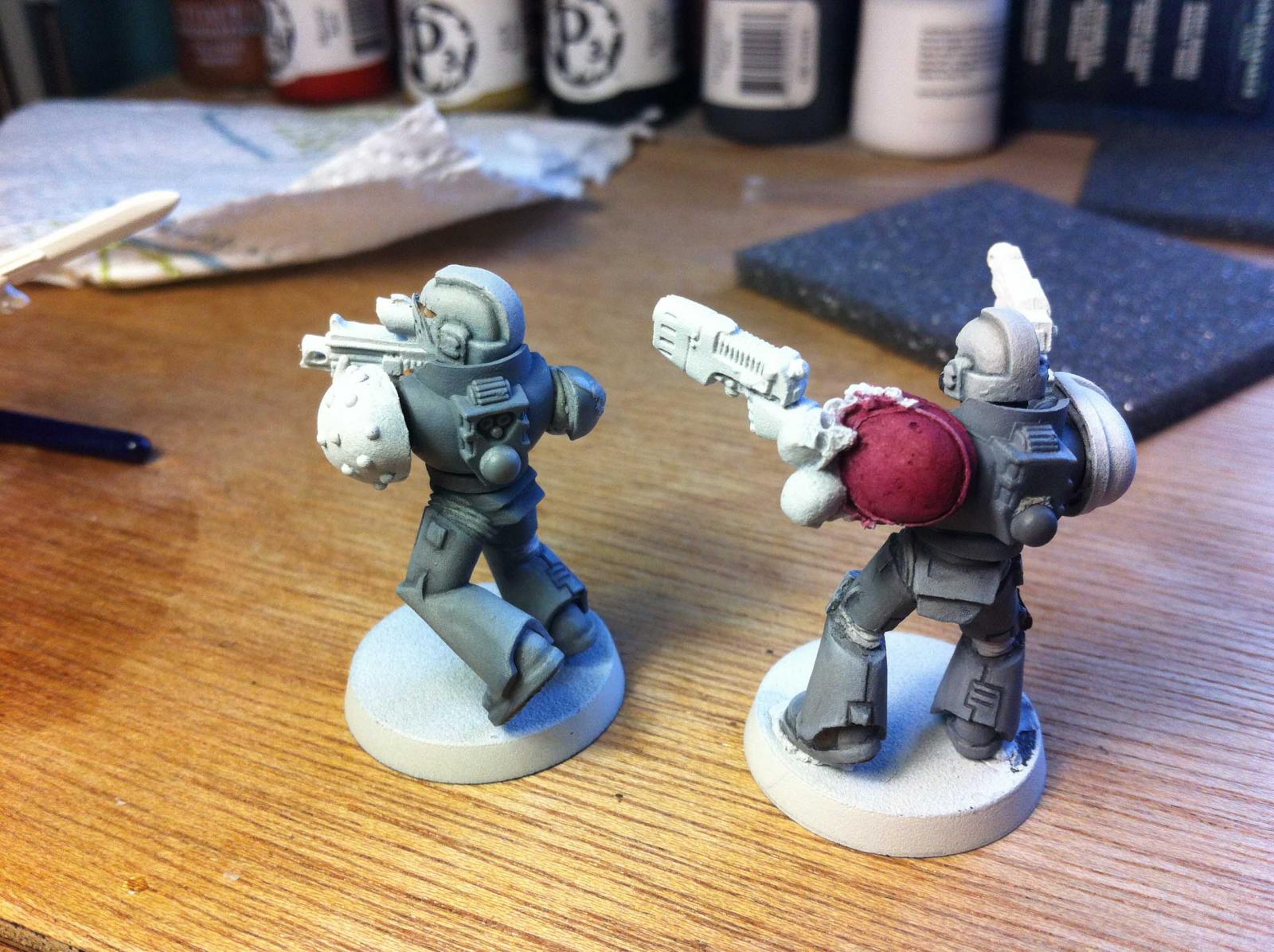
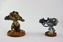
Some of my latest test minis for Comps and Practice. -
-
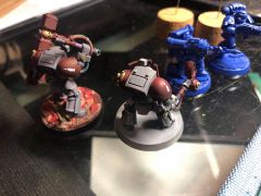
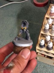
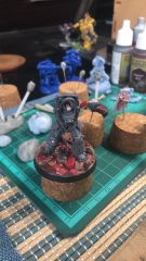
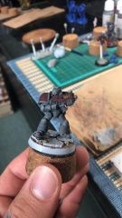
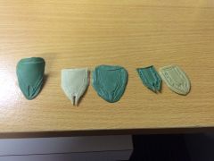
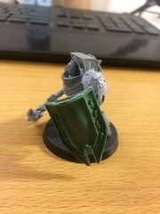
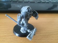
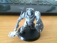
Test Minis
Images added to a gallery album owned by EnigmaShadow in Adeptus Astartes / Legiones Astartes
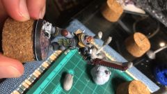
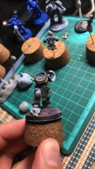
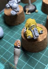
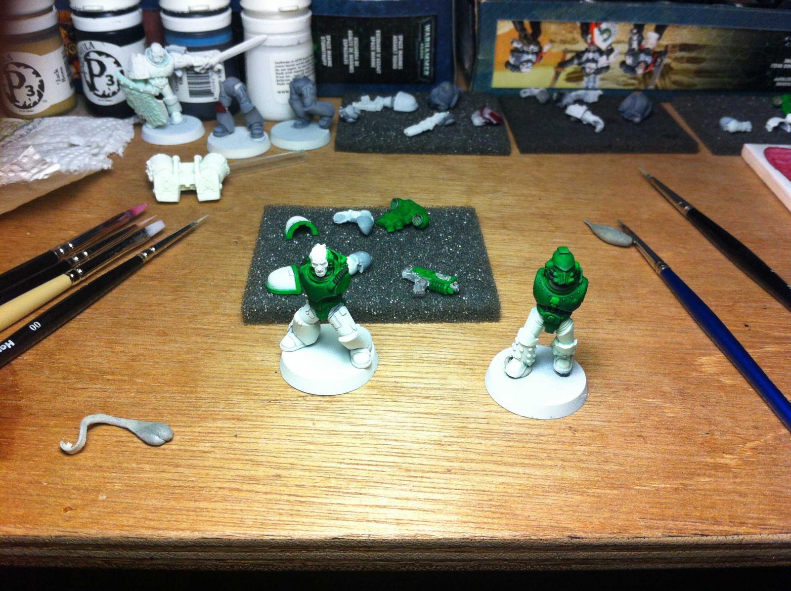
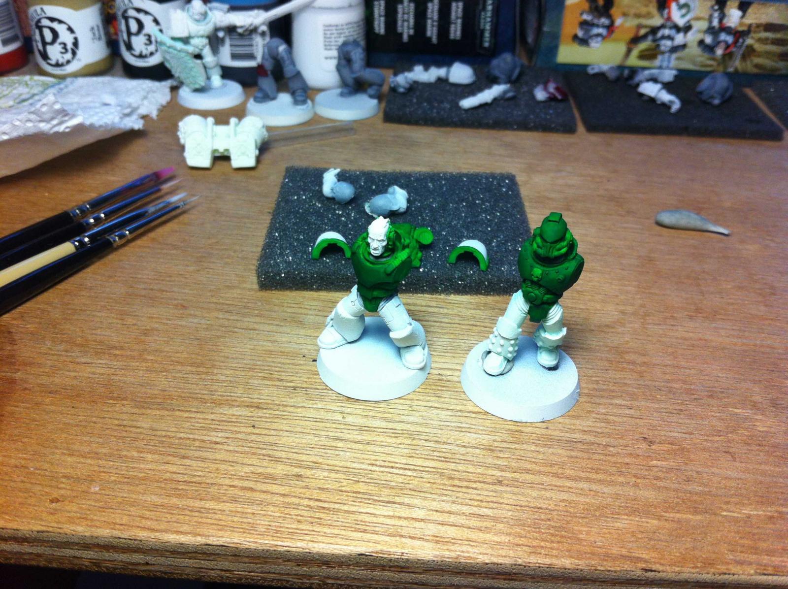
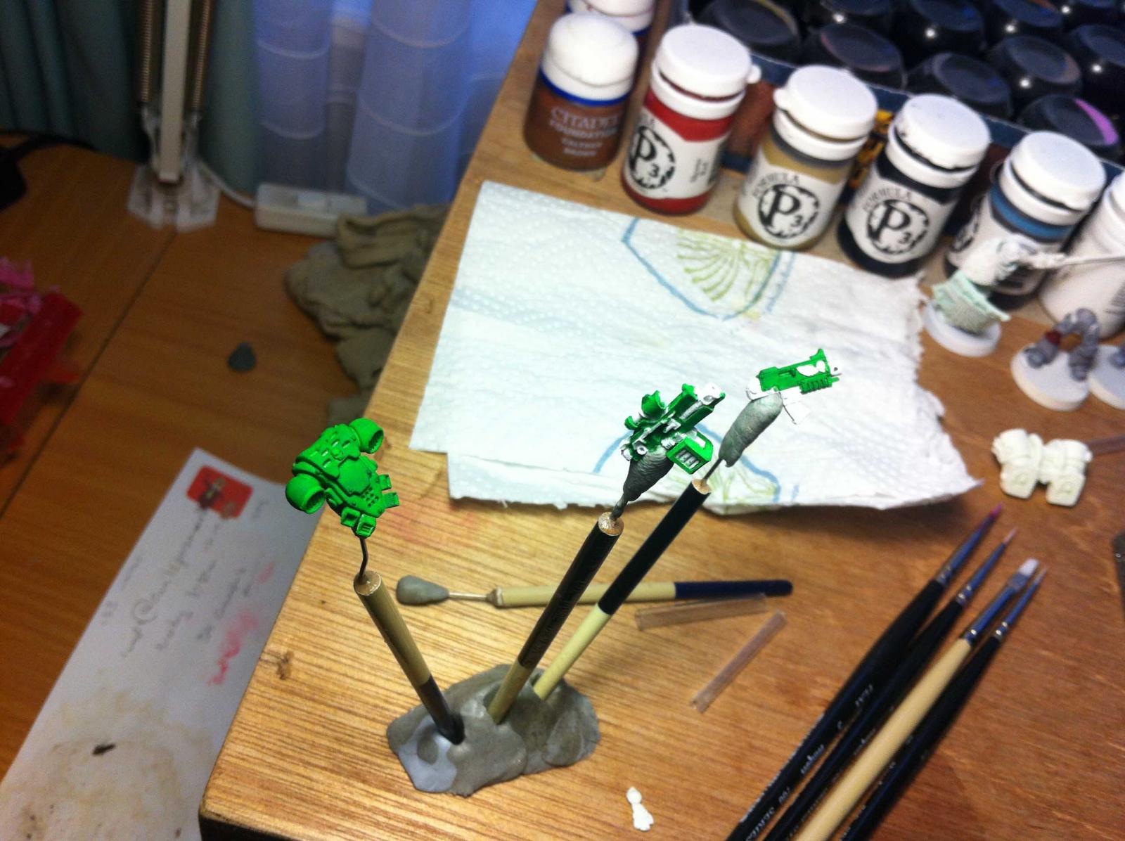
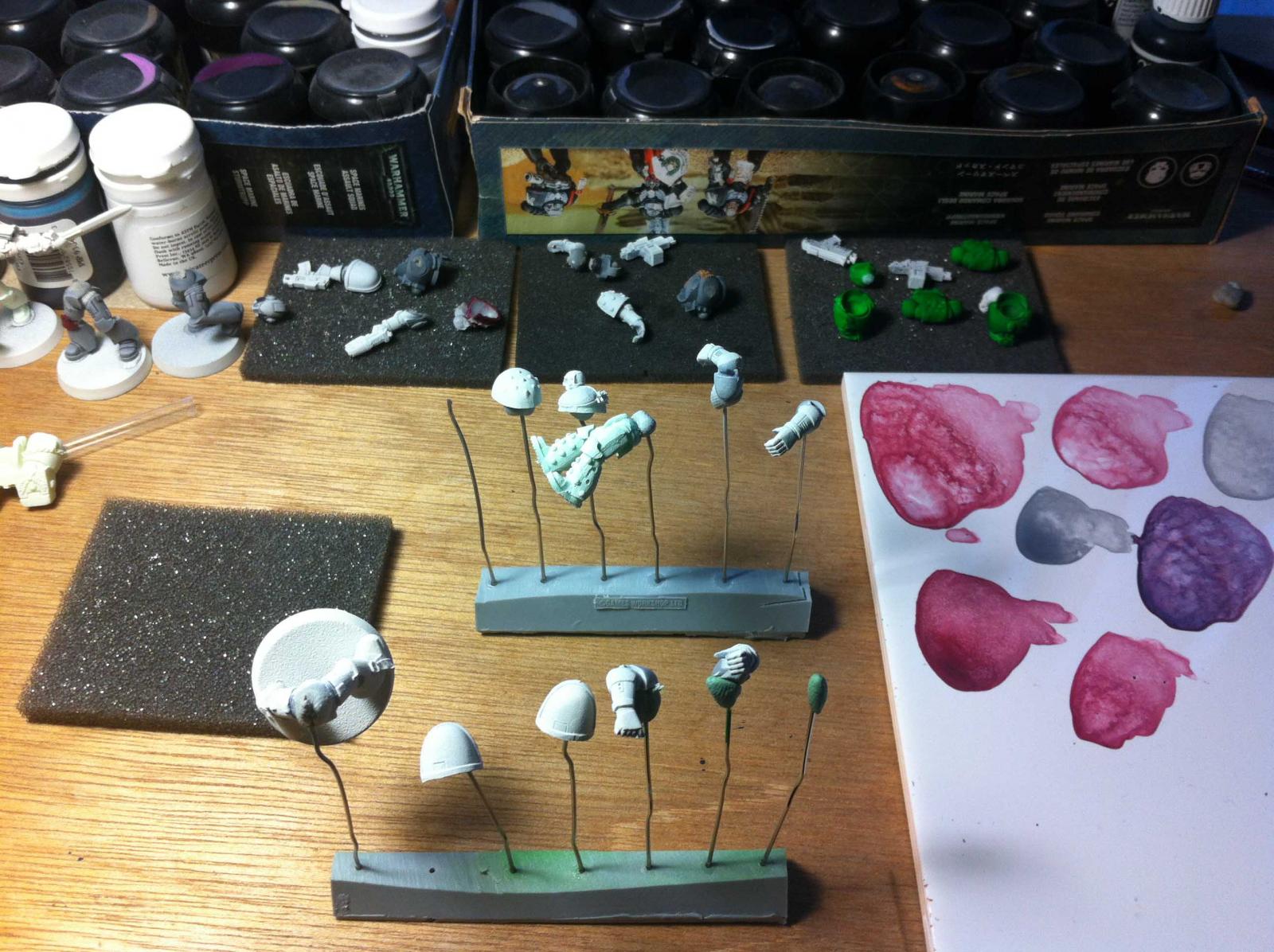
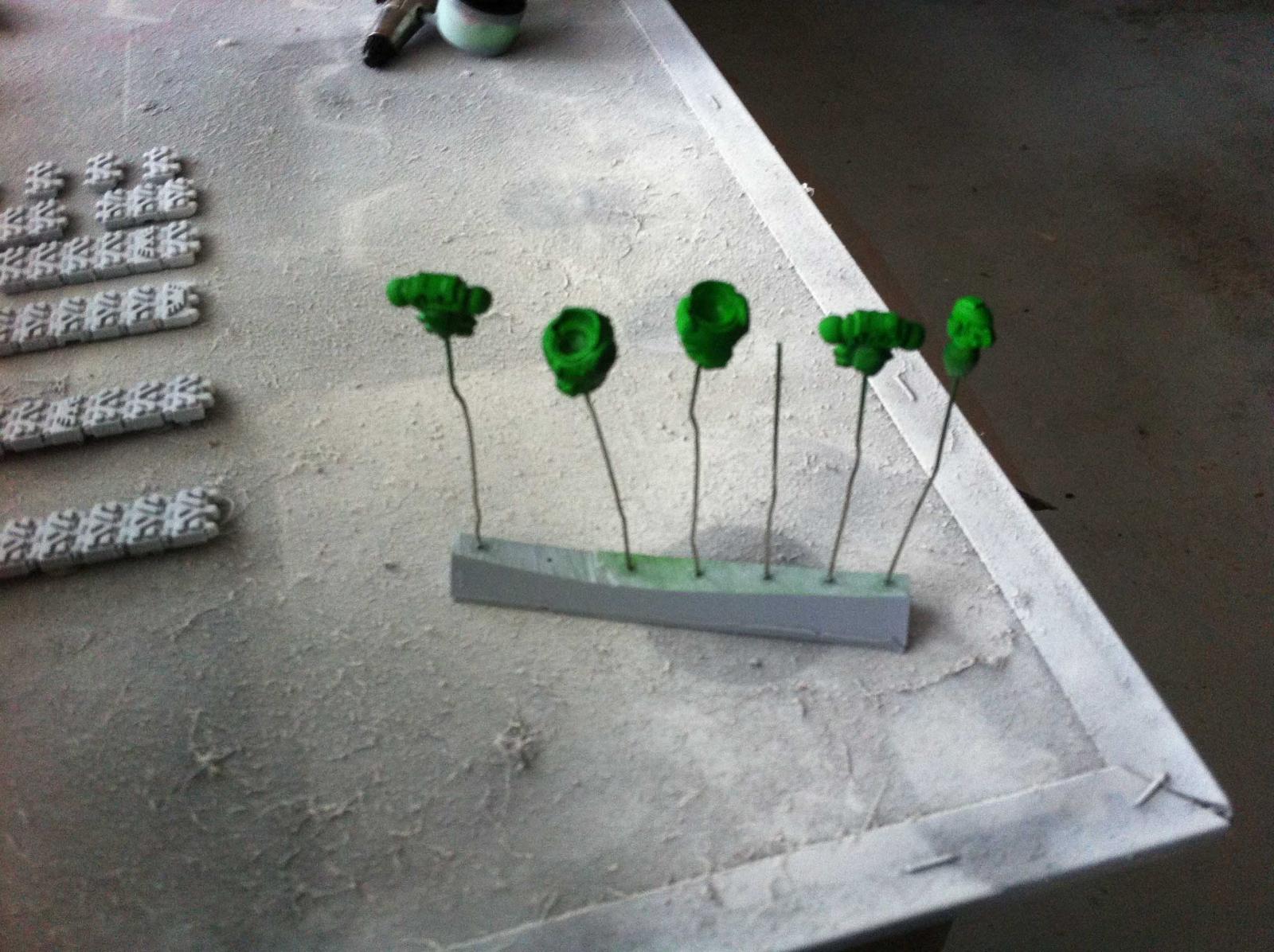
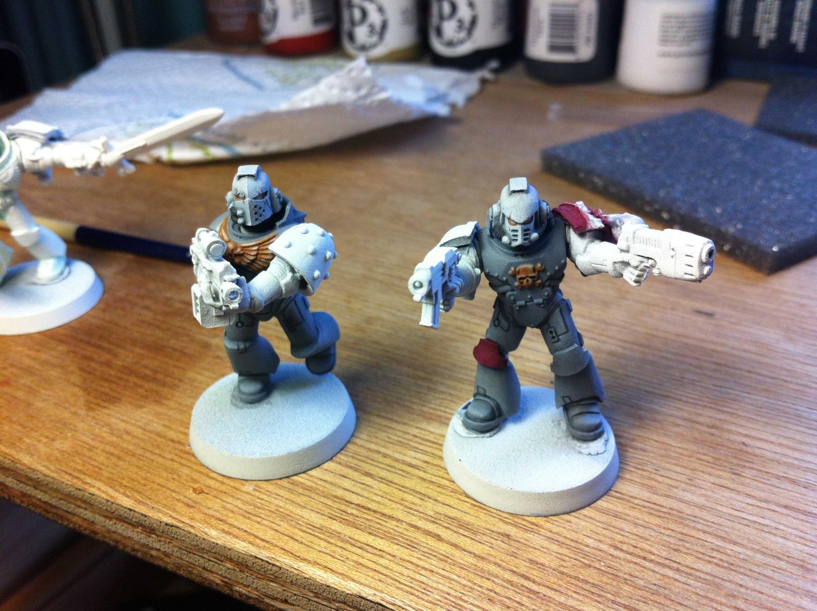
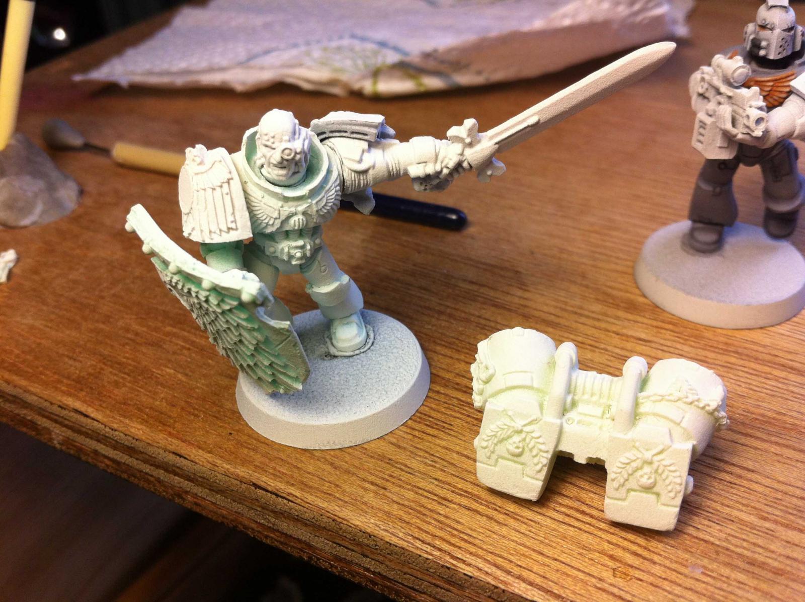
This is a folder I can just put any old thing into to see how it looks. WIP mostly. -
-
So this army.... it looks BAD ASS! Also, glad it was not I trying to put that head into there lol! But MAN it makes me want to do some painting! NEXT WEEK BROTHER!
-
Lol, As per usual, all very nice work, they also look super MEAN close up! One day I'll totally have a go at painting something from your army lol Shadow
-
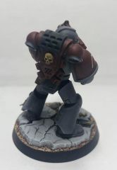
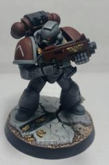
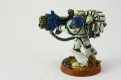
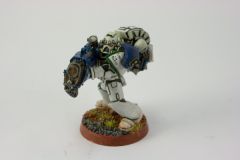
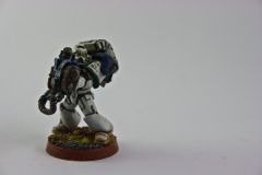
Golden Demon 08
Images added to a gallery album owned by EnigmaShadow in Adeptus Astartes / Legiones Astartes
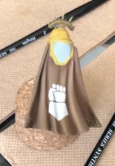
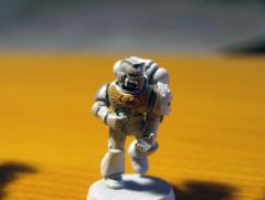
My Marine Entry into the 2008 Golden Demon Got to the Regional Finals -
-
I would have to agree with Octavulg. I can see where you are trying to get at. But its hard to visualise as you go. (I do the exact same thing too. Makes it very hard to write). As for the colours. I would personally go with the whole Green red thing. It's nice and simple. Look pretty nice and could do some nice highlighting. I think the Terminator would look better if his head was the same colour of the shoulder pads. But that could just be me. I personally am not sure about the Chapter symbol. I don't think it really suites the colour. Or the name. The skull thing with wings I can understand, But the colours I think wouldn't work well with what you're going for. But again that might just be me. Do up a quick test model I think and see how it looks and you can go from there. -Shadow