Krieg Display Board 2023 pt 2 - Building a Defense Line and Trenches
Krieg Diorama 2023
Ok, still catching up to where we are presently. So, back to the making of the board itself.
Constraints/limitations.
- Space. Firstly, space is an issue. I'll need to transport this by vehicle. My truck only fits so much. I have to drive 7 hours to Adepticon. It's cramped. I have a truck bed, but March does not have pleasant weather in Minnesota/Wisconsin/Illinois.
- Rules. Second, the rules of the tournament only allow certain sizes. I suppose each tournament is different. For the Adepticon Team Tournament, we have three categories of display, traditional 3'x2', technical 3'x2' and structural - 5'x3'. I've always wanted to do the 5x3, but it won't fit in a single vehicle in my situation (gear, bags, paints, printer). With a bed cover in the back of the truck, maybe it'd fit, but it's also a large liability for moving around in stops and starts. Still, this isn't a tournament of strict/harsh rules. You probably could build whatever and they'd be happy to see hobby effort. I can't imagine they'd throw us out for a size infraction. Still, there were awards for each category in 2022 and 2019. So, crossing into the wrong category could mean untenable competition against larger 5x3 boards.
- Models. Third, we have model constraints. We've got 4 team members, each with 1000 points. 3x2 is not big enough. So, my board from 2022 and this year is going to feature 2 levels. I mean we could have every model on the board, but it'd be so tightly packed there'd be virtually no interesting terrain whatsoever. It'd simply be a textured flat board. So, using multiple levels is the only way I can see to fit the rules. Well, we'd thought about a vertical board with every model magnetized, but this has all kinds of problems of it's own. That design might be a great void combat board - like space marines walking on the outside of a ship, or on a moon.
Design.
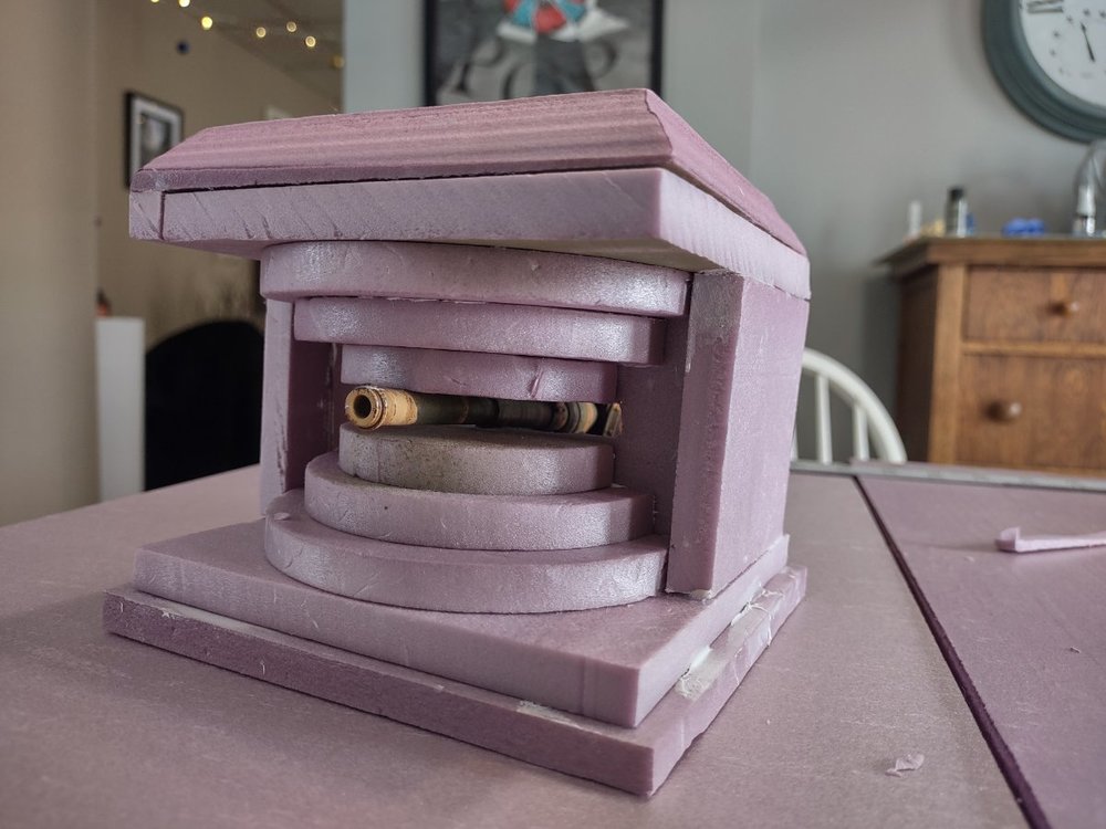
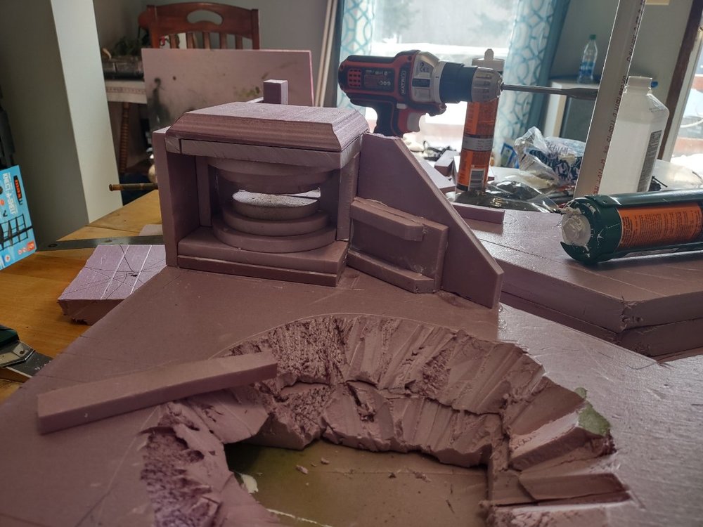
Bunker. The problem this year was trying to avoid repetitiveness of doing Death Korps of Krieg again. I love the trenches, so they'll stay. But, I'm adding a bunker. I liked the atlantic wall style bunker and gave it my best shot. With a proxxon hot wire table, and the circle cutter jig, I was able to make concentric circles for the gun emplacement design. The circles were fatter/thicker than I'd like, but due to time constraints they were good enough to move on. The bunker will need gun shot holes, and chip damage (also some rusty rebar sticking out of any damage is a great effect). I've experimented with camo netting, but am still not satisfied. That needs a rethink.
- Too WW2? Maybe go more gothic? Hmmm...
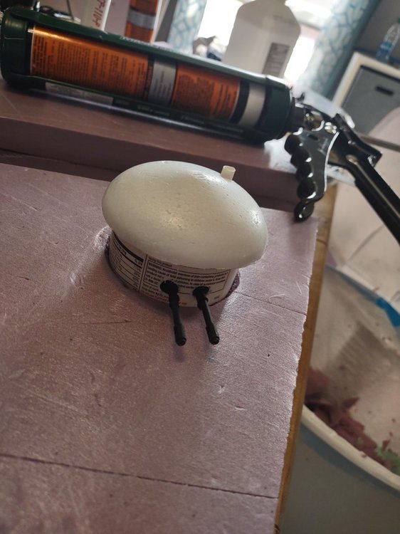
Turret. Also, I wanted to include elements similar to the Maginot line. So, I went about a second experiment with a moveable gun turret. It's supposed to be a retractable turret - it pops up to fire, and sinks down to load. That said, I left the guns sticking out even though this is impractical, as I figured many would not realize this is a gun turret without the guns showing. I'd like to add more of a base for it, so it has more detail. I'm also thinking of scraping it and just adding a hydra turret... That might look better anyway.
- ...also should have designed a ring for it to be seated in. Little details add a lot. I still like the concept, but I think execution needs more.
Layout. The team wanted smoke effects in the trenches again, so I caved and made a crater to pipe in a fog machine. I did want to redesign the trench works, maybe run a communication trench too. And, instead of two opposing trenches as a theme, this year is one defensive trench system being overrun. And, I think I actually want the krieg overrunning the bad guys. So, I'm looking to get some chaos stencils from Fallout Hobbies. I love that old forge world renegade stuff that had rusty eight pointed stars on it. In hindsight I should have paid a lot more time and attention to the design. I'm not thrilled with it spatially. Like at least each table quarter should have something to draw the eye, if not every inch of the table. So, here I've got a somewhat interesting right side and just plan no-man's land on the left. I think tree stumps, water filled craters, or even a destroyed bunker might help fill it out.
*note, it's a lot easier to cut trenches and craters before gluing sections on... carving out three layers deep takes much more time.
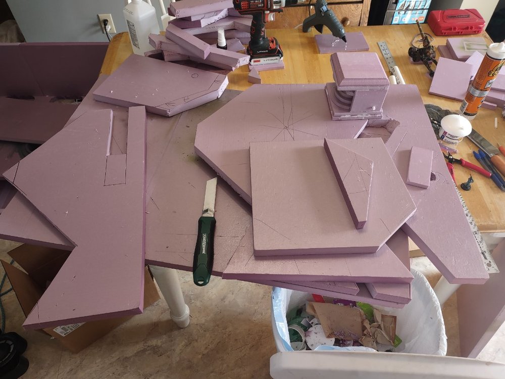
*also note, should have labelled these as it became a huge mess...
Edited by Captain Caine 24th



2 Comments
Recommended Comments
Create an account or sign in to comment
You need to be a member in order to leave a comment
Create an account
Sign up for a new account in our community. It's easy!
Register a new accountSign in
Already have an account? Sign in here.
Sign In Now