As inevitable as the (Green) Tide
Entry posted by zulu.tango in Da Khromeboyz
494 views
A small update to help remind myself that progress has indeed been made.
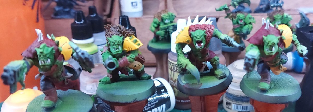
Life has continued to be life, and while I've made some time for da boyz, they are many and batch-painting means that progress feels slow. Since the last post I've moved from cloth to what will be the non-khrome metalic portions, put in time on the scales/hides/furs, gotten a first pass on all bones/nails/teeth and continued pick up belts/pouches/bands that I missed on the last go-round. Initially I used the same base colors for the shoulder pads as I did some the cloth. The result was me kind of hating it. The similarity in the colors bothered me and made the model feel drab in a way I wasn't satisfied with. The fact that the tone was very close to what I ended up using for some of the scales/hides lead to the models feeling one dimensional.
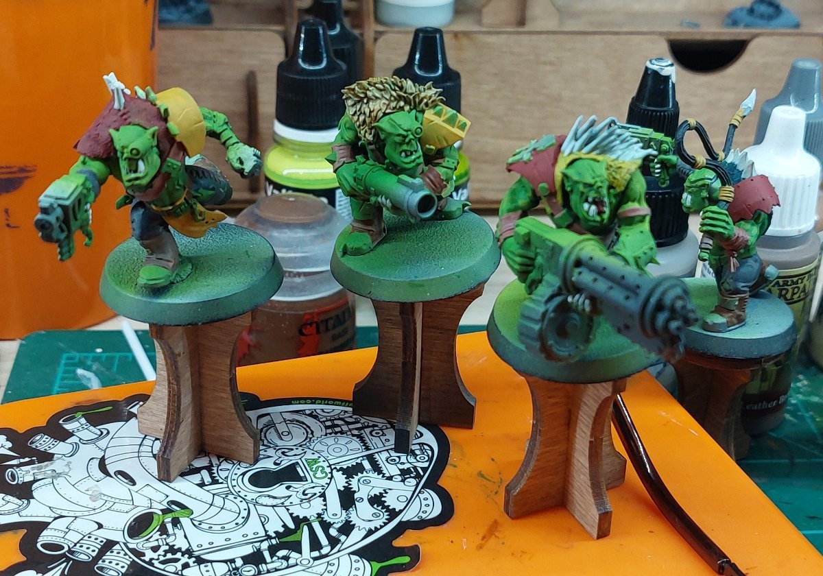
Fortunately satisfaction within reach. I went to brighter tones for both the yellow and red, and after a couple layers (or more in the case of the yellow) both colors lost the muted tone that dirty/worn cloth would have and started to look brighter. I added edge highlights and scratch/damage where included in the models and I'm pretty satisfied with the results. 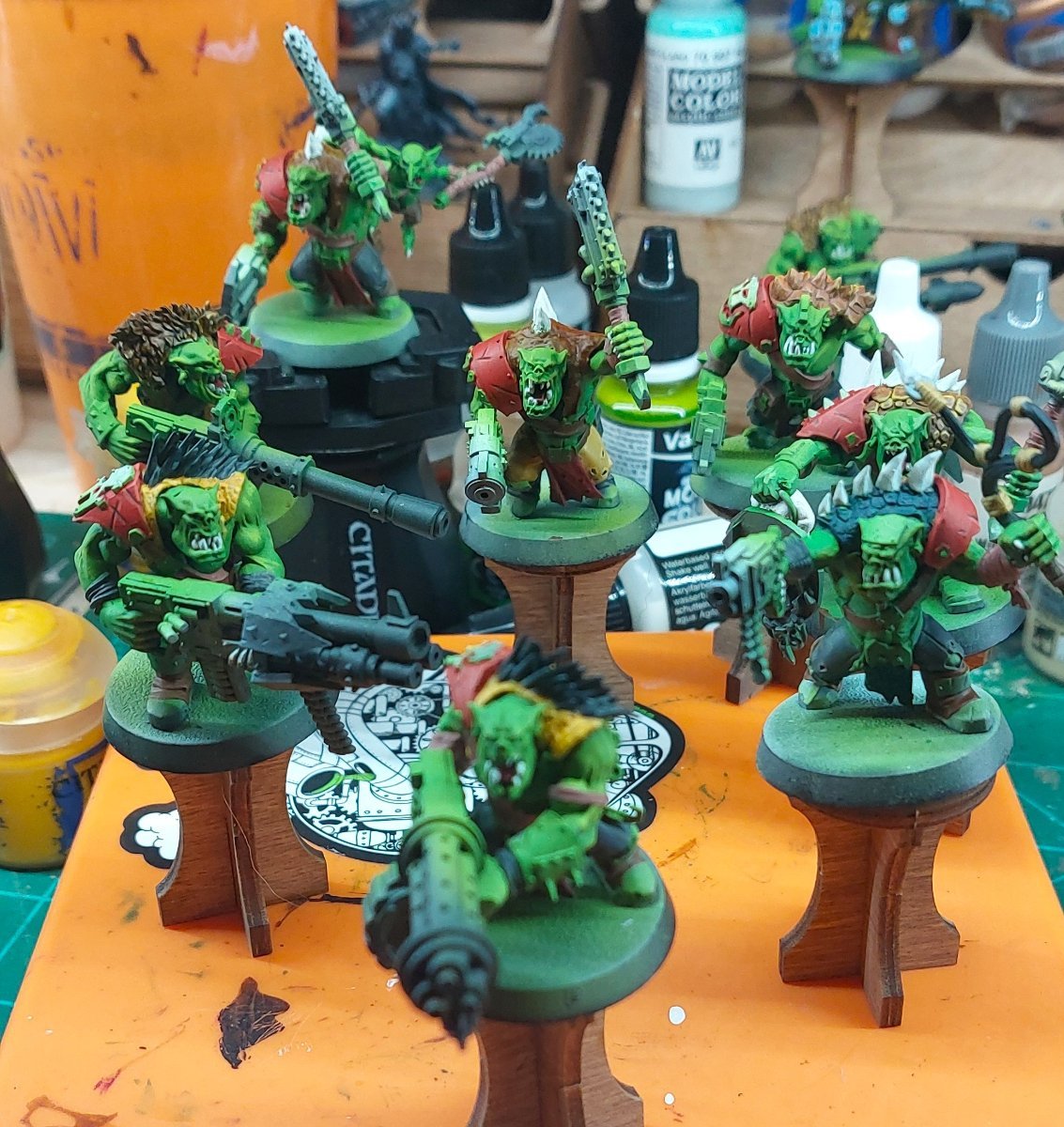
I might go back through and add some more detail/weathering in the future, but certainly for now I'm satisfied enough to move on.
Laziness took over a bit with the furs and scales. When I took a look at how much more I had to complete before my "due date" I reached for the ever faithful bottles of contrast paints. I'm in a love-hate relationship with contrast paints. I think they can do a lot of heavy lifting with a small amount of effort, but they lack vibrancy and are difficult to mix or vary. I also had a problem with the fact that most of the areas I was going to use them on had been over-sprayed during my airbrush portion, so the zenithal that really makes contrasts pop was gone. I went back through with a white ink on all the fur portions before painting with contrasts and then dry-brushing to push up the high-tones. I'm satisfied with the result but there is certainly room for improvement next time.
The pelts are a similar story to the furs, in that I used contrasts with drybrushing.I wanted to add some flair to a couple of them and thought that making the hide a pseudo cheetah print would be fun, but after a bit of effort decided that it wasn't working and painted over it, but it was kind of fun to give it a shot. 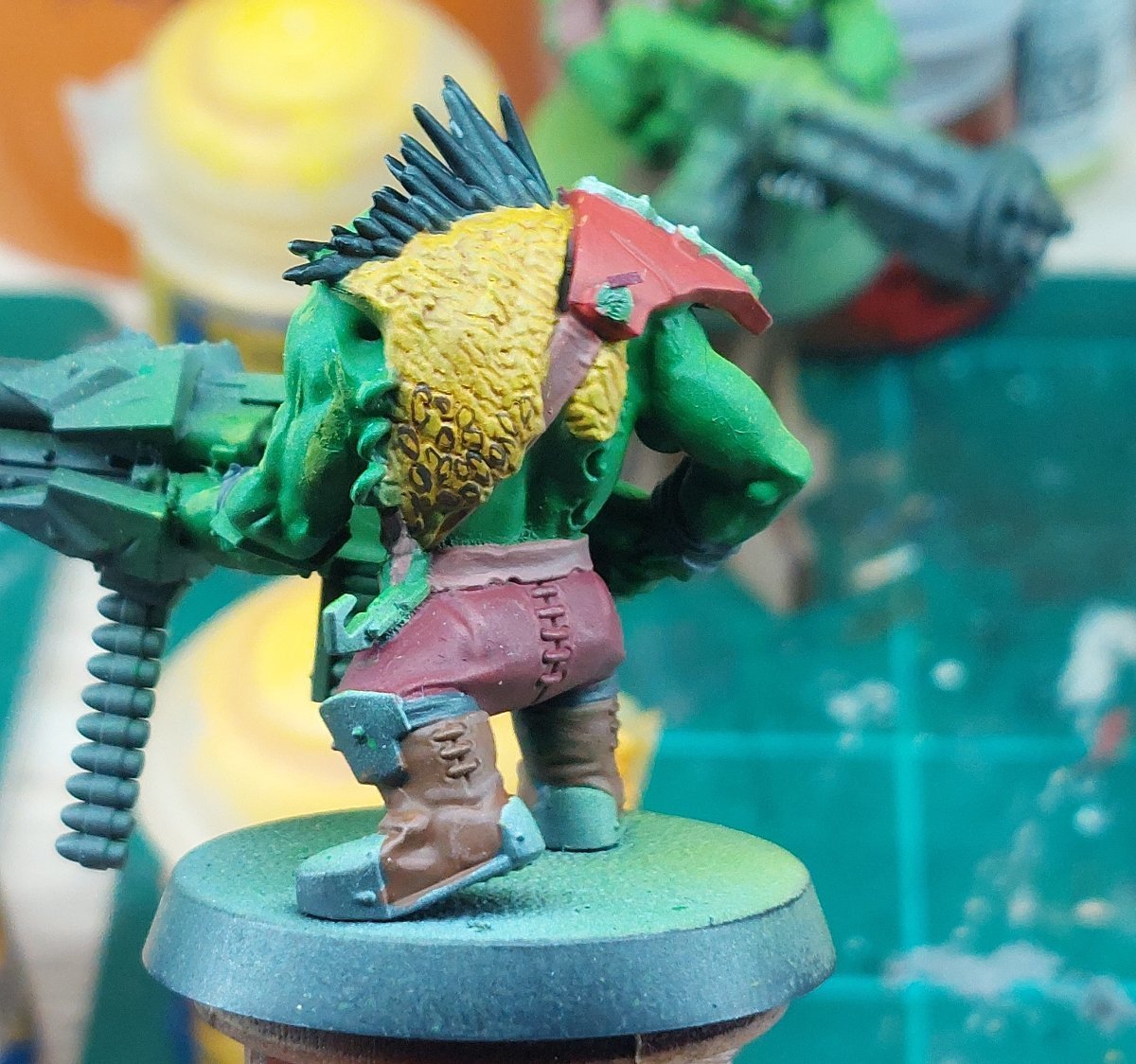
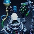
I'm still not 100% on the end result of many of them and might tinker more later, but I'm satisfied enough to move on for now. Next phase is going to be getting started with the khrome effect. I've been stuck so long looking at the over-sprayed/primed portions of the models I think I'm starting to hit a bit of a lull in motivation. As a result I'm going to try and knock out another "test" model with a slightly different approach to the khrome to give me a more clear picture of the finish line, plus help me estimate how much more time I need to work on these boyz.

0 Comments
Recommended Comments
There are no comments to display.
Create an account or sign in to comment
You need to be a member in order to leave a comment
Create an account
Sign up for a new account in our community. It's easy!
Register a new accountSign in
Already have an account? Sign in here.
Sign In Now