The Damned Posted June 21, 2011 Share Posted June 21, 2011 How did you do the snow? It looks fantastic. I can't seem to replicate such an effect. The rest of the model is simply fantastic as well. The snow is woodland scenics, mixed to a paste with white glue, and applied with toothpicks and a sculpting tool. Sweet, thanks for the tip. Link to comment https://bolterandchainsword.com/topic/230300-bjorn-the-fell-handed-wip-pic-heavy/page/4/#findComment-2798699 Share on other sites More sharing options...
tauyippiejoy Posted June 21, 2011 Share Posted June 21, 2011 Okay, so first off I thought I was going to write something mildly witty to make it seem like "yeah, I could do that" and then just burst into "OMG, WOW". The usual kind a deal. But nay, I'll just say that I'd like to see Bjorn truly look like that for real. Your model and your paintwork are outstanding and a labour of excellence! All is not well though because, despite my skills being well and truly below yours that Bjorn of yours make me feel like I should add a new dreadnought to my already way too large force of space wolves. And I had just promised myself to not buy new models.. d'oh. Link to comment https://bolterandchainsword.com/topic/230300-bjorn-the-fell-handed-wip-pic-heavy/page/4/#findComment-2799411 Share on other sites More sharing options...
Baelgrun Posted June 21, 2011 Share Posted June 21, 2011 The dread looks seriously great. If we're being really fussy then I would doubt the snow bits on the 'exhaust vents' around the back of the model. Also more water effects around those to represent melted snow would be ace. With that said, its miiiilles better than what I could achieve. Link to comment https://bolterandchainsword.com/topic/230300-bjorn-the-fell-handed-wip-pic-heavy/page/4/#findComment-2799478 Share on other sites More sharing options...
Darkest Angel Posted June 21, 2011 Share Posted June 21, 2011 This is a fantastic Bjorn, I really like it (even though I'm Unfogiven through and through!) Awsome Job keep it up. Link to comment https://bolterandchainsword.com/topic/230300-bjorn-the-fell-handed-wip-pic-heavy/page/4/#findComment-2799524 Share on other sites More sharing options...
Iacton Qruze Posted June 23, 2011 Author Share Posted June 23, 2011 Alright, another update sooner than I had anticipated, but probably the next-to-last update before finished photos go up. At this point, it's just the claw, banner, and a few little clean ups, and he's done... Well, other than the assault cannon, which I'm thinking I might build and paint in a few weeks. Not a big update, but thanks for looking! http://images.dakkadakka.com/gallery/2011/6/23/238423_sm-Bjorn,%20Dreadnought,%20Space%20Wolves,%20Venerable.jpg http://images.dakkadakka.com/gallery/2011/6/23/238424_sm-Bjorn,%20Dreadnought,%20Space%20Wolves,%20Venerable.jpg http://images.dakkadakka.com/gallery/2011/6/23/238425_sm-Bjorn,%20Dreadnought,%20Space%20Wolves,%20Venerable.jpg Link to comment https://bolterandchainsword.com/topic/230300-bjorn-the-fell-handed-wip-pic-heavy/page/4/#findComment-2800740 Share on other sites More sharing options...
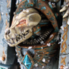
Brother Taio Posted June 23, 2011 Share Posted June 23, 2011 :) That head is... it's just so... ^_^ Link to comment https://bolterandchainsword.com/topic/230300-bjorn-the-fell-handed-wip-pic-heavy/page/4/#findComment-2800752 Share on other sites More sharing options...
shabbadoo Posted June 23, 2011 Share Posted June 23, 2011 The model is looking great, but I'll constructively nitpick at one thing. I didn't really notice it until looking at this picture: http://images.dakkadakka.com/gallery/2011/6/20/237497_sm-Bjorn,%20Dreadnought,%20Space%20Wolves,%20Venerable.jpg The plasma/gem/verdigris colors being so close to each other detracts from the overall visual impact. These are very different things that should look very different, and yet they don't. Technically the painting is brilliant, but this one thing nags at me. It is just...off. Link to comment https://bolterandchainsword.com/topic/230300-bjorn-the-fell-handed-wip-pic-heavy/page/4/#findComment-2800870 Share on other sites More sharing options...
Coopervisor Posted June 23, 2011 Share Posted June 23, 2011 Perfect dreadnought. Venerable doesn't cut it, just epic. As for the comment on the gems, I like the limited colour palette, but could see the gems being amber? Link to comment https://bolterandchainsword.com/topic/230300-bjorn-the-fell-handed-wip-pic-heavy/page/4/#findComment-2800920 Share on other sites More sharing options...
Iacton Qruze Posted June 23, 2011 Author Share Posted June 23, 2011 The plasma/gem/verdigris colors being so close to each other detracts from the overall visual impact. These are very different things that should look very different, and yet they don't. Technically the painting is brilliant, but this one thing nags at me. It is just...off. That's a pretty common crit. The main problem is that they both share a common color in their mixes. They are further apart in life, and the pictures don't show that, but they aren't off by much. I'm considering redoing the coils, but I don't want to take away from the feeling of the model by going in a crazy direction with the color. Perfect dreadnought. Venerable doesn't cut it, just epic. As for the comment on the gems, I like the limited colour palette, but could see the gems being amber? I thought about that at one point, since I wanted to stay away from vibrant reds, but I did his eye amber, and didn't want to take away from them, as they already run the risk of not catching the eye. Link to comment https://bolterandchainsword.com/topic/230300-bjorn-the-fell-handed-wip-pic-heavy/page/4/#findComment-2801014 Share on other sites More sharing options...
DV8 Posted June 23, 2011 Share Posted June 23, 2011 Impressive. Loving the conversion, and the head + cowl are just brilliant. Almost makes me want to build a Dreadnought to add to my own Great Company ;) but that's a project I'll consider another time. As mentioned already, there is a huge problem with your verdigris and being too close in color to the plasma coils and the glow. My concern isn't the color, but that the application of both are so similar that the verdigris looks too much like the glowing of the plasma coil (that is, you're taking it far too white and the end result looks more like sloppy OSL than actual rust/oxidization). http://images.dakkadakka.com/gallery/2011/6/10/232770_sm-Bjorn%20C6.jpg The runic talisman hanging off the torso is perfect. The application of color is subtle enough to not overpower the color of the copper/brass underneath, but strong enough that we can tell it's rust. You contrast it to the oxidization on, say, the power plant exhausts, or the plasma cannon, and you can see a HUGE difference in quality and application; it's sloppier and it looks unrealistic. I would go back with your rust color and try to tone down the color, or failing that (eek) redo it, as it really does detract from the overall look of the model. This will allow the plasma cannon to really glow with that eerie blue, yet at the same time not be over-powered by the verdigris (because that's what's happening right now, and the effect of the plasma cannon is held back because the same technique/application is visible all over the model). DV8 Link to comment https://bolterandchainsword.com/topic/230300-bjorn-the-fell-handed-wip-pic-heavy/page/4/#findComment-2801197 Share on other sites More sharing options...
Iacton Qruze Posted June 23, 2011 Author Share Posted June 23, 2011 Thanks DV8, I'll try that out. I do agree that the verdigris on the power plant and Plasma Cannon has not been where I wanted it. Maybe I can salvage that, rather than repainting the coils. At the very least redoing the bronze would still be less mind numbing than the coils. Link to comment https://bolterandchainsword.com/topic/230300-bjorn-the-fell-handed-wip-pic-heavy/page/4/#findComment-2801221 Share on other sites More sharing options...
DV8 Posted June 23, 2011 Share Posted June 23, 2011 The coils themselves are fine. It's the verdigis that's wrong (or rather, highlighted too heavily). While the copper oxidization effect is typically pretty heavy (that is, oxidized copper tends to be very green), because the color is so similar to the plasma cannon coils, that for the sake of artistic license, you are within your right to tone back the amount of rust you apply to the copper areas. Again reference the rune talisman that is hanging from the torso (I quoted it in my last post) for what I think would look more appropriate/suitable. DV8 Link to comment https://bolterandchainsword.com/topic/230300-bjorn-the-fell-handed-wip-pic-heavy/page/4/#findComment-2801224 Share on other sites More sharing options...
Dreachon Posted June 23, 2011 Share Posted June 23, 2011 Wow just wow, that model is just sooo stunning, wil you be attending GD with this, is certainly looks like a winner to me. Link to comment https://bolterandchainsword.com/topic/230300-bjorn-the-fell-handed-wip-pic-heavy/page/4/#findComment-2801247 Share on other sites More sharing options...
Iacton Qruze Posted June 23, 2011 Author Share Posted June 23, 2011 The coils themselves are fine. It's the verdigis that's wrong (or rather, highlighted too heavily). While the copper oxidization effect is typically pretty heavy (that is, oxidized copper tends to be very green), because the color is so similar to the plasma cannon coils, that for the sake of artistic license, you are within your right to tone back the amount of rust you apply to the copper areas. Again reference the rune talisman that is hanging from the torso (I quoted it in my last post) for what I think would look more appropriate/suitable. DV8 I'm surprised it took me this long to see it; I don't change my steps on the verdigris, so how it was done more half-assed is odd, unless I just overestimated the simplicity of the technique and rushed it too much. I should be able to correct it with some washes though. Wow just wow, that model is just sooo stunning, wil you be attending GD with this, is certainly looks like a winner to me. Yep I'll be at GD in Chicago this year. ;) Link to comment https://bolterandchainsword.com/topic/230300-bjorn-the-fell-handed-wip-pic-heavy/page/4/#findComment-2801471 Share on other sites More sharing options...
Coopervisor Posted June 24, 2011 Share Posted June 24, 2011 Going back over the log, I was wondering if you have clear shots of the conversion work you've done the legs? I'm assuming they've been repositioned and am considering this for my next dreadnought to improve his pose. I will say your dreadnought is an inspiration to try and push myself more with my next dreadnought, both with getting the pose/look just right and then with the painting. Good job once again! Link to comment https://bolterandchainsword.com/topic/230300-bjorn-the-fell-handed-wip-pic-heavy/page/4/#findComment-2801953 Share on other sites More sharing options...
Iacton Qruze Posted June 24, 2011 Author Share Posted June 24, 2011 Going back over the log, I was wondering if you have clear shots of the conversion work you've done the legs? I'm assuming they've been repositioned and am considering this for my next dreadnought to improve his pose. I actually don't, but I can tell you basically what I did: the groin is from a plastic dreadnought kit, as I cut the forgeworld one out, along with the tubes that connect to the legs. I cut the front leg at the "knee" and at the top of the "thigh, and the pinned them at the new angle I wanted, building a new upper leg portion out of brownstuff. When I laid the feet down in position, I also built a little bit of a "lip" under the front greave, so that I could angle the ankle join back to maintain an upright stance. When I put the groin back in, I just cut new pipes from tube styrene and brass, and fit them in a way that looked realistic, then added in some new cabling. When to put the groin back in, you can tilt it at whatever angle you want to suit the dreadnought's position, then just drill the holes for the tubes. Once you've done it once, the proportions kind of become second nature, and it becomes a pretty quick conversion. Link to comment https://bolterandchainsword.com/topic/230300-bjorn-the-fell-handed-wip-pic-heavy/page/4/#findComment-2802020 Share on other sites More sharing options...
Vexicus Posted June 24, 2011 Share Posted June 24, 2011 Sir I am massivly impressed with this. It looks (I can't think iof the words to describe how much I like this). Thank you for sharing you awsome creation with us Brother. Link to comment https://bolterandchainsword.com/topic/230300-bjorn-the-fell-handed-wip-pic-heavy/page/4/#findComment-2802026 Share on other sites More sharing options...
Blckbuster Posted June 26, 2011 Share Posted June 26, 2011 The coils themselves are fine. It's the verdigis that's wrong (or rather, highlighted too heavily). While the copper oxidization effect is typically pretty heavy (that is, oxidized copper tends to be very green), because the color is so similar to the plasma cannon coils, that for the sake of artistic license, you are within your right to tone back the amount of rust you apply to the copper areas. Again reference the rune talisman that is hanging from the torso (I quoted it in my last post) for what I think would look more appropriate/suitable. DV8 I'm so glad someone like DV8 said this cause I was afraid to, and it's the kind of thing that could bump you up from winning your category to wining the whole thing. It's one of the best things I've seen in tabletop models in a long time, and I'd love to try to borrow it, but I'd never do it justice and it's so distinctive it would stand out as a copy Link to comment https://bolterandchainsword.com/topic/230300-bjorn-the-fell-handed-wip-pic-heavy/page/4/#findComment-2803282 Share on other sites More sharing options...
Iacton Qruze Posted June 29, 2011 Author Share Posted June 29, 2011 Alright, time for an update. I just need to do the source lighting on the claw nodes, add some snow, and clean up a couple of spots that I noticed in the giant photos, and it'll be done. Then it's just the banner to finish, and a couple of clean ups on the model. Large photos are great for picking up those tiny errors... http://images.dakkadakka.com/gallery/2011/6/29/241361_sm-Bjorn,%20Dreadnought,%20Space%20Wolves,%20Venerable.jpg For some reason, I guess the lighting, it really takes away the subtlety of the blade knotwork. It looks better in person. Here's an overall shot. I also toned back the "glowy" verdigris that was hurting the overall look. http://images.dakkadakka.com/gallery/2011/6/29/241360_sm-Bjorn,%20Dreadnought,%20Space%20Wolves,%20Venerable.jpg Thanks for looking! Link to comment https://bolterandchainsword.com/topic/230300-bjorn-the-fell-handed-wip-pic-heavy/page/4/#findComment-2806624 Share on other sites More sharing options...
asw thunderlord Posted June 30, 2011 Share Posted June 30, 2011 best dread ive ever seen in 15 years in the hobby keep it up. Link to comment https://bolterandchainsword.com/topic/230300-bjorn-the-fell-handed-wip-pic-heavy/page/4/#findComment-2806707 Share on other sites More sharing options...
Blindhamster Posted June 30, 2011 Share Posted June 30, 2011 :( :jaw: :jaw: :jaw: the above pretty much sums things up. That is one stunning model you've made. It already looks truelly epic, so I can't wait to see the finished product Link to comment https://bolterandchainsword.com/topic/230300-bjorn-the-fell-handed-wip-pic-heavy/page/4/#findComment-2806719 Share on other sites More sharing options...
Iacton Qruze Posted June 30, 2011 Author Share Posted June 30, 2011 Thanks! I guess if you just looked at him, he looks done. I have one final bit of "cowbell" to add to him though. I love banners, so all my dreads get banners, and this one will be a callback for all the old wolves out there. Link to comment https://bolterandchainsword.com/topic/230300-bjorn-the-fell-handed-wip-pic-heavy/page/4/#findComment-2806769 Share on other sites More sharing options...
Master Chaplain Astador Posted June 30, 2011 Share Posted June 30, 2011 So I guess I have to come to Austin in a week to see him or wait till August? Tough choice mate, but he is looking amazing! Link to comment https://bolterandchainsword.com/topic/230300-bjorn-the-fell-handed-wip-pic-heavy/page/4/#findComment-2806867 Share on other sites More sharing options...
AlexCrute Posted July 1, 2011 Share Posted July 1, 2011 Do you hear that? No? Exactly, that's the sound of the other Ancients of the Fang refusing to wake up lest they be compared with this brutal masterwork. Will you be using the original trollslayer-haired Bjorn-and-the-snakemonster banner as the template/inspiration for yours*? If so I think his bright orange shock of hair needs to be referenced on the body of the model somewhere, somehow. *If you're retconning that, then I fully understand. Last minute additions like that are the stuff of nightmares**. **Nightmares of GREATNESS, but nightmares nonetheless. Link to comment https://bolterandchainsword.com/topic/230300-bjorn-the-fell-handed-wip-pic-heavy/page/4/#findComment-2807777 Share on other sites More sharing options...
Brother Lucifer Posted July 1, 2011 Share Posted July 1, 2011 Every time i check up on this topic my mouth drops at the skill you have sir and it makes me want to paint all my wolfs to such a high standard as well but to be totally honest your skills by far eclipse mine :). Keep up the great inspiring work and im sure you will win something at GD :) Link to comment https://bolterandchainsword.com/topic/230300-bjorn-the-fell-handed-wip-pic-heavy/page/4/#findComment-2807816 Share on other sites More sharing options...

Recommended Posts
Archived
This topic is now archived and is closed to further replies.