Firedrake Cordova Posted December 8, 2023 Share Posted December 8, 2023 The general rule is to ensure that there's enough contrast (hue, value, etc) between adjacent elements to ensure they're visually distinct and the model can be "read". The icon is a much lighter "bronze" than the teeth enclosing it, and the liberal verdigris gives the area a cooler tone than the warmer brass of the surrounding area, so I'd say you're fine (I'd also add that the screen capture looks a lighter colour than yours, which may influence perceptions). The only thing I might suggest, looking at it exceptionally critically, is maybe add a little panel-lining between the trim of the shoulder-pad and the teeth, where the teeth come out of it, and a smidge more highlight to the edge of the trim at the same point, although, if I'm honest, I'm really not convinced it's needed. Mithrilforge 1 Back to top Link to comment https://bolterandchainsword.com/topic/381784-if-i-were-a-moral-man-angron-wip/page/2/#findComment-6008288 Share on other sites More sharing options...
Guiltysparc Posted December 8, 2023 Author Share Posted December 8, 2023 Thank you for that! That's a great explanation. When I tell my friends I'm not an artist and they look at the models and don't understand what I mean, that's exactly what I mean. I have pretty good paint-applying technique, but when it comes to making color choices and that sort of thing, I'm really all thumbs. As a follow up question, I did not do anything in the way of highlights on the teeth aside from the over-stipple as I was doing the icons, would you put a little more highlight on them or just go with a little dark lining in the "gums"? Link to comment https://bolterandchainsword.com/topic/381784-if-i-were-a-moral-man-angron-wip/page/2/#findComment-6008348 Share on other sites More sharing options...
Guiltysparc Posted December 8, 2023 Author Share Posted December 8, 2023 And as a side note, I did do the verdigris a little different than how it was done for the screen grab. He did a light layer of nihiloc over the whole thing and then added some more in spots + a green wash between the teeth. I did a darker, blue/green glaze over the whole thing, added some nihiloc, then another glaze layer, then spots of nihiloc, so it is definitely darker than what the other guy did....which is probably why, as you say, the bronze teeth are looking good on my version. Link to comment https://bolterandchainsword.com/topic/381784-if-i-were-a-moral-man-angron-wip/page/2/#findComment-6008350 Share on other sites More sharing options...
Firedrake Cordova Posted December 8, 2023 Share Posted December 8, 2023 46 minutes ago, Guiltysparc said: I did not do anything in the way of highlights on the teeth aside from the over-stipple as I was doing the icons, would you put a little more highlight on them or just go with a little dark lining in the "gums"? I think the main thing would be adding a slight edge highlight on the "gums" would increase the definition of that area (it would also make the base of the teeth appear a little darker, due to the way we perceive colours/contrast). You could add a subtle highlight down the central "ridge" of the teeth, but it's a case of "less is more" - be careful not to over-do it because you don't want them to become light enough to compete with the legion icon (the human eye is drawn to lighter areas, so you want that difference in brightness). Bryan Blaire 1 Back to top Link to comment https://bolterandchainsword.com/topic/381784-if-i-were-a-moral-man-angron-wip/page/2/#findComment-6008362 Share on other sites More sharing options...
Guiltysparc Posted December 8, 2023 Author Share Posted December 8, 2023 Thanks for the advice. I put a light, stippled highlight on the ridge of the teeth, a fine edge highlight on the gums, and then I ran some coeilia greenshade in the recesses of just the lower gums. I think I'm pretty happy with it now. I also blacked out the leather strips too so I could get a better look at the bronze without the over-stipple that was on the leather. One thing to note on this picture, I titled the piece a little away from the light so show the new highlights a little more. The bottom isn't quite that dark, but it's resting in a little shadow. Also, while I was deciding on what to do there, I went ahead and blocked out and shaded the silver and skin. Mithrilforge, Firedrake Cordova, Rusted Boltgun and 3 others 1 5 Back to top Link to comment https://bolterandchainsword.com/topic/381784-if-i-were-a-moral-man-angron-wip/page/2/#findComment-6008378 Share on other sites More sharing options...
Mithrilforge Posted December 8, 2023 Share Posted December 8, 2023 (edited) Ok I love the black teeth version(not going to lie) yours is pretty darn good too though I’d say if you were to keep your version then I’d personally highlight the teeth parts up a bit more than the other areas just for that little extra pop and it will create a border around the icon in the middle without being way different-the black teeth example. , not sure if I explained it well but you get my drift … cheers , M +EDIT+ I must’ve replied without getting to the next page , discard all I said then . Its looking great Edited December 8, 2023 by Mumeishi Learning to read >.< Guiltysparc 1 Back to top Link to comment https://bolterandchainsword.com/topic/381784-if-i-were-a-moral-man-angron-wip/page/2/#findComment-6008385 Share on other sites More sharing options...
Grotsmasha Posted December 9, 2023 Share Posted December 9, 2023 I'm going to throw a hammer in the works, as a homage to the original colours how about a red? Or even bloody teeth? Link to comment https://bolterandchainsword.com/topic/381784-if-i-were-a-moral-man-angron-wip/page/2/#findComment-6008419 Share on other sites More sharing options...
Mithrilforge Posted December 9, 2023 Share Posted December 9, 2023 Out of curiosity (in response to grotsmashas post) what exactly was Angrons armour like ?!… did he have facial tattoos like I’ve seen in pics or was that just warpaint ?!?… cheers, M Link to comment https://bolterandchainsword.com/topic/381784-if-i-were-a-moral-man-angron-wip/page/2/#findComment-6008421 Share on other sites More sharing options...
Pearson73 Posted December 9, 2023 Share Posted December 9, 2023 The armour's shaping up well, you've really nailed the ageing. I think I prefer your take with the brass teeth, compared to the black. Bryan Blaire, Firedrake Cordova and Mithrilforge 1 2 Back to top Link to comment https://bolterandchainsword.com/topic/381784-if-i-were-a-moral-man-angron-wip/page/2/#findComment-6008449 Share on other sites More sharing options...
Mithrilforge Posted December 9, 2023 Share Posted December 9, 2023 (edited) @Pearson73- was that an intended pun “you’ve really “Nailed” the ageing …” … Edited December 15, 2023 by Mumeishi spelling :-P Guiltysparc and Pearson73 2 Back to top Link to comment https://bolterandchainsword.com/topic/381784-if-i-were-a-moral-man-angron-wip/page/2/#findComment-6008458 Share on other sites More sharing options...
Guiltysparc Posted December 10, 2023 Author Share Posted December 10, 2023 21 hours ago, Mumeishi said: Out of curiosity (in response to grotsmashas post) what exactly was Angrons armour like ?!… did he have facial tattoos like I’ve seen in pics or was that just warpaint ?!?… cheers, M I feel like the armor on this model has some nice congruency with the HH Angron model. From what I recall, his armor was described as ancient, gladiatorial armor, so a different look than power armor. Mithrilforge 1 Back to top Link to comment https://bolterandchainsword.com/topic/381784-if-i-were-a-moral-man-angron-wip/page/2/#findComment-6008620 Share on other sites More sharing options...
Grotsmasha Posted December 10, 2023 Share Posted December 10, 2023 (edited) FW painted HH Angrons armour, and Legion symbol in Gold/Brass I should have clarified Legion colours Edited December 10, 2023 by Grotsmasha Mithrilforge 1 Back to top Link to comment https://bolterandchainsword.com/topic/381784-if-i-were-a-moral-man-angron-wip/page/2/#findComment-6008633 Share on other sites More sharing options...
Guiltysparc Posted December 11, 2023 Author Share Posted December 11, 2023 Actually, the armor is the same as on the HH model, which is pretty dope, just demon-a-fied a bit. tinpact, Mithrilforge and Dr_Ruminahui 3 Back to top Link to comment https://bolterandchainsword.com/topic/381784-if-i-were-a-moral-man-angron-wip/page/2/#findComment-6008835 Share on other sites More sharing options...
Mithrilforge Posted December 11, 2023 Share Posted December 11, 2023 Are you going to do the leather straps in a dark red ?!, I’d try and simulate those red markings on his head as well in some way … Link to comment https://bolterandchainsword.com/topic/381784-if-i-were-a-moral-man-angron-wip/page/2/#findComment-6008923 Share on other sites More sharing options...
Guiltysparc Posted December 11, 2023 Author Share Posted December 11, 2023 25 minutes ago, Mumeishi said: Are you going to do the leather straps in a dark red ?!, I’d try and simulate those red markings on his head as well in some way … No, I'm thinking with the red skin on the demon model, red leather wouldn't work as well as on the HH model. Going to do it black with cooler highlights (dark reaper and thunder hawk blue). I do like the idea of the warpaint on the face though. It scares me, but I'll think about it lol. Firedrake Cordova, Dr_Ruminahui and Mithrilforge 1 1 1 Back to top Link to comment https://bolterandchainsword.com/topic/381784-if-i-were-a-moral-man-angron-wip/page/2/#findComment-6008929 Share on other sites More sharing options...
Guiltysparc Posted December 12, 2023 Author Share Posted December 12, 2023 Had a super busy weekend so not much got done, but a quiet morning today let me start in on the skulls, skirt, and dangly leather bits. Dr_Ruminahui, Rusted Boltgun, Firedrake Cordova and 2 others 2 3 Back to top Link to comment https://bolterandchainsword.com/topic/381784-if-i-were-a-moral-man-angron-wip/page/2/#findComment-6009065 Share on other sites More sharing options...
Firedrake Cordova Posted December 12, 2023 Share Posted December 12, 2023 Really nice. I like the cool blue highlights on the leather straps Mithrilforge 1 Back to top Link to comment https://bolterandchainsword.com/topic/381784-if-i-were-a-moral-man-angron-wip/page/2/#findComment-6009084 Share on other sites More sharing options...
Guiltysparc Posted December 12, 2023 Author Share Posted December 12, 2023 Thank you! I think it'll pull the blues in the verdigris together with the rest of the model. Those same leather straps are on the pauldrons as well. Firedrake Cordova and Mithrilforge 2 Back to top Link to comment https://bolterandchainsword.com/topic/381784-if-i-were-a-moral-man-angron-wip/page/2/#findComment-6009095 Share on other sites More sharing options...
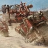
Guiltysparc Posted December 12, 2023 Author Share Posted December 12, 2023 Finished up the leather strips between meetings, and I wanted to redo the bluetac holding him down, so that gave me a chance to look at him on the base, stoked. TrawlingCleaner, Ulfast, Rusted Boltgun and 3 others 1 5 Back to top Link to comment https://bolterandchainsword.com/topic/381784-if-i-were-a-moral-man-angron-wip/page/2/#findComment-6009123 Share on other sites More sharing options...
Mithrilforge Posted December 12, 2023 Share Posted December 12, 2023 It looks Fantastic already and you haven't even got the face and skin popping yet !! ... Cannot wait to see the Big guy done!! Cheers, M Guiltysparc and Firedrake Cordova 1 1 Back to top Link to comment https://bolterandchainsword.com/topic/381784-if-i-were-a-moral-man-angron-wip/page/2/#findComment-6009155 Share on other sites More sharing options...
Firedrake Cordova Posted December 13, 2023 Share Posted December 13, 2023 What @Mumeishi said - he looks great, and I can't wait to see him finished Mithrilforge 1 Back to top Link to comment https://bolterandchainsword.com/topic/381784-if-i-were-a-moral-man-angron-wip/page/2/#findComment-6009204 Share on other sites More sharing options...
Mithrilforge Posted December 18, 2023 Share Posted December 18, 2023 I'm hoping Khorne has blessed you with some more spare time...to work on his angry child ... M Firedrake Cordova 1 Back to top Link to comment https://bolterandchainsword.com/topic/381784-if-i-were-a-moral-man-angron-wip/page/2/#findComment-6010012 Share on other sites More sharing options...
Guiltysparc Posted December 19, 2023 Author Share Posted December 19, 2023 Has the flu for the last week, finally today I felt well enough to pick up the brush. Just did a little low stakes work on the tubes, hair, and claws, so nothing super exciting. Once I get these done then, I think, it'll be on to the skin. Mithrilforge, Firedrake Cordova, firestorm40k and 3 others 3 3 Back to top Link to comment https://bolterandchainsword.com/topic/381784-if-i-were-a-moral-man-angron-wip/page/2/#findComment-6010393 Share on other sites More sharing options...
Pearson73 Posted December 20, 2023 Share Posted December 20, 2023 Great choice to go for blue tones on the highlights, it works really well with the brass and red. Mithrilforge, Guiltysparc and Firedrake Cordova 2 1 Back to top Link to comment https://bolterandchainsword.com/topic/381784-if-i-were-a-moral-man-angron-wip/page/2/#findComment-6010469 Share on other sites More sharing options...
Guiltysparc Posted December 20, 2023 Author Share Posted December 20, 2023 (edited) Thank you! Edited December 20, 2023 by Guiltysparc Link to comment https://bolterandchainsword.com/topic/381784-if-i-were-a-moral-man-angron-wip/page/2/#findComment-6010504 Share on other sites More sharing options...
Recommended Posts
Create an account or sign in to comment
You need to be a member in order to leave a comment
Create an account
Sign up for a new account in our community. It's easy!
Register a new accountSign in
Already have an account? Sign in here.
Sign In Now