Call to Arms 2023 - The Dire Avengers

Entry posted by Bouargh in Call to Arms 2023
665 views

I made this leap of faith/Gambit that I would be able to paint and repaint all the rest of my Aeldari´s Pile of Shame before closing date of the Challenge. I bet that the high painting yield I had over the past 3 weeks could be maintained up to the end of Sept. We will see if it proves to be a reasonable assumption or a fools game.
Anyway, from the list of units set in my second Vow, I decided to treat in priority the Dire Avengers. Wishing to shift from red/burgundy to blue for more variety...
I also made some extra trials wish Slap Chop. Previous attempt was a deception. Let´s see if this time it goes better. Comparatively the test results are giving very contrasted results:
- Base case is NO Slap Chop and Thalassar Blue on white primed model - to flashy - Talassar blue is a very bright and vivid colour. Too bright to migh taste, needs to go darker
- Standard Slap Chop - Black primed model, dry brushed in grey (administratum) and white plus Thalassar Blue - too dark to my taste. I rpobably did not insist suficiently on the dry brushing
- Intermediate Slap Chop - Grey (administratum) primed model, dry brushed in white plus Thalassar Blue - not too bad but still dark. Administratum grey is cnaceling most of the nuances that a Contrast paint can bring
- "Reverse" Slap Chop - My very own añmost genuine denomination - Grey (dawnstone) primed model, dry bruched in Gery (administratum) plus Thalassar Blue - interestingly this one is the one I like best. Do not ask why.
So, conclusion? Let´s go with the fourth one.
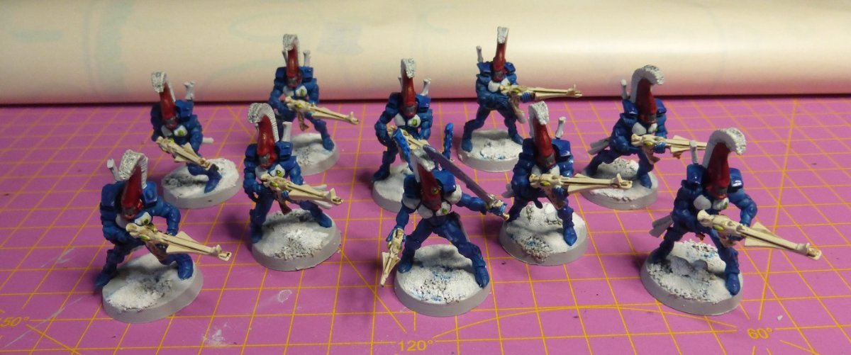
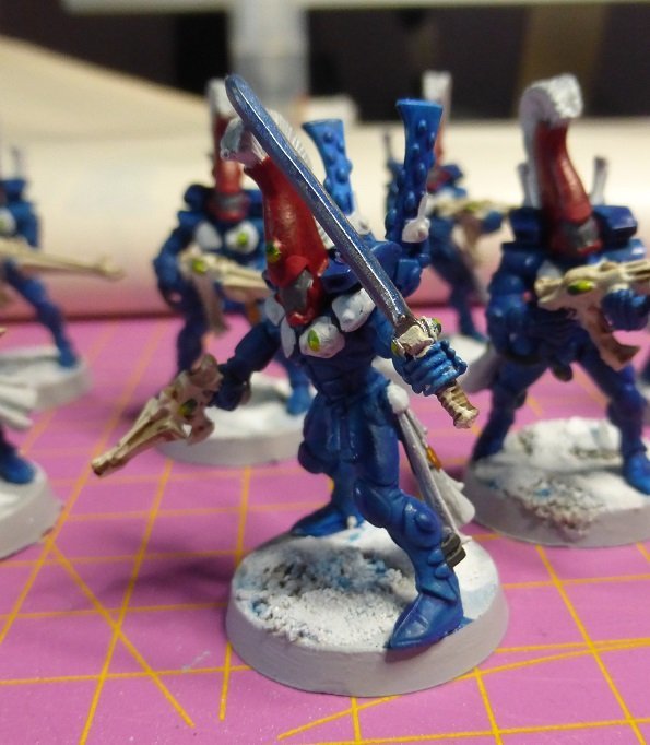
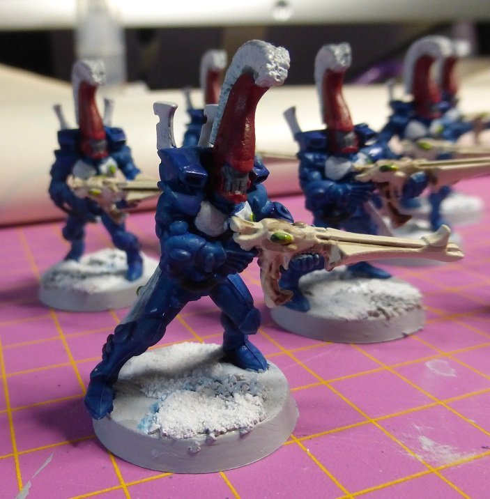
The resulting paint scheme I define is the following:
- The blue recipe Nº4
- The helmets in red with white peanant - more or less like Asurmen model, with the red doing the natural link with the rest of the army
- Some Wraithbone coloured weapons
- Some touches of white on back pack, paultrons and chest plates, to adjust visual impact. I was not decided initially between the white and black, but it ended being white, which is more visualy contrasting than the black.
What is the result? Well see by yourself:
Edited by Bouargh

0 Comments
Recommended Comments
There are no comments to display.
Create an account or sign in to comment
You need to be a member in order to leave a comment
Create an account
Sign up for a new account in our community. It's easy!
Register a new accountSign in
Already have an account? Sign in here.
Sign In Now