Lorenzen Posted October 30, 2011 Author Share Posted October 30, 2011 Cheers guys, ive been trying to improve my sculpting with every character ive done, learning to be patient enough with green stuff and milliput has been the biggest challenge for me, the wings on his legs took way way longer than you'd think they should just because of the layers. Link to comment https://bolterandchainsword.com/topic/223673-fire-angels-2nd-company/page/6/#findComment-2912152 Share on other sites More sharing options...
elohimalpha Posted October 30, 2011 Share Posted October 30, 2011 That's one intense-looking captain - love it! Would it be possible to get some up-close shots of the feet and shoulders? The gs work there looks great, and it's something I'm trying to focus on myself, so I want to see how good modellers do it. Really impressive stuff Link to comment https://bolterandchainsword.com/topic/223673-fire-angels-2nd-company/page/6/#findComment-2912432 Share on other sites More sharing options...
Lorenzen Posted October 30, 2011 Author Share Posted October 30, 2011 unfortunatley my camera sucks balls atm so i cant do much closer than that. ;) the folds on the cloak were made with a clay shaper, normally i wouldnt use any greenstuff to do this, but i was testing out a mix of greenstuff and milliput to see how well it would blend (not very well) i find it best to depress the folds into the cloak starting with the outside edge and keep them as smooth as possible and as thin as possible.. im also a fan of doing 2 depressions on shoulders as it looks the most aesthetically pleasing (rule of 3's) if you work with milliput for the cloak its easy to carve and to sand down with some wet and dry paper (400 grit for me) which is how the cloak manages to be so much smoother than on the power armoured version. getting that smooth, thin look is important with cloaks as you dont want your model to look like he's wearing a duvet round his shoulders. http://i224.photobucket.com/albums/dd199/typhion/helbrecht3.jpg duvet helbrecht. http://i224.photobucket.com/albums/dd199/typhion/templarmarshal.jpg betterer helbrecht. that was one of my first "proper" attempts at doing a cloak.. the back of it looked awful and you can see that despite doing what i could to make the greenstuff smooth its still somewhat lumpy. as far as the icon on the leg is concerned, i looked quite closely at other examples of that shape of wing (mainly grimaldus's crozius) and built it up in stages. the first stage was the right hand lower feathers, they built up the majority of the shape and were made by initially cutting a piece of mixed milliput and greenstuff to shape on the model after flattening it out, and then by slowly working from the inside of the wing outwards depressing the edges of the "feathers" until i got to the outside one, then trimming off the excess putty and leaving it to cure. once that was done, i worked on the top section of feathers using the same technique.. not sure why i decided to switch to pure milliput as its actually more awkward to work with for stuff like that.. was probably just being experimental then finally i ran some putty round the outside of the design to border the wing, flattened and cut to the appropriate thickness.. making sure the whole thing was thin enough was the main challenge and in future it would be done before the tabbard (which i had to thicken near the leg to make the profile stick out further than the cross.) the main thing to do is plan out whatever it is you are going to sculpt and to be very patient. im a big fan of milliput for cloaks due to the fact that you can sculpt part of it, leave it to cure, blend a new piece into it and then sand it all down to get a better finish than greenstuff can give (imho) the final finish is whats important in most cases, sharp lines and smooth surfaces always look 100x better than stuff thats lumpy. ive rambled for quite a while now.. theres a pretty haphazard tutorial for cloaks in this topic, it looks like i was drunk whilst doing it and its a bit of a rush job, but until i can get a better camera and find something to put a cloak on i doubt ill be improving it outside of written word. few random tips though before i press post.. for rope, i highly recommend getting hold of some thin wire (5 amp fuse wire in the case of brom) get 2 strips of it, clamp one end and twist them till theyre all tight and rope looking, looks a whole lot better than using greenstuff etc (hindsight on the front cord in comparison to the one on his back..) clay shapers rock, buy some. look up madscuzzy's tabbard tutorial, its made of win. push yourself, its the only way to improve. Link to comment https://bolterandchainsword.com/topic/223673-fire-angels-2nd-company/page/6/#findComment-2912482 Share on other sites More sharing options...
batu Posted October 30, 2011 Share Posted October 30, 2011 clay shapers rock, buy some. I will ! Do you had the chance to use liquid geen stuff yet ? When yes, how do you like it ? Link to comment https://bolterandchainsword.com/topic/223673-fire-angels-2nd-company/page/6/#findComment-2912663 Share on other sites More sharing options...
Lorenzen Posted October 31, 2011 Author Share Posted October 31, 2011 havent had a chance to use it yet, i tend to just use a mix of milliput and water (affectionatley known as milliput juice by some) i do plan on having a go with the liquid "greenstuff" and the vallejo equivilant too, if either can be used as a decent surfacer to blend 2 pieces of greenstuff together then that alone will be a decent enough reason for it to exist. *EDIT* ninja update :) http://i224.photobucket.com/albums/dd199/typhion/bromcolour.jpg whacked some colour on brom, his arm is missing because its not finished and its magnetized. http://i224.photobucket.com/albums/dd199/typhion/S5030108.jpg this is the reason his arm is missing.. working on the shield slowly.. need to add the nubs to the ends of the cross, finish the scroll and then add some other bling to make the shield worthwhile.. but in the long run its all part of the never ending fun that is improving my sculpts. Link to comment https://bolterandchainsword.com/topic/223673-fire-angels-2nd-company/page/6/#findComment-2912701 Share on other sites More sharing options...
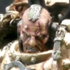
Lorenzen Posted November 4, 2011 Author Share Posted November 4, 2011 So work steadily moves onwards.. Brom has seen a bit more paint as you can see below and I have been working on making a terminator librarian that i actually like seeing as my 1500/1750 point army is lead by one and all. http://i224.photobucket.com/albums/dd199/typhion/Bromhardt-1.jpg As far as Brom is concerned hes coming along nicely, the details on him are generally much sharper this time round, which makes him more pleasing to paint, his shield is also getting close to being primed, i have one side of the scroll work still to finish, one more nub on the cross and then i get to determine wether i need to add anything more to it.. the last pic was blurry as hell and tbh, all the attempts since then have been worse. http://i224.photobucket.com/albums/dd199/typhion/Librarian.jpg The librarian is a proper hack job, but im pleased with the overall result. Parts wise hes made from the axe from the space hulk libby (nice model but plain as hell compared to his space hulky mates) a repositioned shield arm with a little bit of butchery on the wrist for the shield to fit, grey knight termie heraldy shield, grimaldus's servitors banner thingy and a plastic head.. 90% of the work that went into him would have been much easier if he'd been finecast/resin but i have 2 of these guys lying around and no intention of buying a 3rd. anyway i hope you enjoy.. any constructive criticism etc is always appreciated. Link to comment https://bolterandchainsword.com/topic/223673-fire-angels-2nd-company/page/6/#findComment-2916693 Share on other sites More sharing options...
Marius Perdo Posted November 4, 2011 Share Posted November 4, 2011 Love the kit bashing/conversions. Very inspiring. Link to comment https://bolterandchainsword.com/topic/223673-fire-angels-2nd-company/page/6/#findComment-2916742 Share on other sites More sharing options...
Dark Apostle Thirst Posted November 4, 2011 Share Posted November 4, 2011 Very nice, looking forward to even more progress :huh: Link to comment https://bolterandchainsword.com/topic/223673-fire-angels-2nd-company/page/6/#findComment-2916883 Share on other sites More sharing options...
sioka Posted November 4, 2011 Share Posted November 4, 2011 I'm loving the sculpting mate, keep up the good work. Link to comment https://bolterandchainsword.com/topic/223673-fire-angels-2nd-company/page/6/#findComment-2916897 Share on other sites More sharing options...
Lorenzen Posted November 4, 2011 Author Share Posted November 4, 2011 @Sioka coming from you thats pretty positive, some of the stuff on here makes me go "awww crap" a lot of the time, and usually its accompanied by your name. :rolleyes: got both minis lined up next to each other atm, librarian looks like a right short arse next to brom.. not sure if i should continue with how my power armoured libbys paint scheme looks onto the termie armoured one (silver with one blue arm) what do people think? Link to comment https://bolterandchainsword.com/topic/223673-fire-angels-2nd-company/page/6/#findComment-2916930 Share on other sites More sharing options...
Lorenzen Posted November 6, 2011 Author Share Posted November 6, 2011 update time! finally finished sculpting broms shield.. and yes it wasnt worth the wait :) http://i224.photobucket.com/albums/dd199/typhion/Bromshield.jpg its pretty basic, but i wanted him to have something a bit more unique than the same shield that eeeeeeeveryone in my army will be rolling with (all termies have the longer "sarge" storm shield) the libby has received his 1st coat of silver, and progress will be made on him soon.. but he looks like a right short arse compared to brom.. i reckon his grimaldus tribute back banner is compensating for something afterall.. tho if any princesses asked him if he was a little short for a storm trooper he'd use his ninja magic to melt their minds.. so i guess its not all bad. Link to comment https://bolterandchainsword.com/topic/223673-fire-angels-2nd-company/page/6/#findComment-2917959 Share on other sites More sharing options...
batu Posted November 6, 2011 Share Posted November 6, 2011 He looks cool. The painting of the face is amazing ! Looking forward to see him finished. Link to comment https://bolterandchainsword.com/topic/223673-fire-angels-2nd-company/page/6/#findComment-2918038 Share on other sites More sharing options...
Commander Ashabi Posted November 6, 2011 Share Posted November 6, 2011 Really liking these guys, when i opened up imperial armour and found these guys in it, I fell in love, but sadly I want to do them justice and I'll wait till i can afford Forgeworld stuff. Loving the cross and half scheme on Brom's shield. Keep up the good work. Link to comment https://bolterandchainsword.com/topic/223673-fire-angels-2nd-company/page/6/#findComment-2918070 Share on other sites More sharing options...
Lorenzen Posted November 6, 2011 Author Share Posted November 6, 2011 why wait for forgeworld stuff? the fire angels are one of the chapters in the badab war that has an abundance of newer marks of power armour (quite a fair supply of mk8 and 7) up to the point that throughout the ia they arent even shown wearing anything else. outside of the loth stuff and the contemptor 99% of my army is in "up to date" power armour with only a few bits of older stuff thrown in. join the shiny side.. it can only end in joy and happiness* *joy and happiness not guarenteed Link to comment https://bolterandchainsword.com/topic/223673-fire-angels-2nd-company/page/6/#findComment-2918074 Share on other sites More sharing options...
elohimalpha Posted November 8, 2011 Share Posted November 8, 2011 Brom is fantastic - he's got just enough subtle convesions/bits to look important without being pretentious or ostentatious. You can tell he's in the business of killing, and business has been good. Is the shield finished? I like the gs/mili work, but the black cross seems a little flat to me - it'd be a perfect place for some scroll work or heraldry, etc. Then again, I'm not up on the Fire Angels, so maybe that's not their thing. So far, great stuff! Oh and no one is going to comment on the height of someone that can turn your intestines into a hat with just their mind. Link to comment https://bolterandchainsword.com/topic/223673-fire-angels-2nd-company/page/6/#findComment-2919119 Share on other sites More sharing options...
Lorenzen Posted November 8, 2011 Author Share Posted November 8, 2011 paint wise the shield is far from done, its all just block colours atm, i'll be adding some depth to the various colours and potentially will do something fancy on the cross, but until its a little closer to completion im not sure what! As far as ostentation and the such goes, they're meant to be quite a pious chapter, taking the imperial creed as undeniable fact and working closely with the eclesiarchy and the adeptus sororitas (anyone notice the fleur de lis on brom.. it has meaning yo!) and as far as modelling goes i have tried to push some more chaplainy elements across and is why both versions of brom have skulls and trinkets on them rather than the traditional eagles, pimp sticks, gilt and general pimp culture that "special characters" tend to be adorned with.. hell outside of his banner termie brom has 0 aquila on him and the power armoured equivilant only has one small one (not counting his backpack head things) Link to comment https://bolterandchainsword.com/topic/223673-fire-angels-2nd-company/page/6/#findComment-2919402 Share on other sites More sharing options...
Shuggnuggath Posted November 8, 2011 Share Posted November 8, 2011 I would love to take my Mantis Warriors up against these guys, they look great :mellow: Link to comment https://bolterandchainsword.com/topic/223673-fire-angels-2nd-company/page/6/#findComment-2919422 Share on other sites More sharing options...
Lorenzen Posted November 8, 2011 Author Share Posted November 8, 2011 we should harass all the badab people on here (from the uk) to arrange a day down/up to warhammer world and duke it out maelstrom style! Link to comment https://bolterandchainsword.com/topic/223673-fire-angels-2nd-company/page/6/#findComment-2919482 Share on other sites More sharing options...
Lorenzen Posted November 11, 2011 Author Share Posted November 11, 2011 Work on Brom has been a little slower than id've liked, but hes getting more done to him.. the main pieces to be done now are the back banner, the other side of his cloak and some touch up work, before i can even classify him as "done" http://i224.photobucket.com/albums/dd199/typhion/Bromhardtalmostfinished.jpg but whatever the case im really pleased with how hes come along and there isnt really anything i can see at this point that id go "i would change that" sure i could make the rope on his front neater, but most people wont even notice that, or that the rope on his back is in fact small wire that has been meticulously wound to simulate real rope.. so meh. now i know my updates havent been anywhere near as adhd based as usual.. with them all pretty much being of this model.. but lets fact it thats gotta show you how much ive actually enjoyed this. Link to comment https://bolterandchainsword.com/topic/223673-fire-angels-2nd-company/page/6/#findComment-2921825 Share on other sites More sharing options...
Terminatorinhell Posted November 12, 2011 Share Posted November 12, 2011 This guy might be one of my favorite terminator characters ive seen so far! Link to comment https://bolterandchainsword.com/topic/223673-fire-angels-2nd-company/page/6/#findComment-2922112 Share on other sites More sharing options...
subtlebrush Posted November 12, 2011 Share Posted November 12, 2011 I have to agree with Terminatorinhell! Amazing job. +++Mr.M+++ Link to comment https://bolterandchainsword.com/topic/223673-fire-angels-2nd-company/page/6/#findComment-2922208 Share on other sites More sharing options...
Subtle Discord Posted November 12, 2011 Share Posted November 12, 2011 Excellent weathering and dirt. Just the right level if gritty. The pose is so, 'You want some of this?!', it's great. I can almost see the swing through at his first victim, from his current 'balanced blade' stance. I do the same simple thing with putting a foot on a rock, it's amazing how much it can add to a miniature's pose, and you don't even need to do any converting if you camouflage a bit with the basing material. Keep it up! Link to comment https://bolterandchainsword.com/topic/223673-fire-angels-2nd-company/page/6/#findComment-2922416 Share on other sites More sharing options...
elohimalpha Posted November 14, 2011 Share Posted November 14, 2011 Excellent work - I'm really liking the way you did the weathering/battle damage on the armor. It's given me the inspiration to try it out myself. Link to comment https://bolterandchainsword.com/topic/223673-fire-angels-2nd-company/page/6/#findComment-2923990 Share on other sites More sharing options...
Biohazard Posted November 14, 2011 Share Posted November 14, 2011 Really liking the Termi character. Have you converted the legs at all on the Librarian coming down the stairs or is it just clever positioning. Link to comment https://bolterandchainsword.com/topic/223673-fire-angels-2nd-company/page/6/#findComment-2924012 Share on other sites More sharing options...
Lorenzen Posted November 14, 2011 Author Share Posted November 14, 2011 the librarians legs are stock, in the case of both of them its just a matter of finding something suitable to place the bent leg on to add a little bit of height and then hiding the fact that the other foot isnt level when you base the mini. Link to comment https://bolterandchainsword.com/topic/223673-fire-angels-2nd-company/page/6/#findComment-2924016 Share on other sites More sharing options...
Recommended Posts
Archived
This topic is now archived and is closed to further replies.