Doghouse Posted June 4, 2014 Share Posted June 4, 2014 Looking good so far. Glad you are going for an old school rogue trader vibe with these guys and the orange/red. I think the artwork of Wayne England was inspired, seeing that picture brings back memories of the Blood Angels boarding squad preparing to teleport in with one of them in Ultramarine colours as the armour was loaned to them and anyone that repainted it ended up getting killed. So far you are off to a solid start, with your imagination I am expecting to see a lot of thought to go into these guys. :tu: Link to comment https://bolterandchainsword.com/topic/290860-the-angels-numinous/page/4/#findComment-3707684 Share on other sites More sharing options...
Forté Posted June 4, 2014 Share Posted June 4, 2014 Didn't realise those were the Zone Mortalis bases. The pic on the FW site doesn't do them justice. Link to comment https://bolterandchainsword.com/topic/290860-the-angels-numinous/page/4/#findComment-3707833 Share on other sites More sharing options...
MrBear Posted June 4, 2014 Share Posted June 4, 2014 Really nice bases, an army on those should be a sight. Link to comment https://bolterandchainsword.com/topic/290860-the-angels-numinous/page/4/#findComment-3708186 Share on other sites More sharing options...
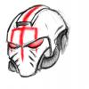
A D-B Posted June 8, 2014 Author Share Posted June 8, 2014 Evidence of progress. A little darker than intended so far. For now, this guy is serving as my test mini. I'm finding that I like the yellow helmet enough that it tempts me to run with a Lamenter vibe, but we'll see. Link to comment https://bolterandchainsword.com/topic/290860-the-angels-numinous/page/4/#findComment-3711995 Share on other sites More sharing options...
Daemon2027 Posted June 8, 2014 Share Posted June 8, 2014 The yellow is really nice so far, will look excellent when highlighted. You could take the red either way, keep it dark or have a brighter red. Link to comment https://bolterandchainsword.com/topic/290860-the-angels-numinous/page/4/#findComment-3712008 Share on other sites More sharing options...
Captain Juan Juarez Posted June 8, 2014 Share Posted June 8, 2014 I actually really like that red in contrast with the yellow of the helmet - I am an Imperial Fist so in theory yellow is my thing but I don't like yellow. Link to comment https://bolterandchainsword.com/topic/290860-the-angels-numinous/page/4/#findComment-3712013 Share on other sites More sharing options...
Dosjetka Posted June 8, 2014 Share Posted June 8, 2014 Nice start on the painting. I especially like the yellow (which paints?). Also, what red are you using and what is the end result you're trying to get to? Link to comment https://bolterandchainsword.com/topic/290860-the-angels-numinous/page/4/#findComment-3712025 Share on other sites More sharing options...
Brother-Chaplain Kage Posted June 8, 2014 Share Posted June 8, 2014 The way I've seen you talk about your modeling and painting skills, I was expecting something much worse. The red looks like it's still in the early stages, but I like that old school orange tint to the yellow helmet. Link to comment https://bolterandchainsword.com/topic/290860-the-angels-numinous/page/4/#findComment-3712043 Share on other sites More sharing options...
Olis Posted June 8, 2014 Share Posted June 8, 2014 I had expected something less... uniform, given how much you bash your painting, brother. As for the red itself, you could always blend up towards a brighter orange if you like. It'll just take ages, is all. ^_^ (I see BCK was thinking the same thing as me... :D ) Link to comment https://bolterandchainsword.com/topic/290860-the-angels-numinous/page/4/#findComment-3712046 Share on other sites More sharing options...
Angrypantz Posted June 8, 2014 Share Posted June 8, 2014 That is looking very good. I would still like to see the red to what you initially wanted just for comparison but if you are happy with it then I say go for it. You are a bit of a dark horse when it comes to painting it would seem lol Link to comment https://bolterandchainsword.com/topic/290860-the-angels-numinous/page/4/#findComment-3712224 Share on other sites More sharing options...
Aqui Posted June 8, 2014 Share Posted June 8, 2014 Loving the shade of red and yellow! Link to comment https://bolterandchainsword.com/topic/290860-the-angels-numinous/page/4/#findComment-3712232 Share on other sites More sharing options...
Max Power Posted June 8, 2014 Share Posted June 8, 2014 I hate to torment you, A D-B, but all I can think when I see that marine is how pants-crappingly awesome it would look as a Lamenter with that shade of yellow. Link to comment https://bolterandchainsword.com/topic/290860-the-angels-numinous/page/4/#findComment-3712249 Share on other sites More sharing options...
Urauloth Posted June 8, 2014 Share Posted June 8, 2014 This owns, the bases own, the kitbashes own, everything in this thread owns, I'm out of likes. I love the assault squad being posed to repel boarders, that's a fantastic piece of theming and it makes the squad very characterful. With regards to the first mini you posted - I never liked those pistols much when I saw them in profile on the FW website, but I see the appeal now. The muzzle looks great from the front. Link to comment https://bolterandchainsword.com/topic/290860-the-angels-numinous/page/4/#findComment-3712322 Share on other sites More sharing options...
Spinsanity Posted June 8, 2014 Share Posted June 8, 2014 Everyone loves the yellow but I dig that red... I know you're aiming for a more old-school BA orange-ish color, but that's a red I love nonetheless :) Link to comment https://bolterandchainsword.com/topic/290860-the-angels-numinous/page/4/#findComment-3712376 Share on other sites More sharing options...
Captain Juan Juarez Posted June 8, 2014 Share Posted June 8, 2014 I actually really like that red in contrast with the yellow of the helmet - I am an Imperial Fist so in theory yellow is my thing but I don't like yellow. Everyone loves the yellow but I dig that red... I know you're aiming for a more old-school BA orange-ish color, but that's a red I love nonetheless How dare you! Link to comment https://bolterandchainsword.com/topic/290860-the-angels-numinous/page/4/#findComment-3712378 Share on other sites More sharing options...
Phoros Posted June 8, 2014 Share Posted June 8, 2014 ...I'm ashamed to say that I the first thought that keeps springing to mind when I see that is "That's a Fire Lord", possibly because the yellow and red are very similar to the colours on my own army (albiet much more nicely done). I don't know what that says about me, since I don't even collect them any more. What I'm trying to say here is that that's looking absolutely lovely. Link to comment https://bolterandchainsword.com/topic/290860-the-angels-numinous/page/4/#findComment-3712647 Share on other sites More sharing options...
War Angel Posted June 8, 2014 Share Posted June 8, 2014 Why is you're name familiar? And you're painting awesome? Link to comment https://bolterandchainsword.com/topic/290860-the-angels-numinous/page/4/#findComment-3712700 Share on other sites More sharing options...
reckoning Posted June 9, 2014 Share Posted June 9, 2014 Im a big fan of that red. But that yellow i gorgeous. Awesome start. Link to comment https://bolterandchainsword.com/topic/290860-the-angels-numinous/page/4/#findComment-3712859 Share on other sites More sharing options...
Primarch83 Posted June 9, 2014 Share Posted June 9, 2014 Wow these are going to look fantastic. The yellow helms and red bodies go well together, plus every marine is posed solidly which goes a long way to making the model look good in the end. Link to comment https://bolterandchainsword.com/topic/290860-the-angels-numinous/page/4/#findComment-3712876 Share on other sites More sharing options...
A D-B Posted June 9, 2014 Author Share Posted June 9, 2014 ...I'm ashamed to say that I the first thought that keeps springing to mind when I see that is "That's a Fire Lord", possibly because the yellow and red are very similar to the colours on my own army (albiet much more nicely done). I don't know what that says about me, since I don't even collect them any more. What I'm trying to say here is that that's looking absolutely lovely. The Fire Lords are such a killer Chapter. Their colours and have always intimidated me, admittedly, but I've dug their lore for ages (what little of it there is) and they use the fist icon, which is one of my faves. I have so many fist shoulder pads lying around that every six months I think "Fire Lords... No, Subjugators... No, Crimson Fists... Actually, I'll just play WarCraft until I decide." And then promptly never decide. Everyone loves the yellow but I dig that red... I know you're aiming for a more old-school BA orange-ish color, but that's a red I love nonetheless The red's now been edge highlighted with Fire Dragon Bright, then darkened a little with a Bloodletter glaze. It's not the old-school orange-ish I was going for, but it's not bad, either. I think I'm happy with it. Or at least, happy enough to give it another shot. This owns, the bases own, the kitbashes own, everything in this thread owns, I'm out of likes. I love the assault squad being posed to repel boarders, that's a fantastic piece of theming and it makes the squad very characterful. With regards to the first mini you posted - I never liked those pistols much when I saw them in profile on the FW website, but I see the appeal now. The muzzle looks great from the front. I know exactly what you mean. Umbra bolt pistols often feel like the skinny lesser cousins of Phobos and co. but I like to sprinkle them here and there. They're definitely growing on me the more I have them on my desk, and I like the way they add variety. I can easily imagine them 'feeling' different in the setting: firing slightly differently, feeling more elegant or more mass-produced, or whatever else. I hate to torment you, A D-B, but all I can think when I see that marine is how pants-crappingly awesome it would look as a Lamenter with that shade of yellow. I'm still tempted. Tempted to make the Angels Numinous yellow, rather than doing an entire Lamenter army. Loving the shade of red and yellow! Thanks, dude! That is looking very good. I would still like to see the red to what you initially wanted just for comparison but if you are happy with it then I say go for it. The eternal equation of 'What's good enough?' balanced against 'How much free time do I have to try all of this out?' and 'Will I be happy anyway?" Because... I had expected something less... uniform, given how much you bash your painting, brother. As for the red itself, you could always blend up towards a brighter orange if you like. It'll just take ages, is all. (I see BCK was thinking the same thing as me... ) The way I've seen you talk about your modeling and painting skills, I was expecting something much worse. The red looks like it's still in the early stages, but I like that old school orange tint to the yellow helmet. ...rather cunningly, I think neatness can take you a long way. If something's neat, it can fake a lot of the same stuff as things that are good. Admittedly, I've only actually finished... fewer than 15 models in my entire life. But whatever. Thanks for bearing with me. Nice start on the painting. I especially like the yellow (which paints?). Also, what red are you using and what is the end result you're trying to get to? At that stage, the red is: 1. Skull White undercoat. 2. Mephiston Red basecoat. 3. Agrax Earthshade all-over wash. 4. Evil Sunz Scarlet heavy drybrush. 5. Carroburg Crimson all-over wash. The next two stages (no pics yet) with orange it up a little more are: 6. Fire Dragon Bright edge highlight. 7. Bloodletter all-over glaze. And the yellow is: 1. Skull White undercoat. 2. Casandora Yellow all-over wash. 3. Casandora Yellow recess wash. The next bit (no pics yet) is: 4. Flash Gitz Yellow edge highlight. I actually really like that red in contrast with the yellow of the helmet - I am an Imperial Fist so in theory yellow is my thing but I don't like yellow. How dare you muddy the issue with controversial opinions? The yellow is really nice so far, will look excellent when highlighted. You could take the red either way, keep it dark or have a brighter red. More progress pics soon... Link to comment https://bolterandchainsword.com/topic/290860-the-angels-numinous/page/4/#findComment-3712888 Share on other sites More sharing options...
Captain Semper Posted June 9, 2014 Share Posted June 9, 2014 Great work ADB! Never thought you had in you! I really like your approach with the deep red and the deep yellow... Personally I find yellow the most difficult colour in the world so tons of respect there... Let's see this squad taking shape! (Just, before you commit to Lamenters think whether you can do checkers and little hearts in a circle... ) Link to comment https://bolterandchainsword.com/topic/290860-the-angels-numinous/page/4/#findComment-3712896 Share on other sites More sharing options...
Captain Juan Juarez Posted June 9, 2014 Share Posted June 9, 2014 I'm also now going to throw up the whole "What's with saying you can't paint!?" bit? Unless your painting involves throwing a mini in to a room full of paint and then blowing the room up, then you're not terribad at all. Link to comment https://bolterandchainsword.com/topic/290860-the-angels-numinous/page/4/#findComment-3712965 Share on other sites More sharing options...
Emperors Immortals Posted June 9, 2014 Share Posted June 9, 2014 At that stage, the red is: 1. Skull White undercoat. 2. Mephiston Red basecoat. 3. Agrax Earthshade all-over wash. 4. Evil Sunz Scarlet heavy drybrush. 5. Carroburg Crimson all-over wash. The next two stages (no pics yet) with orange it up a little more are: 6. Fire Dragon Bright edge highlight. 7. Bloodletter all-over glaze. Aaah, very nice indeed. I just tried this out and am happy with the result, especially with a VERY heavy drybrush of scarlet. Unfortunately you've outed yourself and must now paint until you bleed. For Sanguinius. Link to comment https://bolterandchainsword.com/topic/290860-the-angels-numinous/page/4/#findComment-3713040 Share on other sites More sharing options...
Balthamal Posted June 9, 2014 Share Posted June 9, 2014 You've outed yourself now dude, there'll be no more "But I really can't paint that well" talk around here any more. I'm a fan of the colour, especially if that highlight of orange turns out to be what I'm picturing in my head. I'd offer a high five but shall settle for a bro fist instead Link to comment https://bolterandchainsword.com/topic/290860-the-angels-numinous/page/4/#findComment-3713053 Share on other sites More sharing options...
drmarco Posted June 10, 2014 Share Posted June 10, 2014 Really, really effective techniques, well executed. Can't wait to see where you're up to with the highlights... Link to comment https://bolterandchainsword.com/topic/290860-the-angels-numinous/page/4/#findComment-3713990 Share on other sites More sharing options...
Recommended Posts
Archived
This topic is now archived and is closed to further replies.