WingsOfTheFalcon Posted January 13, 2011 Author Share Posted January 13, 2011 Hey guys, Here's a first shot of my pledge for the Librarium Painting Challenge (see sig): http://a.imagehost.org/t/0056/DSC00479.jpg All minis are built, now I just need to get them based and undercoated. Link to comment https://bolterandchainsword.com/topic/188598-iron-snakes-battleforce-wip/page/6/#findComment-2615682 Share on other sites More sharing options...
WingsOfTheFalcon Posted February 3, 2011 Author Share Posted February 3, 2011 LPC Update.. need to work faster! http://i56.tinypic.com/fjot1v.jpg Can anyone suggest a way to resize these images a bit smaller? I generally prefer to drop thumbnails rather than fill the thread with big pictures. Link to comment https://bolterandchainsword.com/topic/188598-iron-snakes-battleforce-wip/page/6/#findComment-2645306 Share on other sites More sharing options...
Dosjetka Posted February 3, 2011 Share Posted February 3, 2011 Can anyone suggest a way to resize these images a bit smaller? I generally prefer to drop thumbnails rather than fill the thread with big pictures. As in to crop the image and it stays cropped or as in crop the image and then you click on it and it comes up bigger? Ludovic Link to comment https://bolterandchainsword.com/topic/188598-iron-snakes-battleforce-wip/page/6/#findComment-2645346 Share on other sites More sharing options...
WingsOfTheFalcon Posted February 3, 2011 Author Share Posted February 3, 2011 As in to crop the image and it stays cropped or as in crop the image and then you click on it and it comes up bigger? Ludovic Well I used to use a site called Imagehost which has now gone bust, which gave me forum code for thumbnailed versions. Now I can't do that the images are massive as per above. I'd prefer them not to be bigger than a few hundred pixels. Link to comment https://bolterandchainsword.com/topic/188598-iron-snakes-battleforce-wip/page/6/#findComment-2645570 Share on other sites More sharing options...
AngryJohnny Posted February 3, 2011 Share Posted February 3, 2011 You could post a link to the image from your hosting so we have to click on it to view it. Link to comment https://bolterandchainsword.com/topic/188598-iron-snakes-battleforce-wip/page/6/#findComment-2645995 Share on other sites More sharing options...
WingsOfTheFalcon Posted February 7, 2011 Author Share Posted February 7, 2011 LPC update: http://img40.picoodle.com/s527/grpn_c7c_u0.jpg Link to comment https://bolterandchainsword.com/topic/188598-iron-snakes-battleforce-wip/page/6/#findComment-2649800 Share on other sites More sharing options...
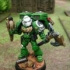
WingsOfTheFalcon Posted February 15, 2011 Author Share Posted February 15, 2011 Non-LPC Update! Any hints for improving my edge highlights? http://img40.picoodle.com/s52f/grpn_5ee_u0.jpg Link to comment https://bolterandchainsword.com/topic/188598-iron-snakes-battleforce-wip/page/6/#findComment-2659437 Share on other sites More sharing options...
Vulkan454 Posted February 15, 2011 Share Posted February 15, 2011 That Libby looks great to me, but I assume some bits are still WIP? No idea how to improve your highlights, they look better than I could do. Keep up the good work. Vulkan Link to comment https://bolterandchainsword.com/topic/188598-iron-snakes-battleforce-wip/page/6/#findComment-2659532 Share on other sites More sharing options...
GooseDaMoose Posted February 15, 2011 Share Posted February 15, 2011 I really don't think you need to improve your edge highlights to be honest man :D Looking good! Link to comment https://bolterandchainsword.com/topic/188598-iron-snakes-battleforce-wip/page/6/#findComment-2659535 Share on other sites More sharing options...
WingsOfTheFalcon Posted February 15, 2011 Author Share Posted February 15, 2011 Cheers guys, I think I need to try and do something to smooth out the transition between the extreme highlights and some of the lower tones. I'm not sure whether a glaze or something might help with this? For the record I'm so glad that most of my marines are metallic!! :D Link to comment https://bolterandchainsword.com/topic/188598-iron-snakes-battleforce-wip/page/6/#findComment-2659537 Share on other sites More sharing options...
SCC Posted February 15, 2011 Share Posted February 15, 2011 Cheers guys, I think I need to try and do something to smooth out the transition between the extreme highlights and some of the lower tones. I'm not sure whether a glaze or something might help with this? Nail on the head right there. That's really the next step for smooth transitions without going to wet blending or adding extra steps in the highlighting process - either of which can work spectacularly well but both of which will take a considerable investment in time/effort. Glazes are simple, thin out a blue wash, ink or one of your mid-tones colours to a translucent, barely blue colour and apply to the areas you want to smooth out. Repeat until satisfied. You can achieve a whole variety of different effects by altering the colour, intensity and other elements of the glaze. Glowing effects for example can be achieved with glazes as can shading and highlighting entire models if you really want :D Link to comment https://bolterandchainsword.com/topic/188598-iron-snakes-battleforce-wip/page/6/#findComment-2659546 Share on other sites More sharing options...
WingsOfTheFalcon Posted February 15, 2011 Author Share Posted February 15, 2011 Cheers guys, I think I need to try and do something to smooth out the transition between the extreme highlights and some of the lower tones. I'm not sure whether a glaze or something might help with this? Nail on the head right there. That's really the next step for smooth transitions without going to wet blending or adding extra steps in the highlighting process - either of which can work spectacularly well but both of which will take a considerable investment in time/effort. Glazes are simple, thin out a blue wash, ink or one of your mid-tones colours to a translucent, barely blue colour and apply to the areas you want to smooth out. Repeat until satisfied. You can achieve a whole variety of different effects by altering the colour, intensity and other elements of the glaze. Glowing effects for example can be achieved with glazes as can shading and highlighting entire models if you really want B) Brilliant, thanks for that, I'll have a go with a very thin glaze of regal blue and see how it comes out. ^_^ Link to comment https://bolterandchainsword.com/topic/188598-iron-snakes-battleforce-wip/page/6/#findComment-2659606 Share on other sites More sharing options...
BloodWulf Posted February 15, 2011 Share Posted February 15, 2011 I love that someone is playing the Iron Snakes and I love the detailed work you are putting into converting and painting them! Looks great and you really seem to be enjoying the whole process! I'm slightly jealous but thats good, maybe it will motivate me more! Link to comment https://bolterandchainsword.com/topic/188598-iron-snakes-battleforce-wip/page/6/#findComment-2659882 Share on other sites More sharing options...
WingsOfTheFalcon Posted February 15, 2011 Author Share Posted February 15, 2011 I love that someone is playing the Iron Snakes and I love the detailed work you are putting into converting and painting them! Looks great and you really seem to be enjoying the whole process! I'm slightly jealous but thats good, maybe it will motivate me more! Mate, not half as jealous as I'm going to be when FW bring out a load of sexy bits for the Carcharodons! Glad you like the army, I chose them because I loved the book and also the metallic scheme is pretty simple (for a PA army) to paint. As per my Librarian picture above, I really don't like highlighting PA!! Link to comment https://bolterandchainsword.com/topic/188598-iron-snakes-battleforce-wip/page/6/#findComment-2659985 Share on other sites More sharing options...
Seva Posted February 15, 2011 Share Posted February 15, 2011 Non-LPC Update! Any hints for improving my edge highlights? http://img40.picoodle.com/s52f/grpn_5ee_u0.jpg Make sure your paint is very thin as has been said above. When you pick some paint up with your brush try to get the excess off of it (the brush) as well. I usually run the brush across my thumb a couple of times before I put it to the model. Then almost like a dry brush but more precise, you paint perpendicular to the ridge you want to highlight. You might want to make sure you also have a darker or your base color mixed up and to the side to clean up any edge highlights that don't quite hit just the edge. In my opinion the transition from darker to lighter is just as if not more important than the edge highlights themselves. Glazing is a really good method as well for getting those transitions. Painting the highlights first is another good way to get crisp lines. Keep those brush strokes uniform and that will go a long way to getting good results as well. Hope that helped. Link to comment https://bolterandchainsword.com/topic/188598-iron-snakes-battleforce-wip/page/6/#findComment-2660123 Share on other sites More sharing options...
WingsOfTheFalcon Posted February 16, 2011 Author Share Posted February 16, 2011 Another cheeky non-LPC update, decided to do some more work on my Chaplain, finished his shoulder pads and chapter badge, also painted his purity seals blue. Just a bit more washing to do and his base needs tidying up, but then he should be finished! http://img40.picoodle.com/s52g/grpn_6a9_u0.jpghttp://img40.picoodle.com/s52g/grpn_4b8_u0.jpg Link to comment https://bolterandchainsword.com/topic/188598-iron-snakes-battleforce-wip/page/6/#findComment-2660658 Share on other sites More sharing options...
WingsOfTheFalcon Posted February 16, 2011 Author Share Posted February 16, 2011 Make sure your paint is very thin as has been said above. When you pick some paint up with your brush try to get the excess off of it (the brush) as well. I usually run the brush across my thumb a couple of times before I put it to the model. Then almost like a dry brush but more precise, you paint perpendicular to the ridge you want to highlight. You might want to make sure you also have a darker or your base color mixed up and to the side to clean up any edge highlights that don't quite hit just the edge. In my opinion the transition from darker to lighter is just as if not more important than the edge highlights themselves. Glazing is a really good method as well for getting those transitions. Painting the highlights first is another good way to get crisp lines. Keep those brush strokes uniform and that will go a long way to getting good results as well. Hope that helped. Thanks very much for the advice, just checked out your BA, they're superb! Are you just glazing up from a white undercoat to get that blended/diffuse effect? Link to comment https://bolterandchainsword.com/topic/188598-iron-snakes-battleforce-wip/page/6/#findComment-2660661 Share on other sites More sharing options...
sioka Posted February 16, 2011 Share Posted February 16, 2011 Can anyone suggest a way to resize these images a bit smaller? I generally prefer to drop thumbnails rather than fill the thread with big pictures. As in to crop the image and it stays cropped or as in crop the image and then you click on it and it comes up bigger? Ludovic In relation to your questions about photo/digital image work have you seen this bit of software?? http://www.gimp.org/windows/ I use it to crop my images so as to remove blank space from the edges and also to reduce the file size of an image, there is an option to set the width and height of your image in pixles and the best thing is its public domain so completely free to upload! Its like the poor mans photoshop but works fine for the rather limited use I give it. Link to comment https://bolterandchainsword.com/topic/188598-iron-snakes-battleforce-wip/page/6/#findComment-2660817 Share on other sites More sharing options...
WingsOfTheFalcon Posted February 16, 2011 Author Share Posted February 16, 2011 Haha, yeah I know GIMP well. I didn't phrase my question well enough, basically I was looking for a hosting solution which would give me BB Code to post thumbnails that click through to enlarged images.. In the end I found Picoodle. A bit of a weighty site in terms of ads, but it ticks the boxes! Link to comment https://bolterandchainsword.com/topic/188598-iron-snakes-battleforce-wip/page/6/#findComment-2660842 Share on other sites More sharing options...
Brother Kovash Posted February 16, 2011 Share Posted February 16, 2011 Very nice work. I just started reading Brotherhood of the Snake, so I'm very interested to see how these turn out. Link to comment https://bolterandchainsword.com/topic/188598-iron-snakes-battleforce-wip/page/6/#findComment-2660997 Share on other sites More sharing options...
Seva Posted February 16, 2011 Share Posted February 16, 2011 Thanks very much for the advice, just checked out your BA, they're superb! Are you just glazing up from a white undercoat to get that blended/diffuse effect? White or gray, depends on what I have on hand. I like using white more though on account of the end colors being brighter, but gray is just as good. When I glaze I usually start with the brightest color and then work down from there. The following picture I started with white primer. Then I do about 5-10 glazes with dwarf flesh. From there you just work your way down until you get to the darkest red you want. I like my Bloods a bit darker so it all ends at the awesomely named "scab red". You could stop earlier, it's all up to what color you want. I used a bunch of sepia wash and even some purple wash in there as well. I think I did the purple was once I glazed it enough to look red. I am sure I posted a step by step of how I did these guys but I can't seem to find it. Basically I was trying to ape the fine work of Lunchbox. Check his stuff out, its pretty sic. http://i267.photobucket.com/albums/ii292/MrBlonde567/DSC01567.jpg The latest guys I have been using a different technique. It's more of the traditional way to do it Where I start dark and work my way up to the bright. I like it because it's a bit faster. I still use a white base/primer and the basecoat is a bit thicker. With the glaze method it takes awhile before the color starts showing up. The guy below was painted using the more traditional technique. I think the glazing gives me personally a smoother result and I will go back to it again but I really like this way as well. It's a toss up really, I think both ways give good results. http://img14.imageshack.us/img14/2915/dsc02695nj.jpg I haven't tried doing red over black primed marines in ages but I know that works as well. There was a guy on here a couple of years back by the name of Picster. He had really good results going up from a black base. I guess it depends on how bright you want your blue to be. I personally would use a white primer and just glaze down. Sometimes if you through some funky colors into the mix it will help create a more "complex" color if that makes any sense. Chuck a couple of green glazes in with the blue and see what happens. Man I ramble sometimes. Hope that helps! Link to comment https://bolterandchainsword.com/topic/188598-iron-snakes-battleforce-wip/page/6/#findComment-2661533 Share on other sites More sharing options...
WingsOfTheFalcon Posted February 24, 2011 Author Share Posted February 24, 2011 Awesome news, I've just commissioned the sculpting god that is Sioka to produce some torso sculpts for my Iron Snakes. If you're not familiar with his work, check out this thread where he is sculpting up a True-Scale space marine. I'll hopefully receive his first design sketches on Wednesday. I'm very excited!! ;) Link to comment https://bolterandchainsword.com/topic/188598-iron-snakes-battleforce-wip/page/6/#findComment-2670151 Share on other sites More sharing options...
WingsOfTheFalcon Posted February 24, 2011 Author Share Posted February 24, 2011 Sioka just made my day.. :rolleyes: Link to comment https://bolterandchainsword.com/topic/188598-iron-snakes-battleforce-wip/page/6/#findComment-2670763 Share on other sites More sharing options...
WingsOfTheFalcon Posted March 4, 2011 Author Share Posted March 4, 2011 LPC Update: http://img37.picoodle.com/s534/grpn_e81_u0.jpghttp://img37.picoodle.com/s534/grpn_2bd_u0.jpghttp://img37.picoodle.com/s534/grpn_1d8_u0.jpg Also started doing the fleshtones on my Librarian, need to work out how to do OSL for his eyes, any suggestions/links? http://img37.picoodle.com/s534/grpn_c43_u0.jpg Link to comment https://bolterandchainsword.com/topic/188598-iron-snakes-battleforce-wip/page/6/#findComment-2677912 Share on other sites More sharing options...
Janitor101 Posted March 4, 2011 Share Posted March 4, 2011 I think your snakes would really benefit from a Badab Black wash, it'll make them pop a lot more. That and you missed a mold line on the shoulder shield for the normal termie pictured. :P Link to comment https://bolterandchainsword.com/topic/188598-iron-snakes-battleforce-wip/page/6/#findComment-2677921 Share on other sites More sharing options...
Recommended Posts
Archived
This topic is now archived and is closed to further replies.