Subtle Discord Posted January 18, 2018 Author Share Posted January 18, 2018 Hey, that looks great. I admit I was a bit sceptical on the idea of green lights on the breast plates - but the green looks suitable ghostly and somewhat high-techy and alien. Love it! What colour are you going to do the eyes? Green as well or just blue? I don;t think red would be good - it's make the mini's look too christmassy Oh, I completely agree. Green and red must be used very carefully for just this reason. The eyes will be green and except for the odd secondary lens and maybe a button or two, I won't be using any red (or any other 'warm' colours) in the army at all. Blue and green will be the primary colours used in the scheme with blue naturally being the dominant colour thanks to the robes. However, I will break this self-imposed rule and use some yellow since I think there are going to be a few places where I want to do hazard stripes, and the yellow-and-black combination lends itself to that so well to that. Augustus b'Raass 1 Back to top Link to comment https://bolterandchainsword.com/topic/241839-legion-rising/page/47/#findComment-4986118 Share on other sites More sharing options...
The Traitor Posted January 18, 2018 Share Posted January 18, 2018 Okay, I changed my mind, that green looks too awesome, much much better than the blue I must admit! :P Link to comment https://bolterandchainsword.com/topic/241839-legion-rising/page/47/#findComment-4986361 Share on other sites More sharing options...
Thousand Eyes Posted January 18, 2018 Share Posted January 18, 2018 Some very interesting stuff here, thanks for sharing. Link to comment https://bolterandchainsword.com/topic/241839-legion-rising/page/47/#findComment-4986573 Share on other sites More sharing options...
Augustus b'Raass Posted January 18, 2018 Share Posted January 18, 2018 Hazard stripes ahoy! Yippie! Link to comment https://bolterandchainsword.com/topic/241839-legion-rising/page/47/#findComment-4986859 Share on other sites More sharing options...
Subtle Discord Posted January 18, 2018 Author Share Posted January 18, 2018 Yoinks and away! Link to comment https://bolterandchainsword.com/topic/241839-legion-rising/page/47/#findComment-4986976 Share on other sites More sharing options...
JeffTibbetts Posted January 19, 2018 Share Posted January 19, 2018 Looking good! My only suggestion on the OSL would be to add a tiny bit of white in the center of the light. It really sells OSL as colored light instead of just an area tint. If you're feeling brave, maybe try it out on a test one and see if you like it. Subtle Discord 1 Back to top Link to comment https://bolterandchainsword.com/topic/241839-legion-rising/page/47/#findComment-4987966 Share on other sites More sharing options...
Subtle Discord Posted January 22, 2018 Author Share Posted January 22, 2018 Sleep now. Later, more ramble and as well as images for enjoyment of looking. Bjorn Firewalker, DuskRaider, Augustus b'Raass and 7 others 10 Back to top Link to comment https://bolterandchainsword.com/topic/241839-legion-rising/page/47/#findComment-4989717 Share on other sites More sharing options...
Bjorn Firewalker Posted January 22, 2018 Share Posted January 22, 2018 Good job on the Skitarii. Subtle Discord 1 Back to top Link to comment https://bolterandchainsword.com/topic/241839-legion-rising/page/47/#findComment-4990351 Share on other sites More sharing options...
DuskRaider Posted January 22, 2018 Share Posted January 22, 2018 They look awesome! Subtle Discord 1 Back to top Link to comment https://bolterandchainsword.com/topic/241839-legion-rising/page/47/#findComment-4990402 Share on other sites More sharing options...
Augustus b'Raass Posted January 22, 2018 Share Posted January 22, 2018 Wow. Such a grand, impressive colour scheme. Majestic in its simplicity. I take my hat off to you, sir! Subtle Discord 1 Back to top Link to comment https://bolterandchainsword.com/topic/241839-legion-rising/page/47/#findComment-4990492 Share on other sites More sharing options...
The Traitor Posted January 22, 2018 Share Posted January 22, 2018 They are looking amazing, the green OSLs have really given them a new dimension of appeals! Augustus b'Raass and Subtle Discord 2 Back to top Link to comment https://bolterandchainsword.com/topic/241839-legion-rising/page/47/#findComment-4990523 Share on other sites More sharing options...
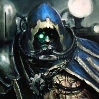
Subtle Discord Posted January 22, 2018 Author Share Posted January 22, 2018 Thanks as always for the ‘likes’ and feedback. It would be an understatement to say that I’m very happy to finally be painting again. What is it about this damn hobby that makes it so compelling? I completely respect that it’s not for everyone, but for those of us who get caught up in it… mmmm… so good. So, the first squad of Skitarii Rangers is almost finished. I still have a few small details and a tiny bit of tidying up to do here-and-there but that's basically a formality at this point. They're all still held together with poster tack so the odd backpack or arm might be a little off. For some reason, I’m hesitant to actually commit them with glue even though I think I’m safe at this point, for fear of overlooking something that would be easier to do while they’re still in separate parts. To sort out my colour pallet and painting technique I focused on the Ranger squad to use them as a proof of concept. Values, 1, 2, 3. One of the most straightforward yet powerful concepts that I learned in college and it applies quite well to miniature painting. Used during the rendering process when you're colouring and/or shading an image to best communicate the form and detail, it's the simple guideline that you only need three distinct Values, light (1), medium (2), and dark (3), to create all of the desired contrast. Generally, beyond that point, any additional steps/values will start to have diminishing returns for the extra effort required to add them. In many ways it seems really obvious and common sense but I found it surprising how often I would be working on something and wondering why it was lacking some visual punch, and then I would notice that there wasn’t enough 1, 2, 3, value definition. Forcing this concept from my unconscious mind into my conscious mind was definitely something that took some practice but it pays off once it becomes more instinctive. The idea translates well to painting where you can create a straightforward guideline to follow; determine the light, medium, and dark, value of each colour you plan to use and make sure each step is distinct. Naturally, that’s not to say there won’t be places where you may want to be more elaborate, but with or without blending it’s surprising just how effective this simple approach is. Conversely, if a paint job seems to fall a bit flat, look at it critically and ask yourself if there’s good 1, 2, 3, value definition happening. Group shot! It took a little longer to get this squad done, but now that I have a good idea what each step involves future squads will/should/might happen faster. As I said, I still need to tweak a few details and do some minor cleanup. OSL really does force you to pay attention if you want it to be reasonably convincing so now that they’re assembled there are a few spots that need some attention. I also want to boost the shoulder mounted lamps which are just not bright enough for my liking. The Vanguard weapons are also giving me pause as I continue to contemplate just how I want to treat the OSL glow with them. I’ve given them the first hit with the airbrush but I don’t know I’ve it’s too strong for the final look. Oh well, that’s a final puzzle to hopefully work out next painting session. After years of painting predominantly black, the bold colours are also forcing me to accept that it might be time to upgrade my seven-year-old camera. The images aren’t bad by any stretch, but even with a bit of Photoshop to adjust and darken them, the colours are noticeably more vibrant in the pictures than in person; in particular, the blue is bold but it’s just not that bright in reality. It’s not really a priority by any means but something with better colour accuracy would be nice at some point in the future. The plan is to get 50-to-60 Skitarii done to roughly this point before I really contemplate how I’ll be completing the scheme. That will give me time to finish the decal designs I’ve started and get them printed, ready for a marathon session of decaling them in one big batch. Part of me wants to try to add some freehand keyed trimming on the coats but the rest of me is a coward who doesn’t want to screw it up. Thinking about it, I have an idea to get long strips of binary code printed in the smallest font possible (read: micro text) so it would appear as just a line unless you looked very closely. I’m just not sure if decals can be printed small enough to pull off the effect or how difficult it would be to apply the strips along the edges of some of the coats and hoods. I like the idea, I’m just not sure how realistic it is. Thanks again for reading and following along. As always, any questions, comments, or general musings are always welcome. Mmmm... soooo satisfying to get back to painting. ChazSexington, Eldrick Shadowblade, The Traitor and 9 others 12 Back to top Link to comment https://bolterandchainsword.com/topic/241839-legion-rising/page/47/#findComment-4990528 Share on other sites More sharing options...
Eldrick Shadowblade Posted January 23, 2018 Share Posted January 23, 2018 THESE LOOK ACE! Cap locks activated! Seriously, very nice OSL lighting is expert especially on the backpacks... very nice touch to a very cool and simple palette. very nice! Subtle Discord 1 Back to top Link to comment https://bolterandchainsword.com/topic/241839-legion-rising/page/47/#findComment-4990722 Share on other sites More sharing options...
Augustus b'Raass Posted January 23, 2018 Share Posted January 23, 2018 Again, excellent work! It's funny how you mention that now that you have a good idea which colours the scheme involves, and the order of colours to do them in, you are confident that you'll do the rest of 'm far quicker - that's very recognizable! About your suggestion of binary decals: why use decals a all? Binary is just dots and stripes. You can easily do that accurately with a sharpie, or some other fine-tipped pen. :tu: Subtle Discord 1 Back to top Link to comment https://bolterandchainsword.com/topic/241839-legion-rising/page/47/#findComment-4990760 Share on other sites More sharing options...
Subtle Discord Posted January 23, 2018 Author Share Posted January 23, 2018 OK, time to start mashing the 'Like' button more often and taking advantage of the quote function. Looking good! My only suggestion on the OSL would be to add a tiny bit of white in the center of the light. It really sells OSL as colored light instead of just an area tint. If you're feeling brave, maybe try it out on a test one and see if you like it. An interesting idea that I sorta' knew about but I didn't really employ. To this end, I've started to add a final bit of thinned yellow to the green to try and reinforce the strength of the light source. For me, I want the green light to feel a little less intense and more like the glow that radium gives off, but for the blue, I think you're right and a bit of white will help it convey the bright blue-white light idea. Good job on the Skitarii. They look awesome! Wow. Such a grand, impressive colour scheme. Majestic in its simplicity. I take my hat off to you, sir! They are looking amazing, the green OSLs have really given them a new dimension of appeals! THESE LOOK ACE! Cap locks activated! Seriously, very nice OSL lighting is expert especially on the backpacks... very nice touch to a very cool and simple palette. very nice! Thanks! Being able to paint for personal pleasure opposed to frantically trying to finish an assignment is so enjoyable and I can consciously sense a change in my mindset toward it, I'm much less daunted by the prospect of doing things now and I just get to work. I'm downright eager to get to work finishing the Vanguard squad so I can get on to the others. Again, excellent work! It's funny how you mention that now that you have a good idea which colours the scheme involves, and the order of colours to do them in, you are confident that you'll do the rest of 'm far quicker - that's very recognizable! About your suggestion of binary decals: why use decals a all? Binary is just dots and stripes. You can easily do that accurately with a sharpie, or some other fine-tipped pen. In theory, I'll be faster now that I've got most of the process sorted out, but we'll see if it translates to my progress in a meaningful way. I like to think it will, but I also know me and my habit of getting distracted a little too easily. The original plan for the decals was to actually do them in white, but come to think of it, that was also when I planned to do the coats in a moderately darker blue. They're bright enough now that I could do either black or white; black would match the colour scheme nicely, while white would provide more contrast. An added bonus of doing black is that I could do them in-house but that wouldn't take away the fact that I'll likely want some white decals for future projects. As for doing the binary by hand, ummm... nope, I value my sanity far too much to attempt that. Besides there being no white pens that fine (as far as I know) if I chose to go that way, I dread the idea of doing it by hand and trying to get results I'd be satisfied with. Humanity has the tools so that I might avoid such trials, therefore, I will make use of them! Thanks for the vote of confidence, either which way. JeffTibbetts and Eldrick Shadowblade 2 Back to top Link to comment https://bolterandchainsword.com/topic/241839-legion-rising/page/47/#findComment-4991661 Share on other sites More sharing options...
JeffTibbetts Posted January 24, 2018 Share Posted January 24, 2018 Makes sense about the green glow, yeah. I'll be interested to see your experiments, as always. Link to comment https://bolterandchainsword.com/topic/241839-legion-rising/page/47/#findComment-4992482 Share on other sites More sharing options...
Subtle Discord Posted January 28, 2018 Author Share Posted January 28, 2018 (edited) "Once more unto the breach, dear friends, once more; or close up the wall with our Skitarii dead." "+++ 75-tack-0 + Reporting... primary target... confirmed. Holding position... Awaiting tactical protocol downlink. +++" *Taps the microphone* Testing, testing, 1, 2, 3... Is this thing on? Testing... Oh, yep, it's on. So I got ahead of myself again, and I should have tested the Vanguard Carbines before getting too eager with the airbrush. As much as the treatment on the right is very striking it's just a bit too strong for the look I'm aiming for. I've done the Plasma with this treatment and I think it looks ace, but I want the Carbines more subdued like the treatment on the left. I wish there was an easy way to get something in between the two, but I can't figure out how to do it; if the light source is coming from within the weapon (how I prefer it) then the coils are going to obstruct just how much light can spill out, and where it can strike. I've never been a fan of how the coils are attached to the Radium Carbine and this just drives it home. So, I've had to go back and cover the heavy green glow I did with the airbrush. Finished now, but I hate redoing work. I know it's going to happen now-and-then but it always annoys me. I'm almost done the black highlights and then it'll be the blue followed by the always intimidating OSL. +++ Motivation Subroutines: Initialized +++ Edited January 28, 2018 by Subtle Discord Checkmate and ChazSexington 2 Back to top Link to comment https://bolterandchainsword.com/topic/241839-legion-rising/page/47/#findComment-4995399 Share on other sites More sharing options...
Subtle Discord Posted February 4, 2018 Author Share Posted February 4, 2018 +++ ++++++ ++ Comm-Link ∙ Active +++++ ++++ Downloading... Complete ++ Displaying Data File ∙ Onscreen +++++ + +++ ++++ Comm-Link ∙ Active +++++++ +++ + Brother Lunkhead, Brother Chaplain Ryld, Checkmate and 4 others 7 Back to top Link to comment https://bolterandchainsword.com/topic/241839-legion-rising/page/47/#findComment-5002487 Share on other sites More sharing options...
The Traitor Posted February 5, 2018 Share Posted February 5, 2018 The infantry looks great, but I would add a bit of white to the green OSL, specially on the plasma coils, otherwise it looks too plain. Maybe just a bit of edge highlighting on the coils? Subtle Discord 1 Back to top Link to comment https://bolterandchainsword.com/topic/241839-legion-rising/page/47/#findComment-5003318 Share on other sites More sharing options...
Subtle Discord Posted February 9, 2018 Author Share Posted February 9, 2018 ++++++ +++ Comm-Link ∙ Active +++++++++ + Downloading… Complete +++++ Displaying Data File ∙ Onscreen ++++++ +++ +++ Command Protocols ∙ Accepted +++ Request ∙ Diagnostic Activation +++_+++ Command Input ∙ Accepted +++ ++ Initializing Subsystems… +++++++ ++++ Generator Subsystems ∙ Online Containment Field ∙ Nominal ++++++++++ +++++ Initialize Plasma Reaction? ∙ Y/N The Traitor, ChazSexington, Checkmate and 5 others 8 Back to top Link to comment https://bolterandchainsword.com/topic/241839-legion-rising/page/47/#findComment-5006751 Share on other sites More sharing options...
Subtle Discord Posted February 9, 2018 Author Share Posted February 9, 2018 The infantry looks great, but I would add a bit of white to the green OSL, specially on the plasma coils, otherwise it looks too plain. Maybe just a bit of edge highlighting on the coils? I get what you're saying, and I'm always hungry for feedback and really appreciate the input, but in this case, nope, I want to get a radium green glow appearance and adding white would take it too far. Radium glows a ghostly but vivid and somewhat uniform green. Part of the problem is that my camera is really struggling with the vivid colours I'm working with here; it keeps brightening the blue a fair bit and the green is really losing some of the subtlety in the shading and the final yellowish-green highlights. I've been playing with the camera settings a bit and found that it does have some colour saturation functions that I've turned down in hopes that future images will be a bit more faithful to the real world colours. The Traitor 1 Back to top Link to comment https://bolterandchainsword.com/topic/241839-legion-rising/page/47/#findComment-5006765 Share on other sites More sharing options...
Bryan Blaire Posted February 9, 2018 Share Posted February 9, 2018 I know that I'm very late on this and you have already painted plenty with the green, but color theory-wise, why not go with the orange? Subtle Discord 1 Back to top Link to comment https://bolterandchainsword.com/topic/241839-legion-rising/page/47/#findComment-5006851 Share on other sites More sharing options...
Subtle Discord Posted February 9, 2018 Author Share Posted February 9, 2018 It came down to one part colour theory and one part selection by omission. From the start, I wanted to stick with a cold-centric colour scheme, so red, orange, and yellow was out; however some future hazard stripes will feature some yellow, but that will be about the only place. As the fiction for Atrum Laboris was filled out some and it included a bright blue sun that locked blue for the coats. So I chose to totally embrace the idea and went with green as a strong analogous colour to blue. Yes, it is meant to clash and be mildly disconcerting, opposed to a complementary colour that would be more harmonious. If I darkened the blue it would diminish the effect some, but where's the fun in that? Brother Lunkhead and Bryan Blaire 2 Back to top Link to comment https://bolterandchainsword.com/topic/241839-legion-rising/page/47/#findComment-5006866 Share on other sites More sharing options...
Bryan Blaire Posted February 9, 2018 Share Posted February 9, 2018 I don't think it clashes or is disconcerting at all, it's almost nicely organic really, especially the plasma calivers - the line of those almost reminds me of Virginia bluebell flowers. I think it looks nice, I was just wondering what the reason was for not using the contrasting/complimenting orange. The cold-centric scheme is a good reason to me! Look forward to seeing more (especially since I'm still trying to settle on my own scheme for my Mechanicus forces). I really like all your model add-ons, and I really like your "MkII" design for the Land Raider. Edit: Damn Autocorrect Subtle Discord 1 Back to top Link to comment https://bolterandchainsword.com/topic/241839-legion-rising/page/47/#findComment-5006876 Share on other sites More sharing options...
Brother Lunkhead Posted February 9, 2018 Share Posted February 9, 2018 I'm liking what you are doing very much The green blends very well with the blue and stands out nicely. I must say it's a color combination I never thought of for the AdMech, but it works very well. Very unique and very bold. Nicely done sir! Subtle Discord 1 Back to top Link to comment https://bolterandchainsword.com/topic/241839-legion-rising/page/47/#findComment-5006886 Share on other sites More sharing options...
Recommended Posts
Create an account or sign in to comment
You need to be a member in order to leave a comment
Create an account
Sign up for a new account in our community. It's easy!
Register a new accountSign in
Already have an account? Sign in here.
Sign In Now