Doctor Perils Posted June 16, 2016 Share Posted June 16, 2016 Some Households have a knight helmet on top of their crest, blades in the back and so on. Had the following in mind (pattern = crests from the FW HH books): samurai helmet lightning bolt - Minamoto mon (picture) - lightning bolt crossed katanas / wakizashis Or would that be too much? I think it could work, but is this for BoTL or 40k ? In 40k all knight crests are halved, with either half an aquila or half a cog mechanicum. Link to comment Share on other sites More sharing options...
Kelborn Posted June 16, 2016 Share Posted June 16, 2016 It would be for both. Only their fluff regarding the rest of the Imperium would be changed. Currently I'm working on the canon version at first. If it should be halved, no problem at all. Should work as well. Link to comment Share on other sites More sharing options...
Doctor Perils Posted June 16, 2016 Share Posted June 16, 2016 It would be for both. Only their fluff regarding the rest of the Imperium would be changed. Currently I'm working on the canon version at first. If it should be halved, no problem at all. Should work as well. Is it Imperial-aligned or Mechanicum-aligned ? the Imperial crests are a bit easier to do I find, as the Mechanicum ones generally have kinds of "stars" behind the crests, with loads and loads and loads and loads of little rays coming out from the center... which of course is a pain to do ^^ Link to comment Share on other sites More sharing options...
Raktra Posted June 16, 2016 Share Posted June 16, 2016 Hey guys, can someone help me in turning this: http://rlv.zcache.com/kamakura_minamoto_mon_japanese_clan_gold_on_black_lapel_pin-r7112a7de033149329fcab294fcaa140f_zwdkn_324.jpg?rlvnet=1 into something that looks more like a WH symbol? Will be the crest for House Toho. :) I actually love this as-is, the fact that it's not overused WH skulls 'n' ting* makes it pop. *Shuddup, my guys are mean. Link to comment Share on other sites More sharing options...
Kelborn Posted June 16, 2016 Share Posted June 16, 2016 Its imperium aligned. Would never do a Mechanicum one as I dislike them. Can't explain why but I don't like the idea of Knights being forced into submission by the Mechanicum. They are Knights. They should be independent. ;) Link to comment Share on other sites More sharing options...
simison Posted June 16, 2016 Share Posted June 16, 2016 Its imperium aligned. Would never do a Mechanicum one as I dislike them. Can't explain why but I don't like the idea of Knights being forced into submission by the Mechanicum. They are Knights. They should be independent. http://image.bolterandchainsword.com//public/style_emoticons/default/msn-wink.gif Glad I'm not the only one who refuses to do Mechanicum knights. Link to comment Share on other sites More sharing options...
Hesh Kadesh Posted June 16, 2016 Share Posted June 16, 2016 Heh, I like Mechanicum Knights. The.mechanicum is often one dimensional (essentially a technological Tyanid Swarn, when you think about it), and Mechanicum Knights actually introduce a new dynamic to it. Also, Knights being independent is like calling a Knight Templar, or a Samurai independent. They'll be largely autonomous, but more likely subservient to the whims of the household as it is they who control the Sacristans and auxiliary gear. Sure they can go it alone; ronin or freeblades, etc, but the houses survival is dependent on the alignment with the doctrines of the forces it serves alongside. A Knight who enjoys mad charges and singing celtic war songs like a Berserker of old.is not going to fit in with the Dune Seroents style of Link to comment Share on other sites More sharing options...
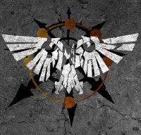
Kelborn Posted August 1, 2016 Share Posted August 1, 2016 (edited) Ok guys, here's my first version of a crest for House Toho. After 1 1/2 hours of hard work with paint (lacking good programms and the necessary skill ^^), it looks like this: As I said earlier, I had something like this in mind. Though I'm quite pleased with it, something is missing. It just don't look like a HH crest. What do you think? Edited August 1, 2016 by Kelborn Link to comment Share on other sites More sharing options...
Nomus Sardauk Posted August 1, 2016 Share Posted August 1, 2016 (edited) Why not add a set of Aquila wings spreading out from the ring and behind the katanas? EDIT/Thought of the Day: Hate the Typo, kill the Typo. Edited August 2, 2016 by SanguiniusReborn Link to comment Share on other sites More sharing options...
~Drakzilla~ Posted August 2, 2016 Share Posted August 2, 2016 (edited) If you want to play up the japanese theme, perhaps some rays extending out from the circle, rising sun style? Maybe in a different color, like yellow or red? One thing that might help is transposing the design onto a shield shape or banner shape so you can see how it would look on an actual Knight. On a related note, is there an 'official' design for the Legio Gojira icon yet? If not, I'd love to try my hand at designing it. I basically grew up on Godzilla movies, and *insert meme here* graphic design is my passion, so it's something I'd be honored to do, or contribute to. Edited August 2, 2016 by drakzilla Link to comment Share on other sites More sharing options...
~Drakzilla~ Posted August 3, 2016 Share Posted August 3, 2016 Just need the go ahead from whoever is in charge of doing said Legio. Link to comment Share on other sites More sharing options...
Nomus Sardauk Posted August 11, 2016 Share Posted August 11, 2016 (edited) Just a minor resuscitation of this thread as it just struck me, do we have a colour scheme and symbol for the pre-Raktra VIIth, the Shepherds of Eden? It might be pertinent if the Shepards revert to their old colours after they split from the Berserkers after Khârn's minor tiff with ol'papa R. http://image.bolterandchainsword.com//public/style_emoticons/default/ermm.gif EDIT: Sharp eyes Blunt, cheers. Edited August 11, 2016 by SanguiniusReborn Link to comment Share on other sites More sharing options...
bluntblade Posted August 11, 2016 Share Posted August 11, 2016 (edited) I believe it's bone-white and dark gold. Like a fancy, knightly Death Guard. While we're hating and killing typos, *Shepherds Edited August 11, 2016 by bluntblade Link to comment Share on other sites More sharing options...
Sigismund229 Posted August 11, 2016 Share Posted August 11, 2016 I thought it was duck egg blue? Perhaps white&gold could be the rangers? Distinguish them from the Hands and Nightguard Link to comment Share on other sites More sharing options...
bluntblade Posted August 11, 2016 Share Posted August 11, 2016 I haven't considered their heraldry; if anything they'll probably go the Knights Errant route until they join the Nightguard before or after the Siege of Terra. Link to comment Share on other sites More sharing options...
Raktra Posted August 13, 2016 Share Posted August 13, 2016 Changed the duck egg to the white and gold :) The symbol's not yet decided. A set of gates maybe? Link to comment Share on other sites More sharing options...
~Drakzilla~ Posted August 16, 2016 Share Posted August 16, 2016 So after doing some random thinking about the Insurrectionists' symbol, I realized that it is a bit too Chaos-y for the early Insurrection, and imo looks a tad cluttered. For example, when you look at the Eye of Horus, it is immediately recognizable, can translate to black and white, and lacks any Chaos symbology, so it can be used for early and late Heresy. Yet it still conveys a menacing image. Both it and it's loyalist counterpart, the Aquila, are iconic symbols that have a simple sillhoutte, something that is key to effective symbol design, and that frankly our current one lacks. So with that said, I'm proposing a new symbol that meets the criteria I mentioned before. The Eye of the Storm(born): http://image.bolterandchainsword.com/uploads/gallery/album_11930/sml_gallery_92945_11930_24912.jpeg Now this is an obvious callback to the infamous Eye of Horus, but I think that works in our favor. There is the problem that it may be a little to close to the symbols of the Godslayers and the Nightguard, which is why I also mocked up an alternative: http://image.bolterandchainsword.com/uploads/gallery/album_11930/sml_gallery_92945_11930_8604.jpeg Obviously I can play around with the design further, but at least the idea is down. Thoughts? Link to comment Share on other sites More sharing options...
MikhalLeNoir Posted August 16, 2016 Share Posted August 16, 2016 Instrad of the eye you could add the focus crystal icarion wears in his forehead. Link to comment Share on other sites More sharing options...
~Drakzilla~ Posted August 16, 2016 Share Posted August 16, 2016 Well I definitely wanted to include the eye because A: The connection to the canonverse traitors and B: The play on words :P Hadn't thought about the focus crystal, will have to give that a try. The original Lightning Bearers symbol that this is based on already kinda incorporated it into the design, so would that be a bit redundant? Link to comment Share on other sites More sharing options...
MikhalLeNoir Posted August 16, 2016 Share Posted August 16, 2016 Thing is that the eye is already the symbol of the horus heresy and i think we should make clear that this is a universe standing on its own. But the symbol looks cool. Would prefer the second Link to comment Share on other sites More sharing options...
Kelborn Posted August 16, 2016 Share Posted August 16, 2016 Second reminds me of a shuriken. :) How about placing an Oni mask in the middle of the cross with the peaks still emerging from the skull. On its forehead can be either a special third eye or the crystal of Icarion. Link to comment Share on other sites More sharing options...
Nomus Sardauk Posted August 16, 2016 Share Posted August 16, 2016 @Kelborn: The Oni mask sounds a bit heavy-handed to me, I'd suggest maybe a skull bearing Icarion's forehead crystal instead. Link to comment Share on other sites More sharing options...
Sigismund229 Posted August 16, 2016 Share Posted August 16, 2016 I think it should be Icarion's personal sigil, like of Horus was Horus'. So perhaps the eye of Terra with crossed lightning bolts in the background? Link to comment Share on other sites More sharing options...
bluntblade Posted August 16, 2016 Share Posted August 16, 2016 I believe Sim called the Eye of Terra for the Warmaster. Link to comment Share on other sites More sharing options...
Sigismund229 Posted August 16, 2016 Share Posted August 16, 2016 Hmm...then perhaps a foresight gem thingy with crossed lightning bolts in the background Link to comment Share on other sites More sharing options...


Recommended Posts