Doctor Perils Posted May 25, 2016 Share Posted May 25, 2016 I thought we agreed the Nightguard symbol would be an eye of horus Well, we had been thinking more along the lines of a variation of the Sigilite's eye (an more "normal" eye rather then the semi-circle), but bluntblade put it back in discussion. While you're here Sigismund, could you have another check at the Crimson Lions ? Updated list : 01 - Lightning Bearers: approved ....... 01 - Harbingers: approved 02 - XXXXXXXX 03 - Crimson Lions: ready pending approval ....... 03 - Blood Wolves: approved 04 - Void Eagles: approved (with reserve) ....... 04 - Morningstars: approved 05 - Halcyon Wardens: approved 06 - Iron Bears: approved ....... 06 - Juggernauts: ready pending approval 07 - Berserkers of Uran: approved 08 - Godslayers: approved 09 - Warbringers: approved ....... 09 - Steel Guard: approved 10 - Fire Keepers: approved 11 - XXXXXXXXXXXX 12 - Wardens of Light: approved ....... 12 - Apostles of War: approved 13 - Eagle Warriors: approved 14 - Dune Serpents: approved 15 - Grave Stalkers: approved 16 - The Drowned: approved 17 - Warriors of Peace: approved 18 - Stygian Jackals: unaware of their symbol 19 - Scions Hospitaler: approved 20 - Ghost Walkers: colours to be experimented with XX - Nightguard: to be done LINK TO DRIVE Link to comment Share on other sites More sharing options...
bluntblade Posted May 25, 2016 Share Posted May 25, 2016 We can mix moon and eye imagery, right? I thought it was going to be the "I" of the Sigillite until I suggested the moon. Link to comment Share on other sites More sharing options...
Doctor Perils Posted May 25, 2016 Share Posted May 25, 2016 We can mix moon and eye imagery, right? I thought it was going to be the "I" of the Sigillite until I suggested the moon. Could you show us an idea of this ? I'm afraid that mixing both a moon and an eye will make this too reminiscent of the LunaWolves/SonsOfHorus Link to comment Share on other sites More sharing options...
bluntblade Posted May 25, 2016 Share Posted May 25, 2016 I don't really have any drawing materials to hand. But I was wondering about a side-on view of an eye, to avoid too much of an SoH resemblance. Link to comment Share on other sites More sharing options...
Nomus Sardauk Posted May 25, 2016 Share Posted May 25, 2016 Why are we adding a Moon to the Nightguard's emblem again? I thought the moon was meant to be the symbol of one of their Watchtowers? Link to comment Share on other sites More sharing options...
Doctor Perils Posted May 25, 2016 Share Posted May 25, 2016 Why are we adding a Moon to the Nightguard's emblem again? I thought the moon was meant to be the symbol of one of their Watchtowers? Oh I wasn't aware of that. In any case, this is still in discussion. Link to comment Share on other sites More sharing options...
Nomus Sardauk Posted May 25, 2016 Share Posted May 25, 2016 I'll admit I'm not certain on that, but my gut tells me that was where the Moon symbol was brought up. Hang on, I'll check the NG thread quick... Link to comment Share on other sites More sharing options...
bluntblade Posted May 25, 2016 Share Posted May 25, 2016 To differentiate them from the Insquisition, symbol-wise. Link to comment Share on other sites More sharing options...
Chief Captain Redd Posted May 25, 2016 Share Posted May 25, 2016 (edited) Hey Thorne, I was thinking could we try the more tribal looking bear paw in the orange on a deep crimson or brick background? I can try, like the tribal one in your gallery ? Now, depending on the crimson background, the orange might get lost (not enough contrast), and tribal markings often look a bit too intricate for good markings imo Yeah, the simple line one, not the knot work one. And yeah I know, that's why I was thinking like almost cherry black it's such a deep crimson. And with the bright orange it should pop as a non contrasting accent. I'm trying to bring medicine wheel and Autumn colour palate fully into the legion. And THANK YOU! Edited May 25, 2016 by Chief Captain Redd Link to comment Share on other sites More sharing options...
Nomus Sardauk Posted May 25, 2016 Share Posted May 25, 2016 Do the Inquisition exist in this timeline? Link to comment Share on other sites More sharing options...
bluntblade Posted May 25, 2016 Share Posted May 25, 2016 No, but the same reasons for not wanting to replicate the Eye of Horus apply here Link to comment Share on other sites More sharing options...
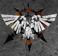
Doctor Perils Posted May 27, 2016 Share Posted May 27, 2016 (edited) http://image.bolterandchainsword.com/uploads/gallery/album_12000/sml_gallery_77459_12000_30574.pnghttp://image.bolterandchainsword.com/uploads/gallery/album_12000/sml_gallery_77459_12000_28133.pnghttp://image.bolterandchainsword.com/uploads/gallery/album_12000/sml_gallery_77459_12000_64127.png What are those like ? I have to admit, the 'Zerkers symbol without the rondel is brutal !!! EDIT: I've done a couple of tries for the NightGuard, if ever they get the ideas going: http://image.bolterandchainsword.com/uploads/gallery/album_12000/sml_gallery_77459_12000_27316.pnghttp://image.bolterandchainsword.com/uploads/gallery/album_12000/sml_gallery_77459_12000_13654.png Edited May 27, 2016 by Lord Thørn Link to comment Share on other sites More sharing options...
Nomus Sardauk Posted May 27, 2016 Share Posted May 27, 2016 Personally I preferred the black field for the Iron Bear symbol, the orange of the claw just doesn't stand out as much on the red. I'm also not overly keen on the bear claws themselves, the first one looks unusual to me for a bear claw (plus my obsessive need for SYMMETRY flares up with the way it's leaning to the right like that) and the second one looks even stranger with the stylised, hollowed look of it, but that just my personal thoughts. I've never had any problems with the Juggernauts symbol, it looks fine to me. I know right?! I knew getting rid of the roundel would improve the 'Zerker symbol, it was the Emperor's will I tell you! Aside from that, do you think you could make the Chains look a bit more 3D, like they're curling around behind the wing and connecting to one another. Those Nightguard badges look amazing, I'll admit I prefer the first one out of the two because it calls back to the group's founding patron Malcador the Sigillite with the inclusion of the I as well as the inclusion of that arcane eye symbol , good work integrating that so seamlessly Thorn! The only thing I can think of that might improve it is the possibility of slipping a crescent moon inside the halo behind the eye, although that could make it seem a little cluttered. What do you think? Link to comment Share on other sites More sharing options...
bluntblade Posted May 27, 2016 Share Posted May 27, 2016 I second Sangi. The black and copper of the Bears is so perfect, I don't think it needs another colour. Zerkers just want more blood ;) I was wondering about placing a side view of the iris within the crescent. Cheese hazard? https://encrypted-tbn3.gstatic.com/images?q=tbn:ANd9GcQB13XUI5oUd6mVod2xWGuIX6xZ8_k63kPVv3vO2pgYo0khrTOrGQ Link to comment Share on other sites More sharing options...
Doctor Perils Posted May 27, 2016 Share Posted May 27, 2016 I know right?! I knew getting rid of the roundel would improve the 'Zerker symbol, it was the Emperor's will I tell you! Aside from that, do you think you could make the Chains look a bit more 3D, like they're curling around behind the wing and connecting to one another. Those Nightguard badges look amazing, I'll admit I prefer the first one out of the two because it calls back to the group's founding patron Malcador the Sigillite with the inclusion of the I as well as the inclusion of that arcane eye symbol , good work integrating that so seamlessly Thorn! The only thing I can think of that might improve it is the possibility of slipping a crescent moon inside the halo behind the eye, although that could make it seem a little cluttered. What do you think? I have to admit, the chains were already complicated enough as they are. If I return to them, it won't be just yet, sorry. If anybody else wants to give it a go though, that's fine by me :) The moon could possibly be integrated in some way into the first one, though I might superimpose the eye a bit more in that case. I second Sangi. The black and copper of the Bears is so perfect, I don't think it needs another colour. Zerkers just want more blood http://image.bolterandchainsword.com//public/style_emoticons/default/msn-wink.gif I was wondering about placing a side view of the iris within the crescent. Cheese hazard? https://encrypted-tbn3.gstatic.com/images?q=tbn:ANd9GcQB13XUI5oUd6mVod2xWGuIX6xZ8_k63kPVv3vO2pgYo0khrTOrGQ I also prefer the black and copper, but Redd wanted to see like this. Like this? http://image.bolterandchainsword.com/uploads/gallery/album_12000/sml_gallery_77459_12000_1332.png Also, what do you guys think of the colours for the NightGuard ? I thought a midnight blue would describe the NightGuard perfectly, yet be distinctive from all the grey and black and red imperial and inquisitorial organisations. Link to comment Share on other sites More sharing options...
Nomus Sardauk Posted May 27, 2016 Share Posted May 27, 2016 I was wondering about placing a side view of the iris within the crescent. Cheese hazard? https://encrypted-tbn3.gstatic.com/images?q=tbn:ANd9GcQB13XUI5oUd6mVod2xWGuIX6xZ8_k63kPVv3vO2pgYo0khrTOrGQ No harm in trying right? I know right?! I knew getting rid of the roundel would improve the 'Zerker symbol, it was the Emperor's will I tell you! Aside from that, do you think you could make the Chains look a bit more 3D, like they're curling around behind the wing and connecting to one another. Those Nightguard badges look amazing, I'll admit I prefer the first one out of the two because it calls back to the group's founding patron Malcador the Sigillite with the inclusion of the I as well as the inclusion of that arcane eye symbol , good work integrating that so seamlessly Thorn! The only thing I can think of that might improve it is the possibility of slipping a crescent moon inside the halo behind the eye, although that could make it seem a little cluttered. What do you think? I have to admit, the chains were already complicated enough as they are. If I return to them, it won't be just yet, sorry. If anybody else wants to give it a go though, that's fine by me http://image.bolterandchainsword.com//public/style_emoticons/default/smile.png The moon could possibly be integrated in some way into the first one, though I might superimpose the eye a bit more in that case. That's fair, I imagined it might be a bit tricky to do, it's just like I've said in the past, it doesn't really look like they're restraining the wing at all, more like the wing is on the floor and they're just haphazardly laid over it it, ya'know? Like this? http://image.bolterandchainsword.com/uploads/gallery/album_12000/sml_gallery_77459_12000_1332.png Also, what do you guys think of the colours for the NightGuard ? I thought a midnight blue would describe the NightGuard perfectly, yet be distinctive from all the grey and black and red imperial and inquisitorial organisations. Ehhh, I think it'd look better with a more rounded Crescent, like this. And maybe an eye like this, minus the circle and eyelashes. Link to comment Share on other sites More sharing options...
bluntblade Posted May 27, 2016 Share Posted May 27, 2016 Sangi's on the right track, but I meant that the crescent is the white of the eye Link to comment Share on other sites More sharing options...
Chief Captain Redd Posted May 28, 2016 Share Posted May 28, 2016 I absolutely LOVE that version of the Bears symbol! If we want for the book I'd be fine if we did just black and copper for the generic. I just wanted to see if the red worked, and I really like it. And the Juggernaut's pad looks perfect. I really like both Night guard pads, it makes me wanna build a small force of them. Link to comment Share on other sites More sharing options...
bluntblade Posted May 28, 2016 Share Posted May 28, 2016 You might find yourself with the chance to do a Nightguard counterpart for a Bear or two, depending on where the story takes us. Red could mark the Pyre or Totem Guard, perhaps. Link to comment Share on other sites More sharing options...
Hesh Kadesh Posted June 16, 2016 Share Posted June 16, 2016 As we already have the Eye of Horus available, what about just simply poaching that instead? Rather than a convoluted one, a simple stylised Eye that we already have models and transfers for could aid things modelwise and tie it to the 40K setting somewhat. Link to comment Share on other sites More sharing options...
bluntblade Posted June 16, 2016 Share Posted June 16, 2016 Could do. Silver and black? I dunno if we decided on colours, but Nightguard kinda implies black Link to comment Share on other sites More sharing options...
Kelborn Posted June 16, 2016 Share Posted June 16, 2016 Hey guys, can someone help me in turning this: http://rlv.zcache.com/kamakura_minamoto_mon_japanese_clan_gold_on_black_lapel_pin-r7112a7de033149329fcab294fcaa140f_zwdkn_324.jpg?rlvnet=1 into something that looks more like a WH symbol? Will be the crest for House Toho. :) Link to comment Share on other sites More sharing options...
Slips Posted June 16, 2016 Share Posted June 16, 2016 Lightning Bolts and a Mechanicum Cog if you were so inclined? Link to comment Share on other sites More sharing options...
Kelborn Posted June 16, 2016 Share Posted June 16, 2016 Some Households have a knight helmet on top of their crest, blades in the back and so on. Had the following in mind (pattern = crests from the FW HH books): samurai helmet lightning bolt - Minamoto mon (picture) - lightning bolt crossed katanas / wakizashis Or would that be too much? Link to comment Share on other sites More sharing options...
Slips Posted June 16, 2016 Share Posted June 16, 2016 Probably not. We'd have to see. Link to comment Share on other sites More sharing options...


Recommended Posts