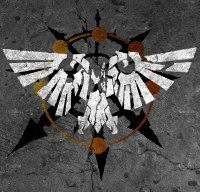
Kelborn Posted September 3, 2016 Share Posted September 3, 2016 Looking at the dragons, I'm starting to like that idea. It resembles the aquila in its own way. I'd go with dragon no 4. The vitruvian look good, but I would prefer 2. 1 is overloaded. Keep in mind that it might be used on minis. Too cpmplicated, though I'm not an expert. My vote for the dragons. Link to comment https://bolterandchainsword.com/topic/314796-art-symbols-icons-and-badges/page/13/#findComment-4488741 Share on other sites More sharing options...
MikhalLeNoir Posted September 3, 2016 Share Posted September 3, 2016 For minos you have cusrom decal sheets^^ Link to comment https://bolterandchainsword.com/topic/314796-art-symbols-icons-and-badges/page/13/#findComment-4488745 Share on other sites More sharing options...
Doctor Perils Posted September 3, 2016 Share Posted September 3, 2016 Hum, yeah, I prefer Vitruvian man 2 - I do actually really like Vitruvian Strelian angel, but that might be too conotated with the Warbringers only, and not the Warriors of Peace - "plain" vitruvian is better as it's more generic. But really, I like all of those symbols :) However, I think that the dragon wings at a distance will look like eagle wings, and I just don't think it fits with the Suzerainty's ethos: they want a new beginning for humanity, an era of building, not destruction - Dragon's are cool, but they have (in european cultures) a more heavily destructions-oriented connotation. Plus, asian dragons don't (generally) have wings, they are more serpentine, so I don't think the use of the "Dragons are big in both cultures" as an argument really works here. However, they all look cool enough that I won't speak vehemently against them :) Link to comment https://bolterandchainsword.com/topic/314796-art-symbols-icons-and-badges/page/13/#findComment-4488853 Share on other sites More sharing options...
Sigismund229 Posted September 3, 2016 Share Posted September 3, 2016 In european cultures dragons were also associated with hoarded wealth :) At least in Germanic ones. Not sure about slavic and latin cultures. I like the 1st vitruvian man. Link to comment https://bolterandchainsword.com/topic/314796-art-symbols-icons-and-badges/page/13/#findComment-4488874 Share on other sites More sharing options...
Doctor Perils Posted September 3, 2016 Share Posted September 3, 2016 In european cultures dragons were also associated with hoarded wealth http://image.bolterandchainsword.com//public/style_emoticons/default/smile.png At least in Germanic ones. Not sure about slavic and latin cultures. I like the 1st vitruvian man. True, though I don't know if the Suzerainty is big on hoarding wealth either? Link to comment https://bolterandchainsword.com/topic/314796-art-symbols-icons-and-badges/page/13/#findComment-4488883 Share on other sites More sharing options...
Sigismund229 Posted September 3, 2016 Share Posted September 3, 2016 (edited) In european cultures dragons were also associated with hoarded wealth http://image.bolterandchainsword.com//public/style_emoticons/default/smile.png At least in Germanic ones. Not sure about slavic and latin cultures. I like the 1st vitruvian man. True, though I don't know if the Suzerainty is big on hoarding wealth either? The wealth of knowledge? Sorry for this but the talk about what the Suzerainty's symbol should be has gotten me thinking about what the Suzerainty's general aesthetic should be(again). As I understand it, following Kozja's death/retirement when Jade takes over, the Suzerainty becomes ever more form-follows-functions, with little ornamentation. My only problem with that is that the Imperium kind of already does that, with every trooper being assigned just gear that is easy to mass produce etc. However, the Imperium still, despite that, has massive resources to call on. Why not make the Suzerainty the opposite? My idea was that every trooper is(by human standards) stupendously well equipped and the legionaries wear armour of an ornateness that is matched only by the artificer armour of Imperial space marines(We'd need to find a way of incorporating the WoP in there. Still thinking on that). This gives off the appearance to the outside world that the Suzerainty is thriving and has plentiful resources and tech. However, it's all just a facade. The space marine's armour is ornate but of a lower quality than imperial armour in an effort to make it easier to produce, the human troops may be well equipped but each day they worry if they're going to run out of ammo or food because of the Suzerainty's lack of resources. The Suzerainty could be the true empire just struggling to make it through each day. Whereas the Imperium has massive resources and can afford to be wasteful and beaurocratic, the Suzerainty has only just enough and the loss of a single world could tip them over into not having enough but they hide it beneath a facade or ornateness and wealth. Edited September 3, 2016 by Sigismund229 Link to comment https://bolterandchainsword.com/topic/314796-art-symbols-icons-and-badges/page/13/#findComment-4488884 Share on other sites More sharing options...
Doctor Perils Posted September 4, 2016 Share Posted September 4, 2016 How about human soldiers having to buy their own equipment, like in medieval europe? Knowing they could be called to fight at any moment they buy the best equipment within their budget, and to appear wealthier then their neighbours they buy the most extravagant and flamboyant equipment, giving the ornamented, bling-bling aesthetic, but a less uniform one. Link to comment https://bolterandchainsword.com/topic/314796-art-symbols-icons-and-badges/page/13/#findComment-4489641 Share on other sites More sharing options...
MikhalLeNoir Posted September 4, 2016 Share Posted September 4, 2016 Blingbling? The Wardens of Light should join the Suzerainity. Blong blong 4 ever Link to comment https://bolterandchainsword.com/topic/314796-art-symbols-icons-and-badges/page/13/#findComment-4489670 Share on other sites More sharing options...

Recommended Posts