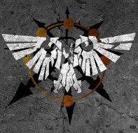
Doctor Perils Posted May 9, 2016 Share Posted May 9, 2016 Sorry to break the thread of conversation here a bit, but I've just discovered the Crusaders' badge, which gave me an idea for the NightGuard's badge. http://image.bolterandchainsword.com/uploads/gallery/album_11299/gallery_77459_11299_25264.jpg If we replace the Skull with an Eye, I think it will look sufficiently close to Malcador's sigil to recognise it as such, but different enough that we won't confuse it with the Knights Errant. Link to comment https://bolterandchainsword.com/topic/314796-art-symbols-icons-and-badges/page/5/#findComment-4389484 Share on other sites More sharing options...
Nomus Sardauk Posted May 9, 2016 Share Posted May 9, 2016 I think I've found the perfect candidate eye for your suggestion Thorn, although it is unfortunately rather large and beyond my current abilities to marry the two symbols together. Regardless, check out this beauty! Link to comment https://bolterandchainsword.com/topic/314796-art-symbols-icons-and-badges/page/5/#findComment-4389985 Share on other sites More sharing options...
Doctor Perils Posted May 9, 2016 Share Posted May 9, 2016 I think I've found the perfect candidate eye for your suggestion Thorn, although it is unfortunately rather large and beyond my current abilities to marry the two symbols together. Regardless, check out this beauty! I think I could work with that :) Link to comment https://bolterandchainsword.com/topic/314796-art-symbols-icons-and-badges/page/5/#findComment-4390004 Share on other sites More sharing options...
Nomus Sardauk Posted May 9, 2016 Share Posted May 9, 2016 (edited) I think I've found the perfect candidate eye for your suggestion Thorn, although it is unfortunately rather large and beyond my current abilities to marry the two symbols together. Regardless, check out this beauty! I think I could work with that http://image.bolterandchainsword.com//public/style_emoticons/default/smile.png Excellent, I look forward to seeing the fruit of your efforts. http://image.bolterandchainsword.com//public/style_emoticons/default/smile.png EDIT: One more option to add to the pile for consideration regarding the Grave Stalker's emblem (and personally I can't believe I didn't remember this one sooner) we have this skull design originally made famous by Spartan Emile-239 in Halo Reach: http://image.bolterandchainsword.com/uploads/gallery/album_10668/sml_gallery_49041_10668_3629.jpg In all honesty, I think I like this one better than the previous two, though I do worry it's a little... Messy? Or am I just over-thinking it again? Let me know your thoughts brothers. Edited May 10, 2016 by SanguiniusReborn Link to comment https://bolterandchainsword.com/topic/314796-art-symbols-icons-and-badges/page/5/#findComment-4390077 Share on other sites More sharing options...
~Drakzilla~ Posted May 10, 2016 Share Posted May 10, 2016 Maybe a cracked, chipped looking skull? I'd say stay away from copying established designs, but I'm digging the whole "messy" skull concept. Link to comment https://bolterandchainsword.com/topic/314796-art-symbols-icons-and-badges/page/5/#findComment-4390157 Share on other sites More sharing options...
MikhalLeNoir Posted May 10, 2016 Share Posted May 10, 2016 Yeah copying could cheapen the effort of grifft. Nonetheless....the last is cool. I would get rid of the lower jaw amd add the messy design of the first and you have something new :) Link to comment https://bolterandchainsword.com/topic/314796-art-symbols-icons-and-badges/page/5/#findComment-4390232 Share on other sites More sharing options...
Kelborn Posted May 10, 2016 Share Posted May 10, 2016 The Grave Stalkers a bit like the Night Lords, right? A winged skull would be too similar. Maybe a horned skull? Are you familiar with Kel'Thuzad? Something like this? httP://img02.deviantart.net/aa66/i/2013/113/c/9/kel_thuzad_by_velespainter-d62pqtp.jpg Without the Egyptian details? Link to comment https://bolterandchainsword.com/topic/314796-art-symbols-icons-and-badges/page/5/#findComment-4390245 Share on other sites More sharing options...
Sigismund229 Posted May 10, 2016 Share Posted May 10, 2016 The Crimson Lions symbol is a side view of a lion's head. The head is dark red while the surrounding shoulder pad is bronze. Hey Sig, would something like this (minus the Crown part) be what you're after? http://overwatch.blizzplanet.com/wp-content/uploads/2016/02/reinhardt-spray-2-emblem.png I also tried whipping up a symbol for the Scions, ended up with two different options, please tell me what you guys think: Yup minus the crown and less angular that's what I imagined Link to comment https://bolterandchainsword.com/topic/314796-art-symbols-icons-and-badges/page/5/#findComment-4390282 Share on other sites More sharing options...
Doctor Perils Posted May 10, 2016 Share Posted May 10, 2016 Yup minus the crown and less angular that's what I imagined Would this do ? (with a change of colours obviously) Link to comment https://bolterandchainsword.com/topic/314796-art-symbols-icons-and-badges/page/5/#findComment-4390462 Share on other sites More sharing options...
Sigismund229 Posted May 10, 2016 Share Posted May 10, 2016 Yes Link to comment https://bolterandchainsword.com/topic/314796-art-symbols-icons-and-badges/page/5/#findComment-4390582 Share on other sites More sharing options...
~Drakzilla~ Posted May 10, 2016 Share Posted May 10, 2016 How about something like this for the base Grave Stalkers skull, with damage added later? https://drive.google.com/open?id=0B4OxGy29hjMsQ2RnaTlELTlGdUk Link to comment https://bolterandchainsword.com/topic/314796-art-symbols-icons-and-badges/page/5/#findComment-4390651 Share on other sites More sharing options...
Nomus Sardauk Posted May 10, 2016 Share Posted May 10, 2016 Yeah copying could cheapen the effort of grifft. Nonetheless....the last is cool. I would get rid of the lower jaw amd add the messy design of the first and you have something new http://image.bolterandchainsword.com//public/style_emoticons/default/smile.png Right-o, how are these? Jawless: With Jaw: How about something like this for the base Grave Stalkers skull, with damage added later? https://drive.google.com/open?id=0B4OxGy29hjMsQ2RnaTlELTlGdUk Hmm, it's cool but personally I think it's too clean and neat, like it's sprayed on via a stencil. Part of why I liked and chose the previous skulls was because they looked messy and sinister, like the kind of thing you'd find daubed on the walls in blood at a murder scene as a calling card, ya'know? Link to comment https://bolterandchainsword.com/topic/314796-art-symbols-icons-and-badges/page/5/#findComment-4390685 Share on other sites More sharing options...
~Drakzilla~ Posted May 10, 2016 Share Posted May 10, 2016 Yea, I think it definitely needs to be rough and "improvised" looking, that was just an idea for what the actual image would be based on. I'm really liking the modified Emile skull, but I feel it needs something to make it more unique. Link to comment https://bolterandchainsword.com/topic/314796-art-symbols-icons-and-badges/page/5/#findComment-4390711 Share on other sites More sharing options...
Nomus Sardauk Posted May 10, 2016 Share Posted May 10, 2016 Yea, I think it definitely needs to be rough and "improvised" looking, that was just an idea for what the actual image would be based on. I'm really liking the modified Emile skull, but I feel it needs something to make it more unique. Maybe a colour change? Link to comment https://bolterandchainsword.com/topic/314796-art-symbols-icons-and-badges/page/5/#findComment-4390730 Share on other sites More sharing options...
~Drakzilla~ Posted May 10, 2016 Share Posted May 10, 2016 Now THAT looks sinister! Link to comment https://bolterandchainsword.com/topic/314796-art-symbols-icons-and-badges/page/5/#findComment-4390775 Share on other sites More sharing options...
Doctor Perils Posted May 10, 2016 Share Posted May 10, 2016 Weirdly... It kinda does, yeah... Link to comment https://bolterandchainsword.com/topic/314796-art-symbols-icons-and-badges/page/5/#findComment-4390797 Share on other sites More sharing options...
Nomus Sardauk Posted May 10, 2016 Share Posted May 10, 2016 (edited) Aaaand once more with feeling! EDIT: Third time's the charm... Just thought I'd try it on a white background to compare the two. Edited May 10, 2016 by SanguiniusReborn Link to comment https://bolterandchainsword.com/topic/314796-art-symbols-icons-and-badges/page/5/#findComment-4390827 Share on other sites More sharing options...
Doctor Perils Posted May 10, 2016 Share Posted May 10, 2016 Hum, the first one seems more sinister somehow... Link to comment https://bolterandchainsword.com/topic/314796-art-symbols-icons-and-badges/page/5/#findComment-4390843 Share on other sites More sharing options...
~Drakzilla~ Posted May 10, 2016 Share Posted May 10, 2016 Yeah, I think it's because the jaw gives the appearance of a smile. Link to comment https://bolterandchainsword.com/topic/314796-art-symbols-icons-and-badges/page/5/#findComment-4390845 Share on other sites More sharing options...
Nomus Sardauk Posted May 10, 2016 Share Posted May 10, 2016 (edited) Okay, no jaw, red skull, white background. Thoughts? EDIT: Also, I thought I'd take a swing at altering colours of the Crimson Lion symbol Lord Thorn posted, also removing that ridiculous tongue. [Deleted] [Deleted] Verdict, brothers? Edited May 16, 2016 by SanguiniusReborn Link to comment https://bolterandchainsword.com/topic/314796-art-symbols-icons-and-badges/page/5/#findComment-4390857 Share on other sites More sharing options...
Slips Posted May 10, 2016 Share Posted May 10, 2016 How about having a third eye on the forehead somehow? Link to comment https://bolterandchainsword.com/topic/314796-art-symbols-icons-and-badges/page/5/#findComment-4390882 Share on other sites More sharing options...
Nomus Sardauk Posted May 10, 2016 Share Posted May 10, 2016 How about having a third eye on the forehead somehow? Why a third eye? http://image.bolterandchainsword.com//public/style_emoticons/default/huh.png Link to comment https://bolterandchainsword.com/topic/314796-art-symbols-icons-and-badges/page/5/#findComment-4390888 Share on other sites More sharing options...
Slips Posted May 10, 2016 Share Posted May 10, 2016 https://en.wikipedia.org/wiki/Third_eye No reason :P Link to comment https://bolterandchainsword.com/topic/314796-art-symbols-icons-and-badges/page/5/#findComment-4390891 Share on other sites More sharing options...
~Drakzilla~ Posted May 10, 2016 Share Posted May 10, 2016 Okay, here's a "grungier" version of the skull I proposed. Going off of Sanguinius's color scheme: https://drive.google.com/open?id=0B4OxGy29hjMsdTJ5VEVtcTZ3N2M Link to comment https://bolterandchainsword.com/topic/314796-art-symbols-icons-and-badges/page/5/#findComment-4390927 Share on other sites More sharing options...
Slips Posted May 10, 2016 Share Posted May 10, 2016 Ohhh that looks nice, very Punisher. Link to comment https://bolterandchainsword.com/topic/314796-art-symbols-icons-and-badges/page/5/#findComment-4390932 Share on other sites More sharing options...

Recommended Posts