PeteySödes Posted July 31, 2018 Author Share Posted July 31, 2018 Vow 2 is done: I really had to scramble to get him done. My newborn was kind of a pill this last month and couldn't really get the painting time i wanted. For the moment he's tabletop worthy though. It was way easier to model though with her (GS curing time I suppose) so I got the IP almost ready: Since those pics I was able to shorten his right arm a bit. After seeing them it looked a bit off so he's slightly more machine than man after a quick forearm shortening. Just needs a bit more smoothing on the armor sections then it'll be ready for painting whenever the heck i can get back to it.... Link to comment https://bolterandchainsword.com/topic/322036-the-storm-stalkers-wip-blog/page/11/#findComment-5134719 Share on other sites More sharing options...
Jackalwolf Posted July 31, 2018 Share Posted July 31, 2018 That's absolutely gorgeous mate and the painting high quality! Link to comment https://bolterandchainsword.com/topic/322036-the-storm-stalkers-wip-blog/page/11/#findComment-5134747 Share on other sites More sharing options...
Konnavaer Posted July 31, 2018 Share Posted July 31, 2018 They look fantastic brother Link to comment https://bolterandchainsword.com/topic/322036-the-storm-stalkers-wip-blog/page/11/#findComment-5134749 Share on other sites More sharing options...
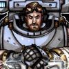
Krakendoomcool Posted July 31, 2018 Share Posted July 31, 2018 Cool! Bjorn looks great, I like the knot work on top and the wolfguard colours on the claw. Plaguebearer skull is nice too. He can have a post ETL banner. Was wondering if being a dad was going to effect your hobby time. Your Iron Priest has a brilliant out in the field practical feel to him. The green stuff details are brilliant, ropes etc.. The goatee and goggles really give him a slightly unhinged mechanic vibe. Great stuff. Link to comment https://bolterandchainsword.com/topic/322036-the-storm-stalkers-wip-blog/page/11/#findComment-5134918 Share on other sites More sharing options...
PeteySödes Posted July 31, 2018 Author Share Posted July 31, 2018 It wasn’t at first! She’s a bit needier now, but seems like it’ll fluctuate. I’ve just been trying to be productive in someway or another, if I can’t paint because I need to hold her generally I may be able to sculpt or something that’s slower. I’m a bit bummed I couldn’t get Bjorn exactly to th level I wanted but you’re totally right, I can do a post ETL update at some point. Link to comment https://bolterandchainsword.com/topic/322036-the-storm-stalkers-wip-blog/page/11/#findComment-5134938 Share on other sites More sharing options...
Krakendoomcool Posted July 31, 2018 Share Posted July 31, 2018 This is exactly how I started blogging. Holding the baby while still trying to do some form of 40k. Never tried painting or modelling with the baby. Link to comment https://bolterandchainsword.com/topic/322036-the-storm-stalkers-wip-blog/page/11/#findComment-5134950 Share on other sites More sharing options...
Jarl Kjaran Coldheart Posted August 1, 2018 Share Posted August 1, 2018 1. THATS JUST TABLE TOP QUALITY!? I kinda hate you right now. 2. That Iron Priest is insane. Just insane. Link to comment https://bolterandchainsword.com/topic/322036-the-storm-stalkers-wip-blog/page/11/#findComment-5135162 Share on other sites More sharing options...
PeteySödes Posted August 1, 2018 Author Share Posted August 1, 2018 Thanks! Lol but yea pretty much that’s why it takes me ages to get anything done. Always something that bugs me and I go back to correct. This ETL has been the most productive in terms of projects complete/time probably ever. I think my area has a crazy number of golden deamon winners around so it’s a bit easier to justify pushing for a higher standard. :P Link to comment https://bolterandchainsword.com/topic/322036-the-storm-stalkers-wip-blog/page/11/#findComment-5135163 Share on other sites More sharing options...
Bjorn Firewalker Posted August 1, 2018 Share Posted August 1, 2018 The First Jarl looks great! I like the right shoulder you gave him. Link to comment https://bolterandchainsword.com/topic/322036-the-storm-stalkers-wip-blog/page/11/#findComment-5135493 Share on other sites More sharing options...
Jackalwolf Posted August 4, 2018 Share Posted August 4, 2018 Hey mind doing a little tutorial on the amazing free hand of Bjorn? Link to comment https://bolterandchainsword.com/topic/322036-the-storm-stalkers-wip-blog/page/11/#findComment-5138077 Share on other sites More sharing options...
PeteySödes Posted August 5, 2018 Author Share Posted August 5, 2018 Most definately! I have family in town so it may land tomorrow but I’ll make it a priority. Link to comment https://bolterandchainsword.com/topic/322036-the-storm-stalkers-wip-blog/page/11/#findComment-5138517 Share on other sites More sharing options...
PeteySödes Posted August 9, 2018 Author Share Posted August 9, 2018 Heyo this is late but today was the first time I've been able to paint. Ironically the baby which has been keeping me from painting got me sick so i stayed home today... But no one cares about my plight, onto some freehand! This may not be the BEST example because its still fiddly but the same rules apply: So we start with our base. This is going to be hard mode because i shaded this a bit so it's not just one nice flat base color, which is what i'd recommend. I'll go into that later though. My reason here is im trying to make it look like worked leather. Step two is the outline. This is where I would break whatever i was doing down into its base shapes. This is going to be knotwork and you can see I don't care yet about the over under or was even that particularly clean here. Main thing is just to get the basic shape. Keep the paint super thin, I also like to use a retarder to slow the drying. You can sort of "push" the color around with it, its real nice. I use the Vallejo one. Here we can start to reign it in a bit. For this example I used a darker color to now hem in the shape. Im also slowly cleaning up and fat or thin lines with that outline color. This is the point im not showing where the overs and unders are going. Again, with the darker color im being careful but not overly concerned. Once I've got the shape down, I'll go back with the background color (easier if its one flat color) and "erasing" any mistakes from the darker outline. I'll go back and forth as many times as needed to that outline and the background color as needed. Sometimes its a lot so don't get discouraged. Next I'll do the same exact thing with that lighter main shape brown and the outline color. Same steps! Here I'll give it some depth. I'll take that main shape color and add a bit of a lighter color, here Im adding a bit of orange for that cured leather look. Keeping it pretty thin I'll go over the middle of each shape and leave a bit of space where the shapes dive under eachother. I'll keep adding light color till i like the look/contrast. I ran out of paint time here but that pretty much how I approach any freehandy type stuff. I hope that helps and makes sense. Let me know if you need anything cleared up! Link to comment https://bolterandchainsword.com/topic/322036-the-storm-stalkers-wip-blog/page/11/#findComment-5141837 Share on other sites More sharing options...
Krakendoomcool Posted August 9, 2018 Share Posted August 9, 2018 Sorry to hear about your plight, get well soon. Thanks for the insight. I'll def be referring to this if I do any knot work. This banner is going to look awesome! Great choice of leather background. Link to comment https://bolterandchainsword.com/topic/322036-the-storm-stalkers-wip-blog/page/11/#findComment-5141841 Share on other sites More sharing options...
PeteySödes Posted August 9, 2018 Author Share Posted August 9, 2018 Thanks and thanks, it’s just a cold so no worries :D I wanted to try the leather thing, I’d never seen it on a banner before and thought it might be cool. It also helped that the design I made before didn’t look good since the wolf skull covered all the good bits! Link to comment https://bolterandchainsword.com/topic/322036-the-storm-stalkers-wip-blog/page/11/#findComment-5141842 Share on other sites More sharing options...
Dantay VI Posted August 10, 2018 Share Posted August 10, 2018 I am in awe of the knot work you have done. I have tried out that design and it is absolute torture to do on a vehicle. We are not worthy!!! I am actually at the point of giving up on the freehand and considering doing some custom decals as outlines, then using paint as fillers. I used the shade when I tried freehanding before, because like you I kept the paint uber thin, the shade with the thin paint almost does the highlighting and shade to the free hand for you , or at least it help point to where you want to put the high lights. The leather looks great. Link to comment https://bolterandchainsword.com/topic/322036-the-storm-stalkers-wip-blog/page/11/#findComment-5141967 Share on other sites More sharing options...
Wispy Posted August 10, 2018 Share Posted August 10, 2018 Great design! Link to comment https://bolterandchainsword.com/topic/322036-the-storm-stalkers-wip-blog/page/11/#findComment-5141977 Share on other sites More sharing options...
TiguriusX Posted August 10, 2018 Share Posted August 10, 2018 That banner is mind blowing.....hot damn Link to comment https://bolterandchainsword.com/topic/322036-the-storm-stalkers-wip-blog/page/11/#findComment-5141987 Share on other sites More sharing options...
PeteySödes Posted August 10, 2018 Author Share Posted August 10, 2018 Another Step! I should have just drawn this out like a series or something. So here in terms of freehand its just more examples of repeating the steps above. In the bottom curve where i made the even smaller knotwork and "FENRIS" runes I blanked out that part with a darker brown. I then hit it with the base brown (thinned and *slowed*), again the base shapes for the knots and just line by line for the runes. Went back with the darker brown to clean it up, then blended upward. Not freehand related but i made the leather relief with just an even darker brown stippled in. theres more to do but i think im going to finish the skull, fur and bits first to get a sense of the colors! Also go rock the vote on the ETL Artificer poll! Link to comment https://bolterandchainsword.com/topic/322036-the-storm-stalkers-wip-blog/page/11/#findComment-5142223 Share on other sites More sharing options...
The Saint Ragnar Posted August 10, 2018 Share Posted August 10, 2018 Also go rock the vote on the ETL Artificer poll! Already voted, you have my axe! Link to comment https://bolterandchainsword.com/topic/322036-the-storm-stalkers-wip-blog/page/11/#findComment-5142243 Share on other sites More sharing options...
Jackalwolf Posted August 10, 2018 Share Posted August 10, 2018 That is amazing mate, thanks for the tutorial. Link to comment https://bolterandchainsword.com/topic/322036-the-storm-stalkers-wip-blog/page/11/#findComment-5142261 Share on other sites More sharing options...
Konnavaer Posted August 10, 2018 Share Posted August 10, 2018 Also go rock the vote on the ETL Artificer poll! Already voted, you have my axe! And my sword ! Link to comment https://bolterandchainsword.com/topic/322036-the-storm-stalkers-wip-blog/page/11/#findComment-5142373 Share on other sites More sharing options...
Panzer Posted August 10, 2018 Share Posted August 10, 2018 You definitely got my vote as well. Best models among all the options. :tu: Link to comment https://bolterandchainsword.com/topic/322036-the-storm-stalkers-wip-blog/page/11/#findComment-5142379 Share on other sites More sharing options...
Rune Priest Jbickb Posted August 10, 2018 Share Posted August 10, 2018 And mine Link to comment https://bolterandchainsword.com/topic/322036-the-storm-stalkers-wip-blog/page/11/#findComment-5142383 Share on other sites More sharing options...
PeteySödes Posted August 10, 2018 Author Share Posted August 10, 2018 Thanks guys! I'm just happy to have been included, i honestly didn't expect to be a contender with how good everyones stuff is. As for my next steps on that banner, I planned to make the fur black which seems pretty challenging to make look good. I wanted to do it on the banner for both contrast but also to practice since id like to make that Iron Priest wolf black as well. How have you guys done your black fur pelts? I'm planning on trying the blue/black method but have reservations since it seems like that kind of a human hair thing. Wolves seem to have that grey or brown tone to them. Any advice? Link to comment https://bolterandchainsword.com/topic/322036-the-storm-stalkers-wip-blog/page/11/#findComment-5142391 Share on other sites More sharing options...
Panzer Posted August 10, 2018 Share Posted August 10, 2018 It's been quite some time since I did any fur for anything so the only advice I can give is: keep in mind that black fur is rarely truly black. It often has lots of grey, brown and/or blue in it as well. If I recall correctly I used to paint fur by almost exclusively dry brushing and a wash inbetween. Link to comment https://bolterandchainsword.com/topic/322036-the-storm-stalkers-wip-blog/page/11/#findComment-5142397 Share on other sites More sharing options...
Recommended Posts
Archived
This topic is now archived and is closed to further replies.