Honda Posted January 4, 2007 Author Share Posted January 4, 2007 Hey Nicorex! This started out as an 1850 pt army, but now that the 2007 RTTs will be 1750, I'll need to drop a squad and then adjust the points back up...which is annoying. C'est le guerre! As a hat tip to you, your SM army basing style is what gave me the inspiration to do an urban theme. Cheers, Link to comment https://bolterandchainsword.com/topic/100590-apocalypse-lords/page/2/#findComment-1159497 Share on other sites More sharing options...
Nicorex Posted January 4, 2007 Share Posted January 4, 2007 Kick Hynnie! I love bringing insperation to the Masses! LOL! Link to comment https://bolterandchainsword.com/topic/100590-apocalypse-lords/page/2/#findComment-1159509 Share on other sites More sharing options...
The Angelus Sanctus Posted January 4, 2007 Share Posted January 4, 2007 Nice work there Honda B) Heh, i wouldnt feel too down about not doing all 30 termies for the highlight stage (hey, you still managed to do over 50%). I personally think you should skip a second coat of shinging gold. The first coat seemed to work very well, and another coat will only add another layer of paint, which from the pics, it doesnt look like you actually need. Id say just go straight to the chestnut ink, get those recesses darkened and start highlighting :P Link to comment https://bolterandchainsword.com/topic/100590-apocalypse-lords/page/2/#findComment-1159668 Share on other sites More sharing options...
truehero Posted January 5, 2007 Share Posted January 5, 2007 really like em, looking forward to more Link to comment https://bolterandchainsword.com/topic/100590-apocalypse-lords/page/2/#findComment-1160633 Share on other sites More sharing options...
Honda Posted January 6, 2007 Author Share Posted January 6, 2007 Ok, quick update: 1. Finished highlighting the black side of all 30 terminators 2. Applied several layers of Chestnut ink to the the gold armor of the Librarian 3. I have started applying the base color for the white side (very thin VMC 987 Medium Grey) Will post some pictures of the progress later today, weather permitting (i.e. Thunderstorms don't force me to disconnect) <rubs hands together> I can really start to feel the army come together even though it has quite a ways to go. :blink: Link to comment https://bolterandchainsword.com/topic/100590-apocalypse-lords/page/2/#findComment-1160961 Share on other sites More sharing options...
Mithrilforge Posted January 8, 2007 Share Posted January 8, 2007 Looking good so far...you have a long way to go- good luck :) as to the gold guy, i have found white,green and/or red contrasts well with gold,have a look at the deamonhunters codex to seek idea's as some of the inquisitors in there are done in gold ;) Mithril Link to comment https://bolterandchainsword.com/topic/100590-apocalypse-lords/page/2/#findComment-1161811 Share on other sites More sharing options...
Dudley Nightshade Posted January 8, 2007 Share Posted January 8, 2007 (although with the RTT limits now at 1750, that changes some things :) ). Hey, um, if you're getting these ready for a tournament and planning to use Deathwing rules, you do know that the rules will be changing at the end of February with the new DA codex, right? Anyway, looking good. Link to comment https://bolterandchainsword.com/topic/100590-apocalypse-lords/page/2/#findComment-1161825 Share on other sites More sharing options...
Honda Posted January 8, 2007 Author Share Posted January 8, 2007 @BY Yep, I'm aware that the codex is changing. However, when I made the statement I was considering a tourney that happened in Feb prior to the codex coming out and certainly within the 30 grace period as stated in the RTT rules. However, it is now unlikely that I will be attending that tourney, so "much ado about nothing". I'll still plan on tuning the list for 1750, but wait for the new codex before I commit to anything. Also, I should have some new pictures up in a day or so...I did some interesting things with the Librarian over the weekend. Still trying to decide if they worked. Cheers, Link to comment https://bolterandchainsword.com/topic/100590-apocalypse-lords/page/2/#findComment-1162052 Share on other sites More sharing options...
angel robertson Posted January 8, 2007 Share Posted January 8, 2007 Looking very good! Waiting patiently for more pics . . . AR Link to comment https://bolterandchainsword.com/topic/100590-apocalypse-lords/page/2/#findComment-1162073 Share on other sites More sharing options...
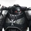
Honda Posted January 9, 2007 Author Share Posted January 9, 2007 Ok, here's some new pictures. First off, I've started painting a line down the middle of the figure to help me block off the white side. I'm about half way through with that. http://i35.photobucket.com/albums/d187/hkowabunga/Apocalypse%20Lords/Omegawing/Omegawing-WIP4018.jpg Note: Some of these highlights are still a little rough. They were among the first figures I started on and I have not gone back to touch up the highlights. I will. Also, I did not apply the black ink on the highlights yet. I decided to wait until I got the white close to being done before I decide how much to soften the black highlights. I didn't want to tone them down too much and then have them overpowered by the white side. Next are some of the retinue with the first layer of the foundation color that the white will go over. For the records, it's VMC 987 Medium Grey, which is a nice "stone" brown/grey color. http://i35.photobucket.com/albums/d187/hkowabunga/Apocalypse%20Lords/Omegawing/Omegawing-WIP4017.jpg http://i35.photobucket.com/albums/d187/hkowabunga/Apocalypse%20Lords/Omegawing/Omegawing-WIP4016.jpg http://i35.photobucket.com/albums/d187/hkowabunga/Apocalypse%20Lords/Omegawing/Omegawing-WIP4014.jpg And now the interesting part. I decided to add some script to the armor of the Librarian. It's not finished as I need to add some black lines to break up the script so that it looks a little more like words. I started off by writing the script in Chaos Black, then went over the black with VMC Silver, then inked with 5-6 coats of yellow. The armor looks nice and "golden" now. I then put some silver highlights on some edges and then applied two more coats of yellow ink. I've also put on the base foundation for the stone work which was black + DA green. I will lighten up from there. I'm not convinced that I've pulled this off yet (the Librarian) as he still has a ways to go, but he's not bad. We'll see how he develops. http://i35.photobucket.com/albums/d187/hkowabunga/Apocalypse%20Lords/Omegawing/Omegawing-WIP4005.jpg http://i35.photobucket.com/albums/d187/hkowabunga/Apocalypse%20Lords/Omegawing/Omegawing-WIP4003.jpg http://i35.photobucket.com/albums/d187/hkowabunga/Apocalypse%20Lords/Omegawing/Omegawing-WIP4002.jpg http://i35.photobucket.com/albums/d187/hkowabunga/Apocalypse%20Lords/Omegawing/Omegawing-WIP4001.jpg The journey continues... C&C more than welcome! Link to comment https://bolterandchainsword.com/topic/100590-apocalypse-lords/page/2/#findComment-1162548 Share on other sites More sharing options...
Bonesthedog Posted January 9, 2007 Share Posted January 9, 2007 The stone looks really cool, and i like the exaggerated highlights on the black. Did you scuplt the librarian's hair? It looks great. As for his armour, try adding a flesh wash, then using a brighter gold for highlights. It will break up the surfaces. Link to comment https://bolterandchainsword.com/topic/100590-apocalypse-lords/page/2/#findComment-1162553 Share on other sites More sharing options...
NemFX Posted January 9, 2007 Share Posted January 9, 2007 For some reason I misread this as "Thirsty terminators" and for whatever reason I was more curious about that.. .. Just sounds like some kind of desert deathwatch team or maybe an Irish based army to me :lol: Link to comment https://bolterandchainsword.com/topic/100590-apocalypse-lords/page/2/#findComment-1162591 Share on other sites More sharing options...
Honda Posted January 9, 2007 Author Share Posted January 9, 2007 For some reason I misread this as "Thirsty terminators" and for whatever reason I was more curious about that.. .. Just sounds like some kind of desert deathwatch team or maybe an Irish based army to me LOL. Actually, after a hard day of removing xenos scum from the galaxy, they prefer to chug down a bottle of Groxade. Nothing replenishes your vital amino acids and electrolyes like Groxade. Groxade, is it in you? Link to comment https://bolterandchainsword.com/topic/100590-apocalypse-lords/page/2/#findComment-1162714 Share on other sites More sharing options...
Honda Posted January 13, 2007 Author Share Posted January 13, 2007 Ok, it's been a little while since I last posted, but fear not, progress has been made. http://i35.photobucket.com/albums/d187/hkowabunga/Apocalypse%20Lords/Omegawing/Omegawing-WIP5015.jpg As you can see, I am in the "gut check" part of the project. So 20 out of the 30 have the initial foundation color for the white side done, 10 to go. This will be the last stage where I work on the army in it's entirety. From here, I'll work on a squad at a time (5 because of the drop pods) and get them to the completed stage. So, I'm still excited about how the figs are coming together and the animation I put into their poses still looks like it is going to show as the painting continues to progress. Cheers, Link to comment https://bolterandchainsword.com/topic/100590-apocalypse-lords/page/2/#findComment-1165215 Share on other sites More sharing options...
angel robertson Posted January 13, 2007 Share Posted January 13, 2007 Looking good there! Just need to keep ploughing through the basecoats! How are the drop pods being painted? The same split scheme? AR Link to comment https://bolterandchainsword.com/topic/100590-apocalypse-lords/page/2/#findComment-1165222 Share on other sites More sharing options...
Honda Posted January 13, 2007 Author Share Posted January 13, 2007 @AR, Not sure yet on the drop pods. I don't think I'll be putting a split scheme on the entire DP (I'm not sure I have the patience for that :rolleyes: ), so more than likely black with a chapter symbol. I've also toyed with the idea of painting the DP's white as that would be unusual looking. However, since the chapter operates at night lot of the time, it might make more sense to stick with the black and do something else to distinguish the vehicles. Anyway, it's something that I ponder as I work my way through the "fun" stuff. Link to comment https://bolterandchainsword.com/topic/100590-apocalypse-lords/page/2/#findComment-1165229 Share on other sites More sharing options...
Honda Posted January 20, 2007 Author Share Posted January 20, 2007 Ok, here are the results of last weeks efforts. First off, all thirty of the terminators have the first level of foundation color on the white side (Yay!). Not a fun exercise, but necessary and I am starting on getting the first squad up to the completed stage. http://i35.photobucket.com/albums/d187/hkowabunga/Apocalypse%20Lords/Omegawing/Omegawing-WIP5001.jpg However, as I wasn't having as much fun with that part (from a mental perspective), I decided to spend time advancing the Librarian, so he got the majority of the attention. So here are some shots of what has been done on Kensai. http://i35.photobucket.com/albums/d187/hkowabunga/Apocalypse%20Lords/Omegawing/Omegawing-WIP5009.jpg http://i35.photobucket.com/albums/d187/hkowabunga/Apocalypse%20Lords/Omegawing/Omegawing-WIP5010.jpg http://i35.photobucket.com/albums/d187/hkowabunga/Apocalypse%20Lords/Omegawing/Omegawing-WIP5011.jpg http://i35.photobucket.com/albums/d187/hkowabunga/Apocalypse%20Lords/Omegawing/Omegawing-WIP5008.jpg http://i35.photobucket.com/albums/d187/hkowabunga/Apocalypse%20Lords/Omegawing/Omegawing-WIP5007.jpg http://i35.photobucket.com/albums/d187/hkowabunga/Apocalypse%20Lords/Omegawing/Omegawing-WIP5004.jpg The blade effect I was striving for was something that looked like the energy was "dripping" off of the blade while he is waiting to strike. Not sure I achieved that, but its not too bad looking. I'm going to let it sit for a little bit before deciding what to do next. Also, I put several thin layers of blue ink on the upper edge of the blade to do something different. Remaining Steps: 1. The chapter symbol is the Greek letter Omega and on these guys it will sit on the right shoulder pad and some knee pads. So I have to build some templates from these: http://i35.photobucket.com/albums/d187/hkowabunga/Apocalypse%20Lords/Omegawing/Omegawing-WIP5012.jpg So that I can consistently trace the image onto the pad and then paint. This will most likely be a subdued red so that it doesn't steal the eye's focus. 2. Highlight his hair. This will take some time as I need to put lines on all the highlights and dry brushing won't cut it. 3. Figure out what to do with the bar on his force weapon as well as the piece next to the blade guard. I am half entertaining the idea of doing the middle bar in a marble effect, but I'm not sure on that. Ideas anyone? 4. Wax on the purity seals. I'm going to put a couple of layers of thinned Flesh Wash on them to tone them down a little bit, then go back and highlight with Blood Red. Originally I was going to do two red and two green seals, but after thinking about it, going with all red seems Ok and appears to balance the green energy on the blade. 5. I'm not too happy with the stone work on the right shoulder pad. For some reason it seems to not turn out like the othe stone work (e.g. Crux Terminatus). So I still have work there. So, there we stand. I will post each week whether it kills you or not. :lol: Since this has become "our" project :ph34r: , C & C is more than welcome. Cheers, Link to comment https://bolterandchainsword.com/topic/100590-apocalypse-lords/page/2/#findComment-1170055 Share on other sites More sharing options...
Yogi Posted January 20, 2007 Share Posted January 20, 2007 looking good! Cant wait to see more. Is the Libby's force weapon bent? Link to comment https://bolterandchainsword.com/topic/100590-apocalypse-lords/page/2/#findComment-1170195 Share on other sites More sharing options...
Honda Posted January 21, 2007 Author Share Posted January 21, 2007 @Yogi, Yeah, it looks like it didn't line up completely straight which seems pretty obvious from some angles. I'll have to think about that. I am quite hesitant to do anything that might harm the work done at this point. Bummer. Oh well, he's still going to kick some Eldar booty when my buddy gets his army painted. ;) Link to comment https://bolterandchainsword.com/topic/100590-apocalypse-lords/page/2/#findComment-1170409 Share on other sites More sharing options...
Honda Posted January 27, 2007 Author Share Posted January 27, 2007 Ok, decided to focus on the retinue this week, so a bunch of pics. The week started off with a near catastrophe in that I made a jump from the foundation color to starting layers of white. It just wouldn't go (VMC White). So I backed off and went with a 7:2 mix of VMC White and the 987 Grey and that seemed to provide better coverage and in the end, it was what I wanted, which is an off white. I also started working the details to try and get some life into the figures. At this point in time they look...barely average to me. I realize that I have to put some "dark" in the creases on the white side, but my new brush that I had been saving for this task (it's not "new" new, just never been used before) developed a spiked do when it got wet and looked like I had been drybrushing with it. :D So, adding some definition to the white is coming. Also, my first go at adding glowing eyes is barely tolerable. It isn't too distracting at gaming distance, but these photos point out that some touch up is definitely needed. Things that seemed to work out Ok: Bronze: I decided that a greenish tint to the bronze would be a good thing (maybe not, but at 4 am it seemed like a good idea), so the black base was covered with a thin coat of DA Green, then VMC Bronze, with highlights done by adding a drop of VMC Silver to the bronze. I'm not really sure it comes out in the pics, but I liked how it turned out. Stone: On the Crux Terminatus, I started again with DA Green over black, then a thin coat of Codex Grey, then lightened the CG with Skull White and finished the highlights. Seems to have turned out pretty decent. Purity Seals: These came out Ok, though I need to put some Flesh Wash on the wax part and then go back over with Blood Red. Most of the right shoulder pads are screaming out at me for their chapter symbol (the Greek letter Omega), but I haven't gotten to making the template yet, so that is coming. Also, I plan on putting oaths and script on both sides of the armor to break up the large areas of base color. Although I will see this through, there were a couple of times, when the white layer went pear shaped on me that I nearly decided to dump them all in Simple Green and just repaint them in black. I'm still not sure I will be able to pull the concept off (vertically bisected white / black), but I am determined to let the project run it's course because it just may be one of those things that doesn't come together until the end. While thinking about the drop pods a little, I have wondered about possibly bulking out the bottom section, so I got some plastic half tube shapes. This would make the bottom a little wider and add to the interesting shape that has developed. We'll see. Anyway Brothers, the quest continues, be it over the mountain tops or through the deep dark valleys. Semper Fidelis C&C most welcome! http://i35.photobucket.com/albums/d187/hkowabunga/Apocalypse%20Lords/Omegawing/Omegawing-WIP6009.jpg http://i35.photobucket.com/albums/d187/hkowabunga/Apocalypse%20Lords/Omegawing/Omegawing-WIP6010.jpg http://i35.photobucket.com/albums/d187/hkowabunga/Apocalypse%20Lords/Omegawing/Omegawing-WIP6011.jpg http://i35.photobucket.com/albums/d187/hkowabunga/Apocalypse%20Lords/Omegawing/Omegawing-WIP6012.jpg http://i35.photobucket.com/albums/d187/hkowabunga/Apocalypse%20Lords/Omegawing/Omegawing-WIP6013.jpg http://i35.photobucket.com/albums/d187/hkowabunga/Apocalypse%20Lords/Omegawing/Omegawing-WIP6014.jpg http://i35.photobucket.com/albums/d187/hkowabunga/Apocalypse%20Lords/Omegawing/Omegawing-WIP6015.jpg http://i35.photobucket.com/albums/d187/hkowabunga/Apocalypse%20Lords/Omegawing/Omegawing-WIP6017.jpg http://i35.photobucket.com/albums/d187/hkowabunga/Apocalypse%20Lords/Omegawing/Omegawing-WIP6016.jpg http://i35.photobucket.com/albums/d187/hkowabunga/Apocalypse%20Lords/Omegawing/Omegawing-WIP6018.jpg http://i35.photobucket.com/albums/d187/hkowabunga/Apocalypse%20Lords/Omegawing/Omegawing-WIP6019.jpg http://i35.photobucket.com/albums/d187/hkowabunga/Apocalypse%20Lords/Omegawing/Omegawing-WIP6020.jpg http://i35.photobucket.com/albums/d187/hkowabunga/Apocalypse%20Lords/Omegawing/Omegawing-WIP6021.jpg Link to comment https://bolterandchainsword.com/topic/100590-apocalypse-lords/page/2/#findComment-1174923 Share on other sites More sharing options...
Khrangar Posted January 27, 2007 Share Posted January 27, 2007 It could just be me but the storm bolters look a little unfinished if they are in fact done. The colours look good I admit and this is an ambitious project and for that, I salute you. Also, the grey cruxes look a bit rushed compared the the rest of the models. Not to be harsh if I am as I think they look good but it could just be me. Khrangar Link to comment https://bolterandchainsword.com/topic/100590-apocalypse-lords/page/2/#findComment-1174952 Share on other sites More sharing options...
Honda Posted January 28, 2007 Author Share Posted January 28, 2007 @Khranger, Thanx for the feedback. I will go back and look at the crux's. I also agree with you on the guns, but I'm not sure yet what I want to do to finish them. I may just add "metal" to the back part of the gun and maybe the magazine. Will think on it. Thanx again! Link to comment https://bolterandchainsword.com/topic/100590-apocalypse-lords/page/2/#findComment-1174989 Share on other sites More sharing options...
ras josh Posted January 28, 2007 Share Posted January 28, 2007 wow..you are a brave soul...thats a butt load od bisection ya got there!! maybe a few thinnes out smoke washes to help give a lil more definition ...movement.flow, what3ever im tryin to say....glowin eyes look good for a 4am job:) mine were done at 3am and i woke up and said///"ouch" everything is always good that early, eh? :D Link to comment https://bolterandchainsword.com/topic/100590-apocalypse-lords/page/2/#findComment-1175034 Share on other sites More sharing options...
The Angelus Sanctus Posted January 28, 2007 Share Posted January 28, 2007 Fantastic work thus far Honda, you are truly working through this project at a remarkable pace, well done :P Now for some comments. The glowing eyes look fantastic, you've really pulled that one off well! Personally, i felt the armor could still use some work (although this may be camera related). The white section looks fine in some areas, but in others (like the back of the legs) look like the recesses could use some more work, as it looks like certain parts have just been fully painted in white without leaving too much dark lining to help bring out some of the detail. The black section, despite the highlights also look a bit "flat". This also isnt help by the weapon cases as it really keeps that section looking rather black and plain. If you added some color to the weapon cases, i think you'll really improve the minis alot. Naturally im not aiming to sound harsh, but you have such a great project to work with, it would be a shame if you didnt see it all the way to its maximum potential. I should really take a few pics of the Terminators i did for my AotL so we can compare terminators and just have a terminator field day :D Link to comment https://bolterandchainsword.com/topic/100590-apocalypse-lords/page/2/#findComment-1175048 Share on other sites More sharing options...
Honda Posted January 28, 2007 Author Share Posted January 28, 2007 @RJ In the early AM, everything looks better. :D However, that is my normal time for painting, so I always need to wait until day to see what I've really done. I've never used that Tamiya Smoke stuff, does it flow to the recesses without overly darkening the base color? I'm happy with the base color, I just need to get some definition on the white side. @AS Thanx for the comments and they are in no way taken as being harsh. I freely admit that I have grabbed two tigers (painting black and white) by the tail and am stretching myself in multiple directions. I will continue this to the end, but unlike others that kind of breeze through their projects, mine usually end up being knife fights all the way through. I will get there though, even if I have to crawl across the finish line on bloody knees. Eyes: I added a thinned coat of green ink to darken the recesses and I will follow up with some highlights to see if I can do better this time. White side: I will definitely be adding some "dark" into creases et al, as for the most part I did just paint it white all over. The other way was taking a very long time to do and it just wasn't coming out the way I wanted it to. So, I'll get there, but probably using an alternative route. Black side: I agree with you. Early on I had considered adding a red gun housing to them and then left that out. I may have to do that to liven up the black side. Given the palette of colors I am working with, does a deep red seem workable to you? Thanx again one and all. I think if I can get these guys where they need to be visually, then the following groups will be easier to work through as I will know what needs to be done. Right now, I'm in Lewis and Clark mode ("Oh look, a HUGE river...wonder how we'll get across") :( Link to comment https://bolterandchainsword.com/topic/100590-apocalypse-lords/page/2/#findComment-1175350 Share on other sites More sharing options...
Recommended Posts
Archived
This topic is now archived and is closed to further replies.