Phebrickid Posted July 7, 2011 Share Posted July 7, 2011 Insane, Depressing, Awe-inspiring, 20/10, nothing else to say really, superlatives fail me! :lol: Link to comment Share on other sites More sharing options...
Phebrickid Posted July 7, 2011 Share Posted July 7, 2011 Insane, Depressing, Awe-inspiring, 20/10, nothing else to say really, superlatives fail me! :lol: Link to comment Share on other sites More sharing options...
Token Posted July 7, 2011 Share Posted July 7, 2011 Impressive. Link to comment Share on other sites More sharing options...
Magnor Posted July 7, 2011 Share Posted July 7, 2011 Great job. It looks amazing...... Link to comment Share on other sites More sharing options...
Wulfebane Posted July 7, 2011 Share Posted July 7, 2011 I honestly can't say anything more about this. It's depressing, really, because I'll never have one. Link to comment Share on other sites More sharing options...
TemplarCoyote Posted July 7, 2011 Share Posted July 7, 2011 Outstanding!!! Link to comment Share on other sites More sharing options...
Grimfoe Posted July 7, 2011 Share Posted July 7, 2011 Fantastic work! I wish you all the best in the competition. Link to comment Share on other sites More sharing options...
Chef Wulfen Posted July 7, 2011 Share Posted July 7, 2011 oh sweet jebus that is awsome. thats a gold right there. Link to comment Share on other sites More sharing options...
Levitas Posted July 11, 2011 Share Posted July 11, 2011 Congrats on the Austin Warcon paint win man! My buddy painted the Death Guard Vindi that came second. The ruinoius pwoers never prevail... ;) I was rooting for both though. Very well deserved, hope they showered you in prizes! Link to comment Share on other sites More sharing options...
Iacton Qruze Posted July 11, 2011 Author Share Posted July 11, 2011 Thanks man. I gotta say, I loved that DG tank. Very well done, and he should be proud of it. They gave me some cool stuff. a box of Grey Hunters is always welcome in my house, and I needed 2 more wolf heads anyway. They also hooked me up with some sweet battlefoam stuff. In talking with Romeo more about that, we started hashing out something REALLY cool, that I'll post a pic of once we get it done and sent over to me... It's SW related, so... you know. :D Link to comment Share on other sites More sharing options...
Levitas Posted July 11, 2011 Share Posted July 11, 2011 Thanks man. I gotta say, I loved that DG tank. Very well done, and he should be proud of it. They gave me some cool stuff. a box of Grey Hunters is always welcome in my house, and I needed 2 more wolf heads anyway. They also hooked me up with some sweet battlefoam stuff. In talking with Romeo more about that, we started hashing out something REALLY cool, that I'll post a pic of once we get it done and sent over to me... It's SW related, so... you know. ;) I will pass on the praise, he worked pretty hard on it. Funny that I had showed him your dreads WIP pics a few weeks ago. You'll like the fact that he beat my space wolf dread in a local painting comp (and rightly so). So somewhat amuses me that his entry was beaten by a wolf dread. :P I'm glad they showed you some prize love, rightly so! Look forward to hearing about the battlefoam. I'm hoping to make next year and throw an entry at the painting comp, sounded like a lot of fun. Link to comment Share on other sites More sharing options...
Iacton Qruze Posted July 11, 2011 Author Share Posted July 11, 2011 I love the painting comps, and there were a few entries this year that really jumped out at me. The only thing I was disappointed about was that the tables were a lot lighter on entries this year than last year, so I wish that more people had entered. Jackson, the 9 year old that submitted the lictor, is a cool kid. I played at the narrative table with him all weekend, and I think he'll be bringing a lot to the hobby in a few more years. He had a good entry that far outclassed my painting skills at his age. Link to comment Share on other sites More sharing options...
Wulfebane Posted July 11, 2011 Share Posted July 11, 2011 Nice new avatar pic. :P Link to comment Share on other sites More sharing options...
roon Posted July 14, 2011 Share Posted July 14, 2011 Wow, that's one really amazing dreadnought! You can be proud on that one! Both in conversionwork as paintjob. I'd like to ask you some questions about your work. And here they come! Where did you get the model of that banner? And what's your recipe of that amazing paint-chips and bronze? Would you mind sharing that? Cheers! ;) Link to comment Share on other sites More sharing options...
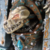
Iacton Qruze Posted July 14, 2011 Author Share Posted July 14, 2011 Wow, that's one really amazing dreadnought! You can be proud on that one! Both in conversionwork as paintjob. I'd like to ask you some questions about your work. And here they come! Where did you get the model of that banner? And what's your recipe of that amazing paint-chips and bronze? Would you mind sharing that? Cheers! :) The banner bit comes from the WHFB Marauder horsemen box, and has a bit from the old 3rd edition SW upgrade sprue added to the top, and is mounted on a brass rod. The bronze is based with a 1:1:1 mix of VGC Brassy Brass, VMC Mahogany Sand, and GW Tin Bitz. Wash with Devlan Mud, then lightly wash with Thraka Green. Edge highlight with Brassy Brass, and you can glaze that final highlight with either Ogryn Flesh or Gryphonne Sepia. The Patina is done by shading the recessed areas with a 1:2 mix of VMC Bluegreen and VMA Gunship Green. On this model, I used a 1:3 mix to offset the blue glow of the Plasma Cannon. I then mix in some white to the previous mix and line some of the deepest areas where oxidation would occur the most. The chips are all done with a sponge and black paint, followed by some boltgun metal painted inside the larger black bloches. I then edge the underside of the black with my highest highlight color, in this case VMC Pale Greyblue. For chips in the shade areas, I use RMS Stone Grey for my edge highlight. Link to comment Share on other sites More sharing options...
roon Posted July 14, 2011 Share Posted July 14, 2011 Marvelous and thanks alot for your quick reply! :) As for the colours, VMC and VGC are the Vallejo model- and gamepaints I assume, but can you tell me what RMS stands for? Link to comment Share on other sites More sharing options...
Iacton Qruze Posted July 14, 2011 Author Share Posted July 14, 2011 RMS is Reaper Master Series. Link to comment Share on other sites More sharing options...
commander alexander Posted July 14, 2011 Share Posted July 14, 2011 It looks stunning! I went to CMON, The guy that rated it a 7, I don't like his comment, but I have to agree with some of it. The green patina on the bronze pieces looks fine, but the blue glow you put on his claw and the plasma cannon seems..... Dusty? But otherwise the greys look excellent not unaturally flat, thats just the nature of the color. And for the rest of the model and all of its awesomeness, and the skill and effort you put into it, I give it a 10/10. No doubt about it. Link to comment Share on other sites More sharing options...
LoneSniperSG Posted July 14, 2011 Share Posted July 14, 2011 Russ' blood. ... It's.. he's... good god... :wacko: Link to comment Share on other sites More sharing options...
Forté Posted July 14, 2011 Share Posted July 14, 2011 Russ' blood. ... It's.. he's... good god... :wacko: well put. Link to comment Share on other sites More sharing options...
Iacton Qruze Posted July 14, 2011 Author Share Posted July 14, 2011 It looks stunning! I went to CMON, The guy that rated it a 7, I don't like his comment, but I have to agree with some of it. The green patina on the bronze pieces looks fine, but the blue glow you put on his claw and the plasma cannon seems..... Dusty? But otherwise the greys look excellent not unaturally flat, thats just the nature of the color. And for the rest of the model and all of its awesomeness, and the skill and effort you put into it, I give it a 10/10. No doubt about it. I think a lot of it has to do with the photos. I'm going to take some better ones after Gamesday, since I'm redoing a little bit of him. For example, the skull is really washed out on the photo, which you can tell if you go back into the WIP photos, and see ones where the skull took a better pic. The banner also did not come out as well in the photo. I think the dusty look, particularly on the claw, might be blur from the camera focusing more on the other parts of the hand. Bla bla is a solid painter. I just wish he had offered solutions to the things he saw, instead of just telling me it was a mediocre piece, that way I'd be less likely to just blow his comment off as "haters gonna hate". :( Thank you for the positive comments, though. I'm glad he has been well received by people. Link to comment Share on other sites More sharing options...
Hear da Lamentation Posted July 14, 2011 Share Posted July 14, 2011 Completely awesome mate - really. Anyone giving that 7/10 is either mad - or jealous imho. Link to comment Share on other sites More sharing options...
Chapter Master Ignis Domus Posted July 14, 2011 Share Posted July 14, 2011 I wonder how many ways I can find to give this more than one ten? :P Link to comment Share on other sites More sharing options...
LoneSniperSG Posted July 15, 2011 Share Posted July 15, 2011 I went to CMON, The guy that rated it a 7, I don't like his comment There's always a blasted naysayer lurking nearby. Always. I dismiss him as "herp derp" and all is good. I honestly do not agree with that comment at all, I think the dread is absolutely stunning. By the way Iacton, those runic plates hanging at the waist of the Dread, did you make those or did you get them from somewhere? If you bought them special, can you tell me where you got them? There's some other projects of mine I would like some for. Link to comment Share on other sites More sharing options...
bevulf Posted July 15, 2011 Share Posted July 15, 2011 It looks stunning! I went to CMON, The guy that rated it a 7, I don't like his comment, but I have to agree with some of it. The green patina on the bronze pieces looks fine, but the blue glow you put on his claw and the plasma cannon seems..... Dusty? But otherwise the greys look excellent not unaturally flat, thats just the nature of the color. And for the rest of the model and all of its awesomeness, and the skill and effort you put into it, I give it a 10/10. No doubt about it. I think a lot of it has to do with the photos. I'm going to take some better ones after Gamesday, since I'm redoing a little bit of him. For example, the skull is really washed out on the photo, which you can tell if you go back into the WIP photos, and see ones where the skull took a better pic. The banner also did not come out as well in the photo. I think the dusty look, particularly on the claw, might be blur from the camera focusing more on the other parts of the hand. Bla bla is a solid painter. I just wish he had offered solutions to the things he saw, instead of just telling me it was a mediocre piece, that way I'd be less likely to just blow his comment off as "haters gonna hate". :) Thank you for the positive comments, though. I'm glad he has been well received by people. Comments on CMON such as that of blabla. are nothing more than strange acts of jealousy. What he wrote has nothing to do with the real truth. Tabletop quality? He must be blind !! your bjorn is a beautiful miniature and just ignore that insane comments. absolutely wonderful work you did. Congrats. Link to comment Share on other sites More sharing options...

Recommended Posts
Archived
This topic is now archived and is closed to further replies.