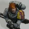
skeletoro Posted June 30, 2013 Author Share Posted June 30, 2013 OK, a little WIP update. Maybe one of these days I'll have some finished models, eh? :) So in these 2 pics you can see two models. One is a practice painting model illustrating my best efforts so far in terms of: a) colour scheme. This scheme is as follows (from darkest to lightest) 1) 1:1:1 The Fang/Dark Reaper/VMA Dark Bluegrey 2) 2:1:1 Russ Grey/Thunderhawk Blue/VMA Base Grey 3) 2:1:1 Fenrisian Grey/Celestra Grey/VMA Light Grey 4) 1:3 of the previous mix/Ulthuan Grey 5) Pure Ulthuan Grey. I want it to be a tad less blue than what I've achieved, so I'll probably reduce the Russ Grey and try pure Celestra Grey on the next practice models. b) Pack markings. I used Tamiya masking tape for the pack markings. Worked amazingly well. I'm very happy with the results. However, I need more contrast in my blacks and reds (in terms of zenithal so I might start with a darker shade (perhaps a brown for the red) and highlight up to a lighter red. The benefit of masking is that you can do zenithal highlighting with this kind of thing. TEMPTED to do my great company markings with masking tape, but they're so little and fiddly... Might just hand paint or buy decals. c) Chipping. I just used VMA steel with WnN Liquid mask over the top. I'm sorta happy with WnN liquid mask for this effect, but not 100% sold. It's VERY runny and it can be quite hard to see where it has ended up when you're trying to take it back off. And I was dumb enough to buy the colourless stuff. I've ordered Vallejo's masking fluid which I hear is much better... thicker and opaque. Also, I'm going to be doing some rust effects over the steel spray using weathering powders (the brown you see is actually unintended. The model I'm painting was originally brown and in my enthusiasm I may have worn the silver paint off in places...) d) Masking off the shoulder pads before painting main armour. This didn't work well at all. The WnN liquid mask is too runny and you have very little control stopping the mask going too far (you can see at the top of the shoulder pad, there's too much red. In other places such as on the reverse pad, the mask seems to have rubbed off or somehow failed to stop the paint and my white pad has some yucky grey patches all over it. Once more, hoping the vallejo mask will work better. If not, I'll use tape (but it's annoying to do on curved pads) Note: My plan would be to do line highlights on top of what you see here, as well as an oil wash. Just haven't gotten round to it yet. What do you think of the colour? I think a tad more grey/turquoise would be better. Also, my first grey hunter is 99% done! I followed Irwit's advice and it worked a charm. Thanks! I've reinforced the windblown wolftail by replacing the links with brass (.51mm) and I've also used two .51mm brass links to attach the strap to the bolter. Super-fiddly work. My fingers are much fatter than .51mm, that's for sure. I also followed Night Runner's awesome guide and gave him a necklace with wolf-teeth and a Runic Charm. Easier than I expected and I really like the result. I've aimed for a windblown look to him - hence the angle on the wolftail and strap as well as the position of the wolfteeth. He is aiming slightly up (but not nearly as much as the picture make him look because the blue tack is propping him up a bit) and I'll make sure the rocks on his base angle very slightly downwards to adjust for this. What do you think? http://img.photobucket.com/albums/v333/skeletoro/DSCF6718.jpg http://img.photobucket.com/albums/v333/skeletoro/DSCF6717.jpg Link to comment https://bolterandchainsword.com/topic/276735-skeletoros-great-company-motivational-thread/page/2/#findComment-3403824 Share on other sites More sharing options...
skeletoro Posted June 30, 2013 Author Share Posted June 30, 2013 Also, probably worth mentioning, the colour isn't quite veridical here. The model looks a fair bit more "space wolf grey" - lighter and more blue.... almost baby blue - hence why I want to desaturate it a bit more. Link to comment https://bolterandchainsword.com/topic/276735-skeletoros-great-company-motivational-thread/page/2/#findComment-3403827 Share on other sites More sharing options...
irwit Posted June 30, 2013 Share Posted June 30, 2013 Gh stripes look nice and crisp. Looking forward to seeing these guys get some paint :) Link to comment https://bolterandchainsword.com/topic/276735-skeletoros-great-company-motivational-thread/page/2/#findComment-3403969 Share on other sites More sharing options...
PupLord Posted June 30, 2013 Share Posted June 30, 2013 Whew! And I seriously thought of myself a perfectionist :) Seriously though, I am quite impressed with the effort you put into your minis - kudos for that Sir. Since you wanted oppinions on your color scheme I must say that I really like it and also I personally disagree with desaturating the color further - I would leave it exactly as is with the final light line highlights added on later. Personally I love the dark grey color scheme for all pre-Heresy legion themed armies but I dislike it equally for 40k era Great Companies. So what I am basically trying to say is that the "baby blue" scheme is where it's at. Your current scheme captures the baby blue color in a menacing, darkish tone and is excellent as is so please, don't change a thing. Now what I don't like is the battle damage. The areas of exposed ceramite are too "dominant" or large for my tastes and they are also lacking seriously in highlights. I would suggest either brushing / sponging the battle damage on as a final highlight (ie. no masking involved) or just reducing the size of the chipped areas. The other thing I don't like is the use of fancy shenanigans like zenithal highlights and airbrush, but that's just the grumpy old man within talking ;) *joking* You have a nice start to your first painted pack there! Have mjod on my tab! ;) My 2 cents, -Pup Link to comment https://bolterandchainsword.com/topic/276735-skeletoros-great-company-motivational-thread/page/2/#findComment-3404070 Share on other sites More sharing options...
skeletoro Posted June 30, 2013 Author Share Posted June 30, 2013 Thanks for that! Yep, I'll definitely be cutting back on the weathering a bit - part of this will be restricting it a tad more to the bottom of the greaves, with only occasional chips above the legs. I've been going a bit more aggressively in part to get more practice in (as this guy is just a practice model), in part to see what the limit is (i.e. how much is too much) and in part because I couldn't see the WnN masking liquid after it had dried so kept second guessing myself and adding more!! :P And yep, they'll be line highlighted and shaded, which makes a big diff. I actually quite like the colour, as you see it, in the pics too. Unfortunately it's not quite accurate and it's much more blue and less grey in reality! Link to comment https://bolterandchainsword.com/topic/276735-skeletoros-great-company-motivational-thread/page/2/#findComment-3404191 Share on other sites More sharing options...
skeletoro Posted July 1, 2013 Author Share Posted July 1, 2013 So I'm waiting for my gloss varnish to dry, before doing a burnt umber oil wash. I'm thinking that a burnt umber wash will actually have the effect of shifting the hue of the armour subtly towards grey and away from blue/green. Burnt umber is essentially a dark grey-red/orange. Shifting turquoise towards red = dark grey... to the extent that the specific paint I'm using is orangey, it may actually make the hue a tad less blue and more green too. Which is kinda exactly what I want. Does that sound plausible? If it works out like I suspect it will, then it might just shift the hue to exactly where I want it. Damn, space wolves are hard!!! EDIT: The more I stare at this half-painted model, the more the current colour scheme grows on me. I blame PupLord and the Mere Exposure Effect! Link to comment https://bolterandchainsword.com/topic/276735-skeletoros-great-company-motivational-thread/page/2/#findComment-3404452 Share on other sites More sharing options...
irwit Posted July 1, 2013 Share Posted July 1, 2013 I got myself some waterbased oil paints the other day. Seem to work just as well. may be worth trying before you commit as I know you are quite meticulous about consistency. They seem to have a slightly more pastel finish but they actual workflow ie painting on then removing where it is unwated, works exactly the same, just with water instead. I know I will not miss the smell and hassle of working with oil paints. Link to comment https://bolterandchainsword.com/topic/276735-skeletoros-great-company-motivational-thread/page/2/#findComment-3404567 Share on other sites More sharing options...
skeletoro Posted July 1, 2013 Author Share Posted July 1, 2013 UGH Yeah, I learned about those paints a couple of days ago while watching some more recent Youtube vids by Les Burley. All I can say is UGH. Why does anybody use oils... watercolour/water based oils seem much more suitable to use with acrylic paints, with, as far as I can tell, zero downsides? Problem is, I've already bought the paint and expensive mineral spirits and my wife is already unhappy about the money I'm burning on this project. Is there much visible difference? If it's really minor I might just use the burnt umber/black I've got, and if I run out down the line I might switch to the other. Unless there's a big visual difference, in which case I may have to cut my losses and make the switch now... doh!!! Link to comment https://bolterandchainsword.com/topic/276735-skeletoros-great-company-motivational-thread/page/2/#findComment-3404904 Share on other sites More sharing options...
irwit Posted July 1, 2013 Share Posted July 1, 2013 I'd say non water based is maybe slightly richer colour. If you haven't started yet maybe worth sticking what you have on eBay. Seriously the spirits really do stink the place out and can work their way through the protective varnish layer and before you know it you are back to plastic. Not the worst thing when you are painting grey anyway but still, I won't be using non water based oils again. Explain to the Mrs long term water based is free compared to all that expensive spirits you'd be using :) Link to comment https://bolterandchainsword.com/topic/276735-skeletoros-great-company-motivational-thread/page/2/#findComment-3404922 Share on other sites More sharing options...
skeletoro Posted July 1, 2013 Author Share Posted July 1, 2013 She hates the fumes, but she's not gonna be happy about me wasting the money. Hmm! I wonder if I can take it back to the shop. I haven't opened my burnt umber OR my mineral spirits. HMMMMMM! Can always try. EDIT: Phew, they're happy to do that. For the price of my burnt umber and mineral spirits, I can gets me both a burnt umber AND a black :) Woot! Wifey will be happy. Link to comment https://bolterandchainsword.com/topic/276735-skeletoros-great-company-motivational-thread/page/2/#findComment-3404928 Share on other sites More sharing options...
skeletoro Posted July 2, 2013 Author Share Posted July 2, 2013 Went to the store to pick up WnN Artisan Burnt Umber and Ivory Black... accidentally got RAW umber instead. Ooops. But looking at the website, the main difference is that it is greener. Which may actually be what you want (as I wanted to green it slightly as I mentioned before). We'll see, I guess! Did you mix black into your wash, Irwit? Or just use pure burnt umber? Link to comment https://bolterandchainsword.com/topic/276735-skeletoros-great-company-motivational-thread/page/2/#findComment-3405108 Share on other sites More sharing options...
irwit Posted July 2, 2013 Share Posted July 2, 2013 with the WnN the pigment is very strong so I added some black to take a little saturation out of it. Did they accept your old non water based ones back then ? Link to comment https://bolterandchainsword.com/topic/276735-skeletoros-great-company-motivational-thread/page/2/#findComment-3405220 Share on other sites More sharing options...
skeletoro Posted July 2, 2013 Author Share Posted July 2, 2013 Yep! ;) Link to comment https://bolterandchainsword.com/topic/276735-skeletoros-great-company-motivational-thread/page/2/#findComment-3405409 Share on other sites More sharing options...
skeletoro Posted July 4, 2013 Author Share Posted July 4, 2013 Okey dokey, pretty happy with the results of this test, overall. In the pics below, I've placed the finished test mini next to a model from the same batch who has been zenithal highlighted but hasn't been line highlighted or washed. As you can see, the end product is quite a lot grey/greener, mainly thanks to the raw umber/ivory black oil wash. I really like this. To the eye, it's hard to say if you'd call it a blue or a grey. It's grey, but it still has that hint of (greenish) blueness to it. Thoughts? A couple of things I'll have to work on: 1) Line highlights were messy but this was kinda on purpose as it's just a test mini and I did it really quickly. I also left out a bunch of details. The main point of this guy was to get the armour process sorted and I like what I ended up with. 2) Need practice with my oil washes :P 3) My blacks need to pop a lot more. I think I'll use black for my blacks in the future (and just zenithal up from there slightly, but not much. http://img.photobucket.com/albums/v333/skeletoro/DSCF6724.jpg http://img.photobucket.com/albums/v333/skeletoro/DSCF6722.jpghttp://img.photobucket.com/albums/v333/skeletoro/DSCF6725.jpg Link to comment https://bolterandchainsword.com/topic/276735-skeletoros-great-company-motivational-thread/page/2/#findComment-3406258 Share on other sites More sharing options...
irwit Posted July 4, 2013 Share Posted July 4, 2013 I like it, it has a very John Blanche esque feel to it, quite expressive. If you wanted feeback, and I know the model is not finished so this may be irrelevant, Id saya couple of things. Firstly the highlights of the armour chips I dont think reallyu work, I think you would get a better look to the model just leaving them blank. Id also try and get some different sizes, maybe look at sponge chipping method? Finally the stripes markinsg look way too clean next to the ret of teh armour, they need roughing up a bit :) What are your plans for doing the bases? Link to comment https://bolterandchainsword.com/topic/276735-skeletoros-great-company-motivational-thread/page/2/#findComment-3406417 Share on other sites More sharing options...
skeletoro Posted July 4, 2013 Author Share Posted July 4, 2013 Yeah, I think you and Puplord have the right of it. I should probably just sponge it on. Am playing around with something else first, but I think I may just end up sponging it on. For the bases I'm thinking a northern alpine-ish look in spring... So rocky, (thin bark to avoid adding too much height to model) a little grass and a touch of snow. I'm also very tempted to try out some third party muzzle flash bits. Undecided though. Link to comment https://bolterandchainsword.com/topic/276735-skeletoros-great-company-motivational-thread/page/2/#findComment-3406460 Share on other sites More sharing options...
skeletoro Posted July 4, 2013 Author Share Posted July 4, 2013 Also... I think I am going to stencil the great company marking. It will look a little more cohesive opposite the pack markings and will allow me to do a more extreme zenithal shading effect (I didn't get it right with the first batch of pack markings - I'm aiming for very dark at the bottom gradiating to a fairly eye-popping highlight for the top) A bit harder to zenithal highlight it if I'm using transfers (though I guess I could feather some highlights over the transfers if needs be!) Also, freehand (well, this isn't quite freehand exactly, but hand drawn and cut stencils) seems to add wow-factor. I want to learn to do it.. only one way to learn, eh? Am I crazy? Link to comment https://bolterandchainsword.com/topic/276735-skeletoros-great-company-motivational-thread/page/2/#findComment-3406764 Share on other sites More sharing options...
irwit Posted July 4, 2013 Share Posted July 4, 2013 Get a tutorial posted if you are stencilling them as I'd love to see how that would work. I think it could look awesome. Be cool as you could sponge the paint on and get some great chipping effects without the need for hairspray or masking liquid and I think would look more natural. Link to comment https://bolterandchainsword.com/topic/276735-skeletoros-great-company-motivational-thread/page/2/#findComment-3406782 Share on other sites More sharing options...
skeletoro Posted July 4, 2013 Author Share Posted July 4, 2013 Yeah, looking at the forge world weathering, it's actually MUCH more subtle than I was remembering in my mind's eye. It looks almost like they've drawn little silver lines on the armour with a tiny tiny micron pen or something. Or painted it on with a needle! Very fine. Can you achieve that kind of effect with a sponge? Link to comment https://bolterandchainsword.com/topic/276735-skeletoros-great-company-motivational-thread/page/2/#findComment-3406788 Share on other sites More sharing options...
irwit Posted July 4, 2013 Share Posted July 4, 2013 yeah definitely. sponging is a bit of a pain and less precise but you can get some great effects. I think its about practice knowing how much paint you need on your sponge, consistency, and how to actually grip the thing. I tried tweezers but it wasn't great. There's a couple of tutorial books FW do. I have both but really everything you need is in the first one, although there's a good marine tutorial in the second one but thats about it. Thery are both very pretty books mind you :) Link to comment https://bolterandchainsword.com/topic/276735-skeletoros-great-company-motivational-thread/page/2/#findComment-3406823 Share on other sites More sharing options...
skeletoro Posted July 4, 2013 Author Share Posted July 4, 2013 hrmmm! Tempting! I'm not much of an expensive-books-buyer (The only GW book I have from 5th edition or later is the space wolf codex... don't have the rulebook even ) but I have been tempted to invest in the rulebook/HH book/apoc and the upcoming Space Marine codex. Looks like the quality of the latest GW books is a bit higher than it has been in the past (full colour, hardback, lots of nice art... kinda more on par with RPGs such as D&D). So you'd say the FW painting book is well worth the price? My 30th birthday is coming up soon... Edit: just bought myself a couple of pens - a silver gel one (was the finest one I could find at the art store) and a Faber Castell PITT (Couldn't see Sakura, the brand that everyone raves about). I'll try out the former for some different chipping effects, and the latter is for my stencils - maybe some details on the model like writing on purity seals etc, too. EDIT 2: first impression is that 0.3mm is too fat for my stencils. I think the eyes and the blood drops may be slightly too small to easily do with masking tape too... I'll give it a go though ;) I could always try painting those masks on with masking fluid and a pin... we'll see ;) But basically, my plan is to paint the shoulder pad red, mask the red bits, then black, then mask the black bits (leave the red mask on too, to help line up the 2 masks), then mask white. We'll see how that goes, haha. The silver pen, though, seems pretty fantastic for putting fine silver lines on the model, for some minor battle damage to the paintwork. It's tempting to try and find a light and dark grey to do the highlight/shade technique to make the damage pop... Link to comment https://bolterandchainsword.com/topic/276735-skeletoros-great-company-motivational-thread/page/2/#findComment-3406888 Share on other sites More sharing options...
skeletoro Posted July 5, 2013 Author Share Posted July 5, 2013 I'm kinda wondering how Forge World got this chipping effect: http://www.forgeworld.co.uk/New_Stuff/LEGION_TARTAROS_TERMINATORS.html I'm guessing they just used a sponge, though it looks like they haven't really done much to highlight/shadow the chips afterwards. Link to comment https://bolterandchainsword.com/topic/276735-skeletoros-great-company-motivational-thread/page/2/#findComment-3406981 Share on other sites More sharing options...
Wintera Posted July 9, 2013 Share Posted July 9, 2013 Thank you for bringing that Kromlech wolf head shoulder to my attention. I think a 2 of those would look amazing on a special character like in the codex. Something along the lines of the Shaman Teir 2 raid set. Link to comment https://bolterandchainsword.com/topic/276735-skeletoros-great-company-motivational-thread/page/2/#findComment-3409453 Share on other sites More sharing options...
skeletoro Posted May 5, 2014 Author Share Posted May 5, 2014 So, I started this WIP thread quite a while ago and then disappeared from the forums. Unbelievably, after moving cities because of the earthquakes in Christchurch, the rental we were living in had a fire and most of our belongings, including all my 40k stuff, were covered in toxic soot. To add insult to injury, we'd been struggling financially after the earthquake and the move, and had cancelled our contents insurance scant months earlier! Long story short, I've had my hands full picking up the pieces. I've managed to get most of the soot off my wolves and paints and have even pieced together a nice little man-cave at our new place. I don't even have to airbrush in the garage anymore! I've now started assembling the first big chunk of my army in earnest. Here's some pics of where I'm at! Link to comment https://bolterandchainsword.com/topic/276735-skeletoros-great-company-motivational-thread/page/2/#findComment-3674854 Share on other sites More sharing options...
skeletoro Posted May 5, 2014 Author Share Posted May 5, 2014 Arg, this website hates my browser. I cannot paste text in and all of the pop up boxes refuse to close (so I can't post images) Link to comment https://bolterandchainsword.com/topic/276735-skeletoros-great-company-motivational-thread/page/2/#findComment-3674865 Share on other sites More sharing options...
Recommended Posts
Archived
This topic is now archived and is closed to further replies.