Daemon2027 Posted July 14, 2014 Author Share Posted July 14, 2014 Thanks for the kind words guys. For colours I am leaning towards the red of post Isstvan V. I have never really painted red in huge quantities, and have seen a scheme I really like on another forum. I must admit though, the grey is tempting. I like the shade FW has, and squads of grey infantry, with elites in the red, and the chaplains in black would be cool. But, I am not sure if I would see all that grey through. Has anyone got any ideas for a name for the chapter, as am currently drawing a blank. For the Chapters background I had in mind something a little different. I don't like the cartoon evil Erebus and friends, and prefer to see the Word Bearers as philosopher-warriors, bringing the truth of chaos to the corrupt imperium. They see the Emperor as a sort of demiurge, a being of god like power, who is trying to usurp the true gods, those of the primordial truth. In order to become close to the gods, the chapter is on a crusade-pilgrimage to holy terra, walking the path of the gods in the hope they can join the ascended and become closer to the gods. Link to comment Share on other sites More sharing options...
Kizzdougs Posted July 14, 2014 Share Posted July 14, 2014 That WB looks great Demon! You've managed to give him a real sense of menace. I'd love to see you do some more WBs, there doesn't seem to be too many 30k WB armies out there which is a shame because they are such an important/great legion. Whatever direction you decide to take, I looking forward to seeing your work :) Link to comment Share on other sites More sharing options...
Daemon2027 Posted July 14, 2014 Author Share Posted July 14, 2014 Thanks dude. Your EC are inspiration to me, so glad to see you back from holiday and working on them :) I want to experiment a bit more with the Word Bearers, I plan to make a Sargent in mark III to see if I can add a thin layer of green stuff and carve some Colchisian runes into the armour. I also want to make a chaplain with burning law, which could be fun to work on. Link to comment Share on other sites More sharing options...
Kizzdougs Posted July 15, 2014 Share Posted July 15, 2014 Sounds good. Green stuff over the armour sounds fairly involved, it might be easier to just cut straight into the resin with a sharp knife. Any mistakes would be easy to fix with green stuff. The Chaplain/Dark Apostle with burning law sounds like an amazing conversion opportunity. Link to comment Share on other sites More sharing options...
Daemon2027 Posted July 16, 2014 Author Share Posted July 16, 2014 I will experiment on an old model and see if I can get the desired effect just by using a sharp knife straight onto resin. Would certainly save time! Been looking at DA kits, some awesome stuff for the Word Bearers in them. Here's a preview of the Word Bearer, armour almost done, only just started on the grey areas. Link to comment Share on other sites More sharing options...
Terimus Posted July 16, 2014 Share Posted July 16, 2014 love the color scheme! keep it up! Link to comment Share on other sites More sharing options...
Forté Posted July 16, 2014 Share Posted July 16, 2014 Got some fantastic stuff here. Nothing wrong with a bit of variety. Link to comment Share on other sites More sharing options...
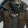
Daemon2027 Posted July 17, 2014 Author Share Posted July 17, 2014 So 15 months after I last managed to finish the painting of a model, I have finally completed the Word Bearer. Huzzah. He is not perfect, but I am really happy how he came out. I would of liked slightly more of the darker brown-red to have remained, and been a bit neater with the hello high lights, but I can work on that. Not sure on the eyes, think they may need a bit more yellow. The base was meant to look like grey dust and ash from a dying city (Imperial Palace of Terra :) ) but the weathering powders I used came out darker. Again, I can work on it on future models. The axe is very meh.mi was trying to give a purple sheen but it didn't work. Not really sure how to fix it, and tbh, have little enthusiasm to. It's something that can be fixed later. The shoulder lad has the chapter symbol. The chapters are named after star constellations, and I thought this looked sort of space. Kind of think it may be the way a more primitive people might depict they Eye of Terror. Now, I know from First Heretic, the Word Bearers had no idea what the Eye of Terror was, but the old faith may have an ancient understanding of it. Haven't got a name for the chapter yet though. Chapter of the Golden Eye, Chapter of the Gods Eye? Not sure. Like the axe, the knife was an experiment gone wrong. It's supposed to represent a tainted weapon and I wanted a natural looking weapon, like stone, again, have little energy to go back and work on it at the mo, so will be done at a later date. Another thing I want to work on is my small scripts looks messy but I am sure I will get better as time passes. So, comments and criticism please. Link to comment Share on other sites More sharing options...
Teetengee Posted July 17, 2014 Share Posted July 17, 2014 I think it is beautiful. Link to comment Share on other sites More sharing options...
Daemon2027 Posted July 17, 2014 Author Share Posted July 17, 2014 Thanks. Was worried it may be to bright gor the Word Bearers. Saying that he is darker to the eye. Link to comment Share on other sites More sharing options...
Knight of the Raven Posted July 17, 2014 Share Posted July 17, 2014 For what it's worth, I think the knife does look like stone. Obsidian, to be more specific. I like him. Link to comment Share on other sites More sharing options...
BeatTheBeat Posted July 17, 2014 Share Posted July 17, 2014 Hell yeah! Just getting back to my own Word Bearers, and those pics sure made me feel good about that. Great work, and good to see some of the new parts being used to good effect. Think I'll have to do some MkIV next now...Edit: How about Chapter of the Ocular Rift?Cheers,BTB Link to comment Share on other sites More sharing options...
Daemon2027 Posted July 17, 2014 Author Share Posted July 17, 2014 Hey BTB, it was your Word Bearers that inspired me. Glad to know your working on them again. Starting to think a bit more critically on mine. Wondering if I should have stopped with the armour after the red shade (post 30). Link to comment Share on other sites More sharing options...
deathspectersgt7 Posted July 17, 2014 Share Posted July 17, 2014 Great looking WB like your take on them . The New WB helms make great Helms for Librarians . Link to comment Share on other sites More sharing options...
Kizzdougs Posted July 18, 2014 Share Posted July 18, 2014 Loving the progress so far! The freehand legion symbol and chapter icon are both really impressive. However, I think the yellow highlight on the armour is a little too stark. As it is, it competes for attention with the freehand because it is so bright. You could try to tone it down a bit with a wash. Looking forward to some more WB goodness :) Ps. I agree with KotR, the dagger looks great, just as I imagined the WB sacrificial blades in Know No Fear. Link to comment Share on other sites More sharing options...
Teetengee Posted July 18, 2014 Share Posted July 18, 2014 I love the yellow, it looks like he is made of lava (now that might not be realistic but rule of cool here). It looks fantastic! Link to comment Share on other sites More sharing options...
Firepower Posted July 18, 2014 Share Posted July 18, 2014 On the purple sheen, were you meaning something literally reflective (like metallic paints/washes) or something that just seemed vibrant? I can help with the latter. I broke my brain trying a ton of different formulas until I ended up with one for my own purple power weapons. You can see them in teh last update of my Templar blog, in the sig. As for the stone knife, I'm not so sure. I've tried to do stone several times, and it sure ain't easy. The one thing I've seen that looked good was a recipe for granite paint, but it wasn't something that can be done easily on a small part of a model, because it involves flicking paint off a toothbrush to get a peppery/spotty effect. I'm not huge on the yellow armor highlights. I've always seen Word Bearers as a darker, ruddy red. The spiral stellar design on the shoulder is pretty cool, though :) Link to comment Share on other sites More sharing options...
Daemon2027 Posted July 18, 2014 Author Share Posted July 18, 2014 Thanks for the comments guys. After a restless night (sticky heat then thunderstorm makes baby not sleep which makes daddy not sleep) I started to feel a bit down on the WB, but I do t want to give up just yet, so during nap time (baby's nap time) I cracked out the paints. I re added some of the darker ready brown mix to the armour, then added orange to tone down a lot of the yellow highlight, leaving it in a few places. I then washed the model purple, which I think has brought me closer to the colour FW show. I'm wondering if I should have done red instead? Firepower, your purple power weapons do look good. I think I need to experiment a bit and see what works. Link to comment Share on other sites More sharing options...
BFeeder Posted July 18, 2014 Share Posted July 18, 2014 Very cool, I really like the posing and the weapon choice - that athame really finishes him off nicely! I think a red wash would probably have been more suitable, as the recesses look a little bit "bluey" to me, but it's certainly darkened the red which looks great! Link to comment Share on other sites More sharing options...
Teetengee Posted July 18, 2014 Share Posted July 18, 2014 He does look more realistic now (although I was clearly a huge fan of the more painterly effect given before). Fantastic stuff. Link to comment Share on other sites More sharing options...
Kizzdougs Posted July 18, 2014 Share Posted July 18, 2014 Yeah, to me he looks much better now. More balanced. The Purple wash turned out really well. I used purple to wash the red topknots on my EC and it really adds great depth without losing the richness of the red (I find that red and brown wash can dull the base colour some times). He'd look great with a couple of buddies :) Link to comment Share on other sites More sharing options...
Reyner Posted July 18, 2014 Share Posted July 18, 2014 He looks so much better after the purple wash :) It makes the runes stand out better and the toned toned highlights look better too :P Lucky you getting thunderstorms -.- I want a thunderstorm! Bloody southerners getting all the thunder and lightning... Link to comment Share on other sites More sharing options...
Firepower Posted July 18, 2014 Share Posted July 18, 2014 Much better. The red you chose initially was a bit bright, but what really sent it over the top was the severity of the highlighting. A wash and a lot less yellow has helped quite a bit, yes. Link to comment Share on other sites More sharing options...
Daemon2027 Posted July 18, 2014 Author Share Posted July 18, 2014 Thanks for the comments guys. Getting back into painting so very rusty. I feel better about this now, going to start building the first 5 of a tac squad tomorrow. Looking forward to trying to perfect the painting over the next few month, so when I get to the Gal Vorbak I can do them justice. Reyner, the storm was impressive, and it looks like more are coming. Link to comment Share on other sites More sharing options...
gizur Posted July 19, 2014 Share Posted July 19, 2014 Nice Work! I prefer my WB a little bit darker overall but your work is very beautiful. Link to comment Share on other sites More sharing options...

Recommended Posts
Archived
This topic is now archived and is closed to further replies.