-
Noserenda's meandering path to dubious glory
-
Evil Eye's Butterfly Brain Induced Hobby Nonsense
-
The Aksha'i Cruentes - A World Eaters Crusade Blog
-
Waffling on - a Hobby blog about everything
-
+ Necessary Ablation: apologist's blog +
-
I am the Very Model of a Modern Major Hobbyist
-
Liber Bellum
-
+Cooling the Rage+ Majkhel's blog
-
Drakhearts - Hobby blog and general musings
-
CFH test blog.
-
The Motive Force Was Inside You All Along
-
Spazmolytic's Trip into the Void
-
Wandering the Void
-
Skirmish Mats Product and Company News
-
Khornestar's Amateur Blood Blog
-
Its the Horus Apostasy, not Horus Heresy....
-
GreenScorpion Workbench
-
Flitter Flutter Goes the Hobby Mojo
-
The Yncarne's Hand
-
Conversions and Scratch Building Madness
-
Ordo Scientia
-
Doobles' slow grind to inbox zero
-
Death Angel
-
In Service of the Imperium- W.A.Rorie's Blog
-
Xenith's Hobby Hangout
-
Brother Nathans...everythings...
-
Killersquid's Chaos Knights
-
40K Feast & Famine
-
The Black & Red: An Accounting of the Malexis Sector and the Nihil Crusade
-
Plz motivate me blog
-
Wraithwing's Primaris Space Wolves - The Blackmanes
-
Brother Casman's Meanderings
-
Old Misadventures in Sci-Fi
-
My 40kreativity blog ( mostly art )
-
The Archives of Antios
-
Straight Outta the Warp - A Brazen Claws Blog
-
Lord Sondar
-
The Strifes of the Matteus Subsector
-
Some Little Plastic Homies
-
immortel
-
General hobby blog
-
Moonreaper's Lore Introspections and Ideas
-
Snakes of Ithaka Hobby Blog
-
McDougall Designs News blog
-
Grotz Hobby Hole Commissions
-
Stealth_Hobo's Hobby Blog (Imperial Fists and Other Stuff)
-
Wall A & B1 up to damp course
-
ZeroWolf's Hobby Madness
-
Saucermen Studios - 3D Printable Terrain
-
TTCombat Paints and Ultramarines
-
Bouargh´s miniatures´ closet clean-up
-
Faith and Teef, a toaae blog
-
Here There Be Monsters
-
Cult of the Octanic Blade - tinpact's Drukhari
-
Sons of the Dawn
-
Maybe this will help
-
Ashen Sentinels - an Ultima Founding Space Marine Chapter
-
Sanguine Paladins Hobby Blog
-
Silver Consuls-Rise to Glory
-
Gaston's Salamander Cult: A GSC Blog
-
A hobby journey for the Horus heresy
-
selnik's hobby blog
-
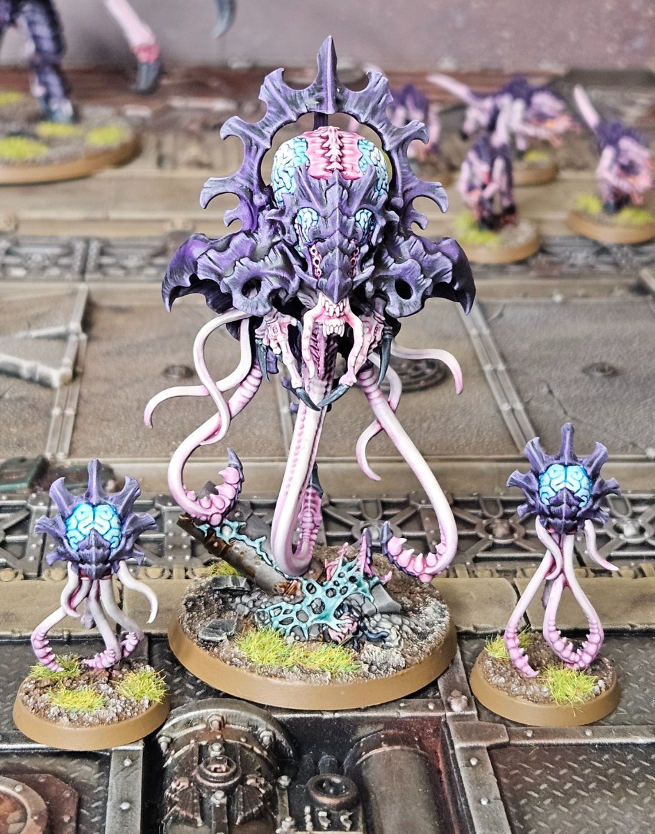
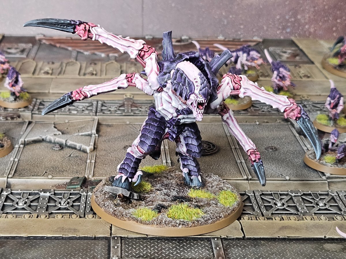
Tyriks's Tyranids
-
Halandaar's Badab Blog!
-
Saracen's Batreps
-
milddead’s Deathguard
-
TC's Odds and Sods
-
The Order of the Broken Arrow
-
Sporadic Hobby Thoughts
-
TheArtilleryman's Fighting Machines
-
Hobby And Design
-
Wormwoods' Various Projects
-
The Observation Post
-
the blog that will probably be renamed
-
Domhnall's hobby goodness
-
Tomcat's WH40K Laser Creations
-
Armata Strigoi
-
Zulu.Tango's Hobby Blog
-
Oni's work at work blog
-
Sven's Hobby
-
Murder Cursed
-
Bolter and Chainsword online conference
-
The Thalassians
-
Uncle Mel's Ramblings
-
The Burning Vengeance Crusade
-
[Insert clever title here]
-
Random Comments and Other Things
-
The Golden Kingdom (a Christian WH40K fan faction)
-
Happy Golden Days - Armies for 4th Edition
-
m-p-constructions Tabletop Terrain
-
Playing with Fire
-
Arx Vigilans
-
Regicide
-
The Legend of Norman Paperman
-
AM Not-Stygies - A Blog about building a new Army
-
Pointy and Spiky
-
The Accusers Chapter
-
The Throne Knights Chapter
-
The Inferno Wardens Chapter
-
The Avenging Lions Chapter
-
Bad Mood Rising
-
How to pretend not starting an army
-
The Iron Hearts
-
Maximize Savings With [acp856709] Temu Coupon Code $100 Off
-
Temu Coupon Code $200 Off [acp856709] First Order
-
Latest Temu Coupon Code 70% Off (acp856709) for This Month
-
Latest Temu Coupon Code $100 Off [acp856709] + Get 30% Discount
-
What is Temu Coupon Code (acp856709)? 90% Off
-
The building uprising of Prawa V
-
The November IX
-
Random 40k Stuff.
-
Brutal Cities | Terrain News & Tips
-
The Forgotten, a Fallen warband on Crusade
-
The Elrin's XIV Mountain jaggers
-
Khorne Daemonkin Project
-
Space Skaven Blog
-
A Forgotten World - Now A Bastion Of Hope
-
Joe's Wonk In Progress
-
Iron and Spirit
-
Space Marine Heroes 2
-
+ Praetors of Calth +
-
The Hateful 88th
-
The Veiled Oblivion - the Severed on Crusade
-
Being a Tournament Organiser for my Games Group
-
Kill Team - Outreach
-
The Hexagrammaton
-
The Hexagrammaton
-
HereticBOLTER’s Dudes/DIY Blog Dump
-
The Tip of the Spear: A journey with the XVI
-
Jackal Company
-
"We are the Hammer!"
-
""A spiritu dominatus, Domine, libra nos"
-
Army List Discussion's
-
Brother Lutheriel’s Dark Angels
-
The Gnostari Dominion - The Ironkin March
-
Skoolkrakka's Sappas
-
K's Salamanders - Unbound Flame
-
Ordo Maledictum: 164th Detachment "Ash Vultures"
-
Kaba's hobby in general
-
Doctrinae Fidei
-
Index Astartes: Red Knives
-
Tanksgiving 2025: Speed Build/Paint/Play
-
Thieving Magpies: An ADHD Approach to Astartes
-
The Terror and The Truth
-
Dawn of War: Building the Blood Ravens 2025-2026
-
The Lost & The Damned
-
Garf's Pile of Shame
-
2026: Building Space Marines
-
Combat Patrolling the Galaxy
-
Liber Insignum - Legion Astartes XVIth Legion - Sons of Horus
-
"By Faith and Fire" - Followers of the Ministorum
-
The Green Templars (2026)
-
120 Ork boyz progress
-
Splinter fleet Rapina
-
BrassClaw's Collection of Projects
-
Para’s Plastic Pile of Potential
-
Blood Angels and whatever is lying around
-
Tactica-Engine: W40k battle simulator
-
The Gellar Field has Failed!
-
Ikka's Hobby Land
-
ODST: Tempestus Aquilons Kill Team
-
"They shall be my finest warriors, these men who give themselves to me."
-
Iron Concord
-
The Golden Legion: What Have I Inflicted Upon Myself?
-
The journey to Birmingham - a Kroot story
-
Refuse
-
The Veeaitchez Clan
-
MmmmmNapalm's Long-Belated Crusade Blog
-
Sons of Horus Fellblade
-
Setting Sons
-
The Golden Legion: Step by Step
-
"Innocence Proves Nothing!"