nornicle Posted October 14, 2012 Share Posted October 14, 2012 Some WIPS from me. I'm going for a triadic green, orange, purple scheme. still trying to work out how to make it 'pop' on the table... http://img.photobucket.com/albums/v47/nornicle/_MG_7028_zpsa56f13ec.jpg The chosen are fine because the purples/ greens and orange are very close to each other but after painting the horns of my hellbrute black and the eyes purple... it seems very 'samey' and not like a very interesting mode.. I coudl use some help. http://img.photobucket.com/albums/v47/nornicle/_MG_7030_zps1aabebdc.jpg Link to comment https://bolterandchainsword.com/topic/260145-your-dark-vengeance-minis/page/11/#findComment-3207788 Share on other sites More sharing options...
Dammeron Posted October 14, 2012 Share Posted October 14, 2012 ^ I like it, personally; the piece has a consistent feeling to it, but if you want to shake it up, I'd perhaps consider painting some of the more "organic" details a similar purple as you've used on the other miniature, or maybe even a pale or rotten flesh hew just to break things up a little. Link to comment https://bolterandchainsword.com/topic/260145-your-dark-vengeance-minis/page/11/#findComment-3207792 Share on other sites More sharing options...
KingDeath Posted October 14, 2012 Share Posted October 14, 2012 Some WIPS from me. I'm going for a triadic green, orange, purple scheme. still trying to work out how to make it 'pop' on the table... http://img.photobucket.com/albums/v47/nornicle/_MG_7028_zpsa56f13ec.jpg The chosen are fine because the purples/ greens and orange are very close to each other but after painting the horns of my hellbrute black and the eyes purple... it seems very 'samey' and not like a very interesting mode.. I coudl use some help. http://img.photobucket.com/albums/v47/nornicle/_MG_7030_zps1aabebdc.jpg Some of the best DV miniatures i have seen. Can you post some larger pictures please? Oh, and don't worry too much about your Hellbrute. It looks fine. To introduce a radicaly different colour might destroy the miniature's style/ colour composition. If you want aditional detail then think about adding scratches/ battledamage to the Hellbrute's armour. Link to comment https://bolterandchainsword.com/topic/260145-your-dark-vengeance-minis/page/11/#findComment-3207854 Share on other sites More sharing options...
nornicle Posted October 14, 2012 Share Posted October 14, 2012 Thanks for all the feedback guys, I really appreciate it (note I also posted this on another forum so I'm just copying an pasting some commentary over) I realise with airbrushing it starts looking 'samey' so you're right you need to make the highlights POP a lot more. So apart from adding some more saturated colours to break up the hellbrute (will do that soon) I've decided to go to town with glazing down and sharp 'specular' 'dotting' highlights http://img.photobucket.com/albums/v47/nornicle/_MG_7032_zps5107d922.jpg If you look at the chosen on the right, I've done the same number of layers (four, wurm green base, coalblack/ordic olive glaze, necrotite green highlight, cygnus yellow/ menoth white 'specular highlight') but the last highlight is applied almost as 'dotting' and the rivets suddenly pop out and the miniature looks a lot more detailed, when actually it's just a visual illusion, takes the same amount of time too. I obviously can't do a side by side on my hell brute, but here is it with more 'specular' highlighting. This includes the little face on his left leg, which now is a lot more defined just by some well placed highlights. Anyway time to hit the sac and work out what my next colour for the brute! http://img.photobucket.com/albums/v47/nornicle/_MG_7033_zps49b55445.jpg Link to comment https://bolterandchainsword.com/topic/260145-your-dark-vengeance-minis/page/11/#findComment-3207865 Share on other sites More sharing options...
Sception Posted October 14, 2012 Share Posted October 14, 2012 Don't skimp on the Purple! The bolter chosen is the best of the three because of that extra interesting visual variety you get from the additional color. It also feels more weirdly organic. Get some of that purple into the hellbrute and the fistimarine and they'll look fantastic. Not that they don't already, mind, but there's a big difference between them and the bolter marine, and that purple's it. Link to comment https://bolterandchainsword.com/topic/260145-your-dark-vengeance-minis/page/11/#findComment-3207921 Share on other sites More sharing options...
Clewz Posted October 14, 2012 Share Posted October 14, 2012 Thanks for all the feedback guys, I really appreciate it (note I also posted this on another forum so I'm just copying an pasting some commentary over) I realise with airbrushing it starts looking 'samey' so you're right you need to make the highlights POP a lot more. So apart from adding some more saturated colours to break up the hellbrute (will do that soon) I've decided to go to town with glazing down and sharp 'specular' 'dotting' highlights http://img.photobucket.com/albums/v47/nornicle/_MG_7032_zps5107d922.jpg If you look at the chosen on the right, I've done the same number of layers (four, wurm green base, coalblack/ordic olive glaze, necrotite green highlight, cygnus yellow/ menoth white 'specular highlight') but the last highlight is applied almost as 'dotting' and the rivets suddenly pop out and the miniature looks a lot more detailed, when actually it's just a visual illusion, takes the same amount of time too. I obviously can't do a side by side on my hell brute, but here is it with more 'specular' highlighting. This includes the little face on his left leg, which now is a lot more defined just by some well placed highlights. Anyway time to hit the sac and work out what my next colour for the brute! http://img.photobucket.com/albums/v47/nornicle/_MG_7033_zps49b55445.jpg Love the corpse look on the hellbrute Link to comment https://bolterandchainsword.com/topic/260145-your-dark-vengeance-minis/page/11/#findComment-3207935 Share on other sites More sharing options...
Rune Priest Ridcully Posted October 14, 2012 Share Posted October 14, 2012 Here is a work in progress, Terminator Champion Narmer of the Thousand sons Link to comment https://bolterandchainsword.com/topic/260145-your-dark-vengeance-minis/page/11/#findComment-3207948 Share on other sites More sharing options...
Bearingtheword Posted October 14, 2012 Share Posted October 14, 2012 Thanks for all the feedback guys, I really appreciate it (note I also posted this on another forum so I'm just copying an pasting some commentary over) I realise with airbrushing it starts looking 'samey' so you're right you need to make the highlights POP a lot more. So apart from adding some more saturated colours to break up the hellbrute (will do that soon) I've decided to go to town with glazing down and sharp 'specular' 'dotting' highlights http://img.photobucket.com/albums/v47/nornicle/_MG_7032_zps5107d922.jpg If you look at the chosen on the right, I've done the same number of layers (four, wurm green base, coalblack/ordic olive glaze, necrotite green highlight, cygnus yellow/ menoth white 'specular highlight') but the last highlight is applied almost as 'dotting' and the rivets suddenly pop out and the miniature looks a lot more detailed, when actually it's just a visual illusion, takes the same amount of time too. I obviously can't do a side by side on my hell brute, but here is it with more 'specular' highlighting. This includes the little face on his left leg, which now is a lot more defined just by some well placed highlights. Anyway time to hit the sac and work out what my next colour for the brute! http://img.photobucket.com/albums/v47/nornicle/_MG_7033_zps49b55445.jpg Quiet Impressive! I am really liking it! and I second what Malisteen suggested.... ~BtW Link to comment https://bolterandchainsword.com/topic/260145-your-dark-vengeance-minis/page/11/#findComment-3208162 Share on other sites More sharing options...
Quixus Posted October 14, 2012 Share Posted October 14, 2012 Quiet Impressive! I am really liking it!+1 (except I'd replace quiet with quite :P) and I second what Malisteen suggested....Thirded. You might even try a purplish skin tone for the hellbrute instead of the beige one to give it a bit more contrast. Link to comment https://bolterandchainsword.com/topic/260145-your-dark-vengeance-minis/page/11/#findComment-3208224 Share on other sites More sharing options...
esinhorn Posted October 14, 2012 Share Posted October 14, 2012 Here are the last of my DV Chaos minis done in a 6 hour marathon http://i216.photobucket.com/albums/cc52/Esinhorn/009-79.jpg http://i216.photobucket.com/albums/cc52/Esinhorn/010-71.jpg http://i216.photobucket.com/albums/cc52/Esinhorn/007-108.jpg http://i216.photobucket.com/albums/cc52/Esinhorn/008-92.jpg http://i216.photobucket.com/albums/cc52/Esinhorn/012-57.jpg http://i216.photobucket.com/albums/cc52/Esinhorn/011-64.jpg http://i216.photobucket.com/albums/cc52/Esinhorn/016-36.jpg http://i216.photobucket.com/albums/cc52/Esinhorn/017-31.jpg http://i216.photobucket.com/albums/cc52/Esinhorn/014-39.jpg http://i216.photobucket.com/albums/cc52/Esinhorn/015-38.jpg Link to comment https://bolterandchainsword.com/topic/260145-your-dark-vengeance-minis/page/11/#findComment-3208302 Share on other sites More sharing options...
nornicle Posted October 14, 2012 Share Posted October 14, 2012 Don't skimp on the Purple! The bolter chosen is the best of the three because of that extra interesting visual variety you get from the additional color. It also feels more weirdly organic. Get some of that purple into the hellbrute and the fistimarine and they'll look fantastic. Not that they don't already, mind, but there's a big difference between them and the bolter marine, and that purple's it. Genius, I thought aobut it some more - the reason why I think you like the purple is that I've kept it a very organic 'orange' purple with highlights of blue. and I'm missing orange on the other types of purple etc. Watch this space :) I will be using purple on robes, teal on jewels, eyes etc. Agree on the hell brute, I'm so lazy to repaint the flesh though, so will have to think about it some more. Link to comment https://bolterandchainsword.com/topic/260145-your-dark-vengeance-minis/page/11/#findComment-3208346 Share on other sites More sharing options...
John_f Posted October 15, 2012 Share Posted October 15, 2012 Some cultists: Link to comment https://bolterandchainsword.com/topic/260145-your-dark-vengeance-minis/page/11/#findComment-3208739 Share on other sites More sharing options...
Bearingtheword Posted October 15, 2012 Share Posted October 15, 2012 Quiet Impressive! I am really liking it!+1 (except I'd replace quiet with quite ;)) Yeah.....That's what I get for having text fill in on, I should know better, hehe. and I second what Malisteen suggested....Thirded. You might even try a purplish skin tone for the hellbrute instead of the beige one to give it a bit more contrast. The purple would look pretty cool, but it still looks cool as is.... ~BtW Link to comment https://bolterandchainsword.com/topic/260145-your-dark-vengeance-minis/page/11/#findComment-3208996 Share on other sites More sharing options...
HJL Posted October 15, 2012 Share Posted October 15, 2012 Havoc Champion Dark Apostle Link to comment https://bolterandchainsword.com/topic/260145-your-dark-vengeance-minis/page/11/#findComment-3209373 Share on other sites More sharing options...
nornicle Posted October 15, 2012 Share Posted October 15, 2012 With painting you can go forever, I think I'm 'done' in terms of what I'm going to expect the basic three colours (orange, green, purple) to look like (not the details like chainmail/ small details) What is very interesting is comparing my old work and realising I under-highlight too often, and I am not sharp enough with my final highlights. and it is a habit I'm trying to change. Previously I would have stopped at the first picture! http://img.photobucket.com/albums/v47/nornicle/Chosenhighlightcompare_zpsc95153a3.jpg Link to comment https://bolterandchainsword.com/topic/260145-your-dark-vengeance-minis/page/11/#findComment-3209521 Share on other sites More sharing options...
Bearingtheword Posted October 16, 2012 Share Posted October 16, 2012 With painting you can go forever, I think I'm 'done' in terms of what I'm going to expect the basic three colours (orange, green, purple) to look like (not the details like chainmail/ small details) What is very interesting is comparing my old work and realising I under-highlight too often, and I am not sharp enough with my final highlights. and it is a habit I'm trying to change. Previously I would have stopped at the first picture! http://img.photobucket.com/albums/v47/nornicle/Chosenhighlightcompare_zpsc95153a3.jpg Oooh! That is so awesome looking! Good job pushing yourself, the first looked good, the second looks epic! Great job!! ~BtW Link to comment https://bolterandchainsword.com/topic/260145-your-dark-vengeance-minis/page/11/#findComment-3209900 Share on other sites More sharing options...
Blackmonkey0 Posted October 16, 2012 Share Posted October 16, 2012 Some great minis up on this thread. Will have to add mine to it. Link to comment https://bolterandchainsword.com/topic/260145-your-dark-vengeance-minis/page/11/#findComment-3209925 Share on other sites More sharing options...
DarkMark Posted October 16, 2012 Share Posted October 16, 2012 @nornicle: great minis mate! Have you considered glazing your colours? Try a thin yellow over the green, and orange over the purple. Add a touch of matt medium if you want to avoid any shine. I reckon that would take your models up a step, and really requires no more than 5 minutes max! Try on a small bit if you're not sure first. The models ace regardless. @every one else: not exactly DV, but here's a shed load of superb painted armies that are sure to get the creative juices going! B) Link to comment https://bolterandchainsword.com/topic/260145-your-dark-vengeance-minis/page/11/#findComment-3209970 Share on other sites More sharing options...
Nemisor Posted October 22, 2012 Share Posted October 22, 2012 I just couldnt leave the highlights alone and i have caved in and gone back to green highlights http://i191.photobucket.com/albums/z110/andrewbartosh/2012/P1040995.jpg and got my Dread done http://i191.photobucket.com/albums/z110/andrewbartosh/2012/P1040992.jpg http://i191.photobucket.com/albums/z110/andrewbartosh/2012/P1040991.jpg http://i191.photobucket.com/albums/z110/andrewbartosh/2012/P1040993.jpg Link to comment https://bolterandchainsword.com/topic/260145-your-dark-vengeance-minis/page/11/#findComment-3215591 Share on other sites More sharing options...
Fullbrook Posted October 22, 2012 Share Posted October 22, 2012 http://img.photobucket.com/albums/v47/nornicle/Chosenhighlightcompare_zpsc95153a3.jpg I really like these. I like the kind of organic feel they have and they look really neat. My test mini not too sure about it i think i made the black too glossy? does anyone know how to bring the shine down a bit? http://i1162.photobucket.com/albums/q538/fullbrook3/S7003360.jpg Link to comment https://bolterandchainsword.com/topic/260145-your-dark-vengeance-minis/page/11/#findComment-3215814 Share on other sites More sharing options...
Sception Posted October 22, 2012 Share Posted October 22, 2012 http://img.photobucket.com/albums/v47/nornicle/Chosenhighlightcompare_zpsc95153a3.jpg Yes! That purple looks so good. These are looking fantastic. Lots of awesome on this page, in fact. HJL: I love that Dark Apostle, the scribblings on the cape are a fantastic touch that really helps it make that jump from 'champion' to 'hero'. Ageis: those are some very nice Alpha Legion. I do like the blue w/ green highlights thing. Fullbrook: looking pretty good! Maybe a thin wash over the metal bits? Black over the silver, sepia over the gold? Maybe not. Anyway, it's always great to see more black legion. Makes me want to work on my own chosen, but I've still got a lot of other things to get done first! Link to comment https://bolterandchainsword.com/topic/260145-your-dark-vengeance-minis/page/11/#findComment-3215826 Share on other sites More sharing options...
Brother Nathan Posted October 22, 2012 Author Share Posted October 22, 2012 keep up the good work guys, looking well. cultists all assembled. so group shots of the assembled guys and of the painted ones. http://i155.photobucket.com/albums/s317/generalhazard_album/models/DSCN0580-1.jpg http://i155.photobucket.com/albums/s317/generalhazard_album/models/DSCN0586-1.jpg Link to comment https://bolterandchainsword.com/topic/260145-your-dark-vengeance-minis/page/11/#findComment-3215888 Share on other sites More sharing options...
Brother Nathan Posted October 22, 2012 Author Share Posted October 22, 2012 keep up the good work guys, looking well. cultists all assembled. so group shots of the assembled guys and of the painted ones. http://i155.photobucket.com/albums/s317/generalhazard_album/models/DSCN0580-1.jpg http://i155.photobucket.com/albums/s317/generalhazard_album/models/DSCN0586-1.jpg Link to comment https://bolterandchainsword.com/topic/260145-your-dark-vengeance-minis/page/11/#findComment-3215889 Share on other sites More sharing options...
wargame insomniac Posted November 3, 2012 Share Posted November 3, 2012 Hi- has anyone done any good conversions of DV Chosen? I have seen some nice ones in this thread of chaos-ifying the DV DA models. But I am looking to add a little bit of variety to my DV Chosen. Thanks James Link to comment https://bolterandchainsword.com/topic/260145-your-dark-vengeance-minis/page/11/#findComment-3228744 Share on other sites More sharing options...
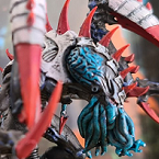
cypher 89 Posted November 3, 2012 Share Posted November 3, 2012 ive only really painted the helbrute for my deathguard so far, here he is http://i.imgur.com/yjSKZ.jpg?1 http://i.imgur.com/c93yZ.jpg?1 http://i.imgur.com/3uqkY.jpg?1 http://i.imgur.com/B1lQR.jpg?1 Link to comment https://bolterandchainsword.com/topic/260145-your-dark-vengeance-minis/page/11/#findComment-3228768 Share on other sites More sharing options...
Recommended Posts
Archived
This topic is now archived and is closed to further replies.