Phalanx Warder Posted October 13, 2013 Author Share Posted October 13, 2013 Wow, so much work without commentary. Fail. :( The concrete shield Dreadnought got a good chortle out of me :lol: Of all your recent-ish work though, the Deathwing wins by a wide margin in my opinion. The shading on the yellow is just too subtle for my tastes. I feel it would do much better as the same deep brown in the crevices of the Deathwing terminator. As is, everything just looks so....soft. That's the best word I can think of. That's just a matter of taste though, and I realize changing it at this point would be a huge endeavor anyway :P. On another note, I quite like the feathery power-weapon technique you have :) Thank you Firepower for your honest appraisal, I will take your suggestions and run with it. Expect a test mini up later today! I dont tend to get a lot of comment love, but I just choose to think that my painting skills leave everyone speechless :P. To be fair, in person the shaded areas are much more stark than the pictures give credit for. I have been working on my freehand technique for my imperial fist icon, once I am comfortable I have to go back through everything and bring them up to standard might present the opportunity should I like the new shading Link to comment https://bolterandchainsword.com/topic/273405-battle8rothers-wip-log-3-march-pic-heavy-update/page/3/#findComment-3493446 Share on other sites More sharing options...
BrotherJim Posted October 13, 2013 Share Posted October 13, 2013 just had a quick skim through you log and there is some really good stuff in here! keep it up fella one thing im wondering about is how you do your battle damage (like on the contemptor and mk3 guys) please don't say: first sponge on a base colour then sponge on some boltgun within the base colour, then underline and highlight cause last time I tried, that it was a massive fail! Link to comment https://bolterandchainsword.com/topic/273405-battle8rothers-wip-log-3-march-pic-heavy-update/page/3/#findComment-3493482 Share on other sites More sharing options...
Phalanx Warder Posted October 13, 2013 Author Share Posted October 13, 2013 just had a quick skim through you log and there is some really good stuff in here! keep it up fella one thing im wondering about is how you do your battle damage (like on the contemptor and mk3 guys) please don't say: first sponge on a base colour then sponge on some boltgun within the base colour, then underline and highlight cause last time I tried, that it was a massive fail! Thank you brother! I have some minis ready to receive some battle damage, I will make an attempt at a tutorial for you! Link to comment https://bolterandchainsword.com/topic/273405-battle8rothers-wip-log-3-march-pic-heavy-update/page/3/#findComment-3493500 Share on other sites More sharing options...
BrotherJim Posted October 13, 2013 Share Posted October 13, 2013 too good mate! Link to comment https://bolterandchainsword.com/topic/273405-battle8rothers-wip-log-3-march-pic-heavy-update/page/3/#findComment-3493513 Share on other sites More sharing options...
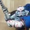
Phalanx Warder Posted October 13, 2013 Author Share Posted October 13, 2013 too good mate!Here goes nothing! First up for Firepower, here is one with a darker wash. (right) Let me know what you think! @ jimmy101 STEP 1 mix together abbadon black with Adeptus battle gray, I look for a very deep gray something like this... picture #1 you will notice in the above picture I have the sponge marks on the paper, I attempt to make a good paint area on the sponge by either using a corner or ripping bits off. STEP 2 when you add paint its better to take most back off (far right blob of picture #1 is no good), i use the paper to get the effect i am after the apply to the mini, you don't want to smash the sponge down on the mini, slowly add pressure and back off to see the results. as the paint is used up just press harder and paint will come to the fore. I try to pick parts of the armor that I expect would take the most grief, you should get this.... Picture #2 Picture #3 Picture #4 STEP 3 You are going to want to use your brush for this next part, get your sliver paint on the tip of your brush I use Mithril silver (but any will do). You want take it almost all the way off (and I do mean ALMOST ALL) and work your brush over the dark gray areas, repeat as needed. For hard edges I leave a thicker amount of paint on the brush. Make sure you leave some of the gray left over, you should end up with this..... STEP 4 You prep the paint on your brush the same as step 3 but with orange (you could also use mechrite red or its new paint range equivalent) this time, aim for the areas between your base color (yellow for me) and the gray that you just sponged on. I try to make it as random as possible. Hope you liked the tutorial, it was my first and not sure how clear the steps are (clear as mud I expect!). i would like to see the results of your attempt. Let me know what you think! Link to comment https://bolterandchainsword.com/topic/273405-battle8rothers-wip-log-3-march-pic-heavy-update/page/3/#findComment-3493593 Share on other sites More sharing options...
BrotherJim Posted October 13, 2013 Share Posted October 13, 2013 aha very good! I did get a little confused around step 3 and step 4, where exactly do you paint the orange? once upon a time laborious detailed a similar technique to me, but I muffed it. hopefully this time around i'll get it right! Link to comment https://bolterandchainsword.com/topic/273405-battle8rothers-wip-log-3-march-pic-heavy-update/page/3/#findComment-3493773 Share on other sites More sharing options...
Phalanx Warder Posted October 13, 2013 Author Share Posted October 13, 2013 aha very good! I did get a little confused around step 3 and step 4, where exactly do you paint the orange? once upon a time laborious detailed a similar technique to me, but I muffed it. hopefully this time around i'll get it right! The biggest thing I can say here is LESS is MORE, if you go too heavy you will kill the effect. I have found that you can always work UP to the effect you want but is almost impossible to work down if you over do it, the difference between step 3 and 4 is....... in step 3 with the silver you aim for the gray (leaving the edges) in step 4 you add the orange to your base color (yellow for me, gray for you) close to the gray, if it overlaps its okay. I hope that clears things up for you. if not PM me Link to comment https://bolterandchainsword.com/topic/273405-battle8rothers-wip-log-3-march-pic-heavy-update/page/3/#findComment-3493828 Share on other sites More sharing options...
Styrofoam04 Posted October 15, 2013 Share Posted October 15, 2013 Great tutorial thanks!! I like the darker wash. It looks more dramatic. Link to comment https://bolterandchainsword.com/topic/273405-battle8rothers-wip-log-3-march-pic-heavy-update/page/3/#findComment-3495887 Share on other sites More sharing options...
Phalanx Warder Posted October 15, 2013 Author Share Posted October 15, 2013 Great tutorial thanks!! I like the darker wash. It looks more dramatic. Thanks brother! As my first tutorial I am glad that you like it, I have to agree on the darker wash except around the shoulder pads were the black trim is but other than that I enjoy the deep tones! Link to comment https://bolterandchainsword.com/topic/273405-battle8rothers-wip-log-3-march-pic-heavy-update/page/3/#findComment-3496042 Share on other sites More sharing options...
Phalanx Warder Posted October 15, 2013 Author Share Posted October 15, 2013 Quick update as I have had my head to the grind stone First up is the first fella from my WIP legion Destroyer squad Still lots to do on him, it says in the the fluff of the destroyers that there armor was "chem burned black" so my interpretation is the paint scheme you see above as I assume that the VII legion would be one of those legions that shunned the use of these Astartes most. Therefore they are ordered to paint parts of there armor black because they would be used in extremis only. Next up is my pride and joy so far............... This mini has been an absolute blast to paint and as it nears completion I have to say that I am going to miss working on him. Still WIP but close!!! Hope you like what you see! I would say C&C is welcome but that just makes everyone not comment or give me helpful and thoughtful critiques on how to improve Link to comment https://bolterandchainsword.com/topic/273405-battle8rothers-wip-log-3-march-pic-heavy-update/page/3/#findComment-3496251 Share on other sites More sharing options...
The_Chaplain Posted October 15, 2013 Share Posted October 15, 2013 I would say C&C is welcome but that just makes everyone not comment or give me helpful and thoughtful critiques on how to improve Haha, that's exactly how I feel about sticking that in the bottom of a post in my threads! I really think your praetor model would benefit from strategic highlights- those shoulderpads are awesome, why not put a grey highlight around the pad holes/vents and make it pop? I'm also not 100% sold on the red casing elements on the weapons he has, it seems like too much contrast with the purple power axe and blue in the archaeotech pistol and shoulderpad wings and then red casings- versus the vibrancy of the imperial fist yellow. Have you thought of gold casing instead and making it more harmonious? A great looking model, dont get me wrong, just wanted to give my 2 cents worth of c&c. Your battle damage tutorial is fantastic btw. Link to comment https://bolterandchainsword.com/topic/273405-battle8rothers-wip-log-3-march-pic-heavy-update/page/3/#findComment-3496266 Share on other sites More sharing options...
Phalanx Warder Posted October 16, 2013 Author Share Posted October 16, 2013 I would say C&C is welcome but that just makes everyone not comment or give me helpful and thoughtful critiques on how to improve Haha, that's exactly how I feel about sticking that in the bottom of a post in my threads! I really think your praetor model would benefit from strategic highlights- those shoulderpads are awesome, why not put a grey highlight around the pad holes/vents and make it pop? I'm also not 100% sold on the red casing elements on the weapons he has, it seems like too much contrast with the purple power axe and blue in the archaeotech pistol and shoulderpad wings and then red casings- versus the vibrancy of the imperial fist yellow. Have you thought of gold casing instead and making it more harmonious? A great looking model, dont get me wrong, just wanted to give my 2 cents worth of c&c. Your battle damage tutorial is fantastic btw. First of all thank you for the honest feedback! When I painted up the black areas I used a gray mix like the one in my battle damage tutorial and gave it a heavy black wash in the hopes of having some instant highlights but failed :(. I agree with you 100% about the black but I have to admit I am a little scared and hesitant to just go and change it, but seen as you have put voice to a concern that I am having I will work on one shoulder guard and post up picts for you! This mini is going to be the centerpiece of my force so I tried to pack some color on him so he stands out. The plan at the moment is for that red to be present throughout the entire force on weapons and the like. Once again I will do a small test section and see how it turns out! Link to comment https://bolterandchainsword.com/topic/273405-battle8rothers-wip-log-3-march-pic-heavy-update/page/3/#findComment-3496666 Share on other sites More sharing options...
Kierdale Posted October 16, 2013 Share Posted October 16, 2013 I like the marble effect you did on Sigismund's shield. How did you achieve it? I also must say that the Mk.III armour looks great with the backs of the legs 'left' bare metal. And as someone painting yellow at the moment (though Scythes rather than fists), your damage tutorial is very useful. I did Leadbelcher in my sponged damaged areas but might add some Mythril now too. Good point on having the middle of some shoulder pads scratched and worn. Barging through human-sized doors, and through walls, that area's going to take a battering. Might be a good way to hide any fumbles on my hand-drawn chapter insignia too... Link to comment https://bolterandchainsword.com/topic/273405-battle8rothers-wip-log-3-march-pic-heavy-update/page/3/#findComment-3496921 Share on other sites More sharing options...
Russ Brother 92 Posted October 16, 2013 Share Posted October 16, 2013 brilliant tut for the battle damage - I'll be pinching it for my HH Iron Hands :D and your other painting is great :) look forward to seeing more - also with your base colours do you always block paint, then wash/ink, then detail and/or re-wash? Link to comment https://bolterandchainsword.com/topic/273405-battle8rothers-wip-log-3-march-pic-heavy-update/page/3/#findComment-3496968 Share on other sites More sharing options...
infyrana Posted October 16, 2013 Share Posted October 16, 2013 Some cracking stuff here ! I wouldn't mind seeing some of these all grouped up in army shots :) (will have to go check the rest of the thread in case now) Link to comment https://bolterandchainsword.com/topic/273405-battle8rothers-wip-log-3-march-pic-heavy-update/page/3/#findComment-3497060 Share on other sites More sharing options...
Brother Pheidias Posted October 16, 2013 Share Posted October 16, 2013 Always good to see another nicely done Fist-army. We have a very similar approach, except I leave out the silver (Ceramite doesn't sound too metallic to me ;) ) Link to comment https://bolterandchainsword.com/topic/273405-battle8rothers-wip-log-3-march-pic-heavy-update/page/3/#findComment-3497097 Share on other sites More sharing options...
Phalanx Warder Posted October 17, 2013 Author Share Posted October 17, 2013 I like the marble effect you did on Sigismund's shield. How did you achieve it? I also must say that the Mk.III armour looks great with the backs of the legs 'left' bare metal. And as someone painting yellow at the moment (though Scythes rather than fists), your damage tutorial is very useful. I did Leadbelcher in my sponged damaged areas but might add some Mythril now too. Good point on having the middle of some shoulder pads scratched and worn. Barging through human-sized doors, and through walls, that area's going to take a battering. Might be a good way to hide any fumbles on my hand-drawn chapter insignia too... Thanks for the above comment because I have added allot of your sugestions and it has made the mini much better IMHO, so thanks again. I will have to get some updated pictures soon but I think it will be based before I make any updates. The shield was a mix of separate grays in a random stripe pattern done over a fortress gray and washed in a Azurman(sp?) blue Some cracking stuff here ! I wouldn't mind seeing some of these all grouped up in army shots (will have to go check the rest of the thread in case now) Thanks brother! I will get an army shot for you here soon, I have entered the painting challenge created by Captain Semper so I will be expanding the force quite allot here soon 2x 10 man assault squad and a relic contemptor so much more to come Always good to see another nicely done Fist-army. We have a very similar approach, except I leave out the silver (Ceramite doesn't sound too metallic to me ) I had a good nosy around your blog and you are spot on! We have a almost perfect match interpretation of the fists, the work you have put into your stuff is amazing I have to say. As far as I know Ceramite is a blend of titanium and ceramics so I attempt to capture both Link to comment https://bolterandchainsword.com/topic/273405-battle8rothers-wip-log-3-march-pic-heavy-update/page/3/#findComment-3498420 Share on other sites More sharing options...
Phalanx Warder Posted October 19, 2013 Author Share Posted October 19, 2013 I know I said no more updates until the praetor was based but I have figured out a new way to do my Imperial Fist icon and like an exited kid on Christmas morning I had to run to the B&C and share it with everyone..... Anyway below is the new icon and of course i have to go back through every mini and do this then go over it with weathering so it will be a long process but well worth it. This one still needs to be worked but it is getting there... and a front shot to show the new highlights on the black trim Link to comment https://bolterandchainsword.com/topic/273405-battle8rothers-wip-log-3-march-pic-heavy-update/page/3/#findComment-3500367 Share on other sites More sharing options...
Laborious Posted October 19, 2013 Share Posted October 19, 2013 Very good stuff, mate, and fair played to you for freehanding all that iconography! I'd lose the will to live! :) That black is looking very nice indeed, btw, just enough highlighting to give it definition but not so much that it looks grey. :) Link to comment https://bolterandchainsword.com/topic/273405-battle8rothers-wip-log-3-march-pic-heavy-update/page/3/#findComment-3500393 Share on other sites More sharing options...
Phalanx Warder Posted November 17, 2013 Author Share Posted November 17, 2013 Very good stuff, mate, and fair played to you for freehanding all that iconography! I'd lose the will to live! That black is looking very nice indeed, btw, just enough highlighting to give it definition but not so much that it looks grey. Cheers mate! The black is gray hit up with black wash, instant highlight Update time! so this is were it gets a little weird........ i have never done the hairspray technique so i gave it a go. here is the prepped tank (based with Rhino Hide and with a sponge used blood red,scorched brown mechrite red and blazing orange. And with some paint on! and this is the soon to be Relic Mortis (former Captain Uriel Rex) I have to say that working with yellow has been a challenge, but one that i embrace, still not 100% on the method but i am honing it in. I appreciate any comments and pointers. Thanks Battle8rother Link to comment https://bolterandchainsword.com/topic/273405-battle8rothers-wip-log-3-march-pic-heavy-update/page/3/#findComment-3524403 Share on other sites More sharing options...
War Angel Posted November 17, 2013 Share Posted November 17, 2013 These guys are looking better and better. And you set the bar so high to begin with too! Keep up the high expectations brother Link to comment https://bolterandchainsword.com/topic/273405-battle8rothers-wip-log-3-march-pic-heavy-update/page/3/#findComment-3524490 Share on other sites More sharing options...
Phalanx Warder Posted November 17, 2013 Author Share Posted November 17, 2013 These guys are looking better and better. And you set the bar so high to begin with too! Keep up the high expectations brother Thanks War Angel! It has been a good time but I am always having to make myself SLOW down because I can get sloppy real fast! I have been lurking around the Eagle Spire and you too have come along way good sir! Link to comment https://bolterandchainsword.com/topic/273405-battle8rothers-wip-log-3-march-pic-heavy-update/page/3/#findComment-3524621 Share on other sites More sharing options...
Noctus Cornix Posted November 17, 2013 Share Posted November 17, 2013 Really like the look of that Destroyer, man. Keep up the awesome work. Link to comment https://bolterandchainsword.com/topic/273405-battle8rothers-wip-log-3-march-pic-heavy-update/page/3/#findComment-3524628 Share on other sites More sharing options...
deathspectersgt7 Posted November 17, 2013 Share Posted November 17, 2013 Some excellent work. Link to comment https://bolterandchainsword.com/topic/273405-battle8rothers-wip-log-3-march-pic-heavy-update/page/3/#findComment-3524696 Share on other sites More sharing options...
War Angel Posted November 18, 2013 Share Posted November 18, 2013 Thanks War Angel! It has been a good time but I am always having to make myself SLOW down because I can get sloppy real fast! I have been lurking around the Eagle Spire and you too have come along way good sir! So that was you the scouts spotted snooping around the hallways. Feel free to announce yourself next time ;) our doors always open. Link to comment https://bolterandchainsword.com/topic/273405-battle8rothers-wip-log-3-march-pic-heavy-update/page/3/#findComment-3524758 Share on other sites More sharing options...
Recommended Posts
Archived
This topic is now archived and is closed to further replies.